kage
kage
hark.com

Design analysis
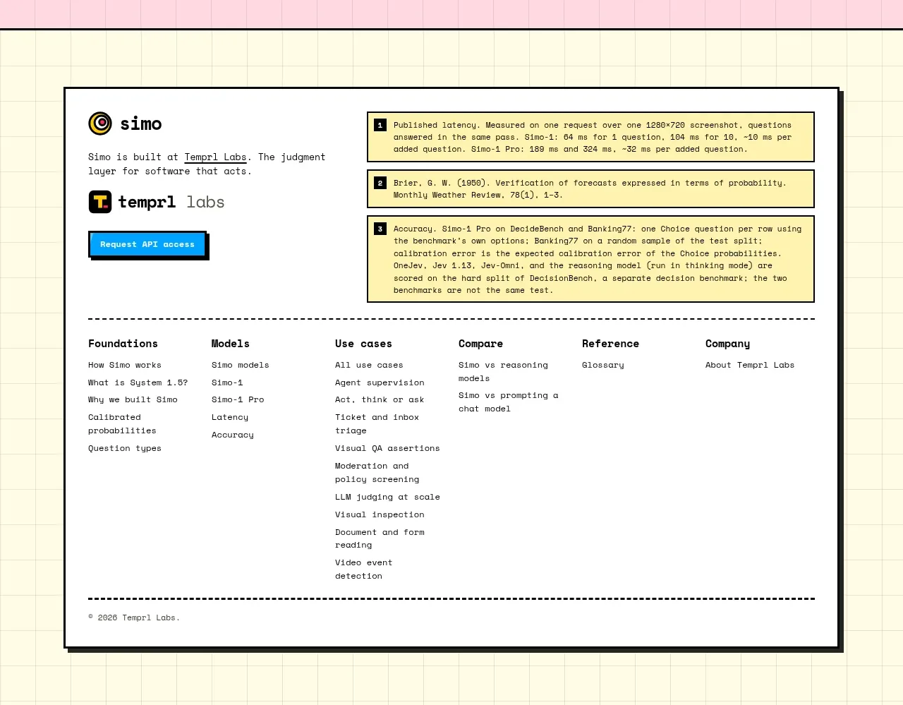
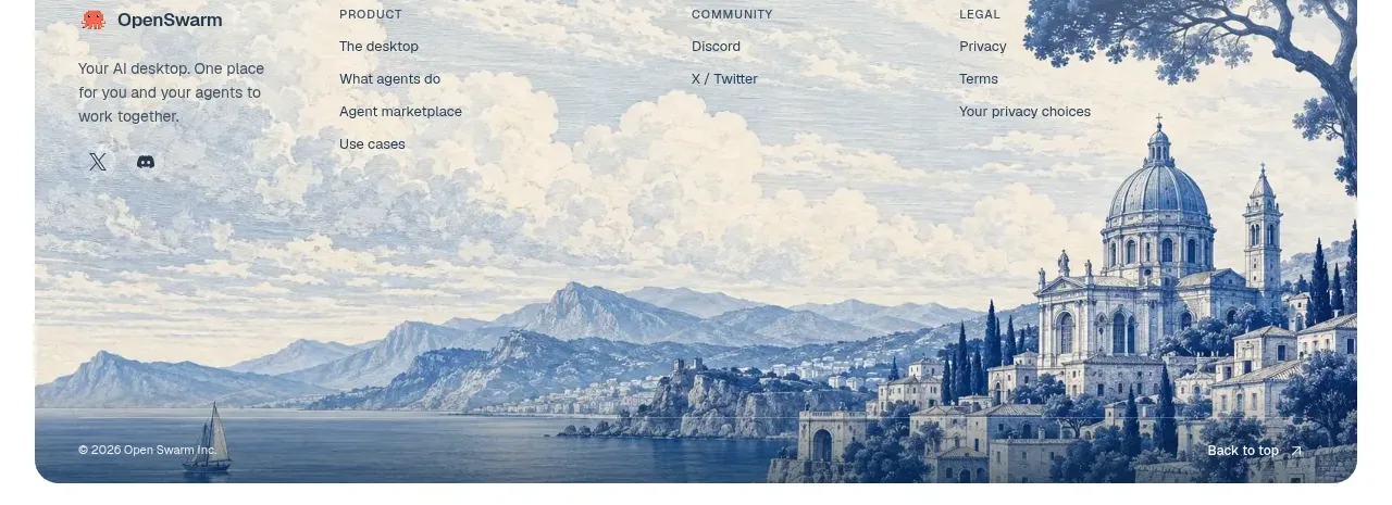
The footer closes with a compact brand mark area, grouped navigation links, app download pills, social links, and a small legal/copyright line.
Prompt preview
## Reference images

Study these alongside the description below: hierarchy, rhythm, spacing, colour. Build for the product you are asked about, using this design language.

- Component: https://kage-design-assets.t3.tigrisfiles.io/components/hark/c0ab7f75-9849-4088-b995-f4bab40ea0a8-1791525722-10.webp
- Full page it was cut from: https://kage-design-assets.t3.tigrisfiles.io/screenshots/hark/c0ab7f75-9849-4088-b995-f4bab40ea0a8-1791525672611-full.webp
- Component on Kage: https://kage.design/component/hark-footer

## Before you start
Ask what the user's product, audience, and brand are, then apply the principles below to create an original version for that product.

Build a compact, airy footer with grouped navigation, platform/download actions, social links, and legal information.

### Design language
- Use a thin top border and a warm white background (`#ffffff`); keep the footer visually quiet.
- On desktop, place a small abstract brand mark at left, three or four link columns toward the right, and a bottom utility row for downloads, social links, and copyright.
- Use small sans-serif type around 11–13px with muted gray labels (`#888888`) and darker link text (`#242424`).
- Render download links as soft-gray pills with 999px radius and subtle borders.
- Keep horizontal and vertical spacing generous despite the compact height; collapse into stacked groups on mobile.
- Provide visible hover/focus states and maintain sufficient contrast for legal links.

### Never
- Never reuse logos, product names, copy, illustrations, or imagery from the reference.
- Never copy the exact legal wording, link taxonomy, or platform badges from the reference.