kage
kage
hark.com
Design analysis
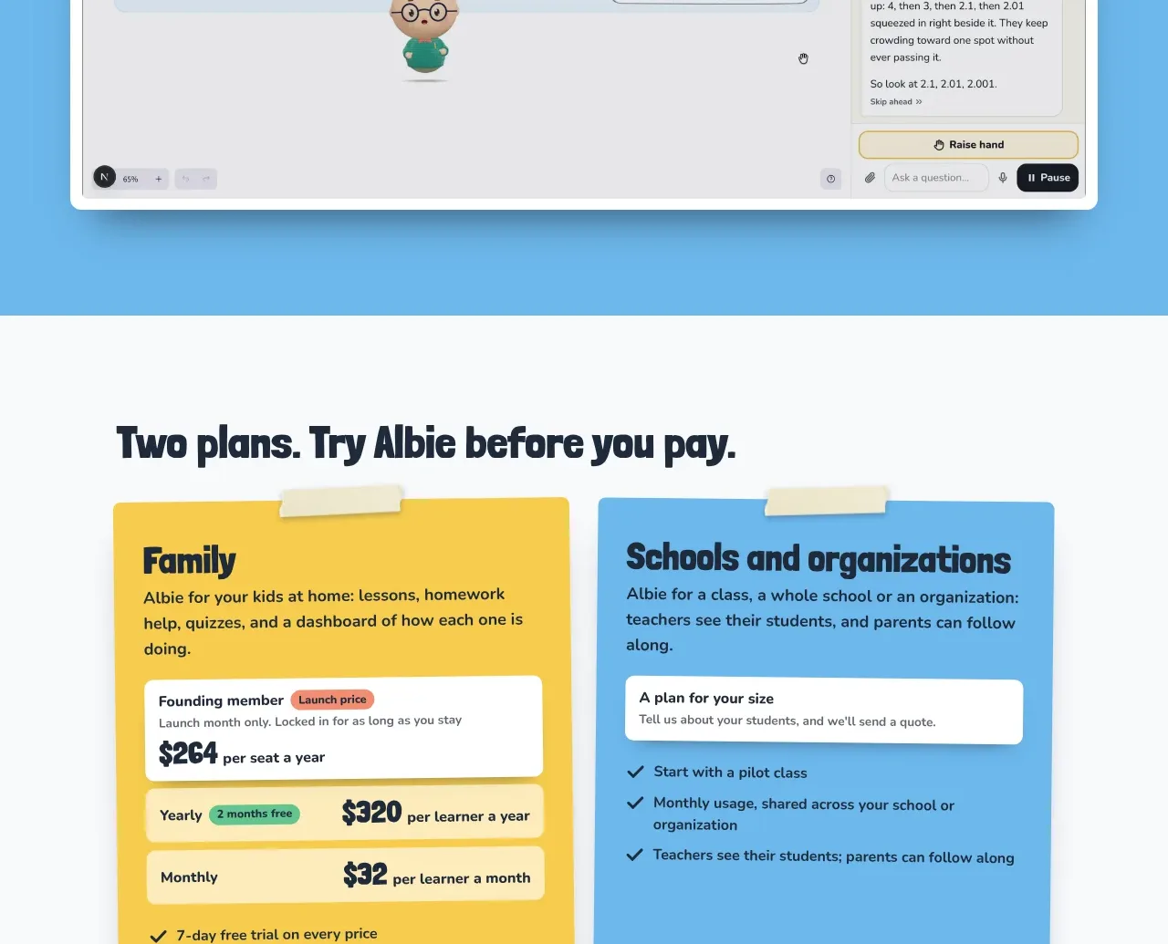
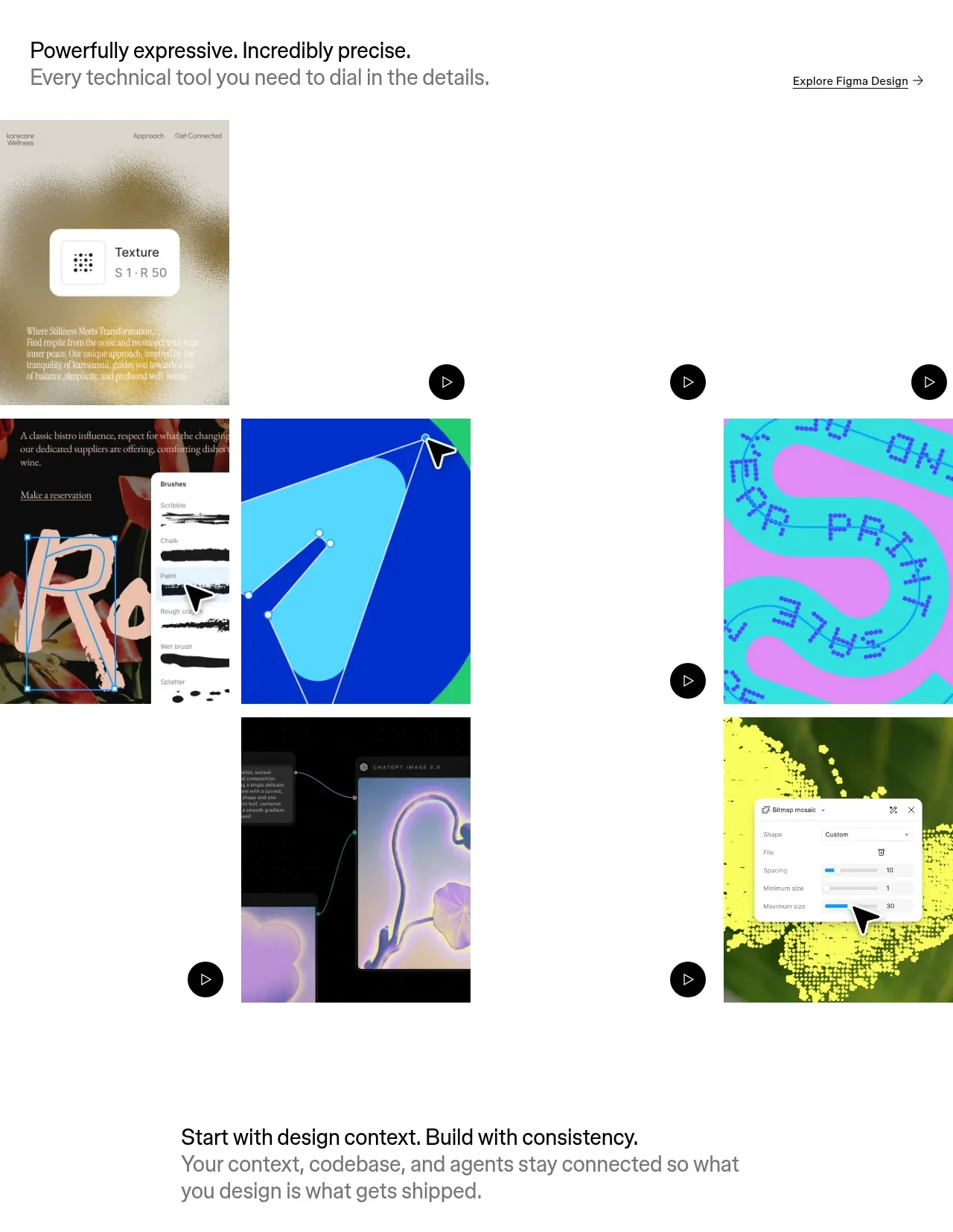
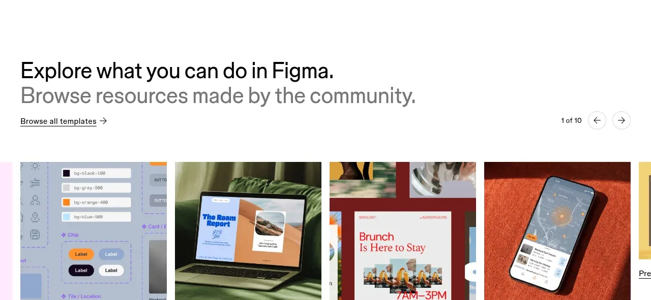
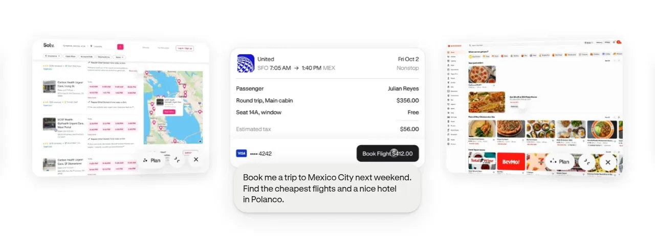
A quiet visual proof section shows several product surfaces at once, with one central card emphasized and supporting screens receding on either side.
Prompt preview
## Reference images

Study these alongside the description below: hierarchy, rhythm, spacing, colour. Build for the product you are asked about, using this design language.

- Component: https://kage-design-assets.t3.tigrisfiles.io/components/hark/c0ab7f75-9849-4088-b995-f4bab40ea0a8-1791525719-1.webp
- Full page it was cut from: https://kage-design-assets.t3.tigrisfiles.io/screenshots/hark/c0ab7f75-9849-4088-b995-f4bab40ea0a8-1791525672611-full.webp
- Component on Kage: https://kage.design/component/hark-gallery

## Before you start
Ask what the user's product, audience, and brand are, then apply the principles below to create an original version for that product.

Create a wide product showcase gallery that communicates breadth through layered interface snapshots rather than a long paragraph.

### Design language
- Use a centered horizontal stage within a max-width container and generous white space above and below.
- Place one primary interface card in the middle, slightly larger and higher contrast, with two or three secondary cards partially visible at the sides.
- Use soft shadows, thin neutral borders, and 16–24px corner radii to make screenshots feel tactile.
- Keep the background near-white (`#ffffff` or `#fafafa`) and let the interface cards provide muted color accents.
- Add only a short caption or one-line value statement beneath the visual group if needed.
- Allow horizontal overflow or a controlled carousel on mobile; make the active card obvious without aggressive controls.

### Never
- Never reuse logos, product names, copy, illustrations, or imagery from the reference.
- Never fabricate recognizable third-party brand marks or turn the section into a dense feature grid.