kage
kage
harmony.io
Design analysis
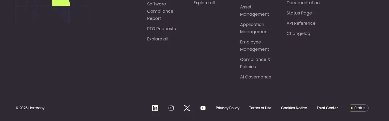
A dark footer closes the page with a compact CTA, grouped navigation columns, an abstract decorative mark, and a legal/social utility row.
Prompt preview
## Reference images

Study these alongside the description below: hierarchy, rhythm, spacing, colour. Build for the product you are asked about, using this design language.

- Component: https://kage-design-assets.t3.tigrisfiles.io/components/harmony/a96ec10f-a650-47bb-acaa-8bed3696d9f4-1790575330-8.webp
- Full page it was cut from: https://kage-design-assets.t3.tigrisfiles.io/screenshots/harmony/a96ec10f-a650-47bb-acaa-8bed3696d9f4-1790575269319-full.webp
- Component on Kage: https://kage.design/component/harmony-footer

## Before you start
Ask what the user's product, support, legal, social, and resource destinations are. Generate the footer hierarchy from those answers.

Build a dark charcoal footer (#292630) with a centered max-width container. Put a short two-color closing CTA at the upper left, optionally beside a small abstract geometric decoration. Arrange several compact link columns with clear 12–14px headings and muted 13–14px links, keeping related destinations grouped. Add a thin divider near the bottom, then a legal copyright line, social links, privacy and terms links, and a small status pill. Use lime and violet only as restrained accents, 48–64px top padding, 28–40px column gaps, and 1px rgba(255,255,255,.12) dividers. Make columns wrap or become accordions on mobile, and maintain strong contrast and keyboard focus states.

Never: use logos, product names, copy, illustrations, or imagery from the reference.