kage
kage
harmony.io

Design analysis
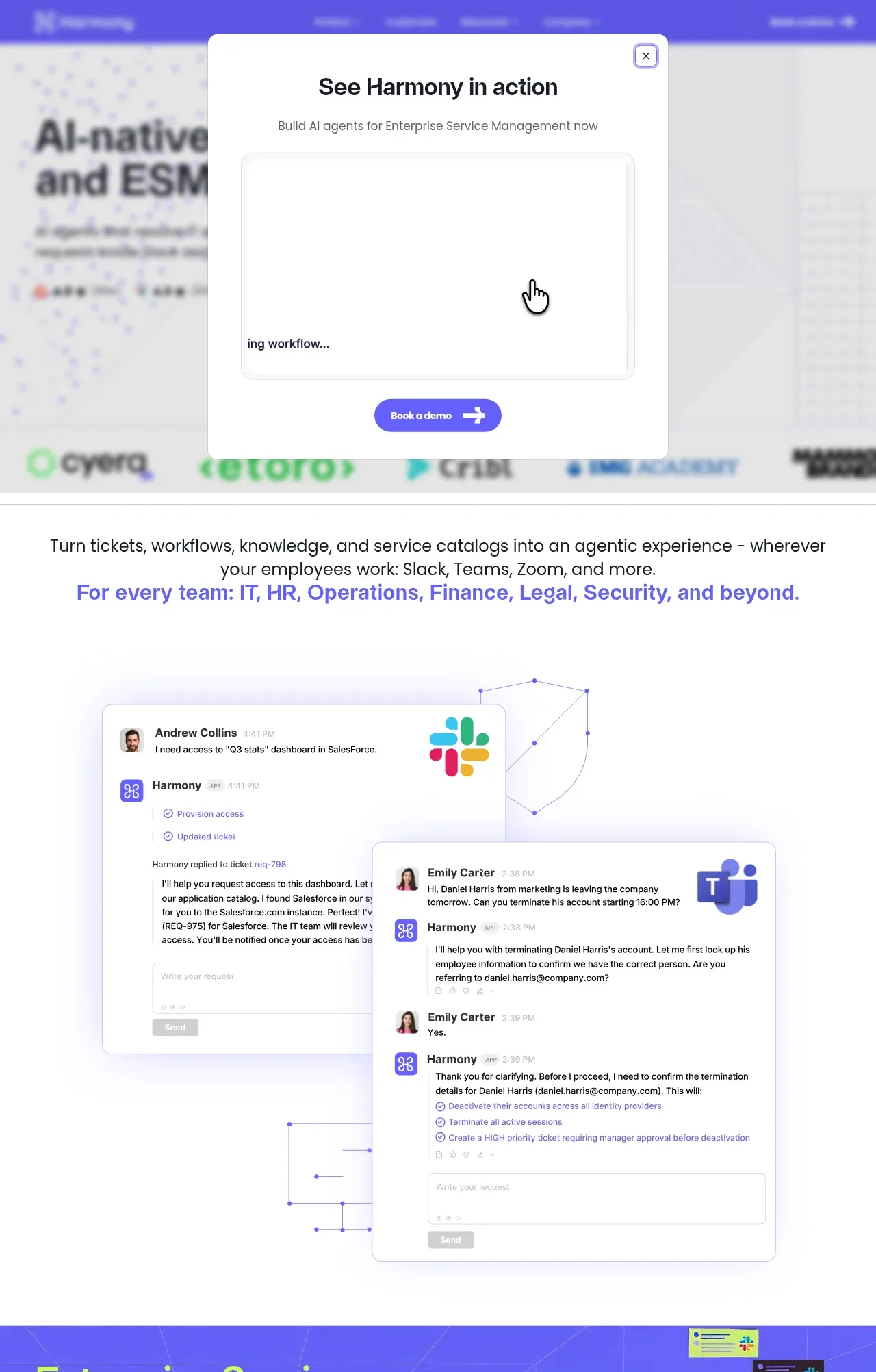
A long-form enterprise landing page moves from a blurred, modal-covered hero into increasingly concrete product proof: conversational Slack and Teams cards, a saturated blue knowledge-generation scene, a tabbed IT platform mockup, testimonial, agent-workforce visualization, integrations, security architecture, and a dense footer. The visual system combines oversized black or white sans-serif headings with purple-to-blue fields, lime highlights, thin technical grid lines, dotted backgrounds, rounded UI cards, and mostly flat surfaces with restrained shadows.
Prompt preview
## Reference images

Study these alongside the description below: hierarchy, rhythm, spacing, colour. Build for the product you are asked about, using this design language.

- Full page: https://kage-design-assets.t3.tigrisfiles.io/screenshots/harmony/a96ec10f-a650-47bb-acaa-8bed3696d9f4-1790575269319-full.webp
- Above the fold: https://kage-design-assets.t3.tigrisfiles.io/screenshots/harmony/a96ec10f-a650-47bb-acaa-8bed3696d9f4-1790575264994.webp
- Design on Kage: https://kage.design/designs/harmony-landing-page

## Before you start
Ask the user what they are building, who it is for, and what brand assets they already have (brand name, colours, typefaces, logos, and product imagery). Wait for their answers before designing. Apply the reference's structural and visual principles to their product, not to the reference product.

## Page structure
1. **Hero and demo modal:** Start with a full-width hero for the product promise, navigation, trust/logo strip, and a prominent CTA. Show a centered white demo modal over a deliberately blurred hero background, with a bold title, short supporting line, large video/embed area, close control, and compact purple CTA.
2. **Positioning statement:** Follow with a white, centered two-line statement explaining the broader workflow and the teams or channels served; use a purple/lime-accented second line for emphasis.
3. **Conversation proof:** Place overlapping Slack- and Teams-style support conversation cards in a large airy white canvas. Use realistic request/response rows, app marks, subtle violet glow, and thin geometric network-line decoration behind the cards.
4. **Knowledge-generation feature panel:** Transition into a saturated blue-purple full-bleed section with perspective grid lines and floating message tiles. Put a large left-aligned headline, short paragraph, and white rounded callout on the left; let the generated knowledge cards recede into depth on the right.
5. **Complete platform showcase:** Return to a white technical canvas with a dotted grid and oversized heading. Build a two-column product showcase: a vertical purple feature selector on the left and a large pale-lavender service desk/table UI on the right, including a ticket detail drawer overlay. Finish the section with a wide white CTA row aligned to the right.
6. **Customer testimonial:** Use a split testimonial band: bright lime-green quote panel with attribution and oversized quotation mark on the left, and a clean white customer/logo panel on the right.
7. **AI agent workforce:** Use a dark blue-to-indigo panel with dotted texture, constellation/network line drawings, and lime pill labels for different agent workflows. Place a white/lime headline and bullet list in a purple inset card on the left, with the agent map extending across the right.
8. **No-code CTA and product demo:** Within the same dark textured area, add a large centered headline with one lime-highlighted phrase, an outlined lime CTA, and a wide rounded product video or builder preview beneath it.
9. **Integrations directory:** Switch to white space with a large black heading, short description, inline link, and pill-shaped category filters. Under that, show a dense multi-row grid of integration logos separated by fine gray vertical and horizontal rules.
10. **Security section:** Present a white security architecture section with a large heading whose first word is purple. Use a two-column layout: stacked pale-lavender security principle cards on the left and a 3-column grid of outlined compliance badge tiles on the right, plus small access-policy pills below.
11. **Footer:** End with a dark charcoal footer. Put a lime/purple CTA block and geometric mark at the left, then several compact navigation columns for customers, agents, integrations, product, resources, and company. Add a thin divider and a bottom utility row with copyright, social links, legal links, and a status pill.

## Design language
- Build hierarchy with very large geometric sans-serif headlines, short paragraphs, and strong left alignment in feature sections; use centered typography only for positioning statements and major CTAs.
- Change rhythm deliberately: begin with a high-attention modal hero, move through airy white proof sections, use saturated full-bleed feature scenes for emphasis, then become denser and more utilitarian in the platform, integrations, and security areas.
- Use a core palette of near-black `#171722`, white `#FFFFFF`, vivid violet `#5B4FF5`, electric indigo `#4C46E8`, deep navy `#202546`, and acid lime `#B8FF3D`. Keep most copy black on white, and reverse it to white on colored or dark panels.
- Pair a bold contemporary sans-serif display face with the same or a closely related neutral sans-serif for body copy and UI labels. Use a tight display scale for headings, medium-weight section labels, and small muted metadata; emphasize select words with violet or lime rather than extra font styles.
- Treat borders as thin technical rules in pale gray or translucent white. Use medium rounded corners on cards and controls, larger radii for video/product frames, and very restrained shadows or violet glows only where a floating UI card needs separation.
- Use perspective grids, dotted matrices, node-and-line diagrams, geometric outlines, and floating message tiles as the recurring illustration system. Keep them schematic and product-adjacent rather than decorative illustrations.
- Make buttons compact and pill-like, with solid violet or lime fills and a simple directional arrow treatment. Use rounded filter chips and outlined CTAs in dark sections.
- Product mockups should resemble real enterprise software: tables, ticket drawers, chat transcripts, tabs, status labels, approval steps, and app integrations. Keep them readable but subordinate to the headline.
- Where motion is added, use slow parallax on grid/depth graphics, gentle floating for message tiles, and short modal/card transitions. Keep the primary CTA and all content usable without animation or hover.

## Never
- Do not copy any logos, wordmarks, product names, written copy, illustrations, photography, icons, customer names, or exact UI content from the reference.
- Do not present the result as Harmony or imply affiliation with it.
- Do not reproduce the reference's specific Slack/Teams artwork or compliance badge artwork; create generic, original substitutes appropriate to the user's product.
- Do not make every section purple: preserve the alternating white, bright feature, dark technical, and dense utility rhythms.
Components from this page
All components
 Floating gradient navigation
Harmony · Navigation
Floating gradient navigation
Harmony · Navigation
 Agentic service management hero
Harmony · Hero
Agentic service management hero
Harmony · Hero
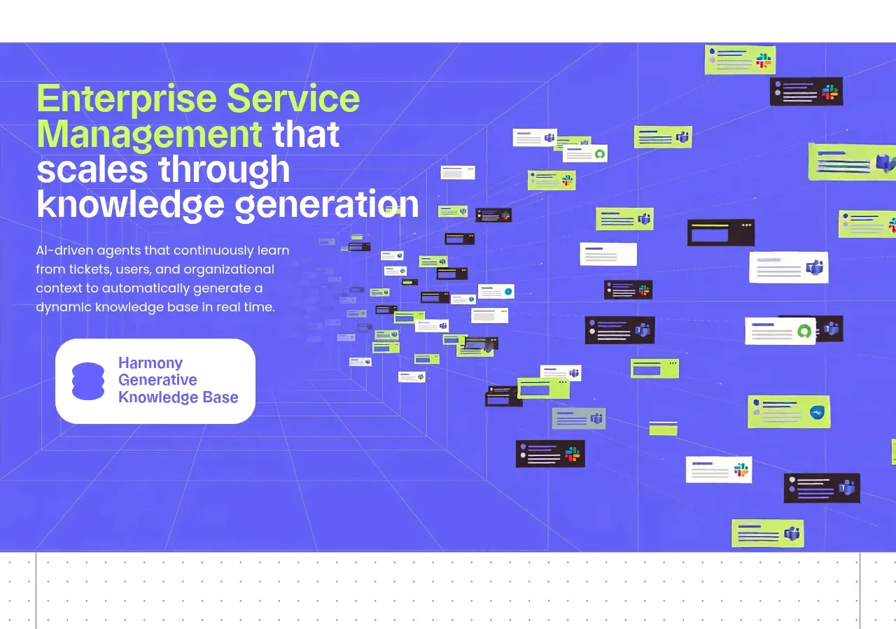 Knowledge generation showcase
Harmony · Feature grid
Knowledge generation showcase
Harmony · Feature grid
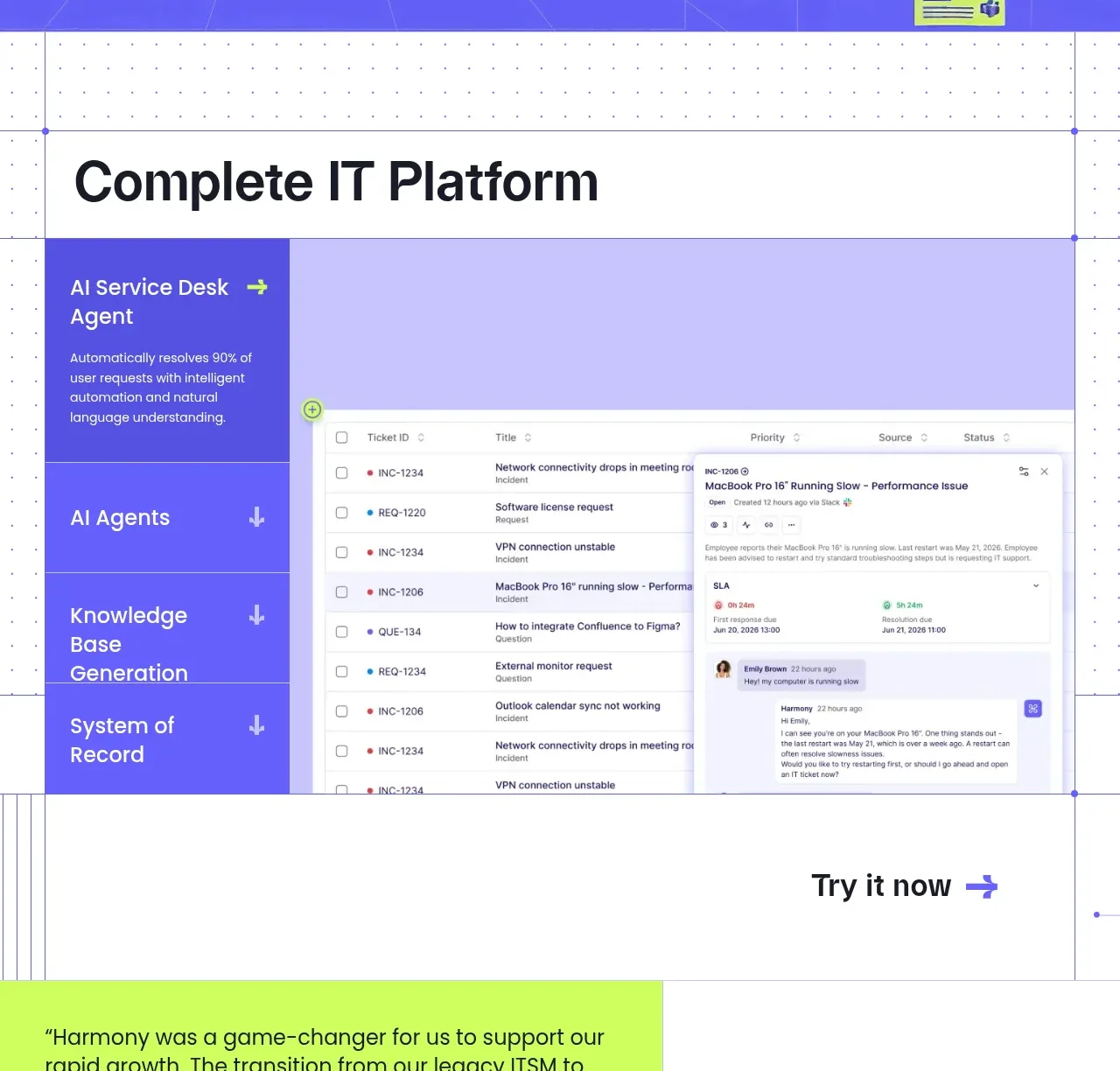 Complete platform product tour
Harmony · Tabs & steps
Complete platform product tour
Harmony · Tabs & steps
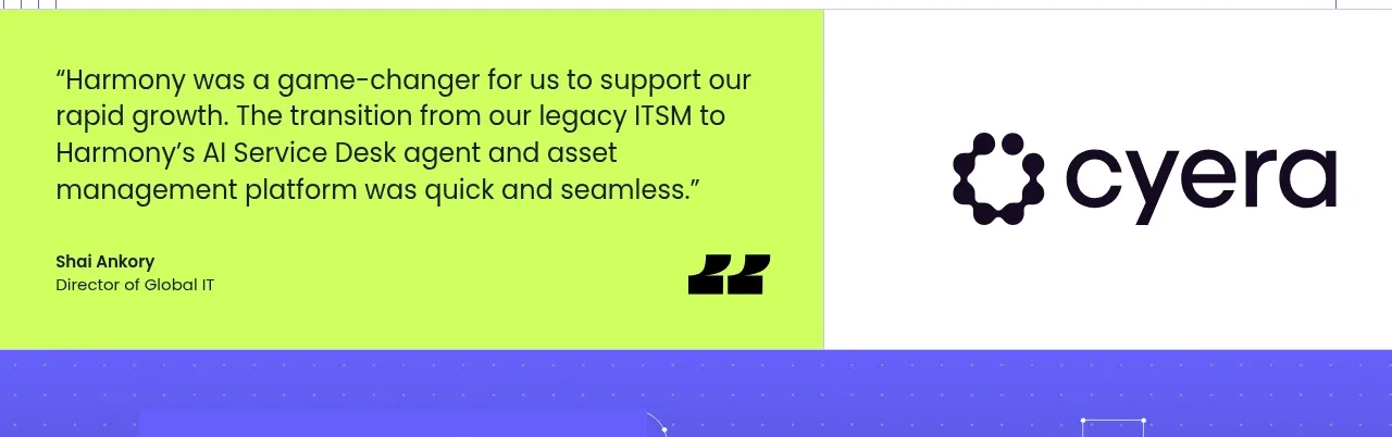 Customer proof statement
Harmony · Testimonials
Customer proof statement
Harmony · Testimonials
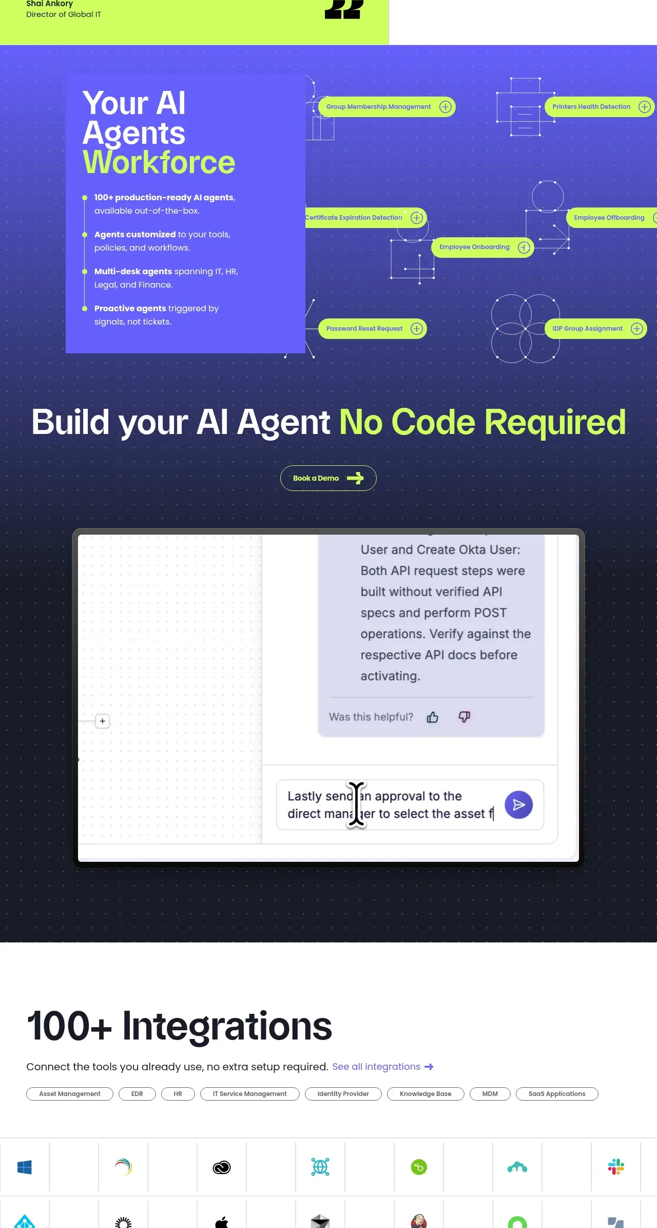 AI agent workforce
Harmony · Feature grid
AI agent workforce
Harmony · Feature grid
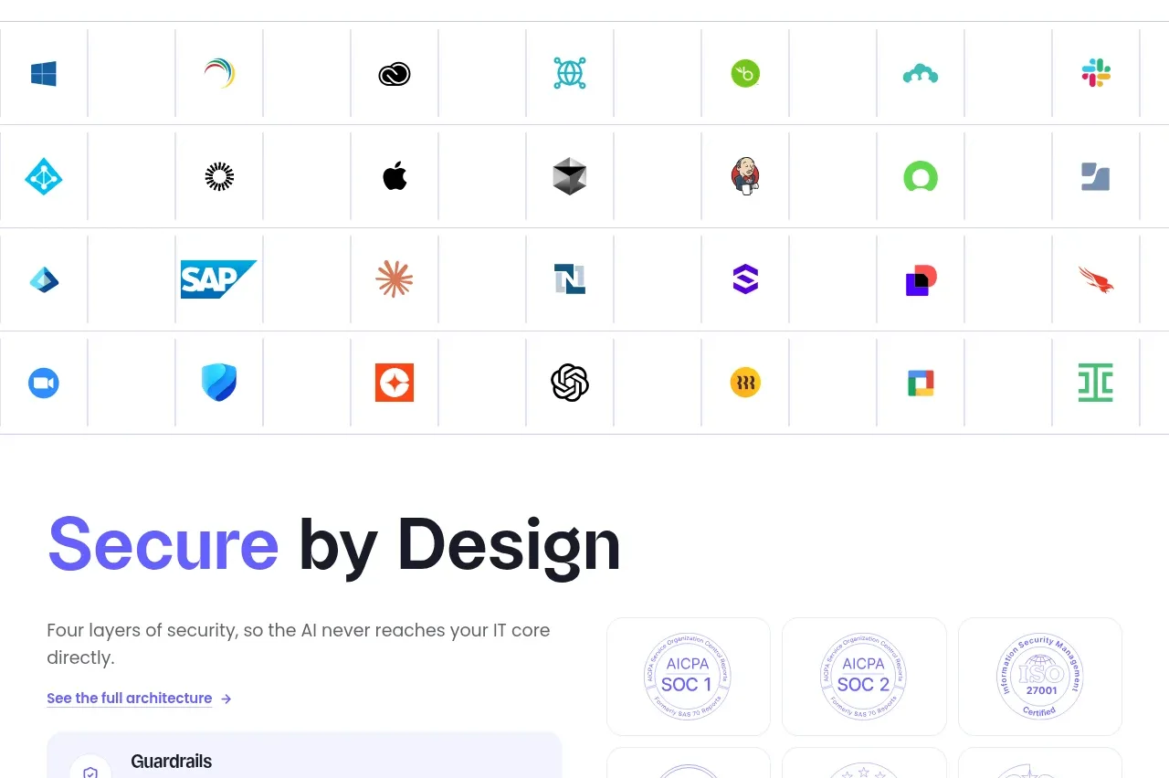 Integration directory
Harmony · Logo cloud
Integration directory
Harmony · Logo cloud
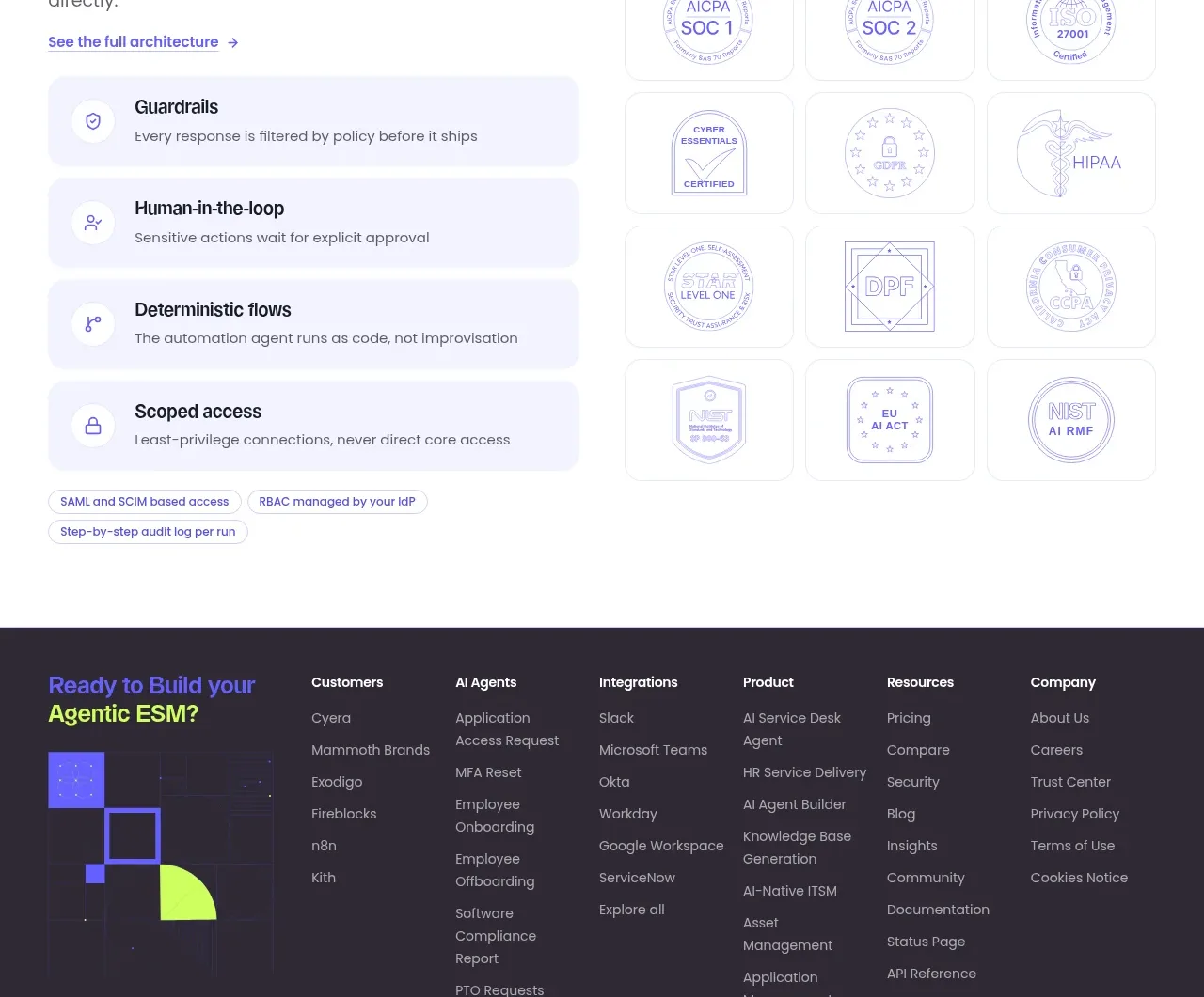 Security by design
Harmony · Feature grid
Security by design
Harmony · Feature grid
 Multi-column product footer
Harmony · Footer
Multi-column product footer
Harmony · Footer