 kage
kage
heypi.xyz
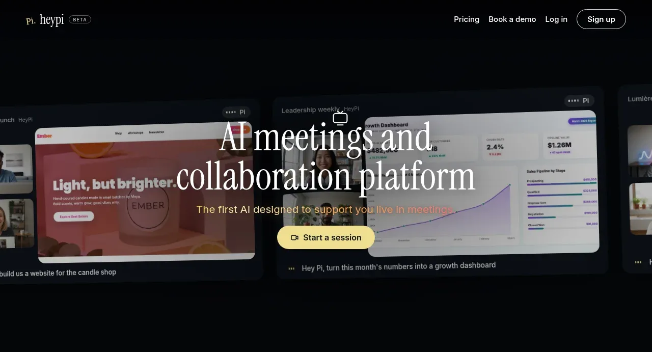
Design analysis
An oversized editorial headline overlays a dark product montage, supported by a warm one-line value proposition and a bright pill-shaped session CTA.
Prompt preview
## Reference images

Study these alongside the description below: hierarchy, rhythm, spacing, colour. Build for the product you are asked about, using this design language.

- Component: https://kage-design-assets.t3.tigrisfiles.io/components/heypi/9fccb756-63dd-4cec-9422-c066b077bc89-1791612276-1.webp
- Full page it was cut from: https://kage-design-assets.t3.tigrisfiles.io/screenshots/heypi/9fccb756-63dd-4cec-9422-c066b077bc89-1791612175185-full.webp
- Component on Kage: https://kage.design/component/heypi-hero

## Before you start
Ask the user what their product is, what action the hero should drive, and what brand personality it needs. Apply these principles to that product rather than copying the reference.

Create a dark, cinematic hero directly below the navigation. Use a wide visual or product-video montage as the background, with a subtle dark overlay so a large centered display headline remains legible. Keep the headline to two or three lines with dramatic serif typography, a short warm-toned supporting sentence, and one centered pale-yellow pill CTA with a small utility icon. Let the visual extend beyond the content container while maintaining safe side margins. Suggested colours: #050607, #111820, #F4F2EA, #E3C965, and muted #9B9A92. Use high contrast, fluid type with clamp(), generous vertical whitespace, 24–32px button radius, and a gentle image/gradient motion treatment if the visual is animated. Ensure the CTA has hover and focus states.

Never use logos, product names, copy, illustrations, or imagery from the reference.
More components
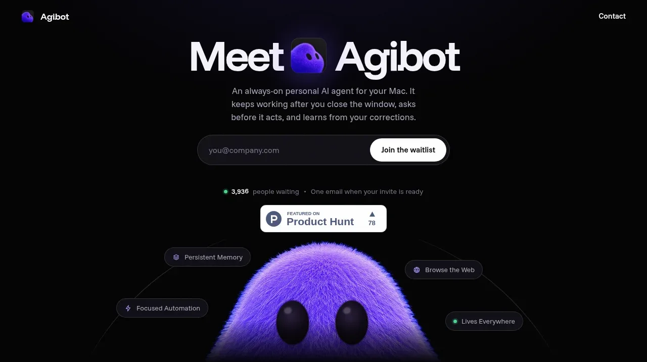
 Waitlist hero with character visual
Agibot · Hero
Waitlist hero with character visual
Agibot · Hero
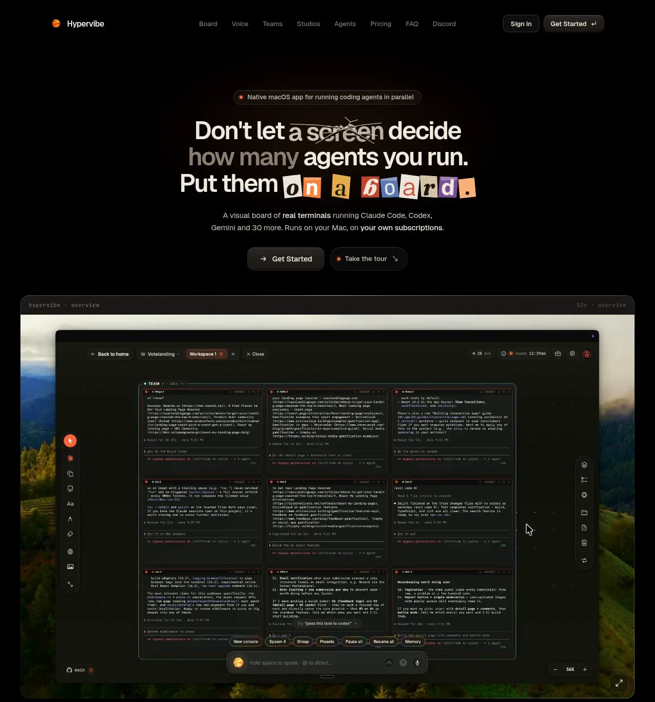
 Hero with product visual
Hypervibe · Hero
Hero with product visual
Hypervibe · Hero
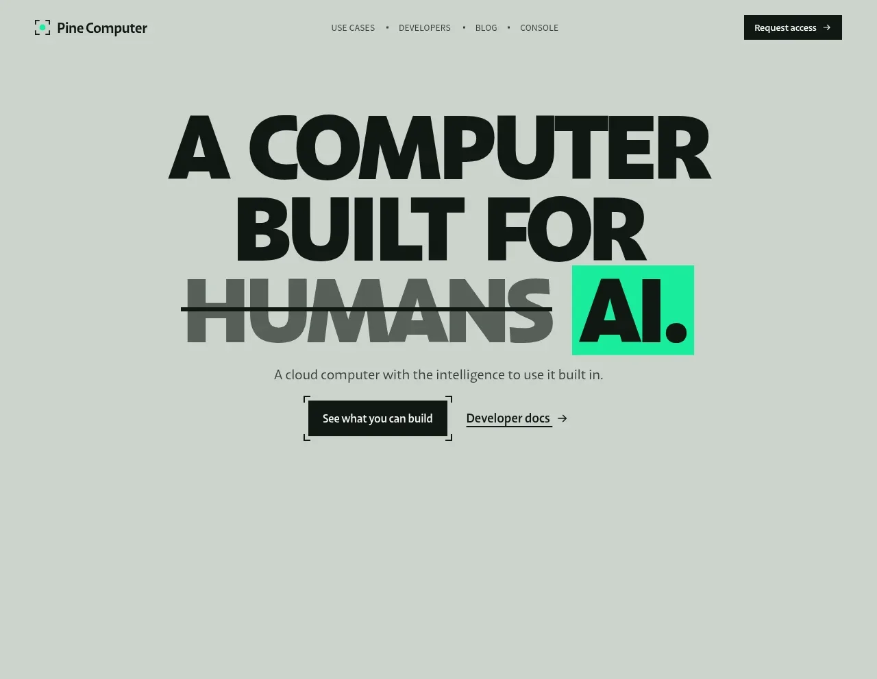
 Oversized human-first hero
Pine Computer · Hero
Oversized human-first hero
Pine Computer · Hero
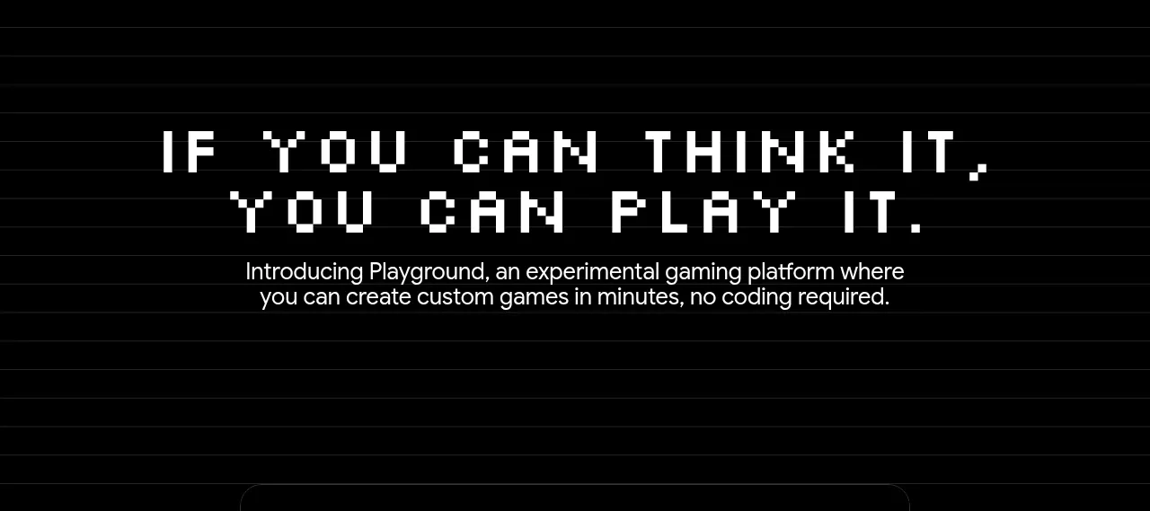
 Introductory product statement
Playground by Google Labs · Hero
Introductory product statement
Playground by Google Labs · Hero
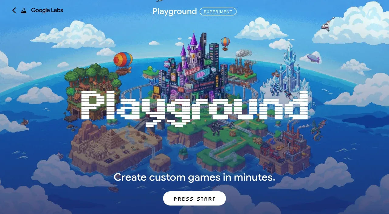 Pixel-art world hero
Playground by Google Labs · Hero
Pixel-art world hero
Playground by Google Labs · Hero
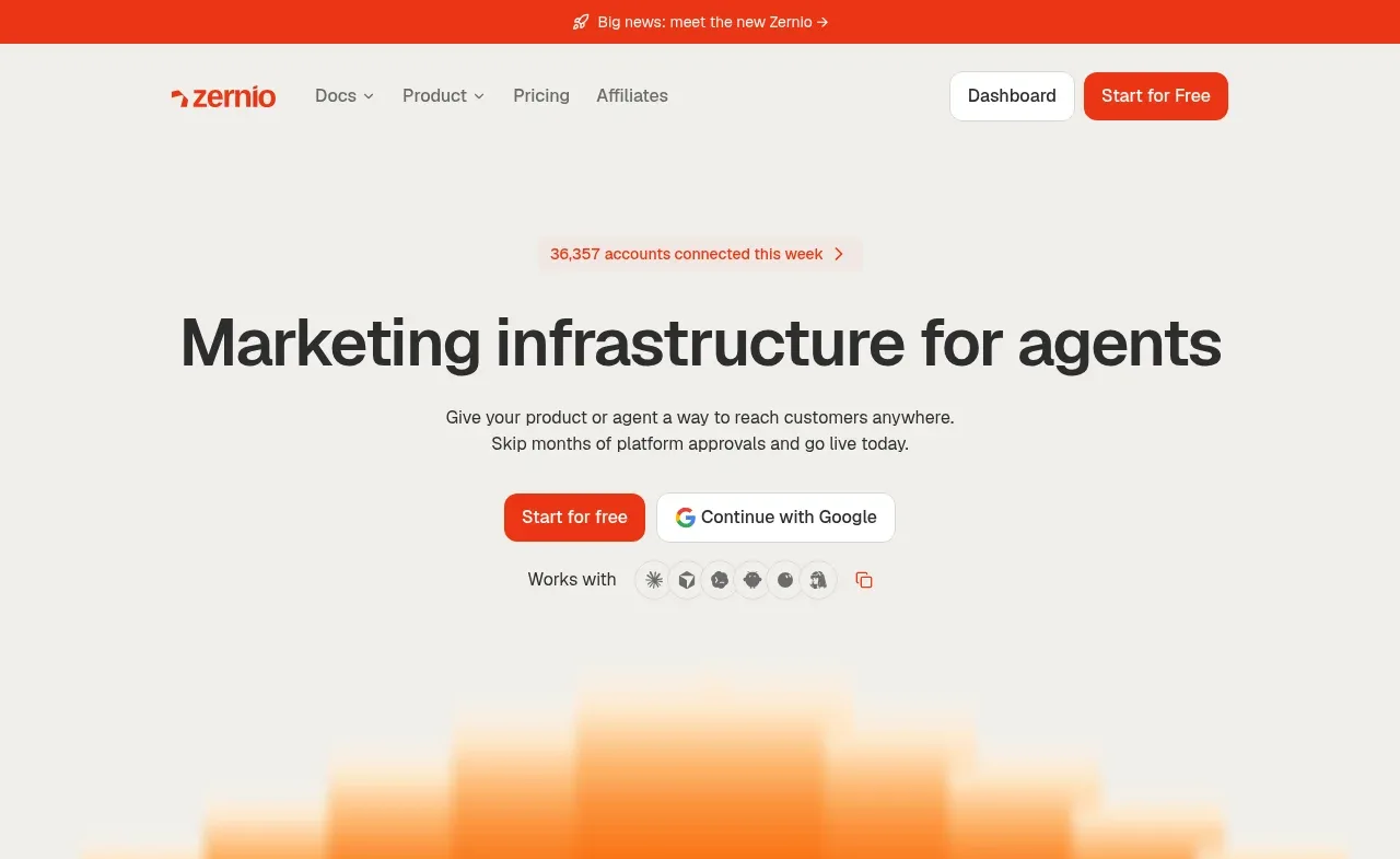
 Marketing infrastructure hero
Zernio · Hero
Marketing infrastructure hero
Zernio · Hero