kage
kage
hireotto.com
Design analysis
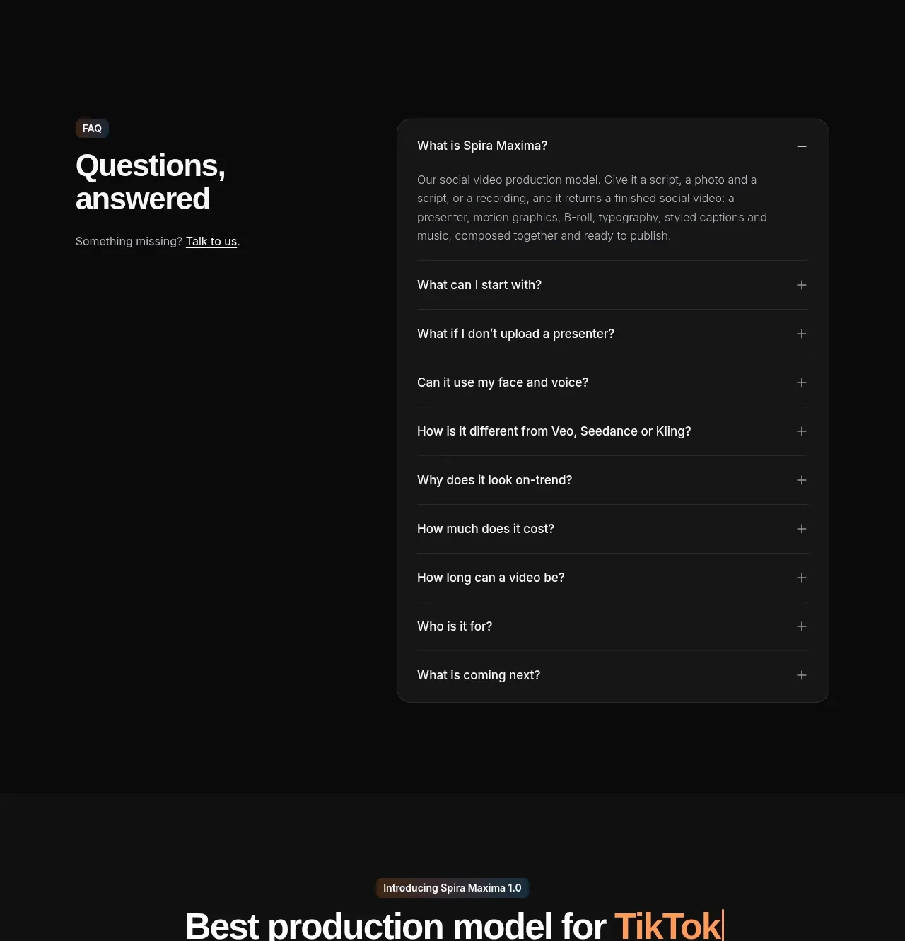
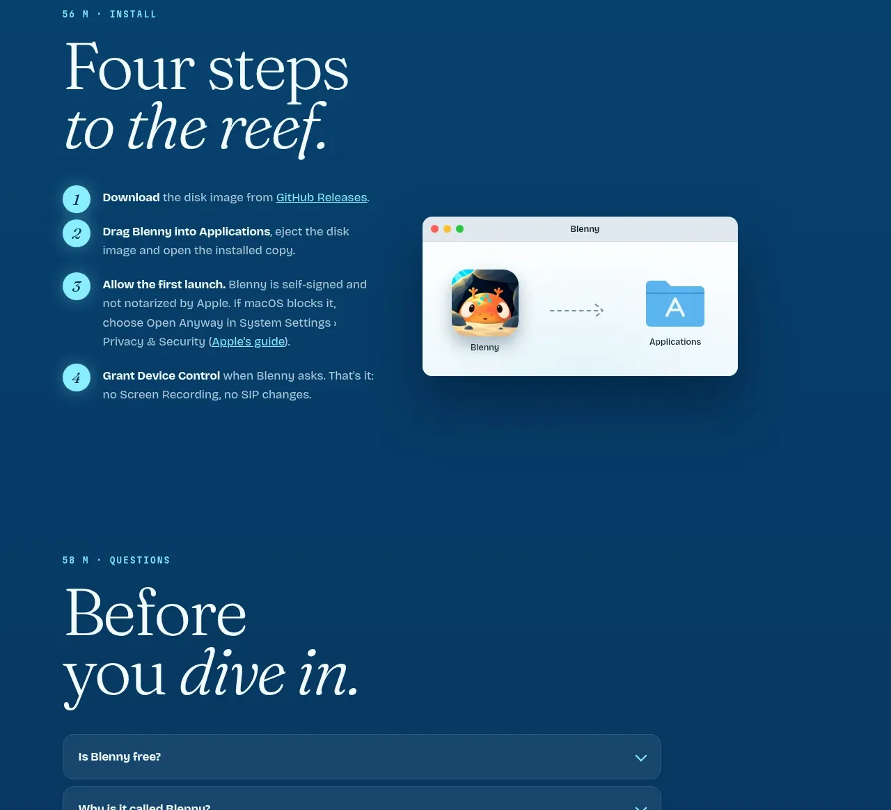
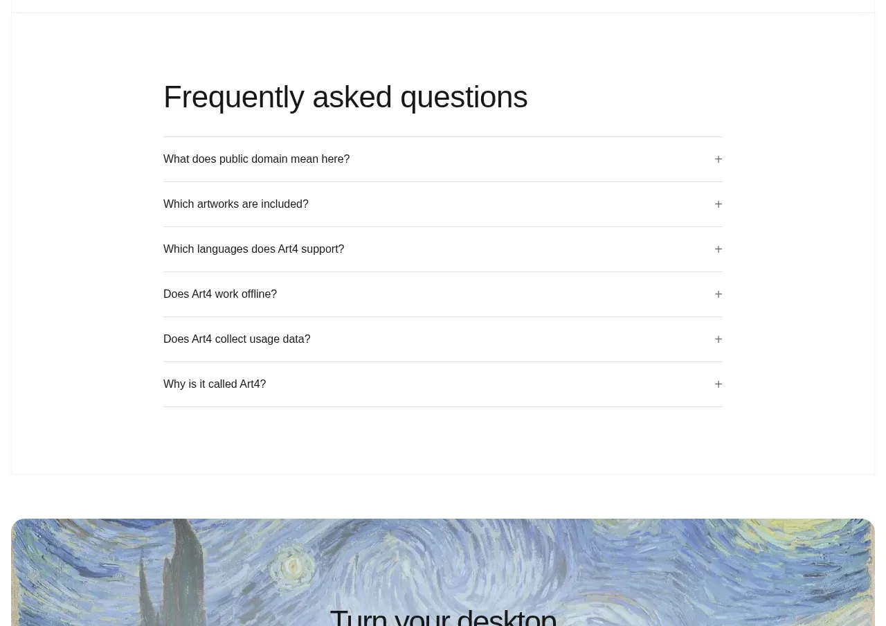
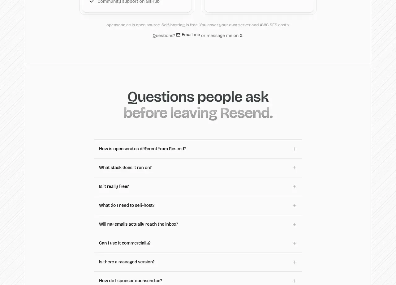
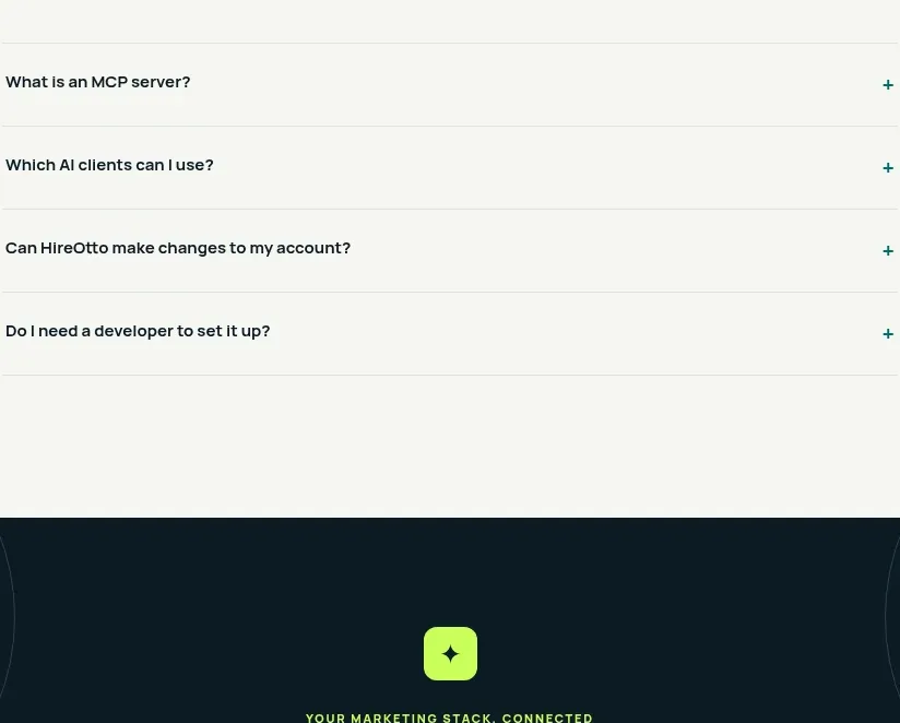
A centered FAQ heading and narrow accordion list answer the main pre-connection objections with strong whitespace and understated dividers.
Prompt preview
## Reference images

Study these alongside the description below: hierarchy, rhythm, spacing, colour. Build for the product you are asked about, using this design language.

- Component: https://kage-design-assets.t3.tigrisfiles.io/components/hireotto/8f3068d7-46ca-4868-8ee8-837dc9e1c249-1790488908-8.webp
- Full page it was cut from: https://kage-design-assets.t3.tigrisfiles.io/screenshots/hireotto/8f3068d7-46ca-4868-8ee8-837dc9e1c249-1790488876025-full.webp
- Component on Kage: https://kage.design/component/hireotto-faq

## Before you start
Ask what the user's product, audience, and brand are, then apply the principles below to that product rather than reproducing this reference.

Build a centered FAQ section on a warm off-white background. Start with a small uppercase eyebrow and a large centered heading, then a narrow max-width accordion list. Each row should have a left-aligned question, a right-aligned plus/chevron control, generous vertical padding, and a thin neutral divider. Use dark navy text (#07151b), muted teal eyebrow (#087875), gray-green rules (#d9e2dc), 15px question text, and a restrained hover background. Support keyboard focus, aria-expanded, and smooth open/close behavior; show one optional answer open by default only if useful. Keep the section calm and avoid card-heavy styling.

### Never
- Never use logos, product names, copy, illustrations, or imagery from the reference.
- Never hide critical product limitations exclusively inside the accordion.