kage
kage
hireotto.com

Design analysis
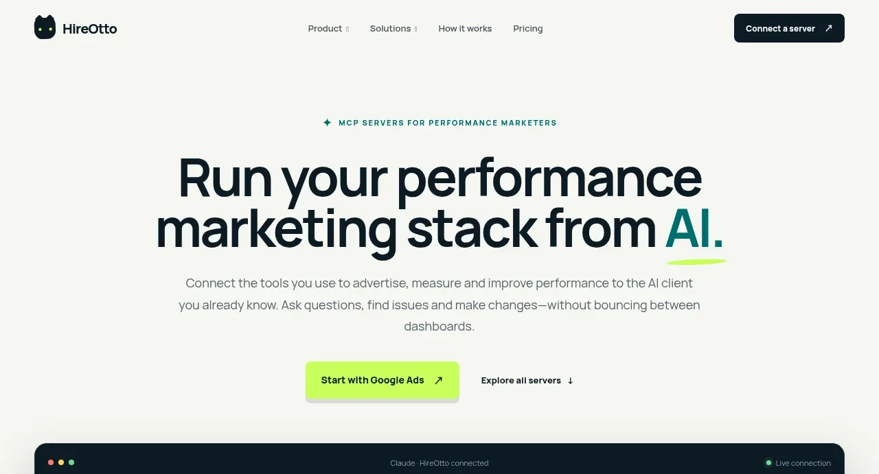
A restrained, editorial SaaS landing page uses an off-white canvas, near-black typography, and bright lime interaction accents with teal used for major contrast sections. The page moves from a centered, spacious hero and dark conversational product mockup into a connected-tools card grid, then increases narrative contrast through a dark problem statement, a three-step workflow, a teal audience-solutions panel, trust and setup reassurance, FAQ rows, and a final dark CTA before a sparse multi-column footer.
Prompt preview
## Reference images

Study these alongside the description below: hierarchy, rhythm, spacing, colour. Build for the product you are asked about, using this design language.

- Full page: https://kage-design-assets.t3.tigrisfiles.io/screenshots/hireotto/8f3068d7-46ca-4868-8ee8-837dc9e1c249-1790488876025-full.webp
- Above the fold: https://kage-design-assets.t3.tigrisfiles.io/screenshots/hireotto/8f3068d7-46ca-4868-8ee8-837dc9e1c249-1790488873970.webp
- Design on Kage: https://kage.design/designs/hireotto-landing-page

## Before you start
Ask the user what they are building, who it is for, and what brand assets they already have (name, colours, type). Wait for their answers before designing. Apply everything below to that product, not to the reference product.

## Page structure
- **Global header:** Place a compact brand mark and name at the left, a small centered navigation for Product, Solutions, How it works, and Pricing, and a dark rounded primary action at the right.
- **Hero eyebrow and headline:** Center a small uppercase teal eyebrow above a very large two-line headline. Highlight the key AI term with teal text and a loose lime underline/accent.
- **Hero supporting copy and actions:** Add a narrow centered paragraph, then a lime primary button and a quiet secondary text link with directional arrow.
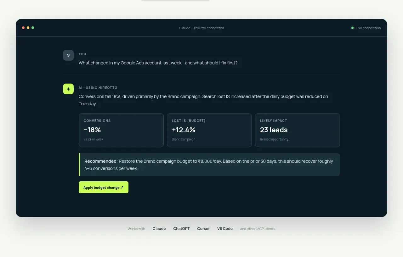
- **Product demonstration:** Show a wide rounded dark browser/conversation mockup beneath the hero. Include a slim browser header, user question, AI response, three metric cards, a recommendation strip, and an action button; keep the interface dense but legible.
- **Compatibility note:** Under the mockup, add a small centered line naming compatible AI clients and tools.
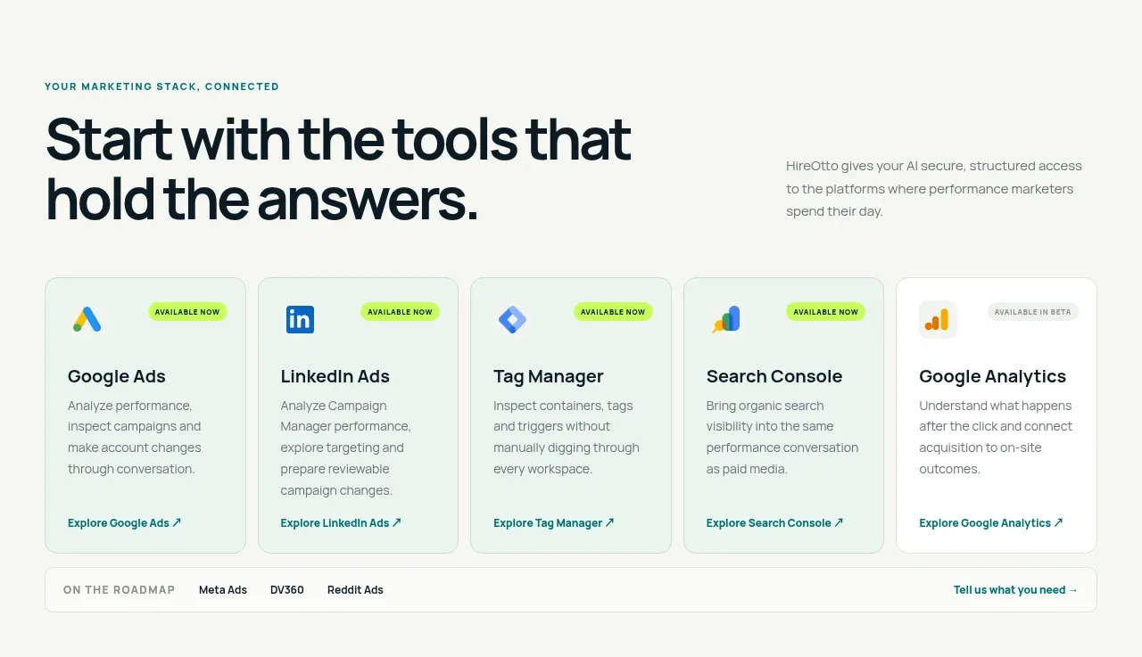
- **Connected tools section:** On the off-white background, use a left-aligned eyebrow and oversized heading, with a short explanatory paragraph aligned to the right. Follow with a five-column row of pale integration cards, each with an icon placeholder, availability badge, title, description, and link. Add a thin roadmap strip below the cards.
- **Problem section:** Switch to a full-width near-black panel. Use a two-column layout: a large white statement on the left and three numbered problem explanations on the right, separated by fine horizontal rules.
- **Workflow introduction:** Return to the light canvas with a centered eyebrow, large multiline heading, and short centered paragraph explaining the complete workflow.
- **Three workflow cards:** Present three equal cards in a row for asking, investigating, and acting. Each card has a small dark square symbol, sequence number, title, concise description, and a pale example/action strip at the bottom.
- **Audience solutions section:** Use a full-width saturated teal panel with a light heading and supporting copy. Below, create one bordered three-column container for agencies, independent operators, and in-house teams; each column contains an audience label, heading, paragraph, checkmarked benefits, and a lime-toned link.
- **Connection reassurance panel:** Back on the light canvas, place a wide pale green-gray rounded panel. Use a two-column layout with a large heading about connecting quickly and staying in control on the left, and three compact checkmarked assurances on the right.
- **FAQ section:** Center an eyebrow and heading above a narrow stack of four full-width divider rows. Put each question on the left and a small plus affordance on the right.
- **Final CTA:** Add a wide rounded near-black banner with subtle oversized circular line details at the edges, a centered lime icon placeholder, eyebrow, large white heading, supporting text, lime CTA, and secondary link.
- **Footer:** Finish with a sparse multi-column footer: brand block and short descriptor on the left, Product, Solutions, and Company link columns to the right, then a fine divider and small copyright line.

## Design language
- Build hierarchy through scale and whitespace: use oversized 56–72px hero and section headlines, compact 11–12px uppercase tracked eyebrows, and quiet 14–16px body copy.
- Keep the page editorial and calm rather than dashboard-dense. Start with generous light sections, tighten density inside cards and the product mockup, then create strong rhythm changes with full-bleed dark and teal bands.
- Use an off-white base around #F7F8F3, near-black navy around #071923 or #081A23, saturated teal around #087B78, and electric lime around #B7FF35 for CTAs, highlights, status marks, and checks. Keep most secondary text muted gray-green around #687271.
- Pair a clean modern sans-serif for all text. Use heavy weight for headlines, medium weight for card titles, regular weight for body copy, and wide letter spacing for uppercase labels.
- Treat borders as thin and low-contrast: pale gray-green on light surfaces, translucent white/teal on dark surfaces. Use modest 10–14px radii on cards and banners; reserve stronger rounding for the browser mockup and CTA panels.
- Keep shadows extremely soft and broad, mostly under the dark product mockup. Avoid glossy gradients; let flat off-white, navy, teal, and lime blocks carry the visual identity.
- Use repeated small square icons and checkmarks as a simple UI vocabulary. Use arrows in links and buttons to reinforce movement without adding a large icon system.
- Make interactions restrained: buttons may brighten or lift slightly on hover, cards can gain a subtle border contrast, FAQ rows should expand in place, and the conversation mockup can reveal response details without changing layout. Do not use noisy parallax or excessive animation.
- Preserve a strong desktop grid with wide outer margins and clear two-column and three-column alignments, collapsing cards and navigation cleanly on smaller screens.

## Never
- Do not use logos, wordmarks, product names, copy, illustrations, photography, or icon sets from the reference.
- Never present the result as HireOtto or imply it is the referenced product.
- Replace all reference-specific brands, tool names, claims, and text with original content for the user’s product.
- Do not copy the reference mascot or exact interface content; use neutral placeholders and a distinct visual identity.
Components from this page
All components
 Minimal product navigation
HireOtto · Navigation
Minimal product navigation
HireOtto · Navigation
 Performance marketing hero
HireOtto · Hero
Performance marketing hero
HireOtto · Hero
 Connected assistant preview
HireOtto · Card
Connected assistant preview
HireOtto · Card
 Connected marketing tools
HireOtto · Feature grid
Connected marketing tools
HireOtto · Feature grid
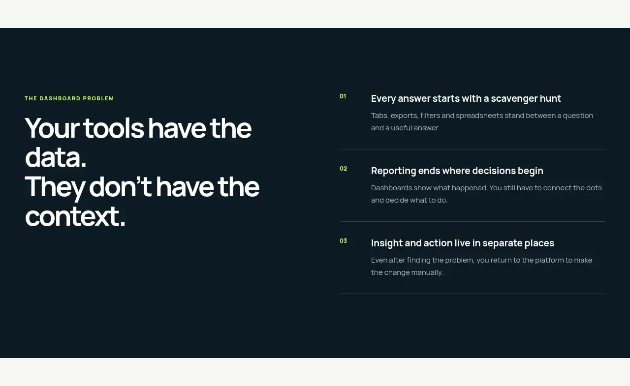 The dashboard problem
HireOtto · Feature grid
The dashboard problem
HireOtto · Feature grid
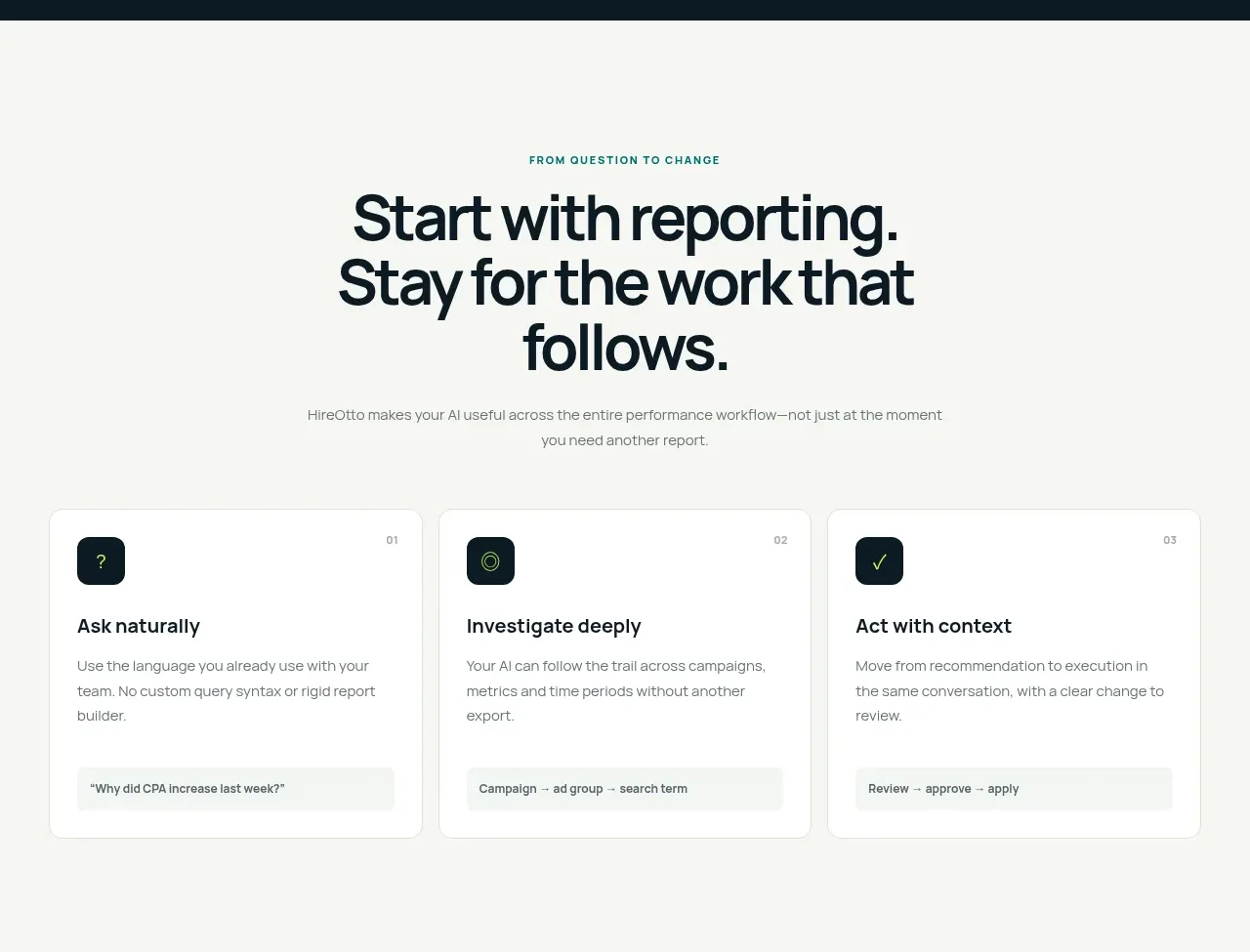 Question to action workflow
HireOtto · Feature grid
Question to action workflow
HireOtto · Feature grid
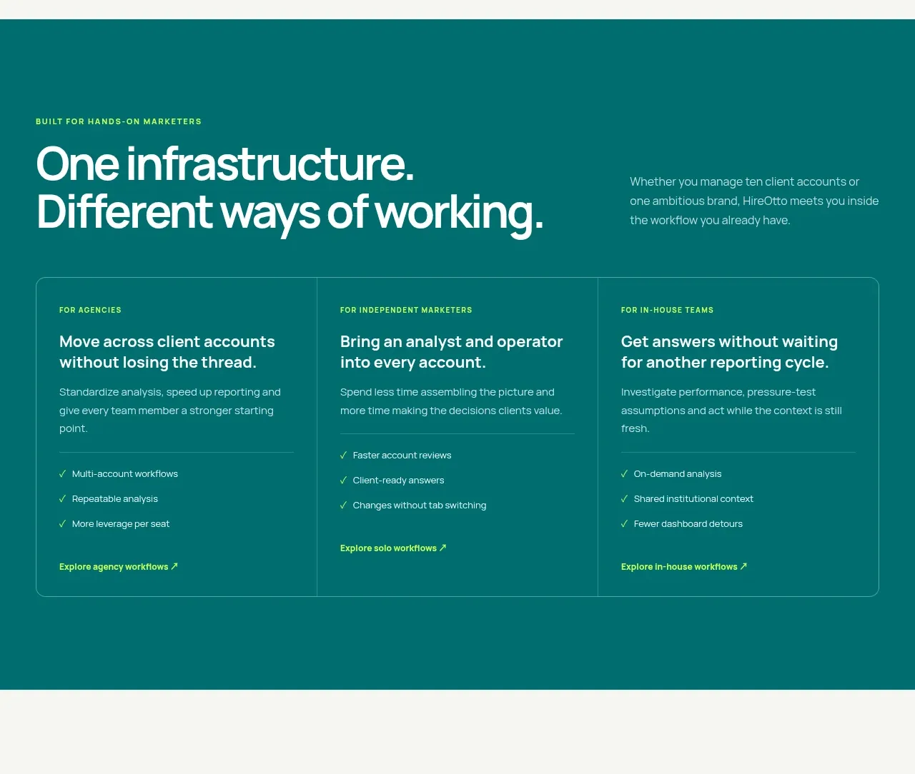 Ways of working
HireOtto · Feature grid
Ways of working
HireOtto · Feature grid
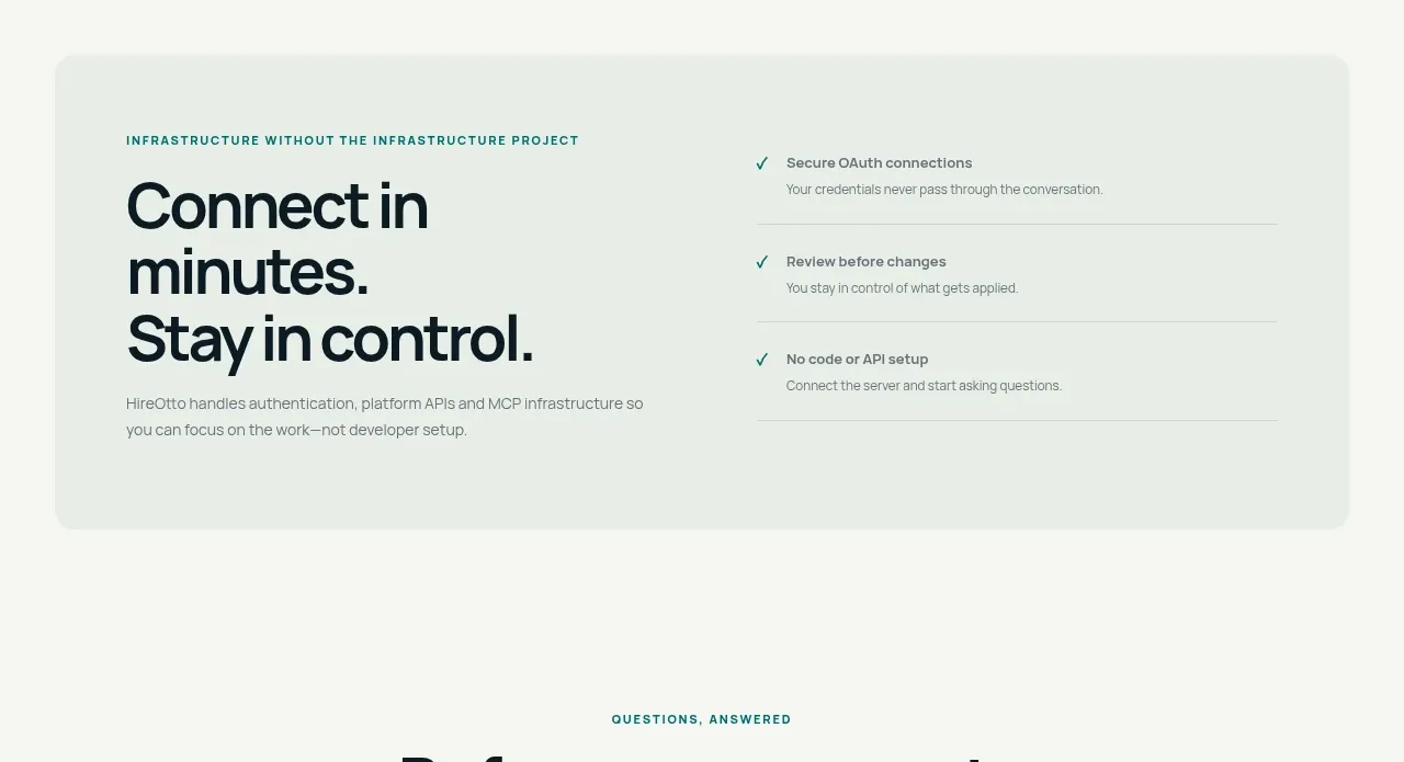 Low-friction connection panel
HireOtto · Card
Low-friction connection panel
HireOtto · Card
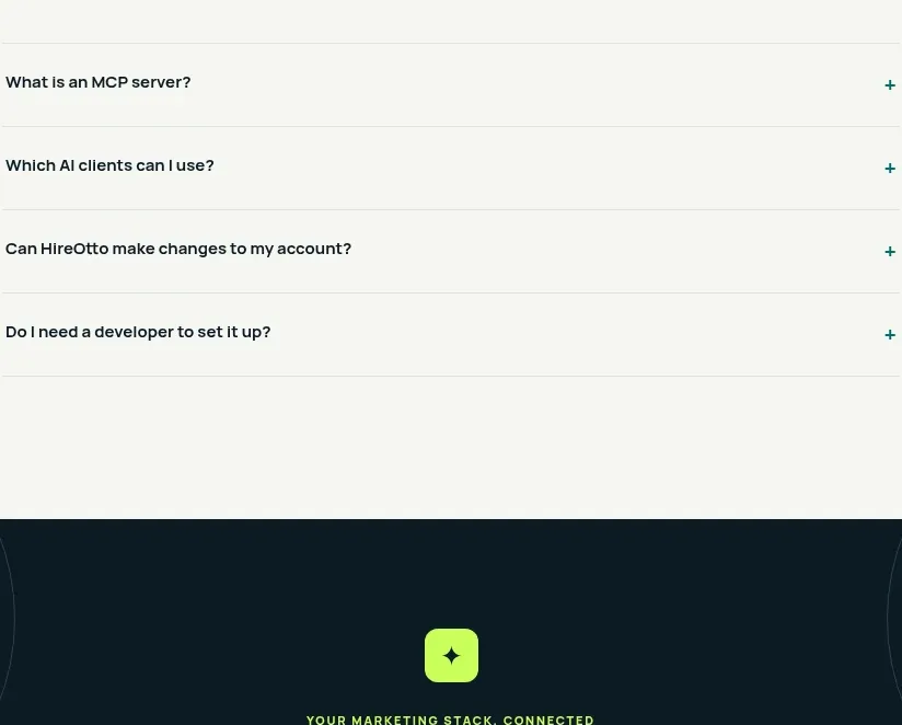 Connection FAQ
HireOtto · FAQ
Connection FAQ
HireOtto · FAQ
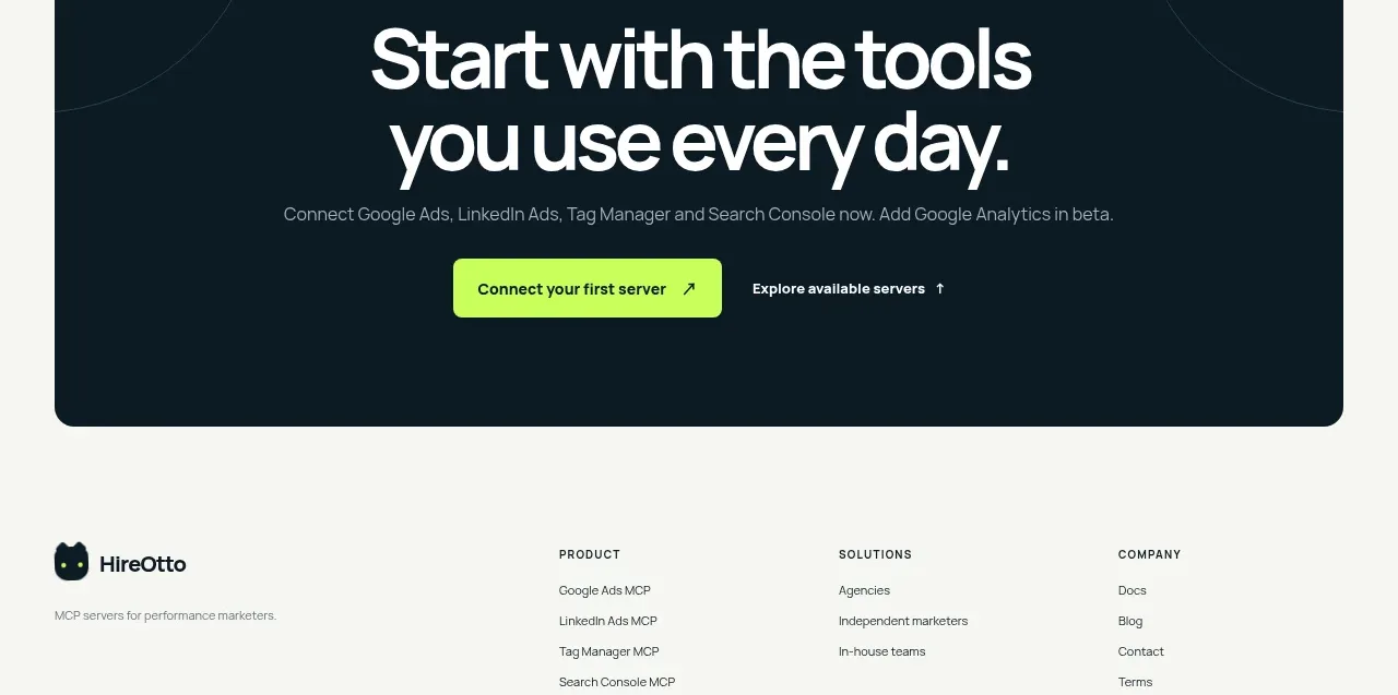 Final connection call to action
HireOtto · Call to action
Final connection call to action
HireOtto · Call to action
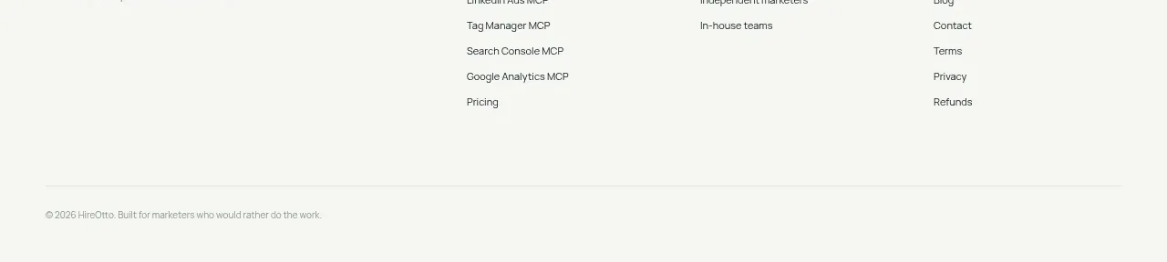 Multi-column product footer
HireOtto · Footer
Multi-column product footer
HireOtto · Footer