kage
kage
hireotto.com
Design analysis
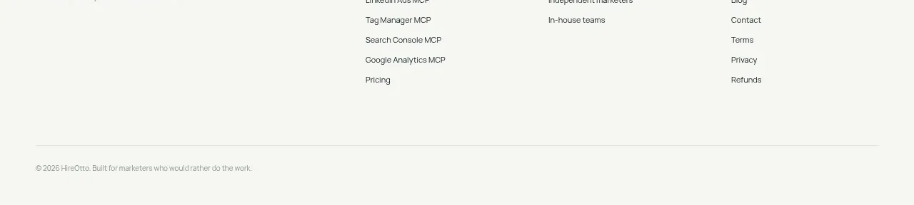
The footer repeats the brand area, organizes product, solution, and company links into columns, and ends with a subtle legal line.
Prompt preview
## Reference images

Study these alongside the description below: hierarchy, rhythm, spacing, colour. Build for the product you are asked about, using this design language.

- Component: https://kage-design-assets.t3.tigrisfiles.io/components/hireotto/8f3068d7-46ca-4868-8ee8-837dc9e1c249-1790488909-10.webp
- Full page it was cut from: https://kage-design-assets.t3.tigrisfiles.io/screenshots/hireotto/8f3068d7-46ca-4868-8ee8-837dc9e1c249-1790488876025-full.webp
- Component on Kage: https://kage.design/component/hireotto-footer

## Before you start
Ask what the user's product, audience, and brand are, then apply the principles below to that product rather than reproducing this reference.

Build a spacious footer on the same warm off-white background as the page. Use a max-width grid with a brand/mission block on the left and three compact link columns on the right. Column headings should be tiny uppercase labels; links should be 12–13px with comfortable vertical spacing. Add a full-width subtle divider and a small copyright/legal line at the bottom. Use near-black text (#07151b), muted gray-green secondary text (#74807d), and very restrained borders (#dbe3dd). Preserve the same horizontal alignment as the navigation and collapse the columns into a 2-column or stacked layout on mobile.

### Never
- Never use logos, product names, copy, illustrations, or imagery from the reference.
- Never bury required legal links or make the footer depend on tiny unreadable text.