kage
kage
hob.dev

Design analysis
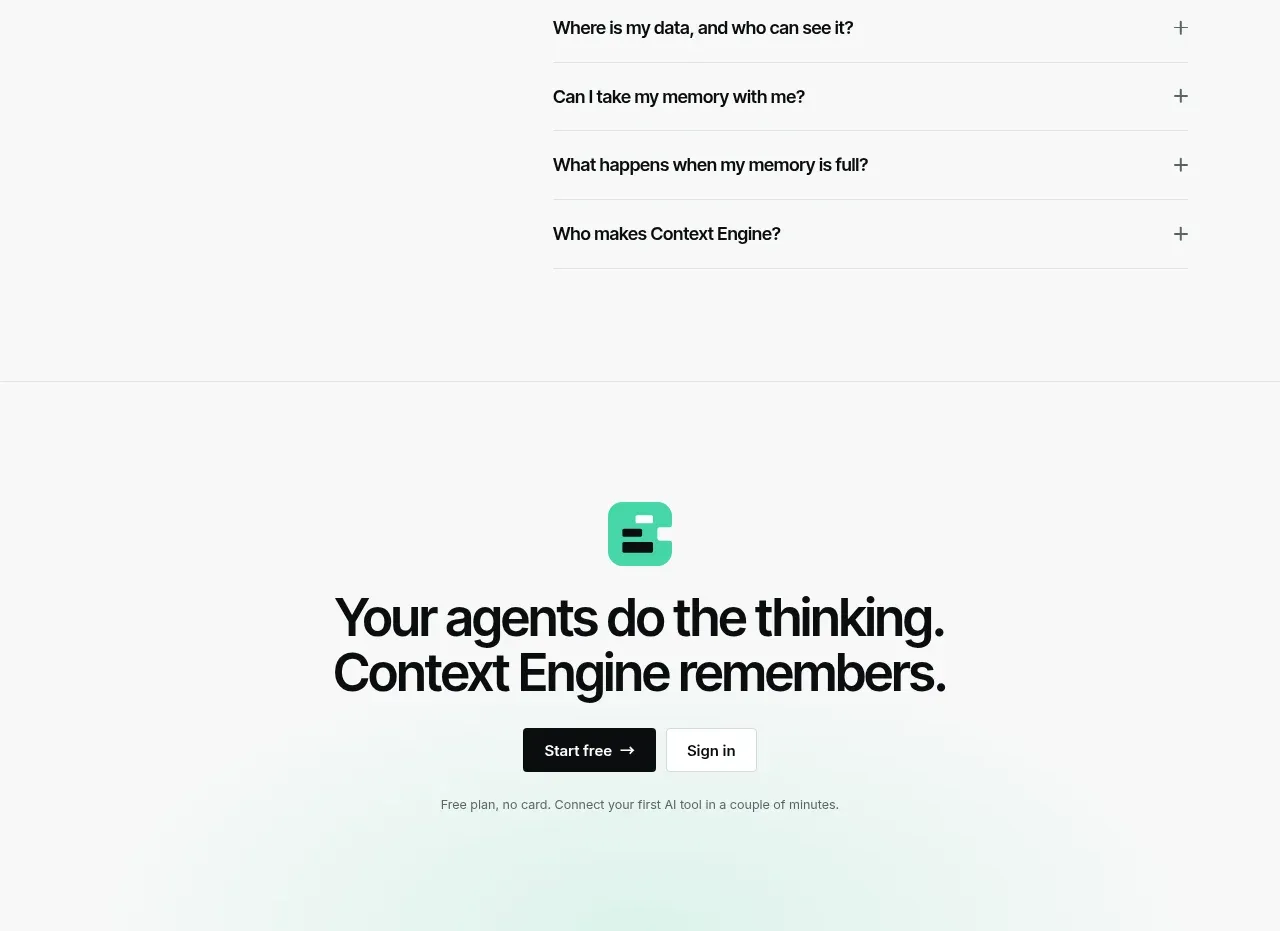
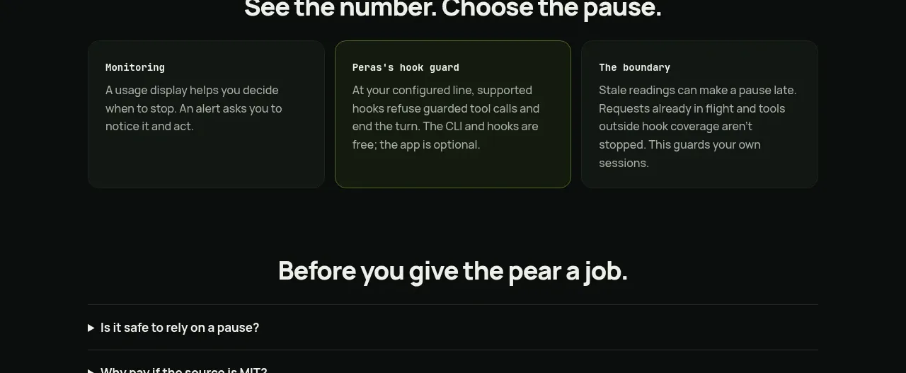
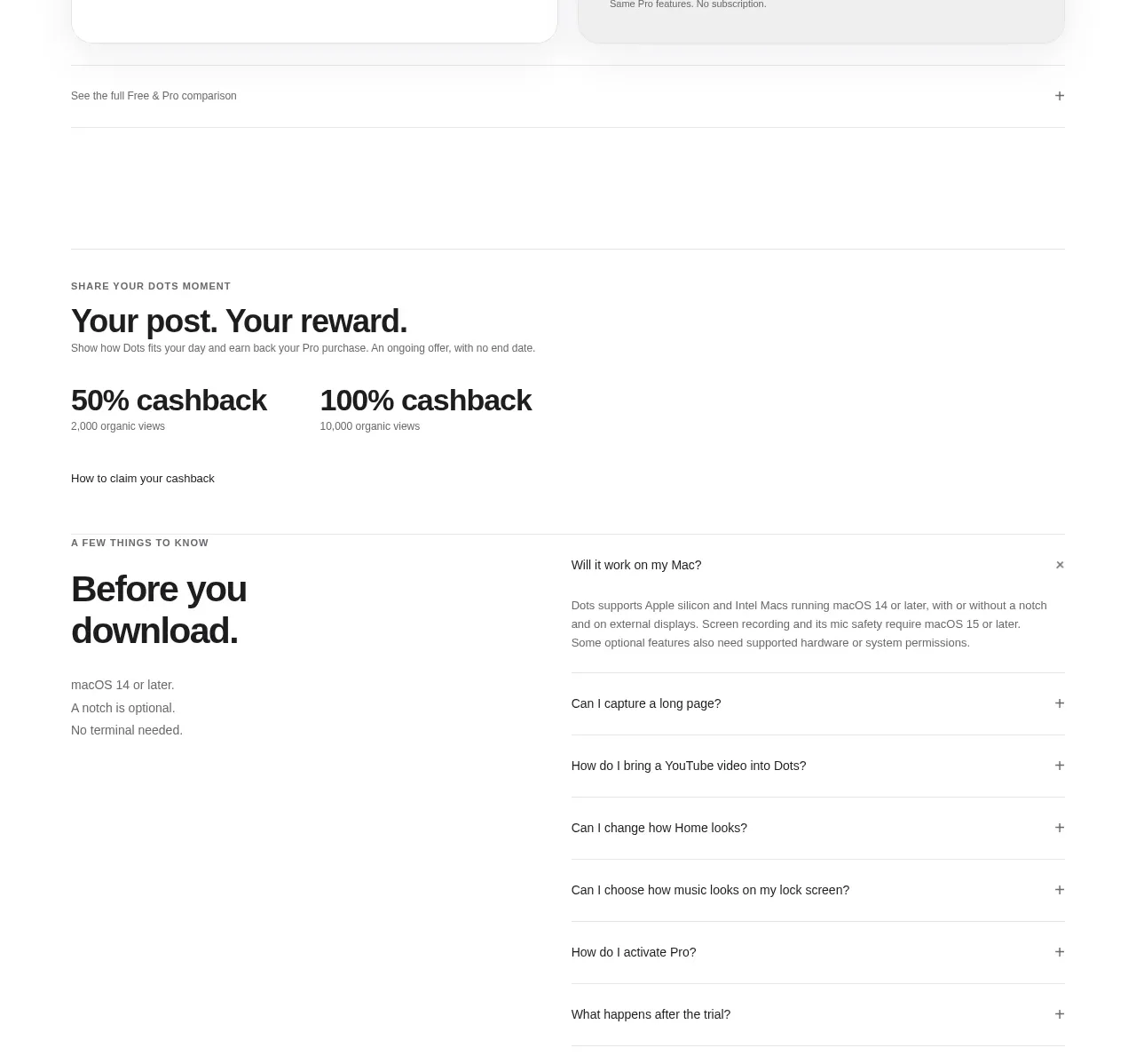
A spacious, full-width FAQ section that uses strong typography, fine dividers, and minimal plus controls to make a long list feel calm and scannable. A centered conversion block beneath the questions provides a clear next step without competing with the content.
Prompt preview
## Reference images

Study these alongside the description below: hierarchy, rhythm, spacing, colour. Build for the product you are asked about, using this design language.

- Component: https://kage-design-assets.t3.tigrisfiles.io/components/hob/bb3af585-7542-45f5-8db1-3e25168b9aff-1789106504-9.webp
- Full page it was cut from: https://kage-design-assets.t3.tigrisfiles.io/screenshots/hob/bb3af585-7542-45f5-8db1-3e25168b9aff-1789106472876-full.webp
- Component on Kage: https://kage.design/component/hob-faq

# Build an editorial FAQ accordion section

## Before you start
Ask me what my product is, who it is for, and what my brand personality and visual identity are. Then apply the principles below to create an original FAQ section for my product, adapting the content, typography, colours, and call to action to my brand rather than reproducing the reference.

## Design goal
Create a calm, premium, highly legible FAQ section for a modern software product. The section should feel editorial and confident: a large heading introduces the topic, questions are arranged as a simple full-width list, and a restrained conversion block follows the accordion.

## Layout and alignment
- Use a white or very lightly tinted page background and a wide content container with generous horizontal padding, approximately 24–32px on small screens and 48–80px on larger screens.
- Align the section heading and every accordion row to the same left edge. Avoid a narrow card or floating panel; the list should span the available content width.
- Place the heading above the list with approximately 32–40px of separation.
- Build each FAQ item as a full-width horizontal row, with the question aligned left and a compact plus control aligned right.
- Give each row approximately 24–28px of vertical padding and use thin horizontal rules to separate rows. Keep the final divider visible.
- After the list, leave a generous vertical pause, then add a centered CTA block. Use a maximum text width of roughly 560–680px so the headline can wrap into two balanced lines.
- Stack the CTA headline, primary button, and supporting note vertically with clear but compact spacing.
- Make the layout responsive: preserve the edge alignment on mobile, reduce heading size and row padding, and ensure long questions wrap without colliding with the control.

## Typography hierarchy
- Use a clean contemporary sans-serif with a neutral, highly readable appearance. Prefer the product’s existing font when available.
- Set the FAQ heading as the dominant element, approximately 48–56px on desktop with tight line-height around 0.95–1.05 and modest negative letter spacing. Scale it to roughly 36–44px on mobile.
- Set questions in a medium-to-semibold weight, approximately 16px desktop/mobile, with a line-height around 1.35–1.5.
- Use a large CTA headline, approximately 44–52px on desktop, with tight line-height and natural wrapping; reduce to 32–40px on mobile.
- Keep the supporting CTA note small and understated, around 12–14px with relaxed line-height.

## Colour
- Use near-black for primary text, approximately `#111111` or `#151515`.
- Use a very subtle divider, approximately `#E2E2E2` to `#E8E8E8`; it should structure the list without looking like a boxed component.
- Keep the page background white, approximately `#FFFFFF`, or use the brand’s closest warm-neutral equivalent.
- Choose one warm, high-contrast accent for the CTA button, such as orange around `#F5A000` or `#F2A000`, while ensuring accessible text contrast. If the user’s brand has a stronger accent, use that instead.
- Use muted charcoal or grey, approximately `#666666`, for secondary CTA text.

## Borders, controls, and shape
- Use 1px horizontal borders only; do not wrap each question in a card.
- Keep corners square or very lightly rounded for the section itself.
- Make the CTA button a pill with approximately 9999px radius, generous horizontal padding around 28–32px, and vertical padding around 14–16px.
- Render the plus control as a simple text or thin-stroke icon around 16–18px. Keep it visually quiet, but provide an accessible button hit area of at least 44×44px.

## Interaction
- Each FAQ row must be keyboard accessible and implemented as a real button or native disclosure pattern, not a clickable generic div.
- On hover, subtly change the question colour or divider tone and give the plus control a small contrast increase; avoid dramatic animations.
- When opened, rotate the plus into a minus or swap to a clear close state. Reveal the answer with a restrained height/opacity transition, respecting `prefers-reduced-motion`.
- Keep the answer text aligned with the question’s left edge and constrain it to a readable width, approximately 640–760px.
- Decide whether multiple answers can remain open based on the product context, but make the behaviour consistent and obvious.
- Include visible focus styles with sufficient contrast and preserve clear semantics using `aria-expanded`, `aria-controls`, and a labelled answer region where needed.
- The CTA button should have hover, active, focus, and disabled states that match the chosen brand accent.

## Content guidance
- Write concise, product-specific questions that address objections, trust, setup, pricing, compatibility, and who the product is for.
- Keep questions conversational and scannable. Answers should be useful rather than promotional.
- Make the CTA headline and button action relevant to the user’s product and stage in the funnel.

## Never
- Never copy the reference’s logos, product names, brand identity, exact questions, exact CTA copy, or proprietary wording.
- Never reuse illustrations, screenshots, icons, imagery, or decorative assets from the reference.
- Never turn the FAQ into heavy bordered cards, a dense dashboard, or a visually noisy accordion.
- Never sacrifice keyboard access, responsive wrapping, focus visibility, or reduced-motion support for visual similarity.