 kage
kage
holavoicemail.com
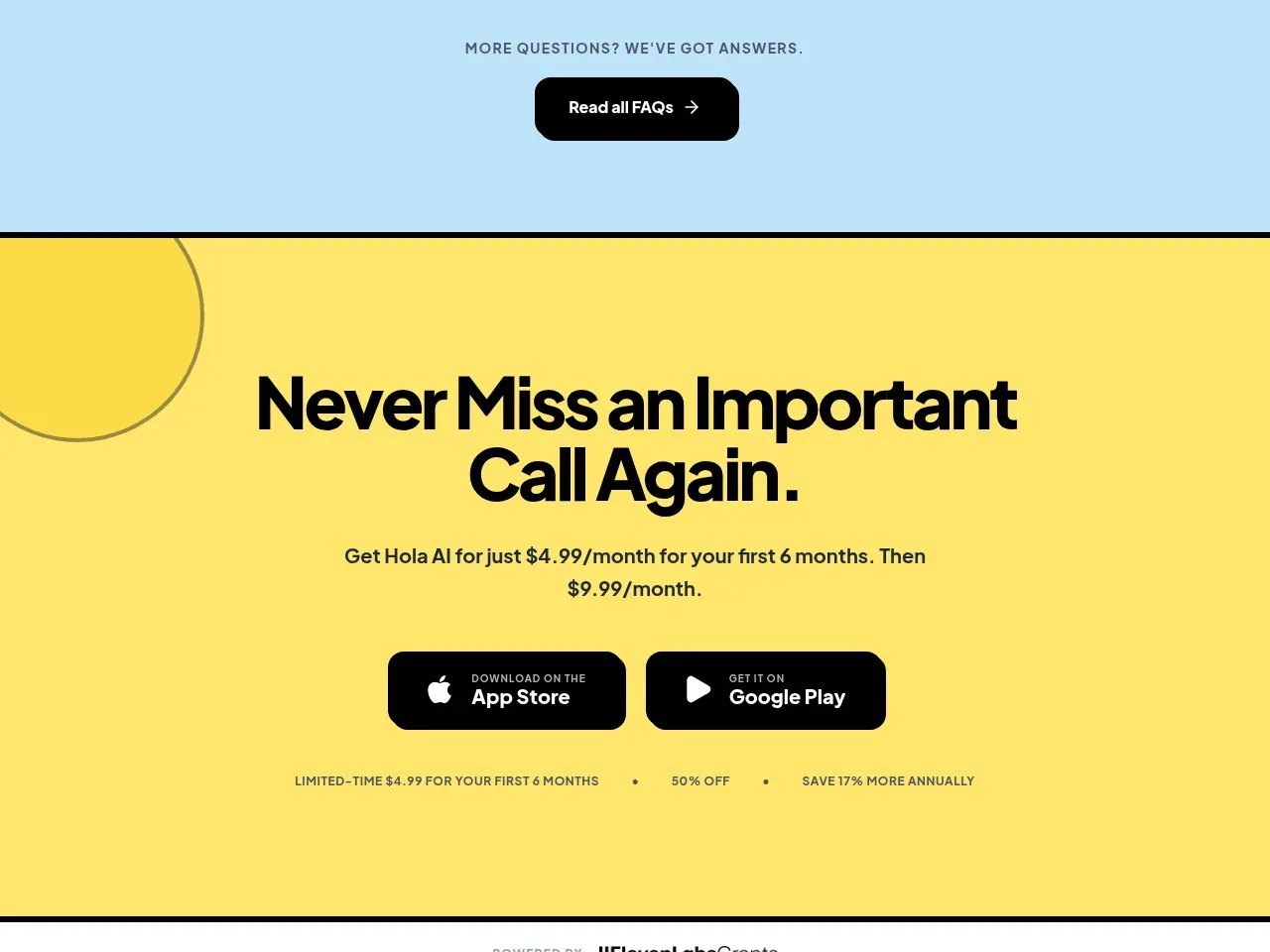
Design analysis
A high-energy yellow conversion band repeats the main benefit, presents platform download buttons, and reinforces the limited offer with small supporting details.
Prompt preview
## Reference images

Study these alongside the description below: hierarchy, rhythm, spacing, colour. Build for the product you are asked about, using this design language.

- Component: https://kage-design-assets.t3.tigrisfiles.io/components/hola-ai/6afc16ea-d4a5-4b10-89cd-47c92dad80e5-1790143389-8.webp
- Full page it was cut from: https://kage-design-assets.t3.tigrisfiles.io/screenshots/hola-ai/6afc16ea-d4a5-4b10-89cd-47c92dad80e5-1790143310582-full.webp
- Component on Kage: https://kage.design/component/hola-cta

## Before you start
Ask what the user's primary conversion is, which platforms are supported, and what incentive or reassurance should appear near the CTA. Then create an original conversion band.

Build a full-width, high-impact CTA section with a warm yellow background around #FFE66B, a thin dark border, and a restrained oversized circular outline motif partly cropped at one edge. Center a two-line headline in very large black type, followed by a short offer/value sentence. Place two equal black app/download buttons side by side with simple platform glyphs and compact two-line labels; give them 10–14px radius, white text, and clear hover/focus states. Beneath, add a tiny uppercase line of offer details separated by dots. Use generous vertical padding around 72–96px, keep the headline max-width near 560px, and stack the buttons on mobile. Ensure the section remains accessible and the decorative circle never competes with the text.

Never: use logos, product names, copy, illustrations, or imagery from the reference.
More components
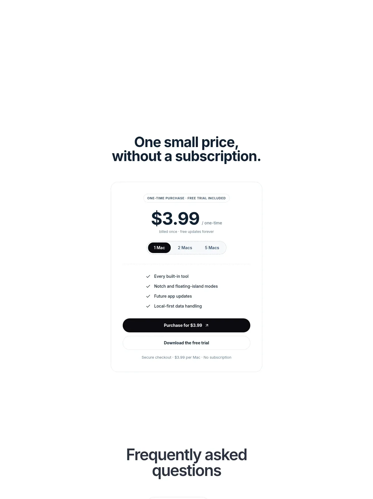
 Visual closing product statement
NotchPop · Call to action
Visual closing product statement
NotchPop · Call to action
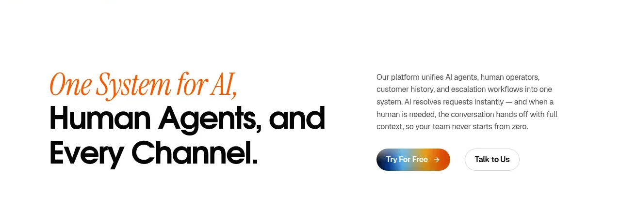
 System positioning statement
IntellAgents.io · Call to action
System positioning statement
IntellAgents.io · Call to action
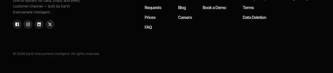 Final conversion banner
IntellAgents.io · Call to action
Final conversion banner
IntellAgents.io · Call to action
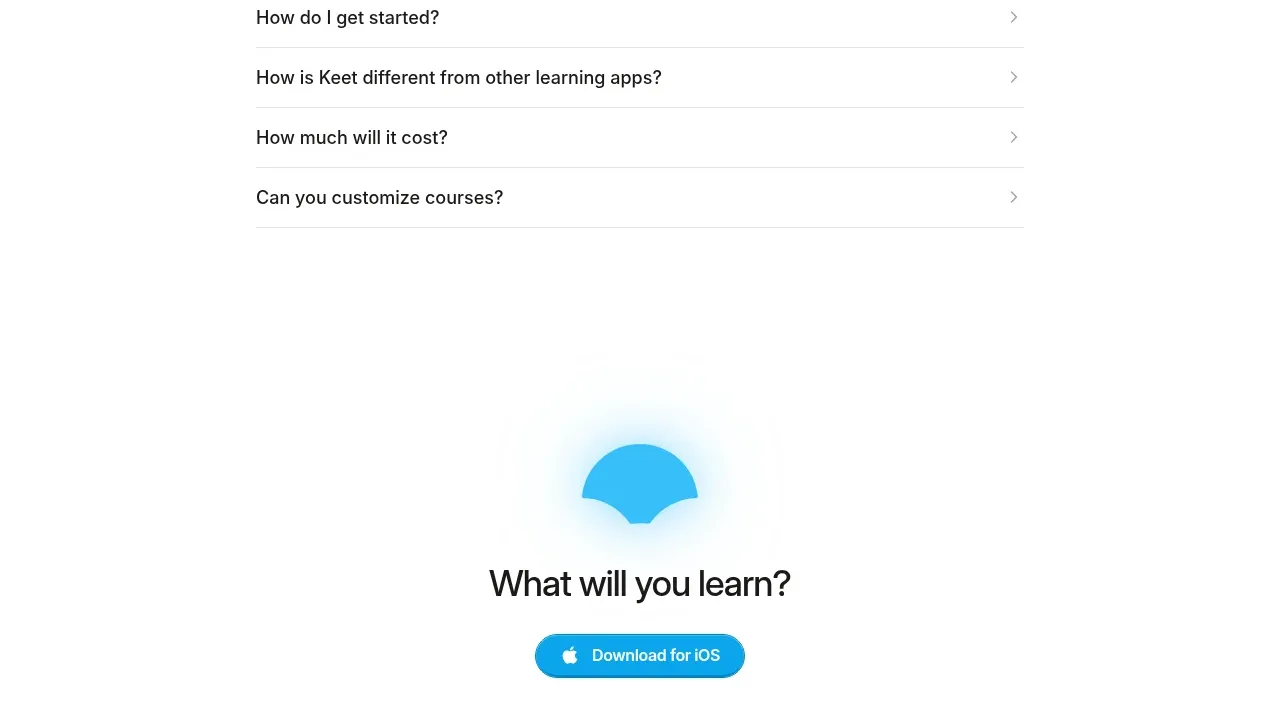
 Final app-download call to action
Keet · Call to action
Final app-download call to action
Keet · Call to action
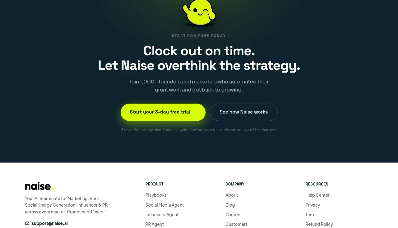
 Dark conversion call to action
Naise AI · Call to action
Dark conversion call to action
Naise AI · Call to action
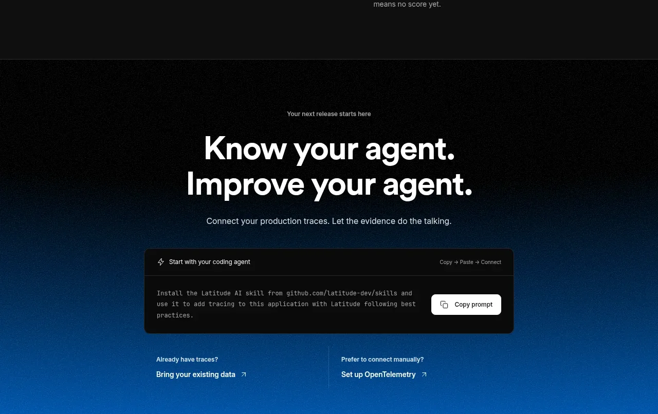
 Connect data and start improving
AgentScore · Call to action
Connect data and start improving
AgentScore · Call to action