kage
kage

Design analysis
A neo-brutalist consumer landing page built on high-energy colour blocking: bold blue and yellow type in the hero, flat feature cards in green/red/blue/yellow/grey with thick black borders and offset hard shadows, and generous section alternation between white, tinted grey and pale blue backgrounds. The page reads top-to-bottom like a classic conversion narrative — announcement bars, punchy hero with phone mockup, old-vs-new comparison cards, a five-card feature grid, testimonial trio, a green-headed feature comparison table, accordion FAQ, yellow full-bleed CTA and a dense multi-column footer. Type is a chunky geometric sans at very large display sizes, with small-caps eyebrow labels and tight two-to-three-sentence card copy keeping density low and rhythm lively.
Prompt preview
## Reference images

Study these alongside the description below: hierarchy, rhythm, spacing, colour. Build for the product you are asked about, using this design language.

- Full page: https://kage-design-assets.t3.tigrisfiles.io/screenshots/hola-ai/6afc16ea-d4a5-4b10-89cd-47c92dad80e5-1790143310582-full.webp
- Above the fold: https://kage-design-assets.t3.tigrisfiles.io/screenshots/hola-ai/6afc16ea-d4a5-4b10-89cd-47c92dad80e5-1790143306316.webp
- Design on Kage: https://kage.design/designs/hola-landing-page

## Before you start
Ask the user what product they are building, who it is for, and what brand assets they already have (name, colours, fonts). Wait for the answers before writing any code. Everything below is a design language to apply to their product, not a clone of the reference.

## Page structure
1. **Announcement bars**: two stacked full-width bars under the nav — one coral Product Hunt launch bar, one black limited-time-offer bar with a yellow "50% OFF" pill and a yellow CTA button.
2. **Hero**: two columns. Left: a small green "voted #1" pill, a huge two-tone headline (black "Skip the spam." then a tilted yellow block containing oversized purple text), a short paragraph, a black pill CTA with arrow plus "secure / instant" micro-badges, and a text-link line for curious visitors. Right: a tilted phone mockup with a full-bleed image and oversized overlaid caption text.
3. **Comparison section** (tinted grey background): centred headline and subline, then two side-by-side cards — white "old way" card with a quoted robotic message box, and purple "new way" card with white text and a full-width white CTA button.
4. **Feature grid**: left-aligned headline, then a 3+2 grid of large rounded cards in flat pastel colours (green, red, blue, yellow, grey), each with a white icon tile, bold title and 2–3 line description. Close with a one-line cross-sell sentence with an inline link.
5. **Testimonials** (tinted background): centred headline, three white bordered cards with italic quote, circular avatar, name and small-caps role.
6. **Comparison table**: centred headline, a bordered table with a green header cell for the product column; each row has a bold feature name, a green check + blue answer in the product column, plain grey text in the traditional column. Below: a bold CTA link, a small-caps eyebrow, then pill-shaped "vs" comparison links.
7. **FAQ** (pale blue full-bleed background): centred headline with small-caps subline, then accordion groups with black header bars ("General", "Pricing") and white bordered rows with "+" buttons, plus a labelled privacy card, and a black "Read all FAQs" pill.
8. **Final CTA**: full-bleed yellow section with a decorative circle, huge centred headline, pricing recap paragraph, black App Store and Google Play buttons, and a small-caps offer footnote.
9. **Footer**: white, brand blurb left with social icons and trustpilot link; four link columns (Links, Company, Comparisons, Support); bottom copyright bar.

## Design language
- Build hierarchy with extreme type contrast: display headlines at 64–96px in a chunky geometric sans (e.g. Archivo/Space Grotesk feel), section subheads ~32px, body 16px, and small-caps 11–12px eyebrow labels with wide letter-spacing.
- Use a two-tone headline trick: one line plain ink, one line inside a tilted coloured block (yellow #FBE85A block with purple #4A3AFF text) for playful emphasis.
- Colour: white background, ink black #111, primary purple #4A3AFF, signature yellow #FBE85A, accent coral #FF6B5E, pastels for feature cards (#B7E4B0 green, #F5A9A5 red, #A9D9F5 blue, #D9D9D9 grey). Backgrounds alternate white → light grey #F5F5F3 → pale blue #CFE8F5 → yellow to segment sections.
- Neo-brutalist card treatment: 2px solid black borders, 16–24px radius, and a solid 4–6px black offset shadow (no blur). Never use soft drop shadows.
- Icons sit in small white rounded squares with black borders, always top-left of the card, title below.
- Tables: heavy 2px black outer border, one saturated header cell, thin internal rules, green check marks, restrained row height.
- Copy discipline: every card is a 4–6 word title plus max three lines; testimonial quotes in italics; roles in small caps.
- CTA pattern: black pill buttons with white text and arrow glyphs; secondary actions are bordered pill links; one yellow CTA inside the black offer bar.
- Motion stays minimal: slight rotation on hero elements, hover states that deepen the offset shadow; no parallax or heavy animation.

## Never
- Do not copy the reference's product name, wordmark, logo, testimonial quotes, photos, phone-mockup imagery, copy or icon set.
- Do not present the result as Hola AI; apply the visual language to the user's own brand.
Components from this page
All components
 Primary navigation
Hola AI · Navigation
Primary navigation
Hola AI · Navigation
 Launch and limited-time offer banners
Hola AI · Banner
Launch and limited-time offer banners
Hola AI · Banner
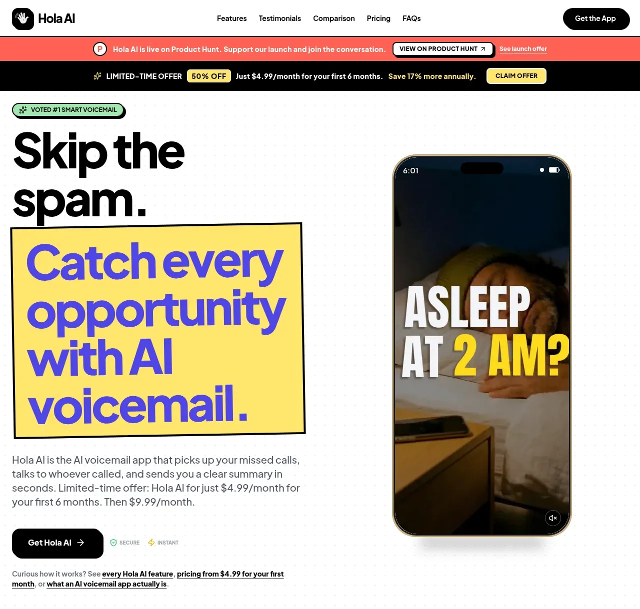 AI voicemail hero
Hola AI · Hero
AI voicemail hero
Hola AI · Hero
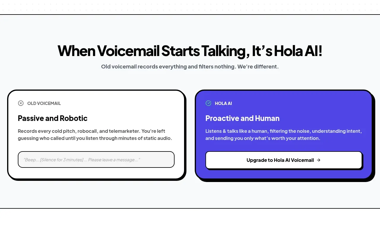 Old versus new voicemail comparison
Hola AI · Card
Old versus new voicemail comparison
Hola AI · Card
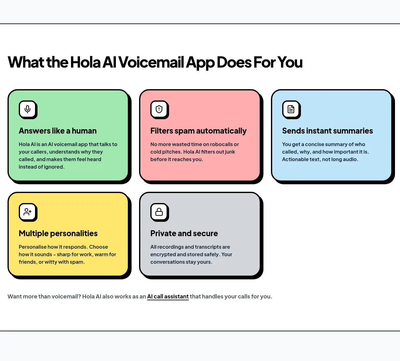 Core product capabilities
Hola AI · Feature grid
Core product capabilities
Hola AI · Feature grid
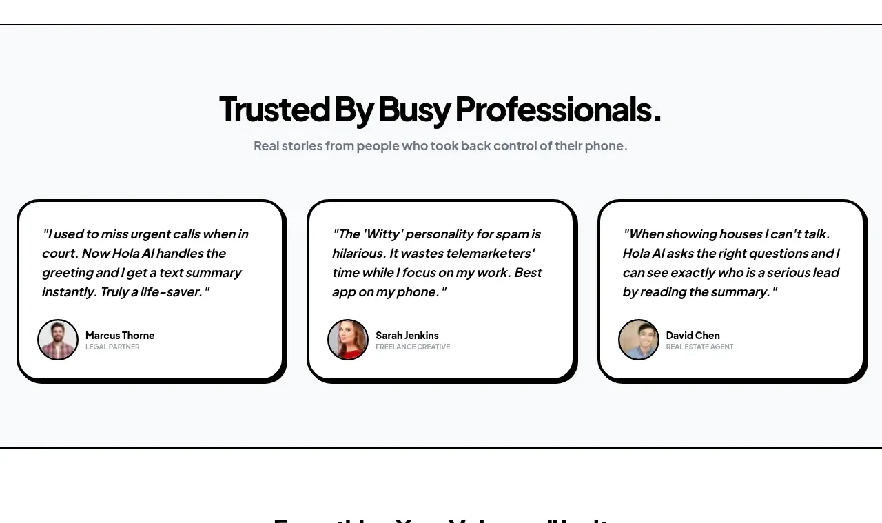 Customer story cards
Hola AI · Testimonials
Customer story cards
Hola AI · Testimonials
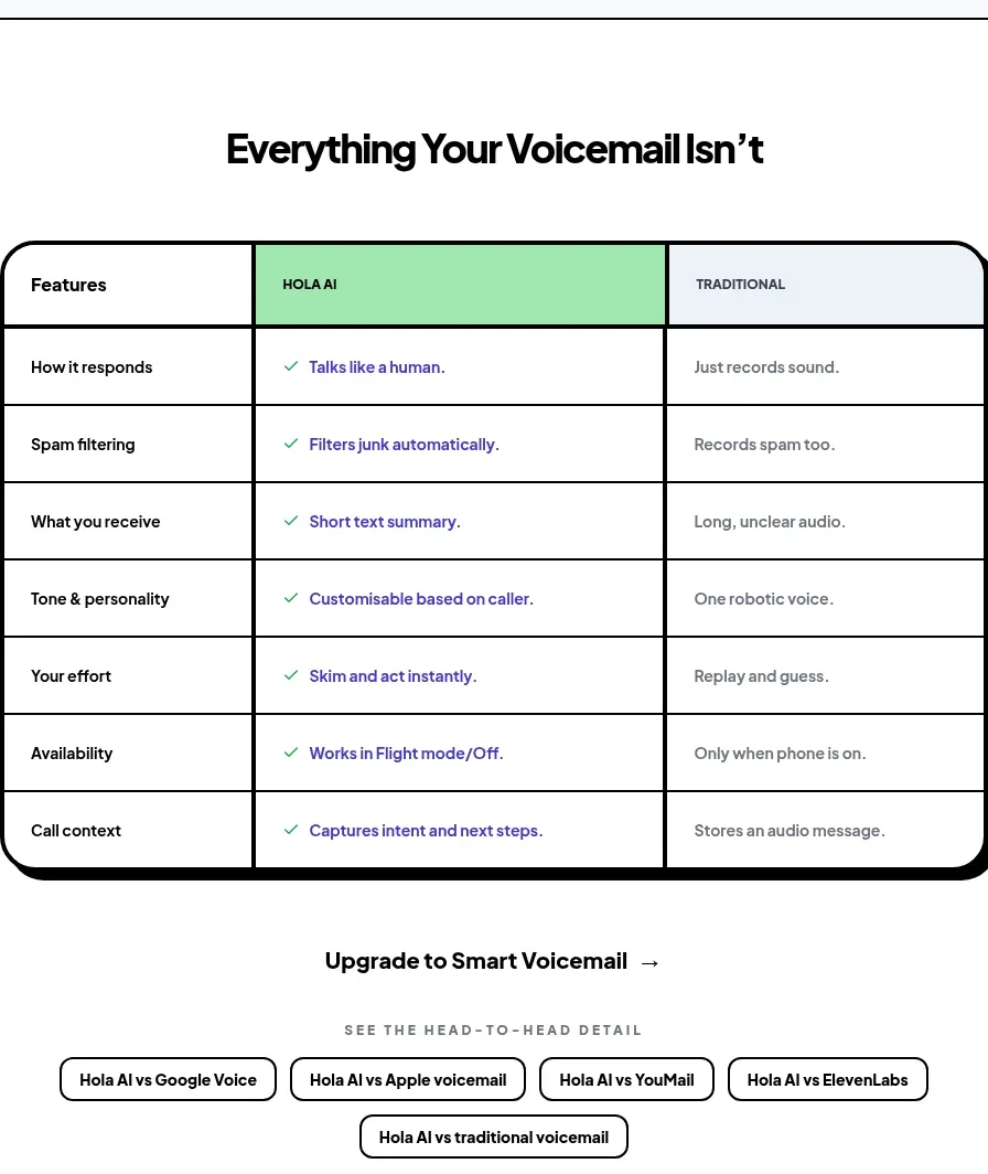 Feature comparison table
Hola AI · Table
Feature comparison table
Hola AI · Table
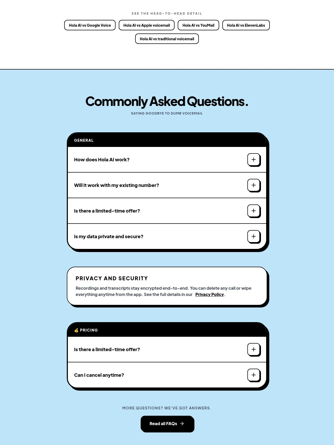 Frequently asked questions
Hola AI · FAQ
Frequently asked questions
Hola AI · FAQ
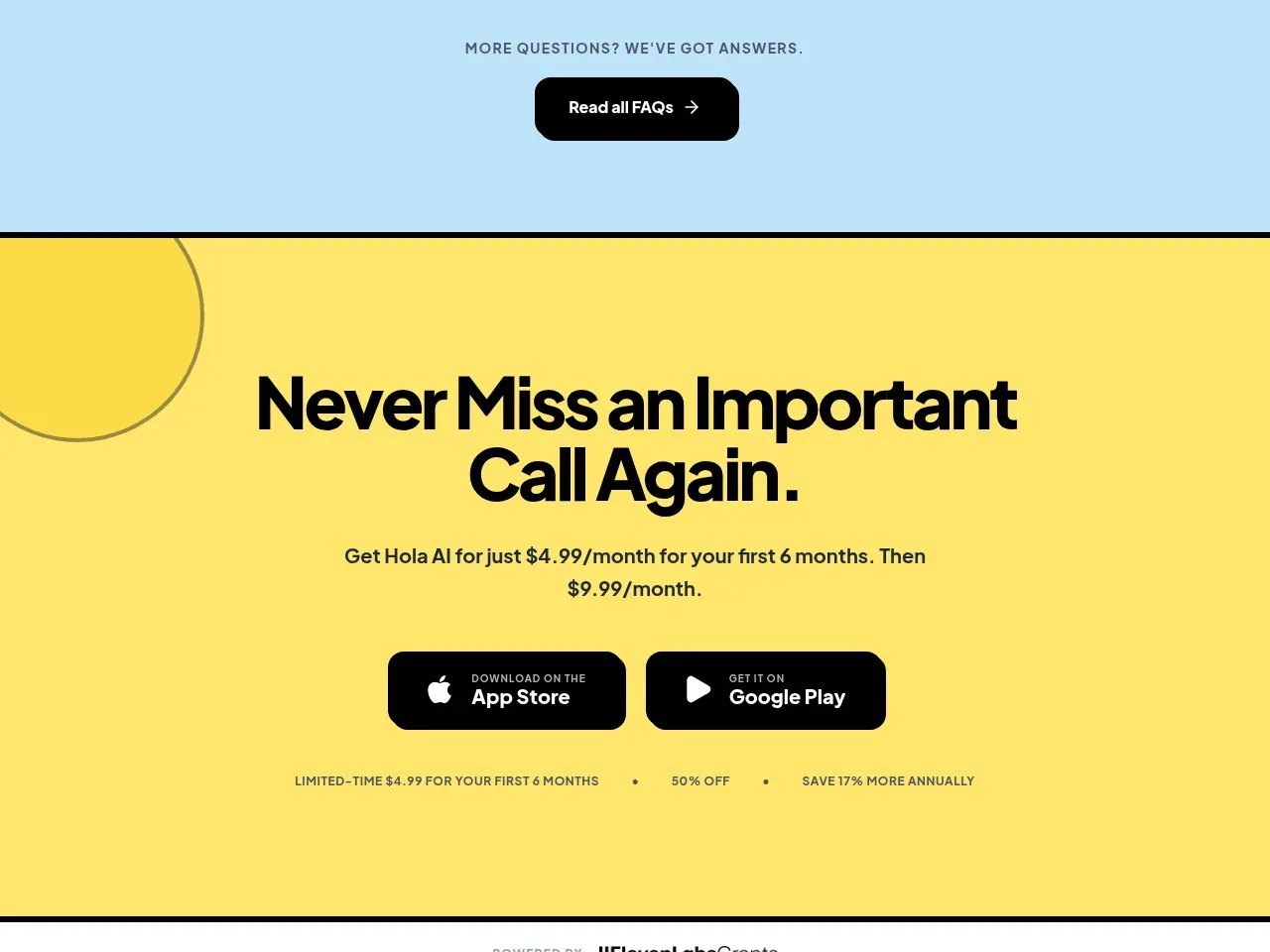 App download call to action
Hola AI · Call to action
App download call to action
Hola AI · Call to action
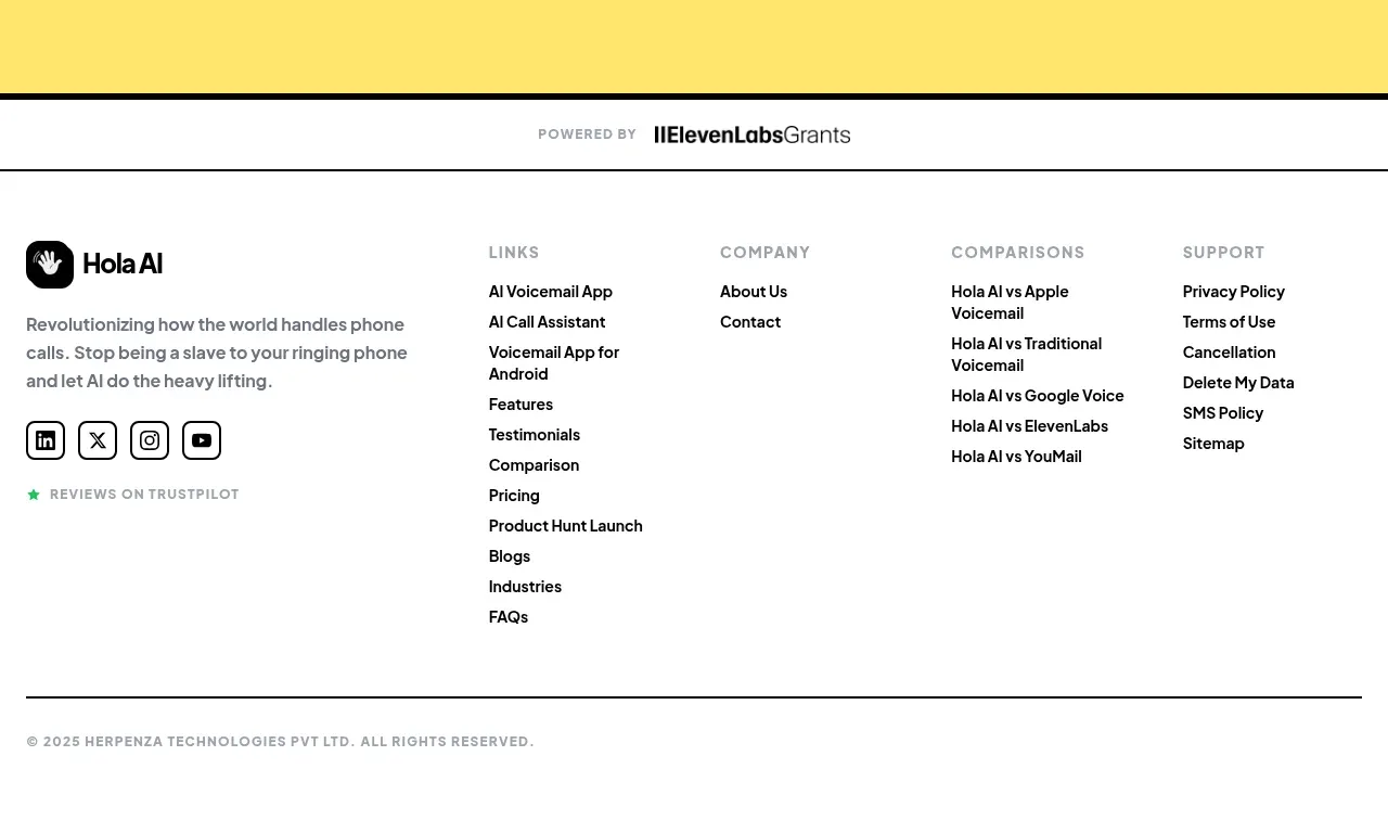 Site footer
Hola AI · Footer
Site footer
Hola AI · Footer