kage
kage
holavoicemail.com
Design analysis
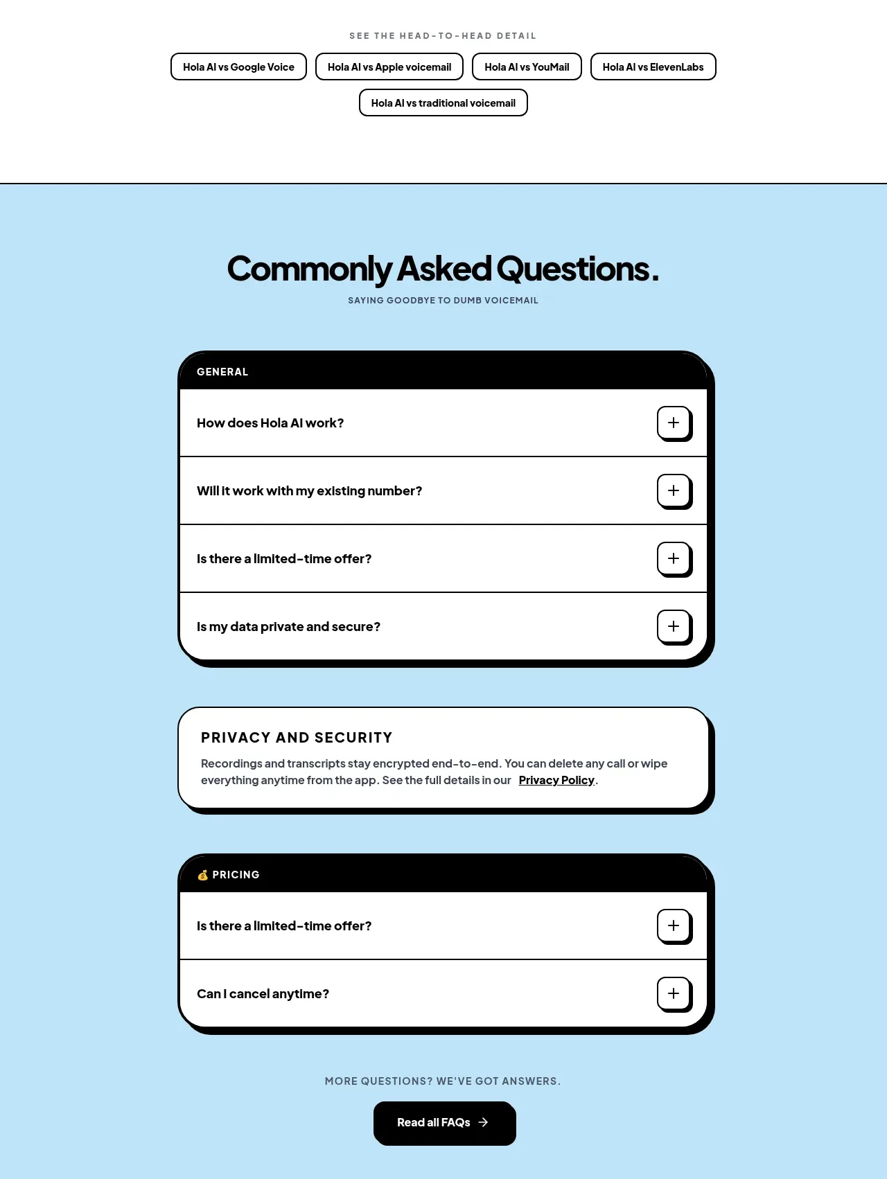
A blue FAQ area combines grouped accordion panels, a security reassurance card, a second pricing group, and a final help CTA.
Prompt preview
## Reference images

Study these alongside the description below: hierarchy, rhythm, spacing, colour. Build for the product you are asked about, using this design language.

- Component: https://kage-design-assets.t3.tigrisfiles.io/components/hola-ai/6afc16ea-d4a5-4b10-89cd-47c92dad80e5-1790143389-7.webp
- Full page it was cut from: https://kage-design-assets.t3.tigrisfiles.io/screenshots/hola-ai/6afc16ea-d4a5-4b10-89cd-47c92dad80e5-1790143310582-full.webp
- Component on Kage: https://kage.design/component/hola-faq

## Before you start
Ask what objections, setup questions, security concerns, and pricing questions users have about the product. Group them into a useful FAQ hierarchy.

Build a full-width FAQ section with a bright pale-blue background around #B9E1F5 and a thin dark top border. Center a strong heading and small uppercase subtitle. Use a narrow centered column of grouped accordion panels: each group has a black header strip with white uppercase label, followed by white rows separated by thin black rules; every row has a question on the left and a square rounded plus button on the right. Give the group container a thick black border, 20–24px radius, and a hard offset black shadow. Insert a separate white security/reassurance card with the same border and shadow language between groups. Finish with a small centered support line and black rounded CTA button. Accordions must be keyboard accessible, support one or multiple open items, animate height/plus rotation, and stack cleanly on mobile.

Never: use logos, product names, copy, illustrations, or imagery from the reference.