kage
kage
holavoicemail.com
Design analysis
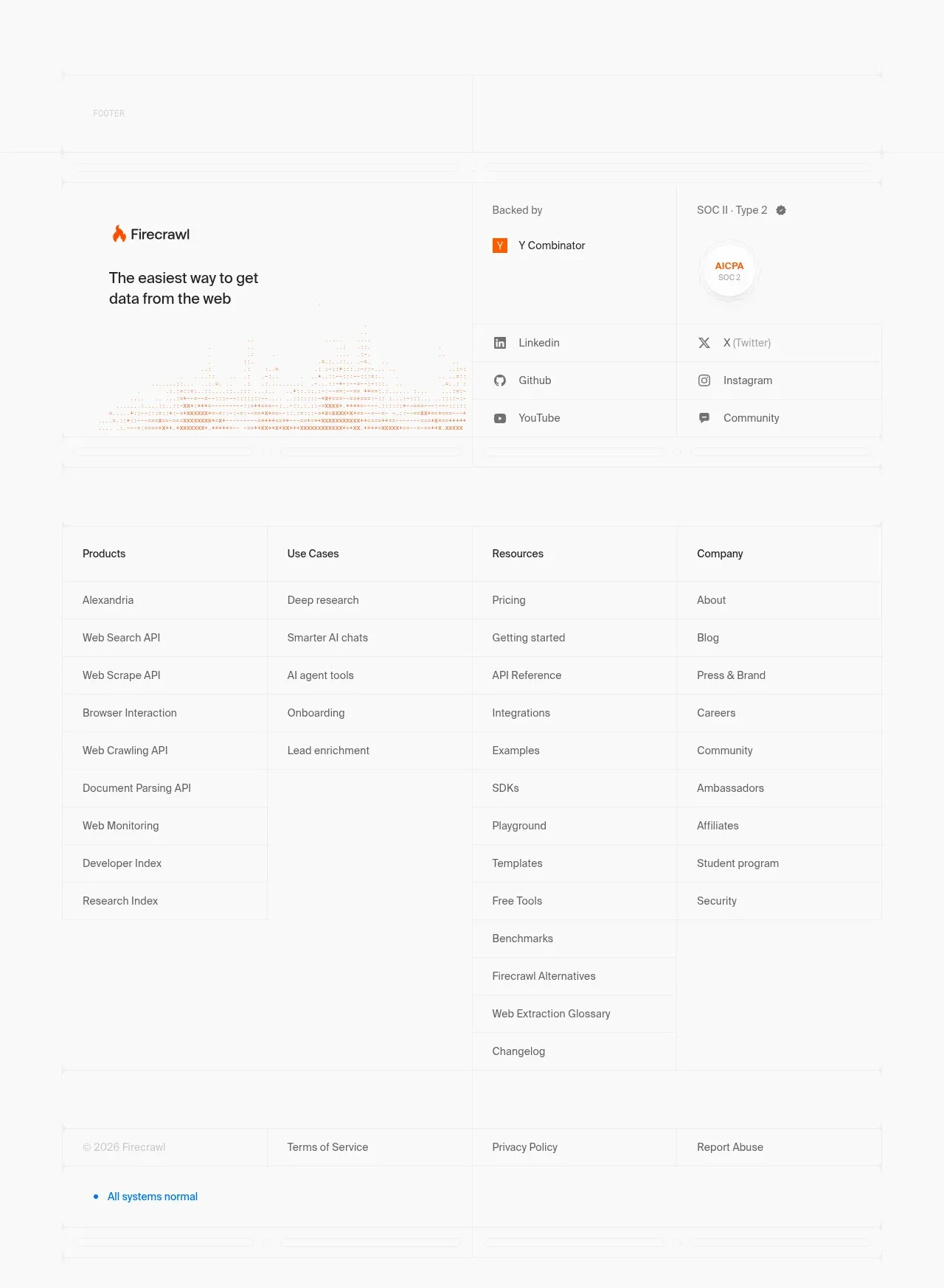
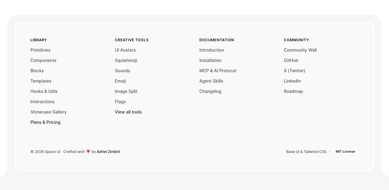
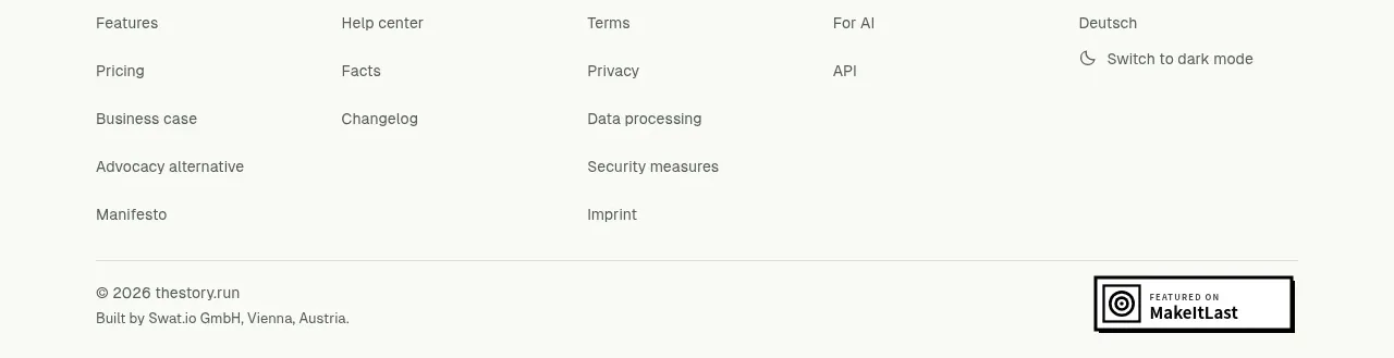
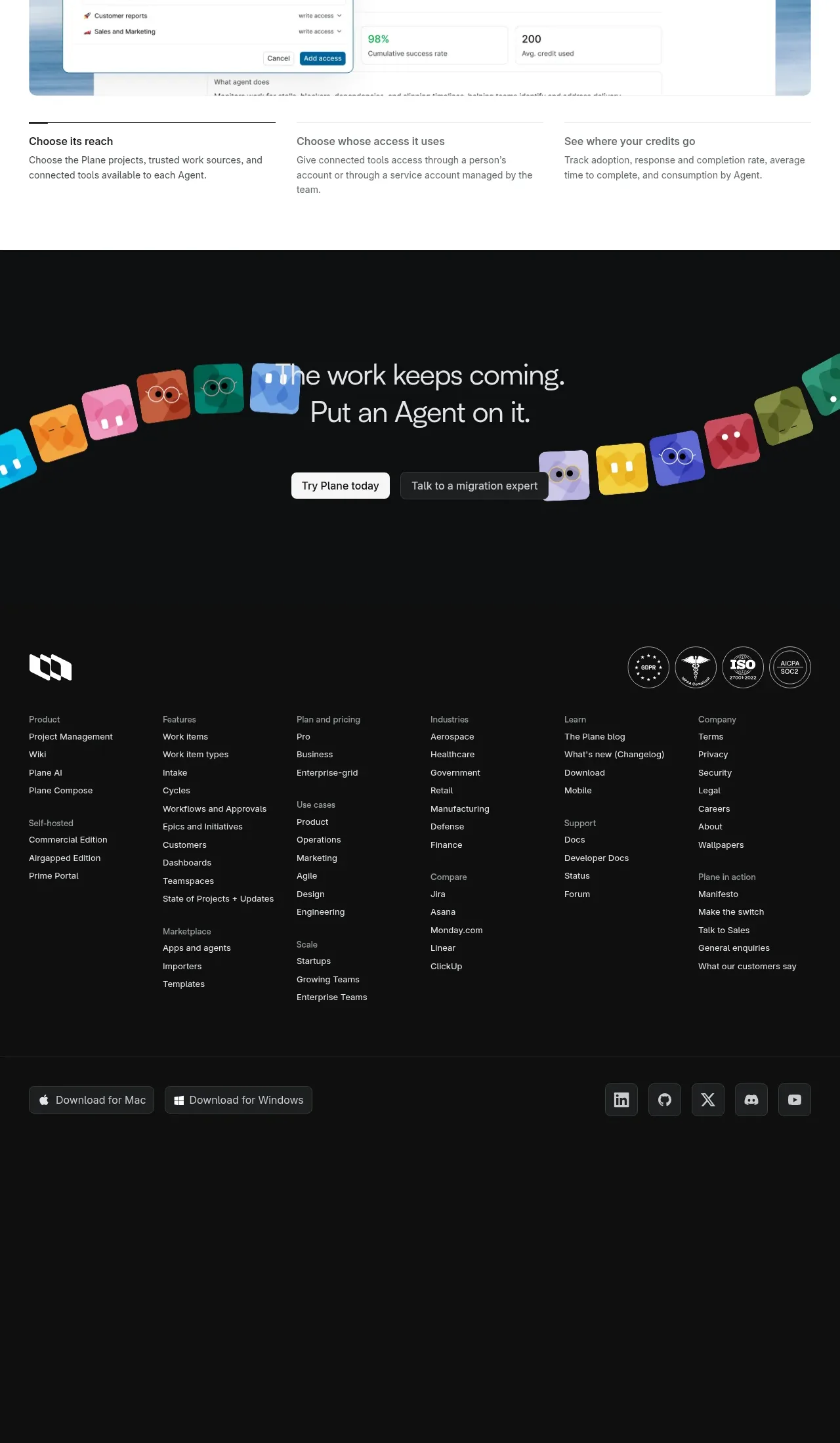
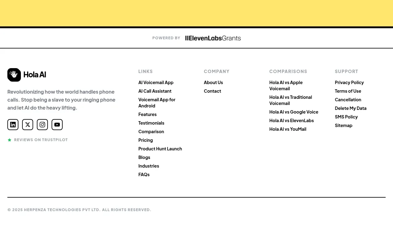
The footer separates a grant/powered-by strip from a multi-column link area, brand description, social buttons, review signal, and legal baseline.
Prompt preview
## Reference images

Study these alongside the description below: hierarchy, rhythm, spacing, colour. Build for the product you are asked about, using this design language.

- Component: https://kage-design-assets.t3.tigrisfiles.io/components/hola-ai/6afc16ea-d4a5-4b10-89cd-47c92dad80e5-1790143389-9.webp
- Full page it was cut from: https://kage-design-assets.t3.tigrisfiles.io/screenshots/hola-ai/6afc16ea-d4a5-4b10-89cd-47c92dad80e5-1790143310582-full.webp
- Component on Kage: https://kage.design/component/hola-footer

## Before you start
Ask what brand identity, legal links, social channels, support destinations, and partner acknowledgements the user's product needs. Build a footer architecture around those real requirements.

Build a footer on white with a thin dark top border. Start with a short centered or full-width partner/powered-by strip separated by a bottom rule. Below, use a multi-column layout: brand block with a compact mark, short mission sentence, social icon buttons, and a small review/accreditation note on the left; then columns for product links, company links, comparisons/resources, and support/legal links. Use 13–15px body links, 11px uppercase gray headings, generous 24–32px column gaps, and muted gray #8B8F94 for secondary text. End with a thin horizontal rule and a small copyright/legal line. On mobile, collapse columns into stacked groups or accordions, keep social buttons prominent, and preserve ample bottom padding. Use real accessible labels for every icon and visible keyboard focus states.

Never: use logos, product names, copy, illustrations, or imagery from the reference.