kage
kage
huly.io

Design analysis
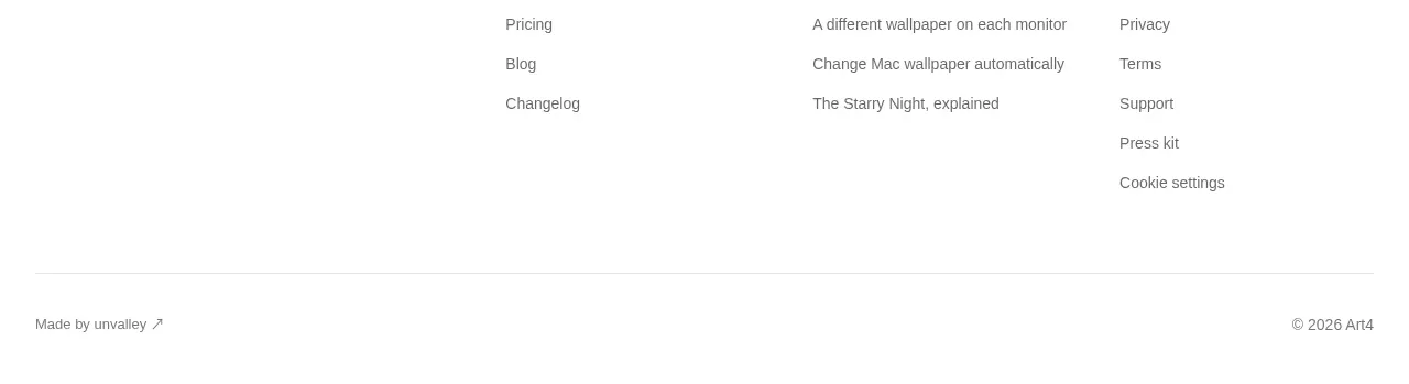
A compact dark footer closes the page with copyright, legal links, social icons, and a small maker attribution arranged on one baseline.
Prompt preview
## Reference images

Study these alongside the description below: hierarchy, rhythm, spacing, colour. Build for the product you are asked about, using this design language.

- Component: https://kage-design-assets.t3.tigrisfiles.io/components/huly-io/19c62401-9349-4b6e-b026-941cb593ca56-1790434842-8.webp
- Full page it was cut from: https://kage-design-assets.t3.tigrisfiles.io/screenshots/huly-io/19c62401-9349-4b6e-b026-941cb593ca56-1790434806578-full.webp
- Component on Kage: https://kage.design/component/huly-footer

## Before you start
Ask what legal links, social destinations, and attribution your product needs, plus the brand's preferred footer treatment. Then implement an original footer.

Build a compact full-width footer on the same near-black background as the closing CTA (#080a0d), separated by generous top spacing or a subtle 1px border. Use a centered max-width row with 12–16px horizontal padding. Put muted copyright text and legal links on the left or in a flexible first group, use small monochrome social icons in the middle, and reserve a quiet maker or company attribution on the right. Typography should be 12–13px, with #8d929a secondary text and white hover states. Use flex-wrap so the content remains readable on narrow screens; stack or center the groups on mobile. Keep the footer visually understated and aligned with the rest of the page grid.

Never use the reference logo, product name, exact copy, illustrations, screenshots, or imagery.