kage
kage
huly.io

Design analysis
A cinematic dark landing page built around glowing product mockups. It alternates near-black sections with soft white ones, using neon violet/orange light effects behind oversized app screenshots to make dense UI imagery the hero. Below the hero, rhythm shifts from a bento of small dark feature cards, to a bright photography-led virtual-office section, back to a black GitHub-sync block with a 6-item icon grid, a floating-card collage for MetaBrain, an editorial docs section with in-editor mockups, and a final glowing CTA over a 3D orb.
Prompt preview
## Reference images

Study these alongside the description below: hierarchy, rhythm, spacing, colour. Build for the product you are asked about, using this design language.

- Full page: https://kage-design-assets.t3.tigrisfiles.io/screenshots/huly-io/19c62401-9349-4b6e-b026-941cb593ca56-1790434806578-full.webp
- Above the fold: https://kage-design-assets.t3.tigrisfiles.io/screenshots/huly-io/19c62401-9349-4b6e-b026-941cb593ca56-1790434801851.webp
- Design on Kage: https://kage.design/designs/huly-landing-page

## Before you start
Ask the user what product they are building, who it is for, and what brand assets they already have (name, logo, colours, type). Wait for the answers before writing code. Apply everything below to *their* product, not the reference.

## Page structure
1. **Nav**: slim transparent bar over the hero — logo left, 4–5 links centre-left, GitHub star count + Sign in / Sign up pill buttons right.
2. **Hero**: dark section with a vertical light beam/glow. Huge two-line headline, short subhead, single gradient "See in action" pill button, then a very large tilted product screenshot with neon rim glow bleeding into the next block. A thin one-line capability strip below (module names separated by dots).
3. **Feature bento ("Unmatched productivity")**: heading + subhead, then 2 rows of dark cards in a 3/2 asymmetric grid. Each card holds a small UI vignette with glow, plus a caption of the form "**Bold term.** explanation sentence."
4. **Virtual office section (light)**: white background, centred headline, large video-call mockup with real photography, a short paragraph, then 3 columns of icon + title + caption.
5. **GitHub sync section (dark)**: left-aligned headline, paragraph, huge glowing screenshot, then a 3×2 grid of icon + title + one-line description.
6. **MetaBrain section (light)**: centred heading, collage of floating rounded cards/screenshots (mixed sizes, slight overlaps) plus a large circular calendar element.
7. **Docs section (light)**: headline, body copy, small version-history card floating left, big editor mockups (document + code block with syntax colours).
8. **CTA / footer (dark)**: 3D glowing orb on the left, "Join the movement" headline, two buttons (primary gradient pill + secondary outline with external icon). Footer bar with copyright, legal links, and social icons.

## Design language
- Work in alternating full-bleed sections: near-black (#050508–#0a0a12) and soft white (#f5f5f7). Use dark for "product power" sections and light for human/lifestyle ones.
- Colour: black/white base with one or two neon accents (violet #7c5cff, blue #4d7cff, warm orange #ff8a3d) used *only* as glows, gradient fills on primary buttons, and small UI accents inside screenshots. Never large flat accent blocks.
- Glow treatment: every big product screenshot gets a soft radial neon rim (blurred gradient behind the frame, ~40–80px spread, low opacity edges). This is the signature move.
- Type: geometric sans throughout. Hero ~72–96px bold with tight leading (~1.05); section headings 48–64px; body 16–18px at 1.6 line-height in muted grey (#9ca3af on dark, #52525b on light). Feature captions use bold inline lead-in + regular continuation.
- Cards: 12–20px radius, 1px rgba(255,255,255,0.08) borders on dark, soft ambient shadows on light. Button pills fully rounded.
- Density rhythm: dense screenshot-heavy sections alternate with airy, mostly-white sections with lots of vertical padding (120px+) — never two dense blocks in a row.
- Interaction: subtle — hover states on links/buttons only; let glows and layered screenshots carry visual motion.

## Never
No copying of the reference's name, wordmark, logo, copy, photography, icon set, or specific screenshots. Never present the result as that product; rebuild the layout language for the user's own brand.
Components from this page
All components
 Global navigation
huly.io · Navigation
Global navigation
huly.io · Navigation
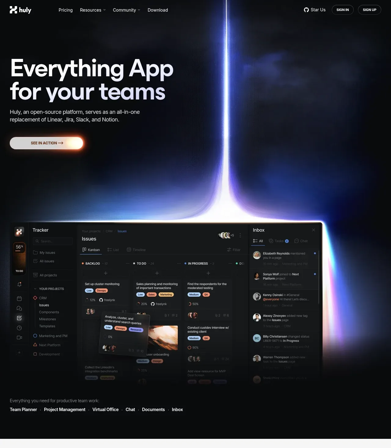 Dark product hero
huly.io · Hero
Dark product hero
huly.io · Hero
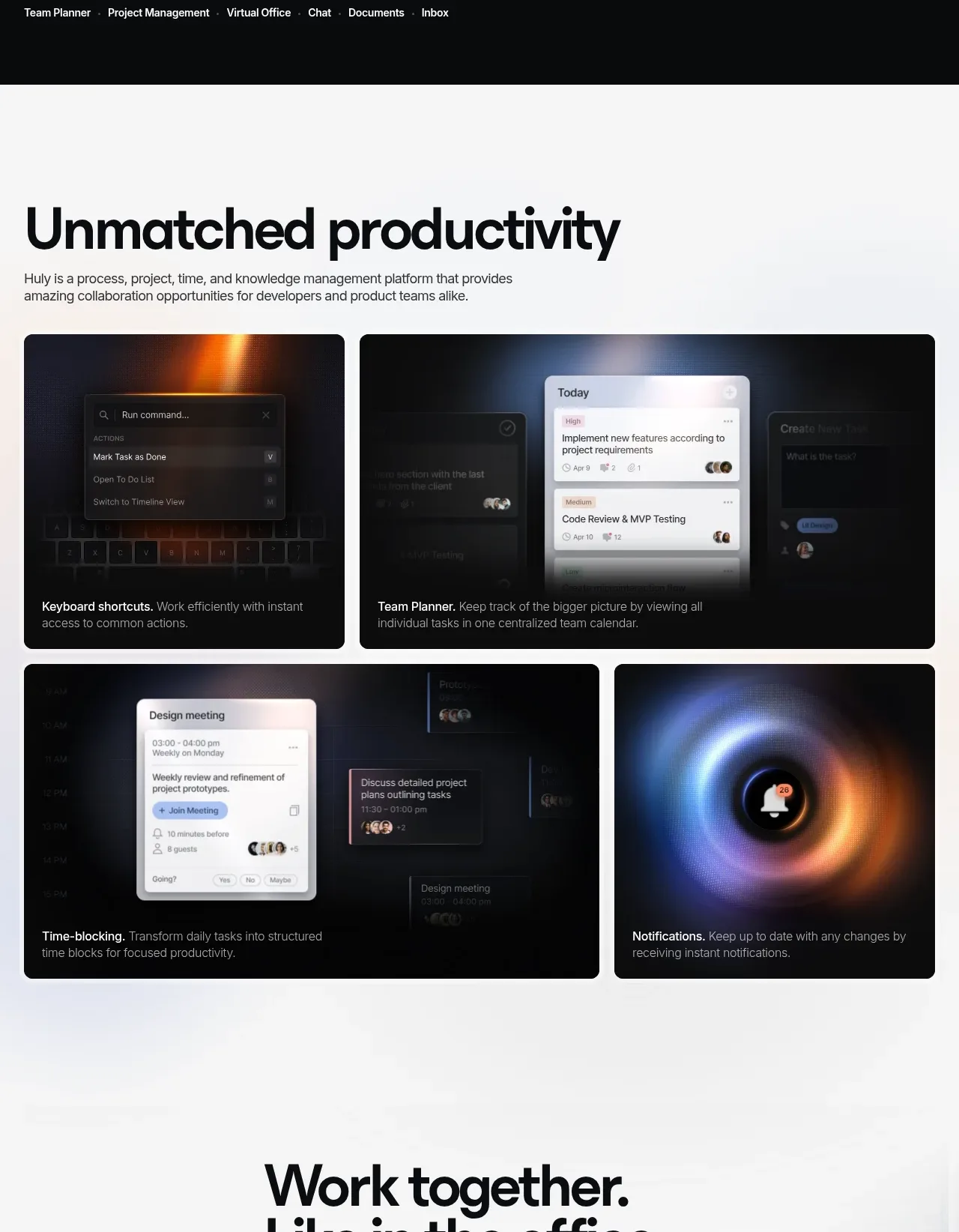 Productivity feature gallery
huly.io · Feature grid
Productivity feature gallery
huly.io · Feature grid
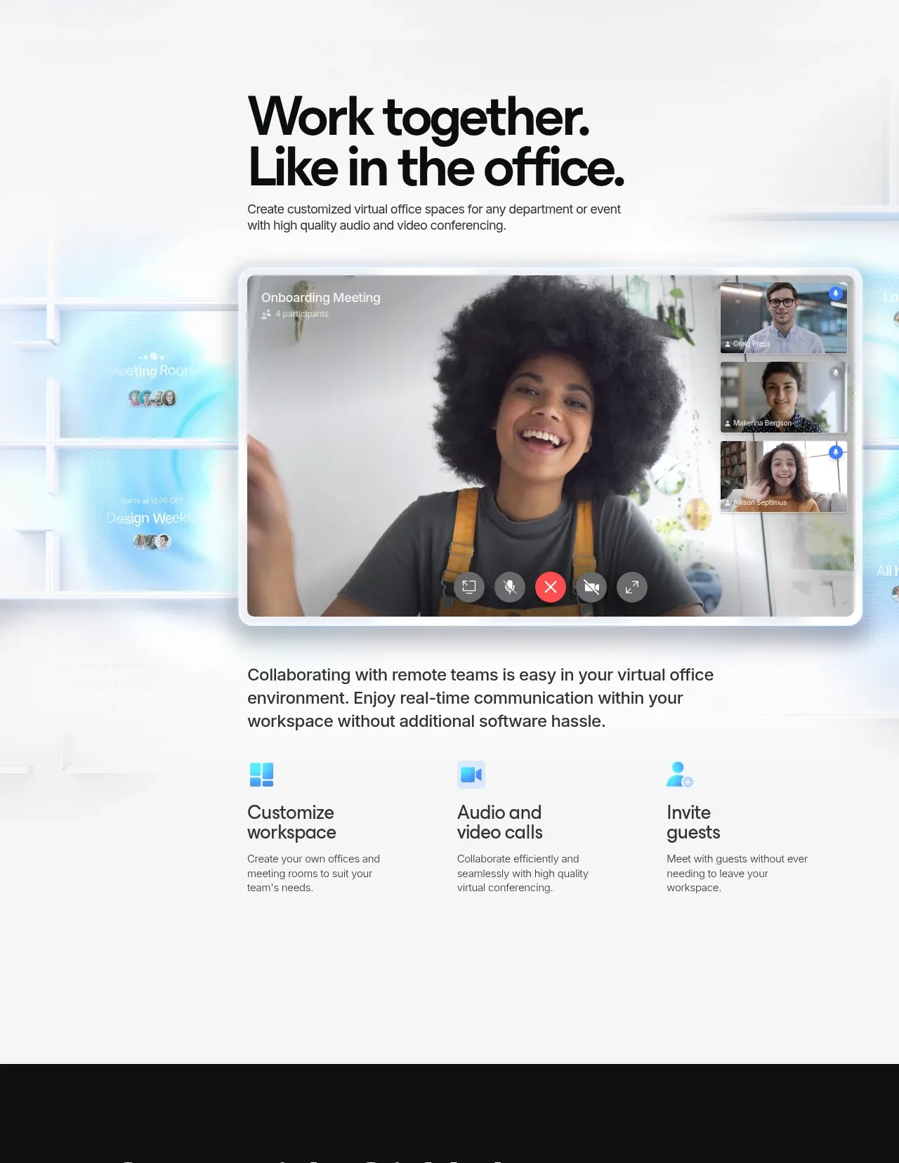 Virtual office collaboration
huly.io · Hero
Virtual office collaboration
huly.io · Hero
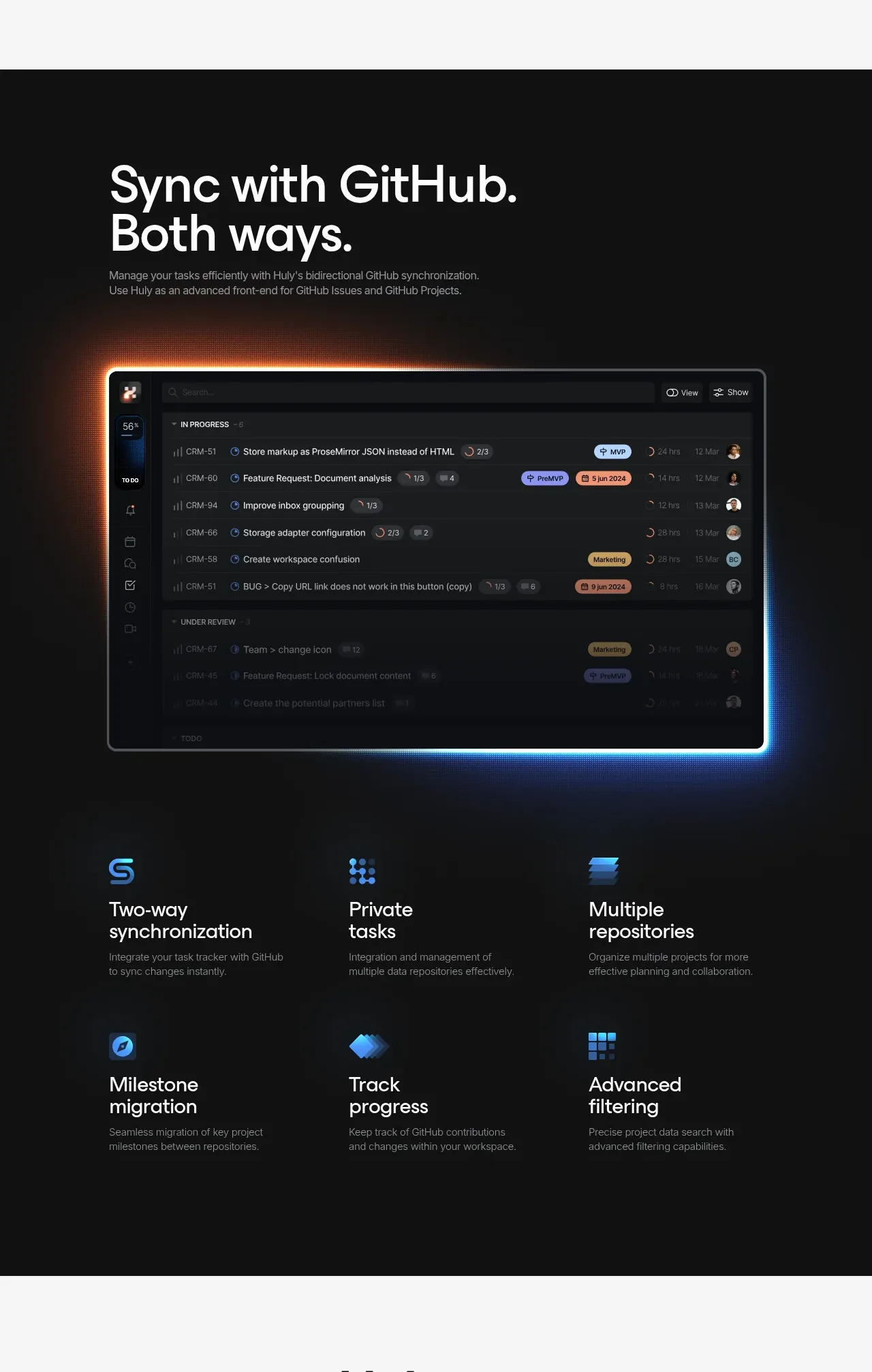 GitHub synchronization features
huly.io · Feature grid
GitHub synchronization features
huly.io · Feature grid
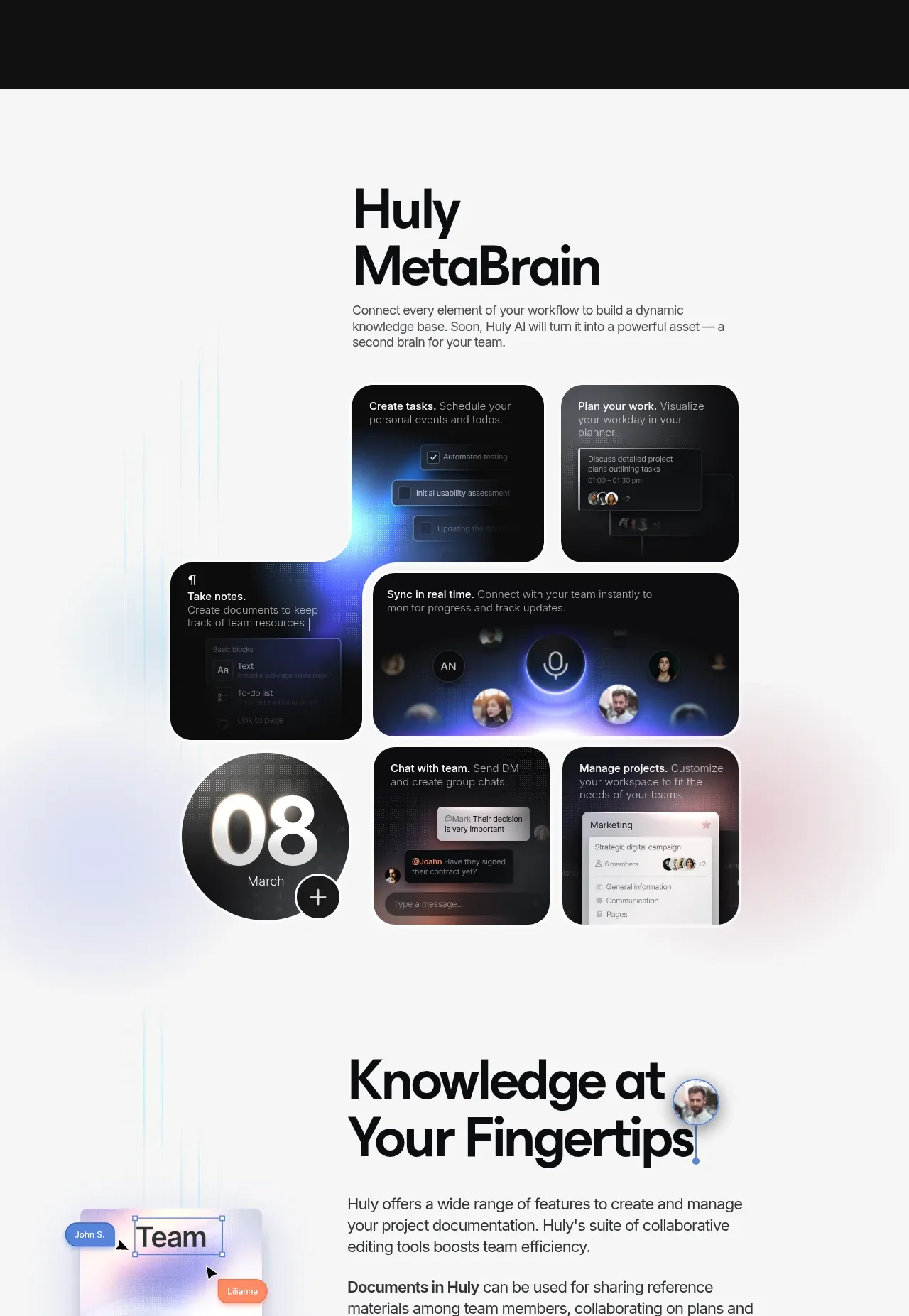 Connected workspace mosaic
huly.io · Feature grid
Connected workspace mosaic
huly.io · Feature grid
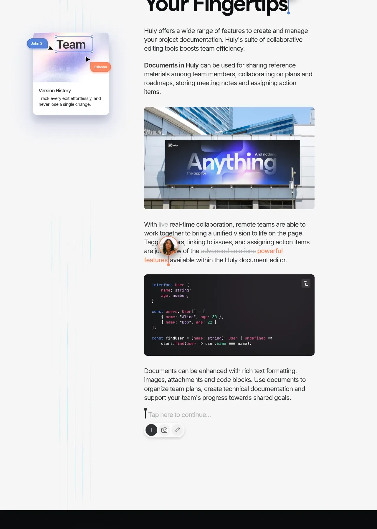 Knowledge and documentation showcase
huly.io · Feature grid
Knowledge and documentation showcase
huly.io · Feature grid
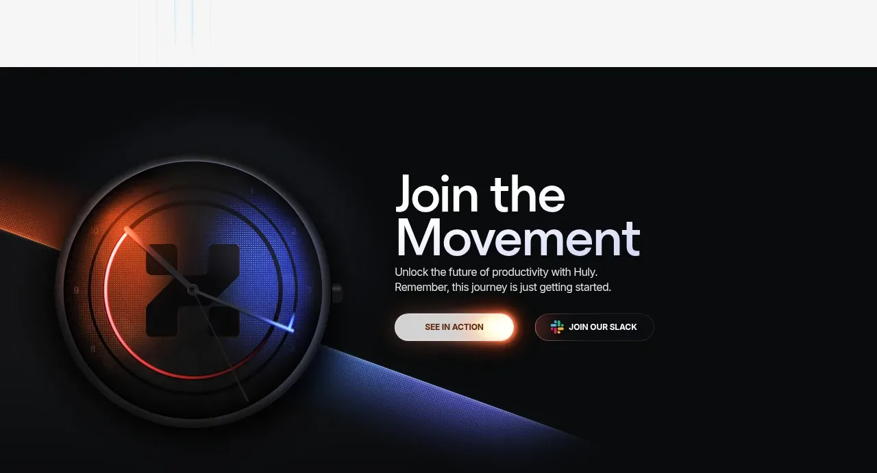 Join the movement CTA
huly.io · Call to action
Join the movement CTA
huly.io · Call to action
 Site footer
huly.io · Footer
Site footer
huly.io · Footer