 kage
kage
humalike.ai
Design analysis
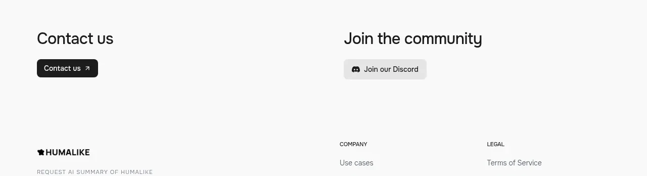
A sparse light band presents two equally weighted next steps—contacting the team and joining the community—without competing with the richer visual sections above.
Prompt preview
## Reference images

Study these alongside the description below: hierarchy, rhythm, spacing, colour. Build for the product you are asked about, using this design language.

- Component: https://kage-design-assets.t3.tigrisfiles.io/components/humalike-x-gta-rp/6ac3c297-ddf9-47c3-9f0d-e872104f2707-1790575369-6.webp
- Full page it was cut from: https://kage-design-assets.t3.tigrisfiles.io/screenshots/humalike-x-gta-rp/6ac3c297-ddf9-47c3-9f0d-e872104f2707-1790575278727-full.webp
- Component on Kage: https://kage.design/component/humalike-x-gta-rp-cta

## Before you start
Ask which two follow-up actions matter most for the user's product and audience. Then apply this simple conversion pattern to those actions.

Build a quiet two-column CTA band on a light background. Give each column a short heading, one compact supporting line if needed, and a single button. Align both columns to a shared grid, keep the hierarchy restrained, and use generous vertical whitespace so the actions feel intentional rather than promotional. On mobile, stack the columns with a clear gap.

Use #faf9f7 or another brand-neutral background, #161616 headings, muted gray #6f6d68 body copy, and one dark filled button plus one softer secondary button. Keep buttons 8–10px rounded, 14–16px text, and provide hover, focus, and disabled states.

### Never
- Never use logos, product names, copy, illustrations, or imagery from the reference.
- Never reuse the reference contact or community wording.
More components
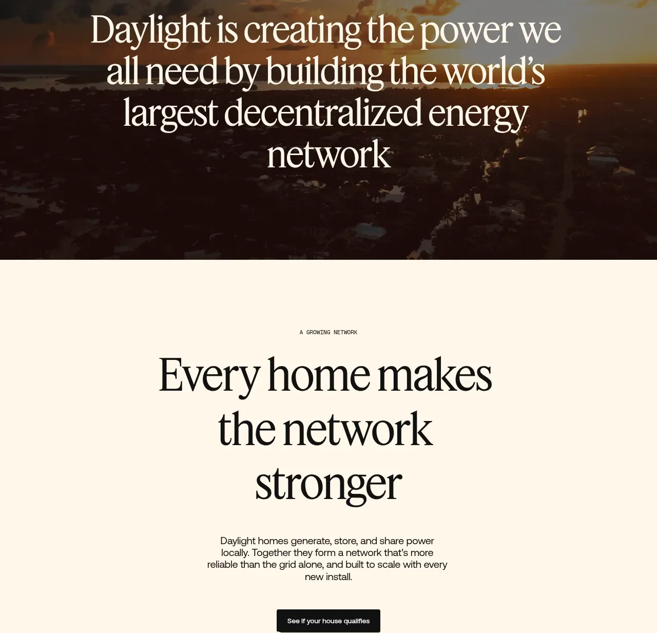
 Network growth CTA
godaylight.com · Call to action
Network growth CTA
godaylight.com · Call to action
 Split closing CTA
godaylight.com · Call to action
Split closing CTA
godaylight.com · Call to action

 Closing conversion banner
FastRouter.ai · Call to action
Closing conversion banner
FastRouter.ai · Call to action
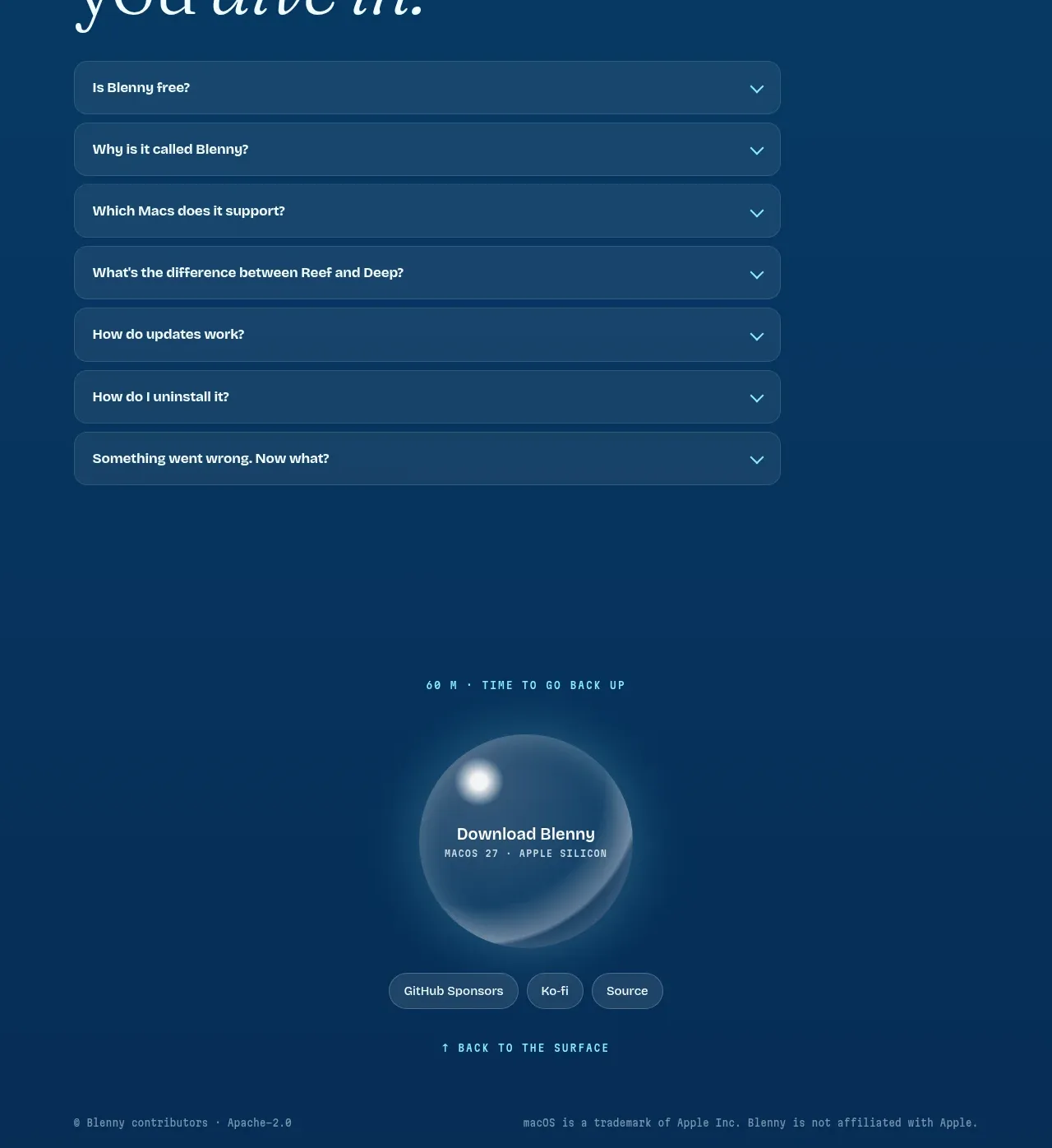
 Final download call to action
Blenny · Call to action
Final download call to action
Blenny · Call to action
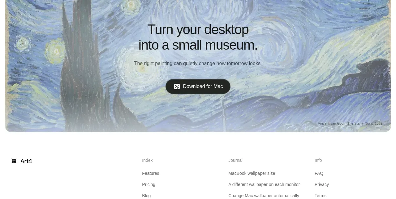
 Visual download call to action
Art4 · Call to action
Visual download call to action
Art4 · Call to action
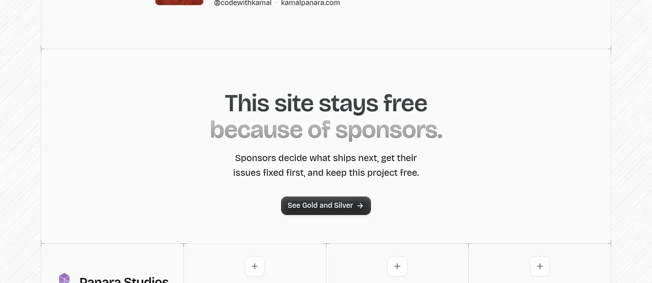
 Sponsor call to action
opensend.cc · Call to action
Sponsor call to action
opensend.cc · Call to action