kage
kage
humalike.ai

Design analysis
A cinematic one-pager built almost entirely from full-bleed GTA V stills, with all copy contained in solid black or white overlay cards so nothing sits directly on the photography. Rhythm comes from a checkerboard alternation — card side and card colour flip with every panel — broken once by a rounded video-showcase card on white after the hero. Chrome stays strictly monochrome (black, white, gray) and lets the warm in-game sunsets supply all colour, closing with two pricing cards floating over a photo and a sparse white footer.
Prompt preview
## Reference images

Study these alongside the description below: hierarchy, rhythm, spacing, colour. Build for the product you are asked about, using this design language.

- Full page: https://kage-design-assets.t3.tigrisfiles.io/screenshots/humalike-x-gta-rp/6ac3c297-ddf9-47c3-9f0d-e872104f2707-1790575278727-full.webp
- Above the fold: https://kage-design-assets.t3.tigrisfiles.io/screenshots/humalike-x-gta-rp/6ac3c297-ddf9-47c3-9f0d-e872104f2707-1790575275030.webp
- Design on Kage: https://kage.design/designs/humalike-x-gta-rp-landing-page

## Before you start
Ask the user what product they are building, who it is for (e.g. game server owners, players, studios), and what brand assets they already have (name, wordmark, colours, type). Wait for their answers before writing any code. Everything below is a design language to apply to *their* product — not a clone of the reference.

## Page structure
1. **Top nav** — transparent bar over the hero: small wordmark with icon on the left; on the right, two social icons, a plain text link ("Contact us"), and a white pill CTA with an ↗ arrow. No border, no background.
2. **Hero** — full-bleed cinematic video/photo background, centered bold uppercase headline, one short subtitle line beneath it, a white pill CTA button, and a small scroll-down chevron near the bottom edge.
3. **Video showcase** — the page background switches to white; a large rounded-corner light-gray card holds an embedded gameplay video with native controls (playhead, duration, volume, fullscreen) and a small picture-in-picture inset. This is the only framed, boxed moment on the page.
4. **Feature panel 1** — full-bleed photograph edge to edge; a white text card anchored right with a bold uppercase headline, one intro sentence, and two bullets.
5. **Feature panel 2** — same pattern but a black card anchored left, white text, three bullets.
6. **Feature panel 3** — white card anchored right, six short role bullets.
7. **Feature panel 4** — black card anchored left, three bullets about groups/factions; the photo itself carries a stylized in-game subtitle overlay as texture.
8. **Feature panel 5** — white card anchored right, six configuration bullets plus one closing sentence.
9. **Feature panel 6** — black card anchored left, a three-step Install / Create / Deploy list.
10. **Proof panel** — same photo+card pattern; the card contains three big numeric stats (players, conversation turns, days live) and a wrap-up sentence.
11. **Pricing** — two floating cards over a sunset photograph: a dark translucent card and a solid white highlighted card, each with plan name, large price with /mo suffix, three checkmark bullets, pill CTA, and small legal/compatibility print with a Documentation link.
12. **Footer CTA band** — plain white, two columns: "Contact us" heading with a dark pill button, and "Join the community" heading with a Discord pill button.
13. **Footer** — white, sparse: wordmark, a one-line brand statement, three small social icons, two link columns (Company / Legal), tiny gray small print.

## Design language
- **Photography carries the page.** Every major section is a full-bleed, cinematic still (warm, sun-lit, shallow depth of field). Never place text directly on a photo — always pull copy into a solid overlay card so contrast is guaranteed without gradients or scrims.
- **Checkerboard rhythm.** Alternate the overlay card side (left, right, left…) and its colour (black, white, black…) panel by panel. This flips the visual weight down the page and keeps six similar sections from feeling repetitive. Break the rhythm once, early, with a framed/rounded card on a white band (the video showcase) so the full-bleed panels land harder afterwards.
- **Monochrome chrome, photographic colour.** UI is strictly black `#0A0A0A`, white `#FFFFFF`, and gray `#6B7280` body text. All colour comes from the imagery (warm oranges, greens). No accent colour, no gradients on UI elements.
- **Type scale.** Display headlines: bold, uppercase, tightly tracked grotesque, roughly `clamp(2.2rem, 4vw, 3.4rem)`, breaking across 2–3 short lines and ending with a period. Body: 14–15px regular, gray, narrow measure (~32ch) inside cards. Bullets: same size as body, with small round markers. Card headings sit directly above 1–2 lines of intro copy, then the list.
- **Cards.** Near-square corners (4–8px radius), subtle shadow, generous padding (~40px), max-width ~42% of the viewport, vertically centered against the photo. Dark cards: white heading, `#9CA3AF` body on `#0A0A0A`. White cards: `#111` heading, `#4B5563` body.
- **Buttons.** Pill-shaped (fully rounded), white background with near-black text plus an ↗ arrow for primary actions; near-black pills for secondary. Small size, no borders.
- **Section shaping.** Full-bleed photo panels separated by white background gaps with rounded top/bottom corners (~24px) on the panels, so the white page peeks through as thin horizontal breaks.
- **Pricing.** Two cards floating over photography rather than on a flat background: one dark glass/translucent, one solid white as the highlighted tier; large price numerals, ✓ bullets, and small gray fine print with a linked "Documentation →" line.
- **Motion.** Minimal: a scroll chevron in the hero, native video controls, and standard hover states on pills and links. Let the photography do the animating (subtle video/parallax in hero is enough).
- **Footer.** Deliberately quiet: lots of white, tiny gray type, plain text link columns, no photography.

## Never
- Do not use GTA, Rockstar, FiveM branding, in-game screenshots, loading-screen art, or any imagery from the reference.
- Do not copy the reference's wordmark, product name, headlines, bullet copy, stats, or pricing numbers — write original copy for the user's product.
- Do not reuse the reference's photographic scenes (bedroom hero, gas station, car wash, lowrider garage, sunset street) — source or generate imagery appropriate to the user's own world.
- Do not present the result as the reference product; apply the layout system and design language to the user's brand only.
Components from this page
All components
 Floating site navigation
Humalike x GTA RP · Navigation
Floating site navigation
Humalike x GTA RP · Navigation
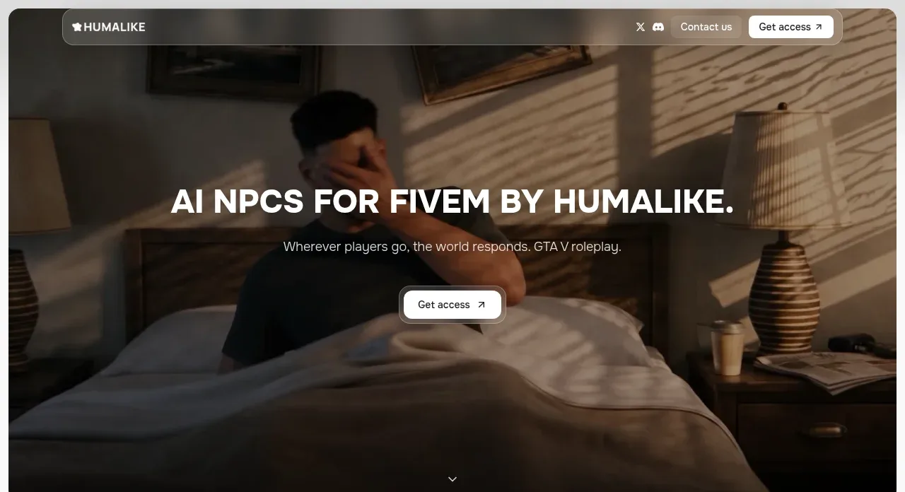 Cinematic AI NPC hero
Humalike x GTA RP · Hero
Cinematic AI NPC hero
Humalike x GTA RP · Hero
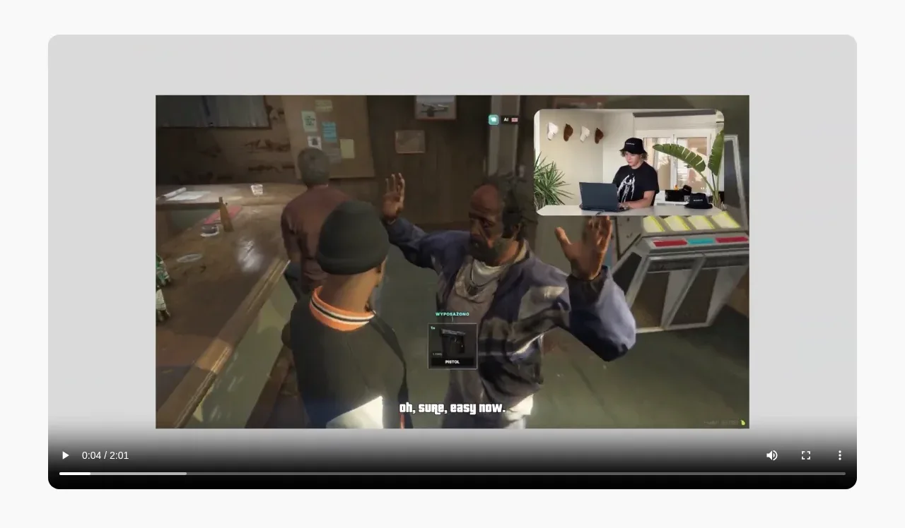 Product demonstration video
Humalike x GTA RP · Gallery
Product demonstration video
Humalike x GTA RP · Gallery
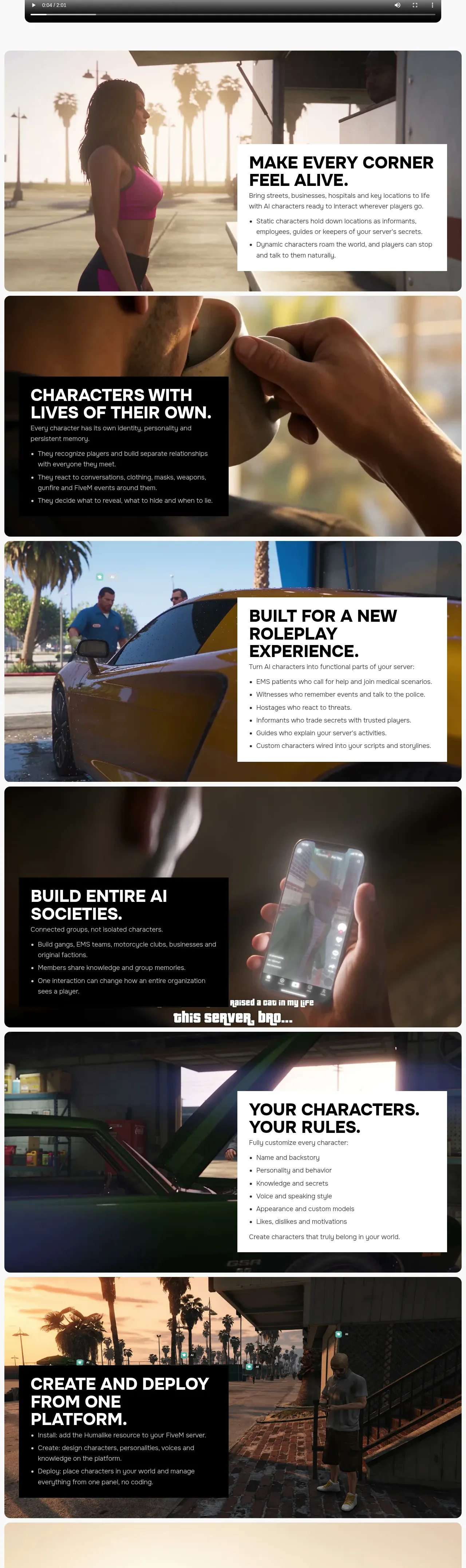 AI character capability stories
Humalike x GTA RP · Feature grid
AI character capability stories
Humalike x GTA RP · Feature grid
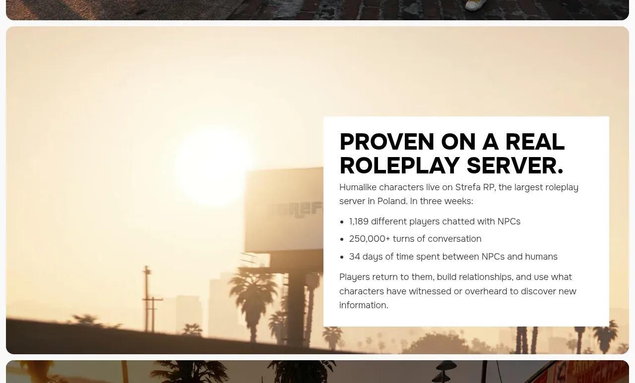 Real-world proof section
Humalike x GTA RP · Stats
Real-world proof section
Humalike x GTA RP · Stats
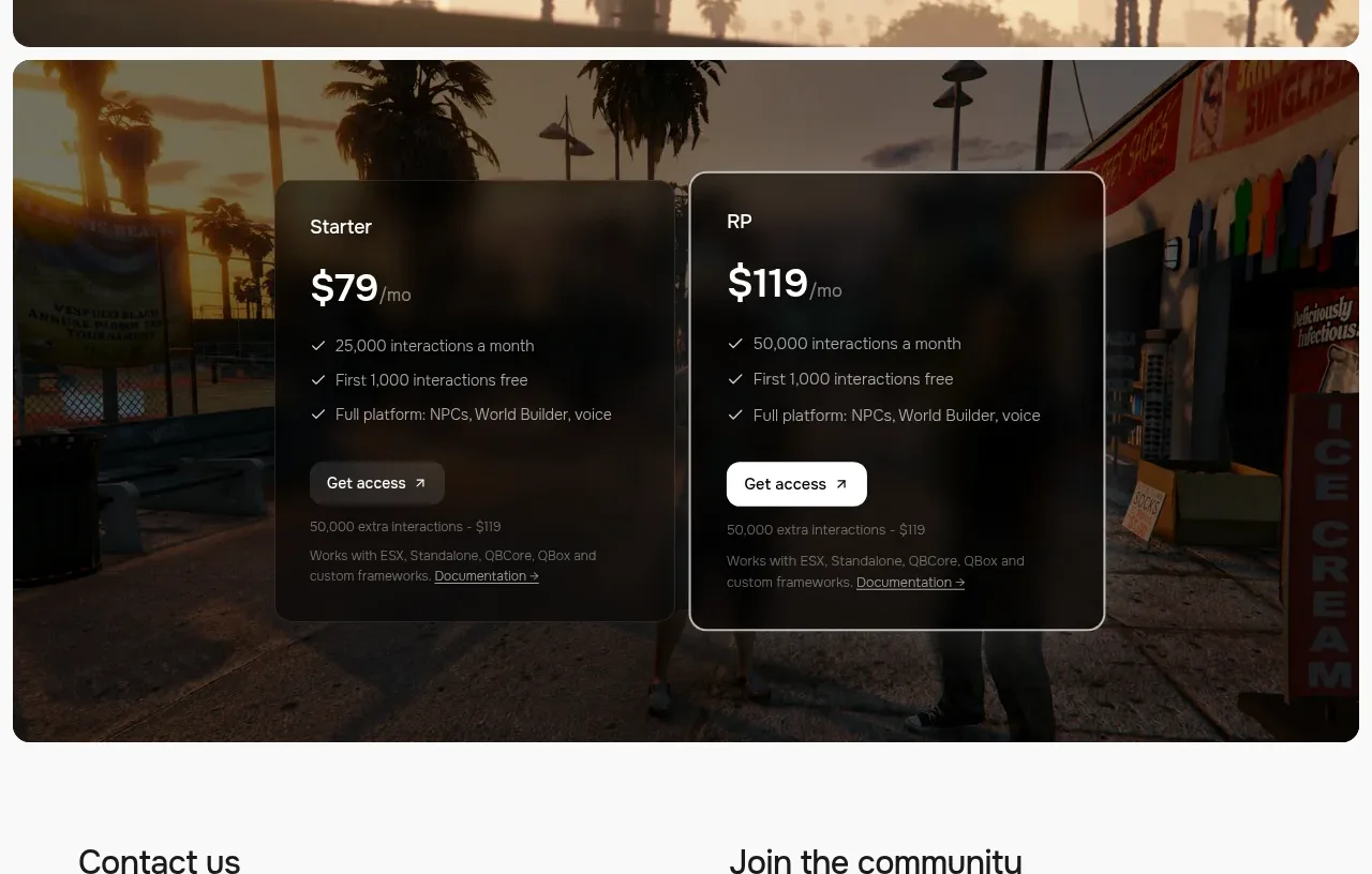 Two-plan access pricing
Humalike x GTA RP · Pricing table
Two-plan access pricing
Humalike x GTA RP · Pricing table
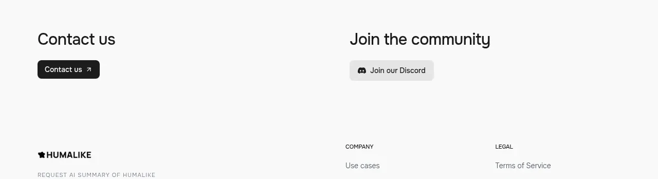 Contact and community actions
Humalike x GTA RP · Call to action
Contact and community actions
Humalike x GTA RP · Call to action
 Minimal site footer
Humalike x GTA RP · Footer
Minimal site footer
Humalike x GTA RP · Footer