kage
kage
humalike.ai
Design analysis
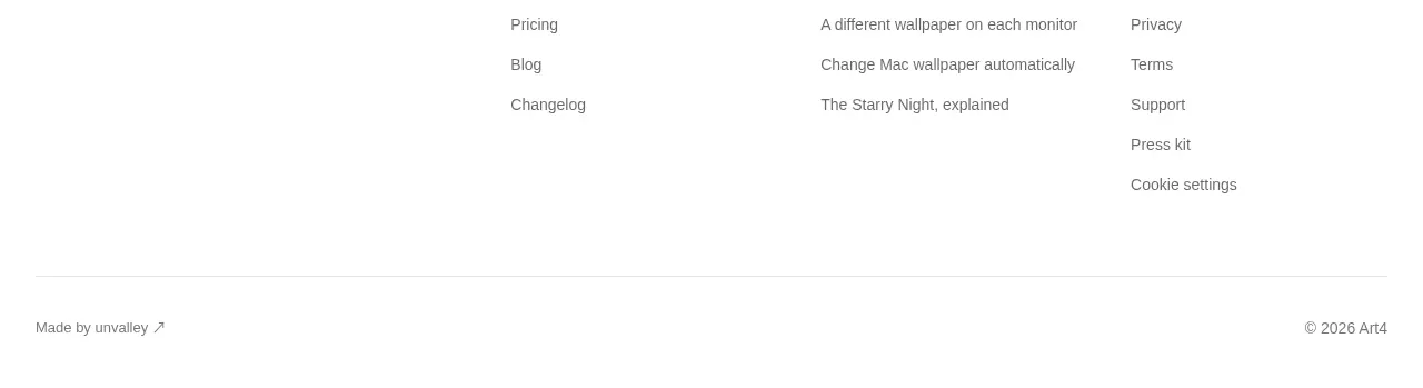
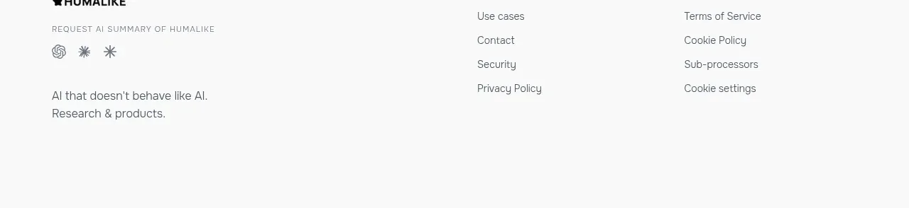
The footer switches to a clean white layout with a compact brand/about block and separated navigation and legal link columns, giving the long page a calm finish.
Prompt preview
## Reference images

Study these alongside the description below: hierarchy, rhythm, spacing, colour. Build for the product you are asked about, using this design language.

- Component: https://kage-design-assets.t3.tigrisfiles.io/components/humalike-x-gta-rp/6ac3c297-ddf9-47c3-9f0d-e872104f2707-1790575369-7.webp
- Full page it was cut from: https://kage-design-assets.t3.tigrisfiles.io/screenshots/humalike-x-gta-rp/6ac3c297-ddf9-47c3-9f0d-e872104f2707-1790575278727-full.webp
- Component on Kage: https://kage.design/component/humalike-x-gta-rp-footer

## Before you start
Ask what brand details, support destinations, and legal links the user's product requires. Then apply the following information architecture to that product.

Create a clean multi-column footer on an off-white surface. Place a compact brand/about block on the left, optionally with a short value statement, and organize the remaining links into clearly labeled groups such as product, company, resources, and legal. Use generous top padding, a subtle divider, and enough bottom space for the page to end comfortably. Collapse link groups into stacked sections on mobile while preserving readable tap targets.

Use #faf9f7 background, #171717 headings, #73716c secondary text, and divider #17171718. Keep typography smaller than the main page but not below accessible reading sizes, use 8–12px gaps between links, and add understated underline or color changes on hover. Include visible focus rings and mark external links where appropriate.

### Never
- Never use logos, product names, copy, illustrations, or imagery from the reference.
- Never copy the reference footer content, company/legal names, or icon marks.