kage
kage
humalike.ai
Design analysis
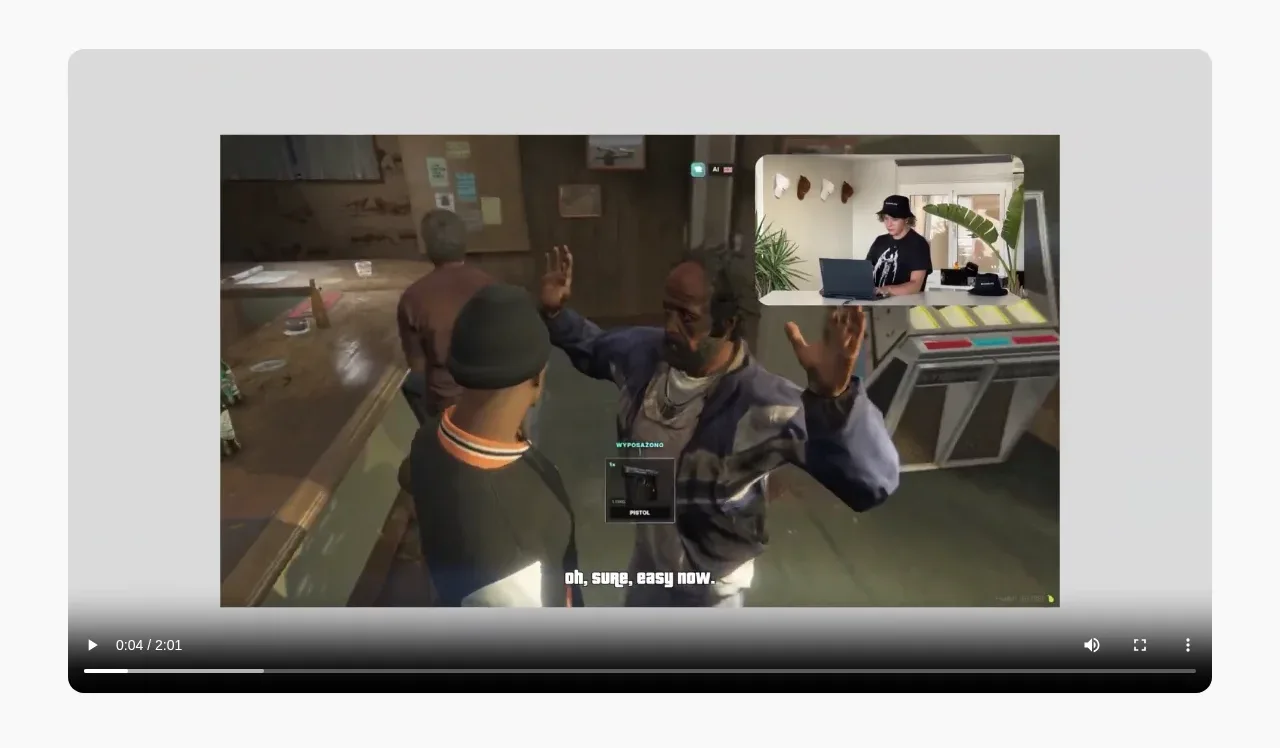
A pale rounded panel isolates a large embedded product video, giving the visitor an immediate proof point after the hero while retaining generous surrounding whitespace.
Prompt preview
## Reference images

Study these alongside the description below: hierarchy, rhythm, spacing, colour. Build for the product you are asked about, using this design language.

- Component: https://kage-design-assets.t3.tigrisfiles.io/components/humalike-x-gta-rp/6ac3c297-ddf9-47c3-9f0d-e872104f2707-1790575367-2.webp
- Full page it was cut from: https://kage-design-assets.t3.tigrisfiles.io/screenshots/humalike-x-gta-rp/6ac3c297-ddf9-47c3-9f0d-e872104f2707-1790575278727-full.webp
- Component on Kage: https://kage.design/component/humalike-x-gta-rp-gallery

## Before you start
Ask what the user's product needs to demonstrate and whether the content is best shown as a video, animation, or interactive preview. Then apply these principles to that product.

Build a spacious demonstration section on a soft neutral background. Center a large 16:9 media player inside a rounded light-gray panel, with generous inset padding and a subtle shadow or border. Preserve the media aspect ratio, use native or custom controls, and ensure the player remains legible on mobile by allowing horizontal breathing room rather than cropping important content. The section should feel like a proof/demo moment, not a dense feature grid.

Use an off-white page background #faf9f7, panel gray #dededc, player surface #161616, and restrained borders around #00000012. Use 14–18px radii. Include play/pause, progress, volume, and fullscreen affordances only when implementing custom controls, with clear focus states and captions where relevant.

### Never
- Never use logos, product names, copy, illustrations, or imagery from the reference.
- Never reuse the reference video or screenshot.