 kage
kage
humalike.ai

Design analysis
A warm, sunlit media panel supports a white proof card with quantified usage and a short explanation of retention and relationship-building, turning abstract claims into evidence.
Prompt preview
## Reference images

Study these alongside the description below: hierarchy, rhythm, spacing, colour. Build for the product you are asked about, using this design language.

- Component: https://kage-design-assets.t3.tigrisfiles.io/components/humalike-x-gta-rp/6ac3c297-ddf9-47c3-9f0d-e872104f2707-1790575368-4.webp
- Full page it was cut from: https://kage-design-assets.t3.tigrisfiles.io/screenshots/humalike-x-gta-rp/6ac3c297-ddf9-47c3-9f0d-e872104f2707-1790575278727-full.webp
- Component on Kage: https://kage.design/component/humalike-x-gta-rp-stats

## Before you start
Ask which measurable outcomes and customer evidence are credible for the user's product. Then apply these principles without inventing unsupported claims.

Build a proof section as a wide rounded image panel with a warm, low-detail background and a readable light content card aligned to one side. The card should contain a strong evidence-led heading, one context paragraph, three or four concise metrics in a bulleted or stacked format, and a closing interpretation of what the numbers mean. Keep numbers visually scannable and avoid overloading the panel. Use a responsive layout that moves the card below or over the image on small screens.

Use warm neutrals such as #f5e6c8, white #fffefaF2, black #101010, and body gray #5f5d58. Use 12–16px radii, subtle shadow, 30–44px card padding, and high contrast. If metrics are animated, respect reduced-motion preferences and do not animate values in a way that harms comprehension.

### Never
- Never use logos, product names, copy, illustrations, or imagery from the reference.
- Never fabricate statistics or reuse the reference server's figures.
More components
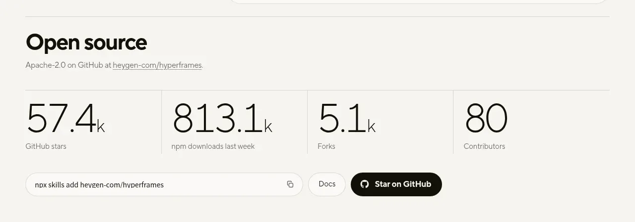
 Open-source proof and repository stats
HyperFrames Studio (Desktop) · Stats
Open-source proof and repository stats
HyperFrames Studio (Desktop) · Stats
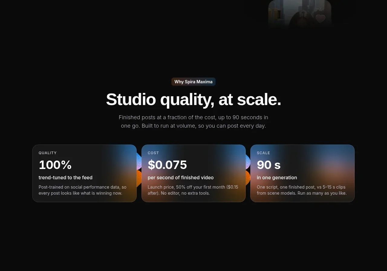
 Quality, cost, and scale metrics
Spira Maxima · Stats
Quality, cost, and scale metrics
Spira Maxima · Stats
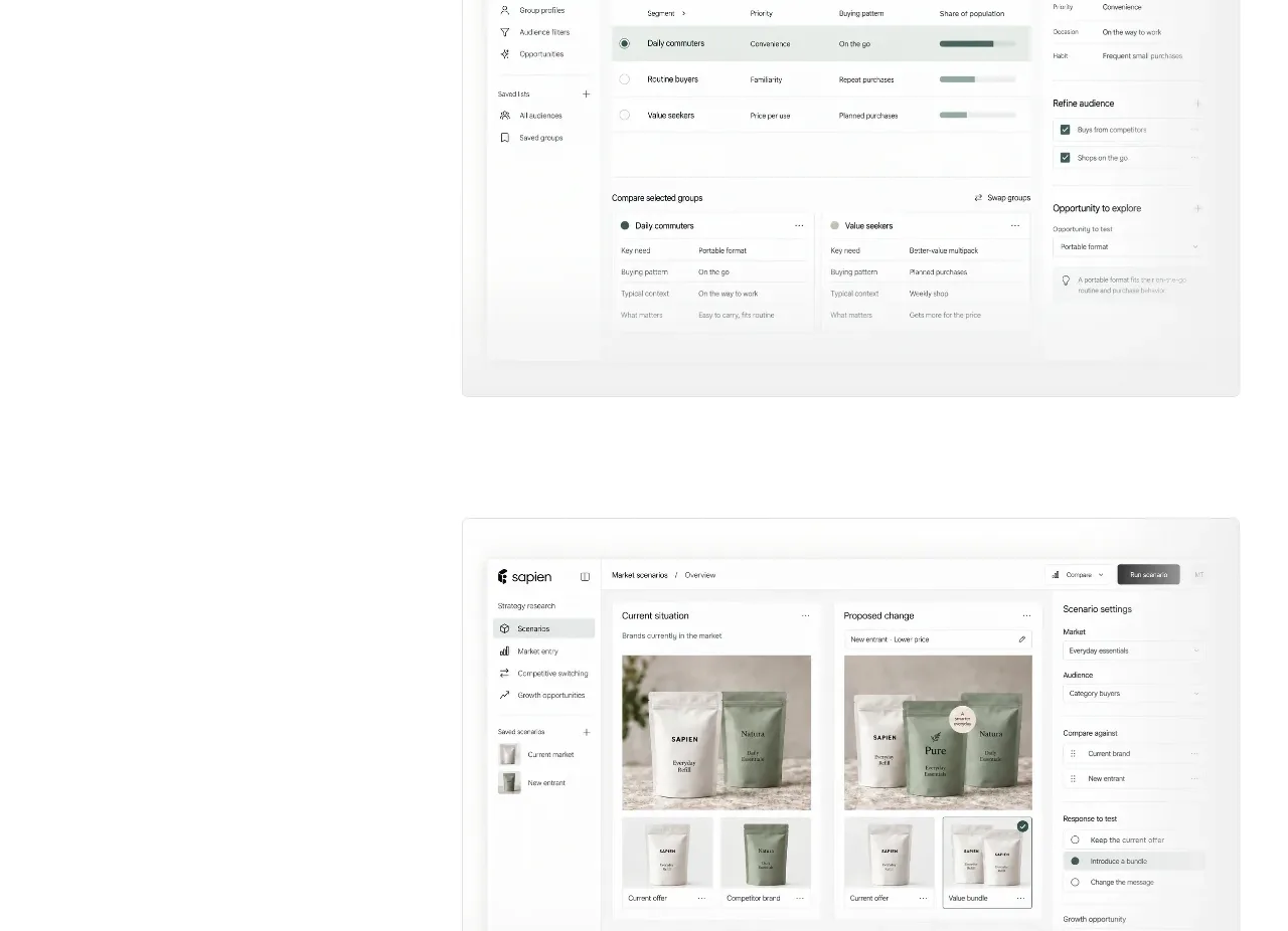
 Prediction benchmark statistic
Sapien · Stats
Prediction benchmark statistic
Sapien · Stats
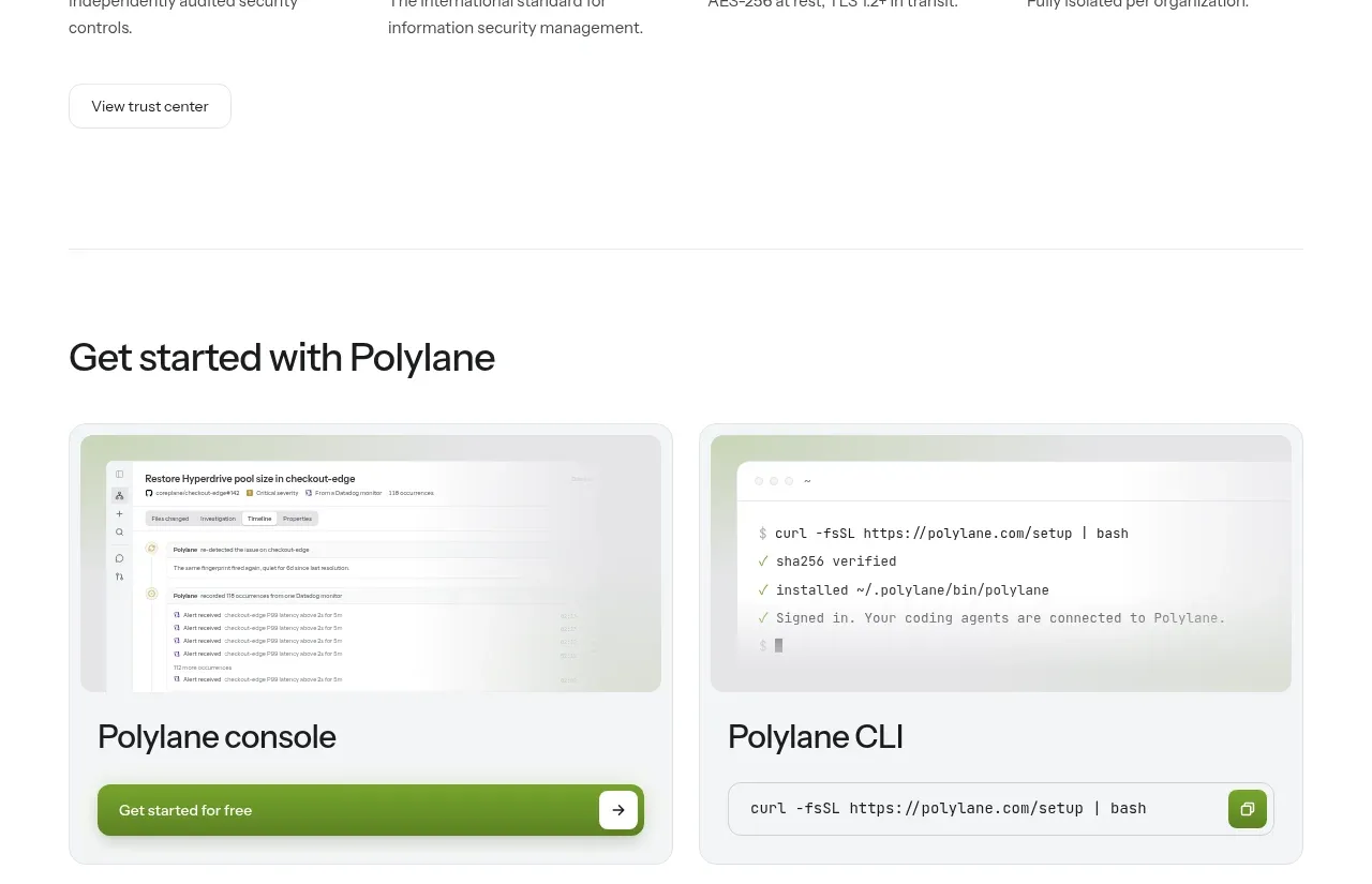
P
Security and trust assurances
Polylane · Stats

 Safety and control principles
Omnia Agent · Stats
Safety and control principles
Omnia Agent · Stats

 Customer proof and outcome grid
ColdIQ x Slack · Stats
Customer proof and outcome grid
ColdIQ x Slack · Stats