kage
kage
hypervibe.so

Design analysis
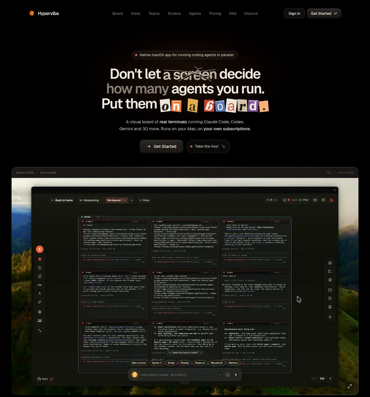
A nearly black, centered marketing page uses restrained orange accents, fine divider rules, and a serif/sans-serif type pairing to create an editorial developer-tool feel. The hero establishes the product with oversized stacked typography and a large framed product capture; below it, the page alternates left-aligned feature introductions with wide UI demos and compact two-column capability grids, then shifts into an onboarding panel, pricing, FAQ, community, final CTA, and a sparse multi-column footer. Visual rhythm comes from generous vertical spacing, repeated rounded screenshots with subtle green landscape edges, and increasingly information-dense sections toward pricing and footer.
Prompt preview
## Reference images

Study these alongside the description below: hierarchy, rhythm, spacing, colour. Build for the product you are asked about, using this design language.

- Full page: https://kage-design-assets.t3.tigrisfiles.io/screenshots/hypervibe/0f025394-2dff-4c9b-be5f-8e394ec4a30f-1791699070438-full.webp
- Above the fold: https://kage-design-assets.t3.tigrisfiles.io/screenshots/hypervibe/0f025394-2dff-4c9b-be5f-8e394ec4a30f-1791699059327.webp
- Design on Kage: https://kage.design/designs/hypervibe-landing-page

## Before you start
Ask the user what they are building, who it is for, and what brand assets they already have (product name, logo, colours, typography, imagery, and existing UI). Wait for their answers before designing. Apply the system below to their product, not to the reference product.

## Page structure
1. **Header navigation** — Use a slim, centered navigation bar on a black canvas, with a small brand mark at left, compact low-contrast links in the middle, and subdued sign-in and primary-action buttons at right.
2. **Hero eyebrow and headline** — Add a small pill-shaped eyebrow above a large, centered, stacked headline. Mix a refined serif treatment with a clean sans-serif emphasis, and use a small orange-highlighted word or label as a visual anchor.
3. **Hero supporting copy and actions** — Place a short description below the headline, followed by two compact pill buttons: one primary and one secondary/demo action.
4. **Hero product capture** — Show a large rounded screenshot or product mockup beneath the hero, framed like a desktop application window with a thin top bar and a dark interface over a subtle atmospheric background.
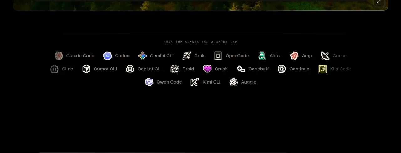
5. **Supported tools strip** — Add a centered, widely spaced row of small tool badges or names beneath the hero capture, with muted labels and restrained multicolour marks.
6. **Feature section: workspace** — Introduce the first capability with a numbered uppercase eyebrow, a large left-aligned heading, a narrow explanatory paragraph, and a wide product screenshot below. Follow it with a two-column grid of smaller screenshots, each with a concise title and description.
7. **Feature section: voice interaction** — Repeat the numbered section pattern with a new heading and paragraph, then show one large, wide application capture. Keep the section sparse so the single demo feels prominent.
8. **Feature section: orchestration** — Present another numbered heading and explanatory copy, followed by a large screenshot and a two-column row of supporting screenshots with captions.
9. **Feature section: studios** — Use a numbered heading and copy, then a balanced two-column grid of four smaller product captures. Each card should have a compact caption beneath it.
10. **Feature section: continuity** — Repeat the feature rhythm with a heading and description, then use a two-column grid of four screenshots showing history, usage, accounts, or memory-related capabilities.
11. **System/onboarding panel** — Insert a large inset panel with a subtly different near-black surface and clipped or chamfered decorative edges. Center a heading and small eyebrow, place a collage of supported tool marks or abstract product symbols, then add four compact principle cards and a three-step setup row connected by subtle directional lines.
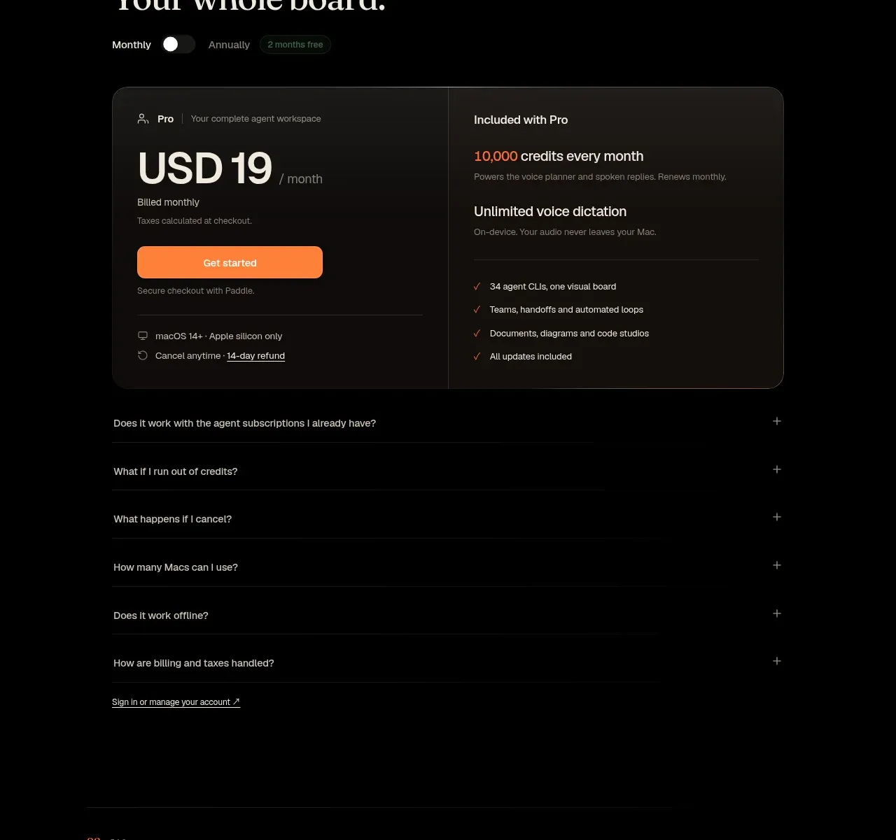
12. **Pricing section** — Add a numbered pricing heading with a monthly/annual toggle. Use a wide rounded two-column pricing card: the left side shows plan name, large price, purchase button, and terms; the right side lists included features with checkmarks. Follow with collapsed FAQ rows specific to billing and usage.
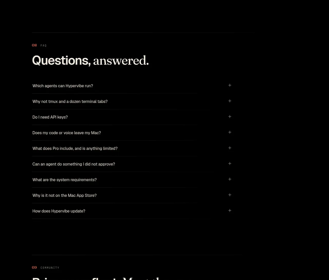
13. **FAQ section** — Use a separate numbered heading and a vertically stacked list of questions. Keep rows sparse, separated by faint rules, with a small plus control aligned at the far right.
14. **Community section** — Introduce the community with a numbered heading and short paragraph, then show a wide rounded dark panel split between floating community/tool symbols on the left and explanatory copy, numbered benefits, and a light CTA button on the right.
15. **Final CTA** — Center a short two-line call to action with two pill buttons and a tiny platform note beneath it.
16. **Footer** — Use a thin top divider, then a multi-column footer with a small brand block and badge, product/resource/legal link columns, and a large decorative typographic wordmark-like treatment near the bottom. Finish with tiny copyright and system-note text in low contrast.

## Design language
- Build hierarchy with a restrained scale: tiny uppercase section labels, 32–48px editorial headings, compact 12–14px body copy, and a much larger hero headline. Keep most text left-aligned after the centered hero.
- Pair a high-contrast editorial serif for major headlines with a neutral grotesk sans-serif for navigation, descriptions, labels, buttons, and interface copy. Use italic serif selectively for emphasis rather than decorating every heading.
- Use near-black as the dominant background, approximately `#050505` to `#0a0a09`, with warm off-white text around `#eee9e1` and secondary gray text around `#88837b`.
- Reserve a muted orange/coral accent, approximately `#e86d3f`, for eyebrows, active states, tiny highlights, and occasional emphasis. Let screenshots and supported-tool marks provide the few brighter colours.
- Keep the page narrow and centered, with generous vertical gaps between major sections. Start with airy hero spacing, move into repeated demo-led feature blocks, then increase information density in onboarding, pricing, FAQ, and footer.
- Treat product screenshots as the main visual language: use wide rounded rectangles, very thin gray borders, faint shadows, dark chrome, and occasional atmospheric green/blue imagery behind the application UI. Avoid heavy cards when a screenshot can carry the section.
- Use borders as quiet structural rules: 1px low-contrast dividers, thin framed panels, and subtle inset surfaces. Keep radii moderate, roughly 10–16px for screenshots and panels, and avoid glossy gradients or large drop shadows.
- Make secondary cards feel almost flush with the background; use slight tonal shifts such as `#11110f` and `#171614` rather than strong contrast. The onboarding panel can be a warmer brown-black to mark a change of rhythm.
- Use compact pill buttons with dark fills and hairline borders; make the main CTA slightly brighter or warmer without becoming saturated. Keep labels short and controls understated.
- Use repeated numbered sections to create navigation through the long page. Allow each feature block to breathe, then tighten captions and grids below the primary demo to create a predictable editorial cadence.
- Where interaction is visible, use gentle hover elevation, border brightening, and colour changes only; avoid fast or theatrical motion. Product screenshots should feel like stills from a responsive desktop app, with any carousel or reveal motion subtle and optional.
- Ensure the layout collapses cleanly on mobile: stack screenshot grids, preserve the section numbering, keep the hero centered, and turn the wide pricing and community panels into vertical flows.

## Never
- Do not copy any logo, wordmark, product name, tagline, interface copy, tool marks, illustrations, photography, or icon set from the reference.
- Do not reproduce the reference product or present the result as Hypervibe.
- Do not use the reference screenshots as literal assets; create original UI examples and brand-specific supporting visuals for the user’s product.
- Do not turn every section into a card grid, add bright generic gradients, or replace the quiet editorial spacing with a dense dashboard layout.
Components from this page
All components
 Top navigation
Hypervibe · Navigation
Top navigation
Hypervibe · Navigation
 Hero with product visual
Hypervibe · Hero
Hero with product visual
Hypervibe · Hero
 Supported tools strip
Hypervibe · Logo cloud
Supported tools strip
Hypervibe · Logo cloud
 Core workspace feature section
Hypervibe · Feature grid
Core workspace feature section
Hypervibe · Feature grid
 Voice collaboration section
Hypervibe · Feature grid
Voice collaboration section
Hypervibe · Feature grid
 Agent orchestration section
Hypervibe · Feature grid
Agent orchestration section
Hypervibe · Feature grid
 Studios and output grid
Hypervibe · Feature grid
Studios and output grid
Hypervibe · Feature grid
 Continuity and memory grid
Hypervibe · Feature grid
Continuity and memory grid
Hypervibe · Feature grid
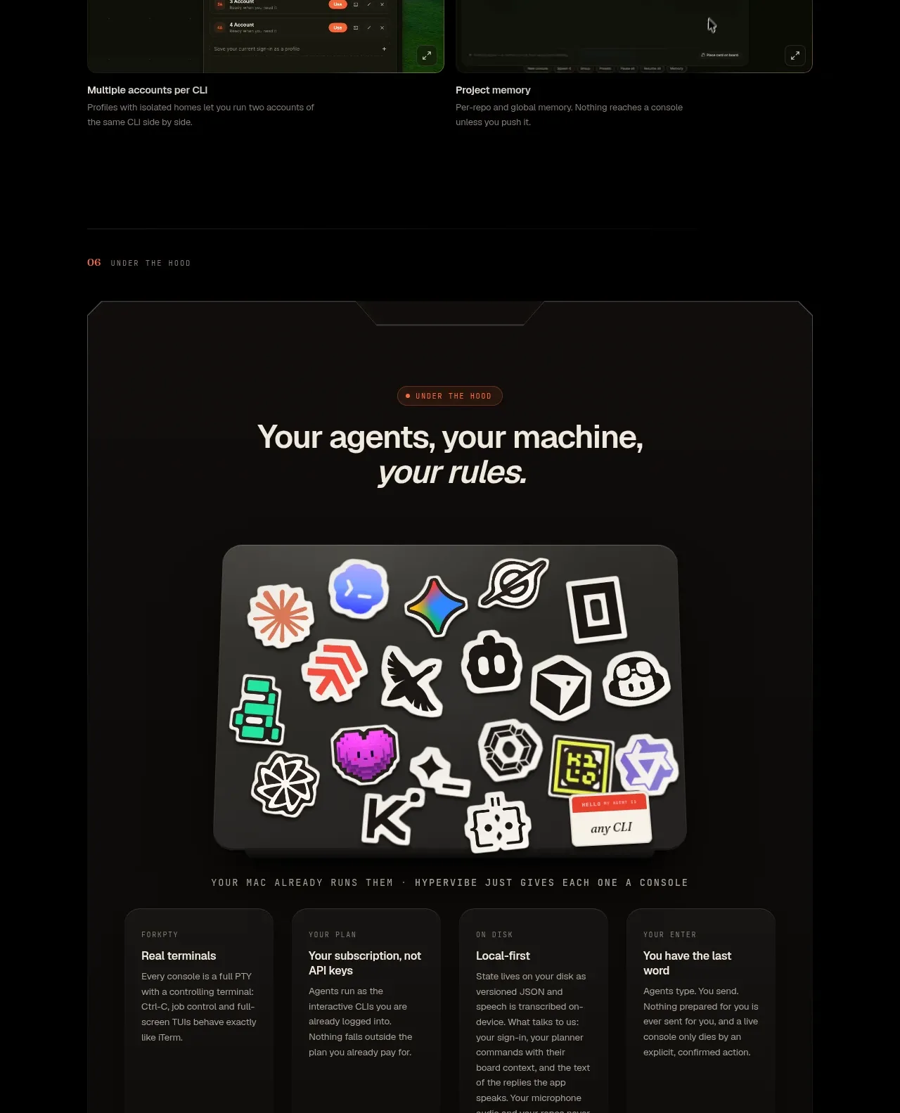 Setup principles card
Hypervibe · Card
Setup principles card
Hypervibe · Card
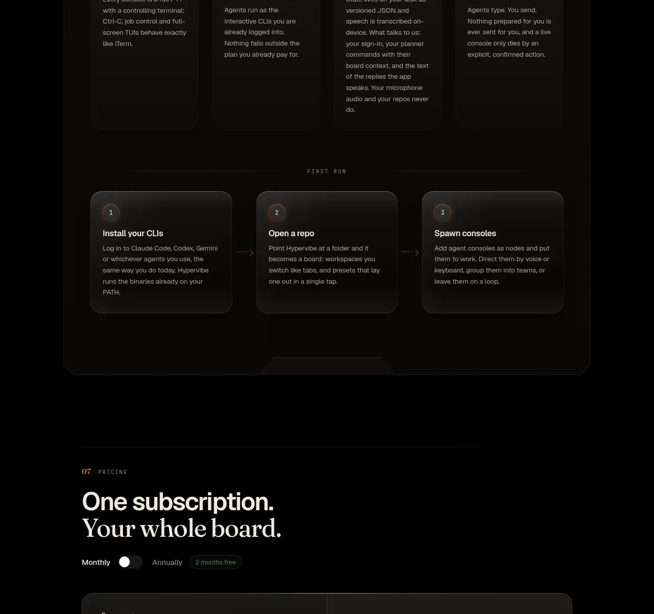 Single-plan pricing
Hypervibe · Pricing table
Single-plan pricing
Hypervibe · Pricing table
 Product FAQ
Hypervibe · FAQ
Product FAQ
Hypervibe · FAQ
 Community invitation
Hypervibe · Call to action
Community invitation
Hypervibe · Call to action