 kage
kage
hypervibe.so

Design analysis
A compact black navigation bar establishes the product identity, primary destinations, and two contrasting account actions without competing with the hero.
Prompt preview
## Reference images

Study these alongside the description below: hierarchy, rhythm, spacing, colour. Build for the product you are asked about, using this design language.

- Component: https://kage-design-assets.t3.tigrisfiles.io/components/hypervibe/0f025394-2dff-4c9b-be5f-8e394ec4a30f-1791699111-0.webp
- Full page it was cut from: https://kage-design-assets.t3.tigrisfiles.io/screenshots/hypervibe/0f025394-2dff-4c9b-be5f-8e394ec4a30f-1791699070438-full.webp
- Component on Kage: https://kage.design/component/hypervibe-navigation

## Before you start
Ask what the user's product is, who it serves, and what brand personality and conversion goal the navigation should support. Then apply the principles below to that product rather than copying the reference.

Build a full-width desktop navigation bar for a dark developer-product landing page. Use a near-black background (#050505), a small brand mark and wordmark aligned in a constrained content rail around 56–72px from the left, and horizontally spaced low-contrast links in a tiny neutral sans-serif. Keep the navigation height compact at roughly 40–56px. Place a subtle outlined sign-in button and a brighter filled primary action on the right; use 6–10px corner radii, 1px rgba(255,255,255,.12) borders, and restrained gray text with one warm accent for the primary action. Preserve generous horizontal alignment and make the bar sticky only if useful. Add keyboard-visible focus states and collapse the links into an accessible menu on small screens.

### Never
- Never use logos, product names, copy, illustrations, or imagery from the reference.
- Never reproduce the exact navigation labels or brand mark.
- Never let navigation styling overpower the hero.
More components

 Minimal top navigation
Agibot · Navigation
Minimal top navigation
Agibot · Navigation
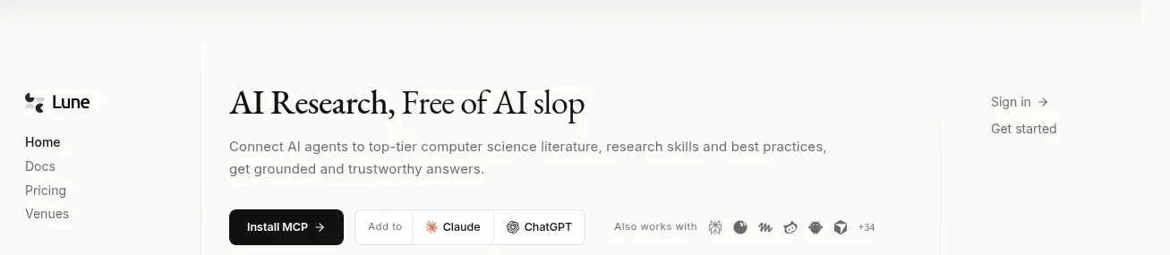
 Editorial research product navigation
Lune · Navigation
Editorial research product navigation
Lune · Navigation

 Minimal product navigation
Pine Computer · Navigation
Minimal product navigation
Pine Computer · Navigation

 Sticky section navigation
Playground by Google Labs · Navigation
Sticky section navigation
Playground by Google Labs · Navigation
 Top experiment navigation
Playground by Google Labs · Navigation
Top experiment navigation
Playground by Google Labs · Navigation

 Announcement bar and primary navigation
Zernio · Navigation
Announcement bar and primary navigation
Zernio · Navigation