 kage
kage
labs.google

Design analysis
A compact, translucent utility bar sits over the artwork, pairing a Labs mark with the centered experiment title and pill label.
Prompt preview
## Reference images

Study these alongside the description below: hierarchy, rhythm, spacing, colour. Build for the product you are asked about, using this design language.

- Component: https://kage-design-assets.t3.tigrisfiles.io/components/playground-by-google-labs/93d2afab-1def-4986-9178-dd9a071e412b-1791612309-0.webp
- Full page it was cut from: https://kage-design-assets.t3.tigrisfiles.io/screenshots/playground-by-google-labs/93d2afab-1def-4986-9178-dd9a071e412b-1791612198337-full.webp
- Component on Kage: https://kage.design/component/playground-by-google-labs-navigation

## Before you start
Ask what the user's product is, who it is for, and what their brand personality and navigation needs are. Apply the principles below to that product rather than copying the reference.

Build a compact top navigation overlay for an experimental digital product. Keep it around 44–52px tall, with a small brand cluster aligned to the left, a centered product title, and a subtle outlined status pill beside it. Use a transparent or lightly tinted background so the hero remains visible underneath. Align content to a consistent 24px horizontal gutter; use a restrained sans-serif at 12–16px, medium weight, with a small uppercase or letter-spaced pill. Use white text over imagery, thin white borders with roughly 999px radius, and generous horizontal breathing room. Make the bar fixed or absolute only if that suits the product; ensure sufficient contrast and keyboard-focus states.

Never: use logos, product names, copy, illustrations, or imagery from the reference.
More components

 Minimal top navigation
Agibot · Navigation
Minimal top navigation
Agibot · Navigation

 Top navigation
Hypervibe · Navigation
Top navigation
Hypervibe · Navigation
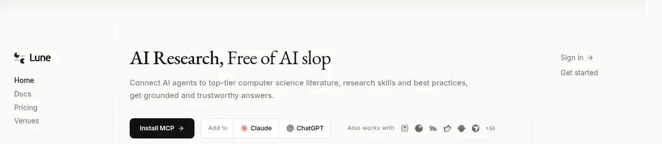
 Editorial research product navigation
Lune · Navigation
Editorial research product navigation
Lune · Navigation

 Minimal product navigation
Pine Computer · Navigation
Minimal product navigation
Pine Computer · Navigation

 Sticky section navigation
Playground by Google Labs · Navigation
Sticky section navigation
Playground by Google Labs · Navigation

 Announcement bar and primary navigation
Zernio · Navigation
Announcement bar and primary navigation
Zernio · Navigation