 kage
kage
pinecomputer.io

Design analysis
A compact header keeps brand recognition at left, utility links centered, and one high-contrast access action at right. Its restrained styling lets the oversized hero typography dominate.
Prompt preview
## Reference images

Study these alongside the description below: hierarchy, rhythm, spacing, colour. Build for the product you are asked about, using this design language.

- Component: https://kage-design-assets.t3.tigrisfiles.io/components/pine-computer/b47ce26e-68eb-4b09-b29e-15beff007c2f-1791612327-0.webp
- Full page it was cut from: https://kage-design-assets.t3.tigrisfiles.io/screenshots/pine-computer/b47ce26e-68eb-4b09-b29e-15beff007c2f-1791612242987-full.webp
- Component on Kage: https://kage.design/component/pine-computer-navigation

## Before you start
Ask the user what their product is, who it serves, and what their brand personality and colours are. Apply the principles below to that product rather than reproducing the reference.

Build a full-width desktop navigation bar for a technical product website. Keep the header short and visually quiet: place a small abstract brand mark and wordmark on the left, a compact row of uppercase or small utility links near the centre, and one dark primary button such as “Request access” on the right. Use a pale warm-grey background, near-black text, generous horizontal padding, and a thin top accent rule. Set links in a small monospaced or tightly tracked sans-serif; make the CTA slightly larger with a subtle arrow. Align everything to one baseline and provide a mobile collapse into a menu button.

Use approximate colours: background #DDE2DC, text #07110D, accent mint #16E7A7. Use 1px borders, square-to-2px corners, and restrained spacing rather than rounded cards.

Never:
- use the reference logo, product name, or exact copy
- copy the reference brand mark
- add reference illustrations or imagery
- reproduce the reference layout verbatim
More components

 Minimal top navigation
Agibot · Navigation
Minimal top navigation
Agibot · Navigation

 Top navigation
Hypervibe · Navigation
Top navigation
Hypervibe · Navigation
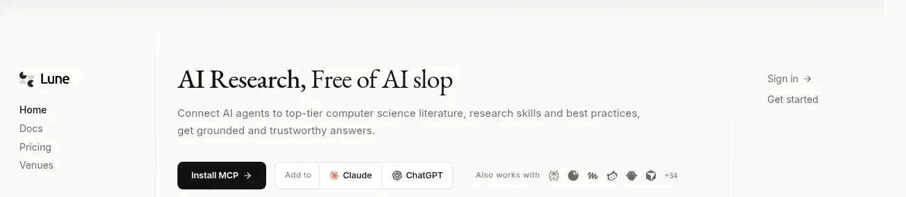
 Editorial research product navigation
Lune · Navigation
Editorial research product navigation
Lune · Navigation

 Sticky section navigation
Playground by Google Labs · Navigation
Sticky section navigation
Playground by Google Labs · Navigation
 Top experiment navigation
Playground by Google Labs · Navigation
Top experiment navigation
Playground by Google Labs · Navigation

 Announcement bar and primary navigation
Zernio · Navigation
Announcement bar and primary navigation
Zernio · Navigation