 kage
kage
luneresearch.com
Design analysis
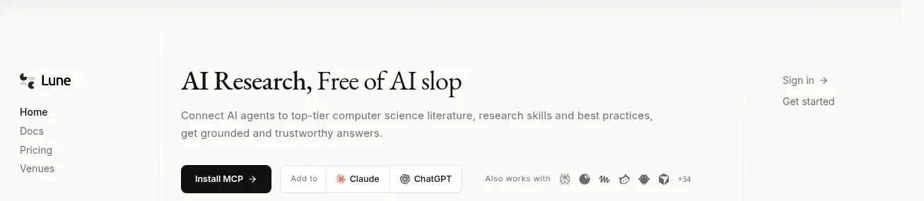
A quiet left-rail navigation anchors the page while the main area introduces the product with a strong serif headline, compact utility links, and install actions.
Prompt preview
## Reference images

Study these alongside the description below: hierarchy, rhythm, spacing, colour. Build for the product you are asked about, using this design language.

- Component: https://kage-design-assets.t3.tigrisfiles.io/components/lune/4bf7ff48-f6a1-4cc9-aba1-cb69c6f24fa8-1791698508-0.webp
- Full page it was cut from: https://kage-design-assets.t3.tigrisfiles.io/screenshots/lune/4bf7ff48-f6a1-4cc9-aba1-cb69c6f24fa8-1791698434673-full.webp
- Component on Kage: https://kage.design/component/lune-navigation

## Before you start
Ask what the user's product is, who it serves, and what its brand personality should be. Apply the principles below to that product rather than reproducing this reference.

Build a responsive navigation and opening masthead for a research-oriented software product. Use a narrow fixed-feeling left rail on desktop with a small abstract brand mark and product wordmark, stacked text links, and compact status/theme controls near the bottom. Keep the central content column aligned to a consistent vertical rule. Place secondary account links at the upper right. Use an off-white background (#f7f7f4), near-black text (#171716), muted gray metadata (#777772), hairline borders (#deded8), and restrained rounded controls (6–8px radius). Pair an elegant high-contrast serif for the main title with a small neutral sans-serif for navigation and labels. Use generous whitespace, 16–18px outer gutters, and a maximum content width around 570px on a 900px desktop canvas. Make links visibly interactive with subtle color changes and underline or opacity transitions; keep the rail usable on mobile by collapsing it into a top bar.

Never: use the reference's logos, product names, copy, illustrations, imagery, or exact iconography.
More components

 Minimal top navigation
Agibot · Navigation
Minimal top navigation
Agibot · Navigation

 Top navigation
Hypervibe · Navigation
Top navigation
Hypervibe · Navigation

 Minimal product navigation
Pine Computer · Navigation
Minimal product navigation
Pine Computer · Navigation

 Sticky section navigation
Playground by Google Labs · Navigation
Sticky section navigation
Playground by Google Labs · Navigation
 Top experiment navigation
Playground by Google Labs · Navigation
Top experiment navigation
Playground by Google Labs · Navigation

 Announcement bar and primary navigation
Zernio · Navigation
Announcement bar and primary navigation
Zernio · Navigation