 kage
kage
labs.google

Design analysis
A dark secondary bar separates the hero from the page and offers anchor links, a Labs return control, and utility icons.
Prompt preview
## Reference images

Study these alongside the description below: hierarchy, rhythm, spacing, colour. Build for the product you are asked about, using this design language.

- Component: https://kage-design-assets.t3.tigrisfiles.io/components/playground-by-google-labs/93d2afab-1def-4986-9178-dd9a071e412b-1791612309-2.webp
- Full page it was cut from: https://kage-design-assets.t3.tigrisfiles.io/screenshots/playground-by-google-labs/93d2afab-1def-4986-9178-dd9a071e412b-1791612198337-full.webp
- Component on Kage: https://kage.design/component/playground-by-google-labs-navigation-2

## Before you start
Ask what sections the user's product has and which destinations deserve persistent navigation. Apply the principles below to that product rather than copying the reference.

Build a dark secondary navigation bar, approximately 56–68px tall, with a left-side back/brand control, centered or evenly distributed anchor links, and compact utility actions on the right. Use a black background near #050505, subtle bottom borders near #242424, and muted gray text around #9B9B9B with white active states. Keep links spaced generously, use 12–14px text, and make the bar sticky only after the hero if that improves orientation. On mobile, collapse anchors into a menu while preserving the primary action. Include visible focus rings and active-section feedback.

Never: use logos, product names, copy, illustrations, or imagery from the reference.
More components

 Minimal top navigation
Agibot · Navigation
Minimal top navigation
Agibot · Navigation

 Top navigation
Hypervibe · Navigation
Top navigation
Hypervibe · Navigation
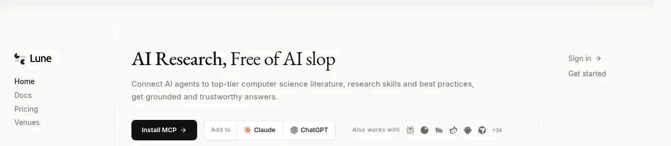
 Editorial research product navigation
Lune · Navigation
Editorial research product navigation
Lune · Navigation

 Minimal product navigation
Pine Computer · Navigation
Minimal product navigation
Pine Computer · Navigation

 Top experiment navigation
Playground by Google Labs · Navigation
Top experiment navigation
Playground by Google Labs · Navigation

 Announcement bar and primary navigation
Zernio · Navigation
Announcement bar and primary navigation
Zernio · Navigation