 kage
kage
idlen.io

Design analysis
The closing CTA returns to the three primary paths—install, buy access, or try the sandbox—over a soft blue-green glow. Small reassurance chips underneath reduce friction immediately before the footer.
Prompt preview
## Reference images

Study these alongside the description below: hierarchy, rhythm, spacing, colour. Build for the product you are asked about, using this design language.

- Component: https://kage-design-assets.t3.tigrisfiles.io/components/idlen/09112380-17fc-499b-a8d2-71eed663a053-1789538555-11.webp
- Full page it was cut from: https://kage-design-assets.t3.tigrisfiles.io/screenshots/idlen/09112380-17fc-499b-a8d2-71eed663a053-1789538482510-full.webp
- Component on Kage: https://kage.design/component/idlen-cta

## Before you start
Ask what the user's product, audience, and brand are, then apply the principles below to that product rather than copying this reference.

Create a centered closing CTA band with a soft diffuse blue/teal glow on a dark background. Use a large short headline, one supporting sentence, a row of two or three actions representing the user's primary conversion paths, and a row of three compact reassurance chips such as privacy, speed, or cancellation.

Design rules:
- Keep the content centered in a max-width 620px container with generous vertical padding.
- Use a 36–44px headline, 15–16px support copy, 14px button labels, and 11–12px reassurance text.
- Approximate colours: #171717 background, glow #24485a, white #f4f4f4, muted #a0a0a0, primary blue #4d9cff, dark secondary #22252a, chip border #303a40.
- Use 7–8px button radii, one filled primary action, and quieter secondary actions.
- Make the CTA choices mutually clear, not three visually competing primary buttons.
- Stack buttons on mobile and keep chips wrapping cleanly.

Never:
- Never use logos, product names, copy, illustrations, or imagery from the reference.
- Never use fake urgency or unsupported guarantees.
- Never let the glow reduce text contrast.
More components

 Final conversion banner
tiun. · Call to action
Final conversion banner
tiun. · Call to action

 Mobile app conversion CTA
Payflip · Call to action
Mobile app conversion CTA
Payflip · Call to action

 Final download call to action
Grimo AI · Call to action
Final download call to action
Grimo AI · Call to action
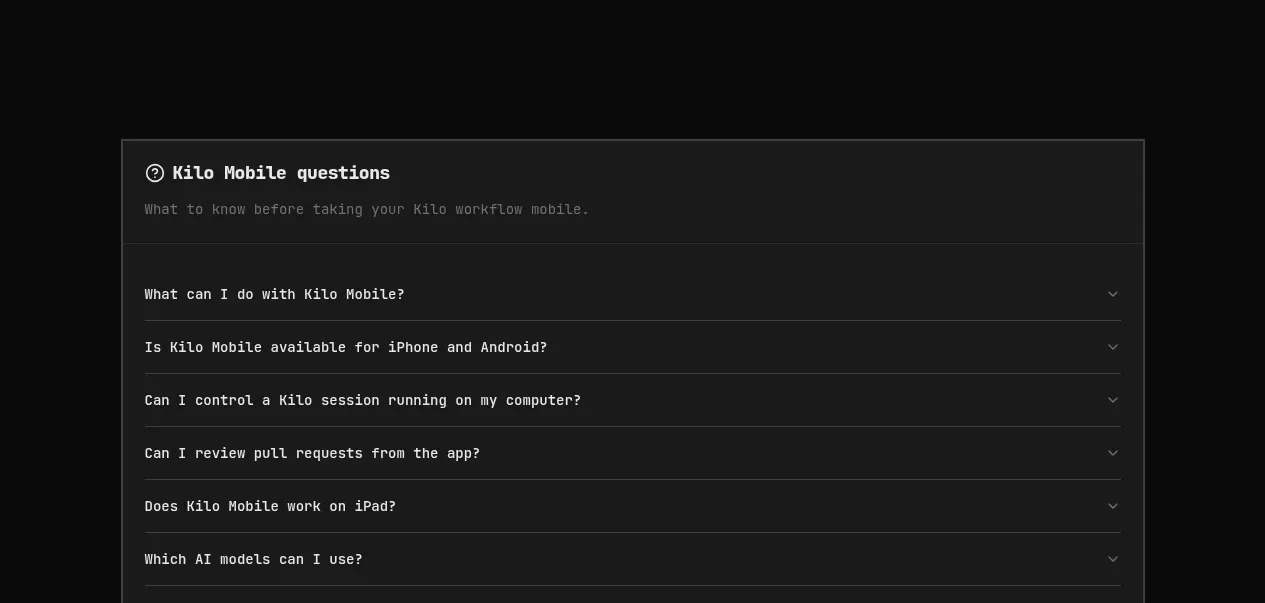
 Download conversion panel
Kilo Code for iOS and Android · Call to action
Download conversion panel
Kilo Code for iOS and Android · Call to action
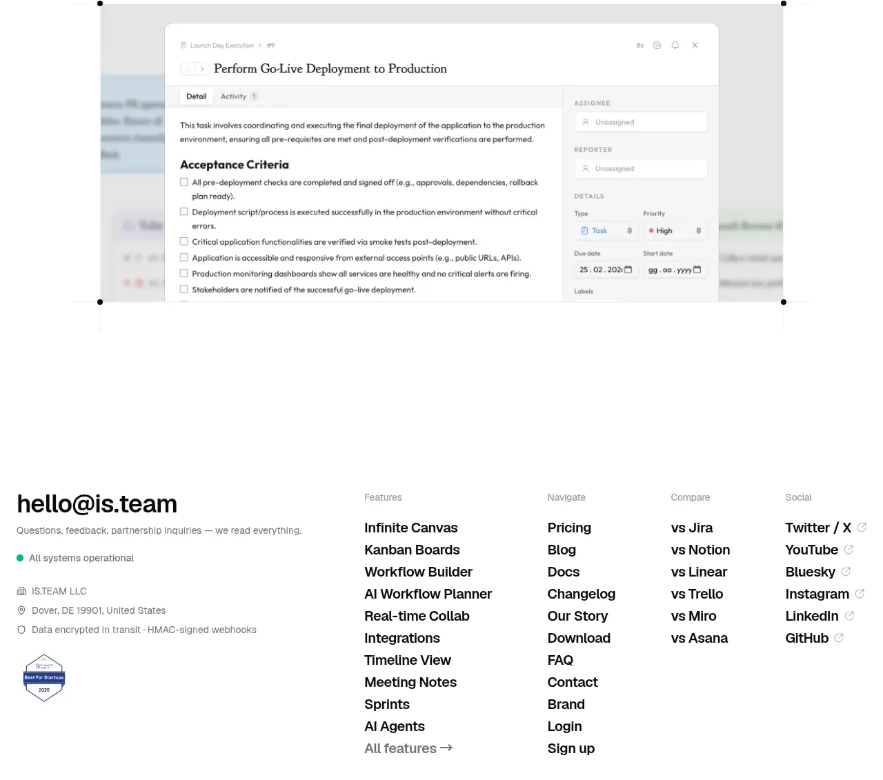
 Final conversion CTA
is.team · Call to action
Final conversion CTA
is.team · Call to action

 Studio closing call to action
FATHER · Call to action
Studio closing call to action
FATHER · Call to action