kage
kage

Design analysis
A dark developer-tools landing page that opens with a short headline and a large mock IDE window, then alternates rhythm: a quiet three-column stat band, a logo marquee, three-card audience segments, a download grid, a numbered how-it-works row, a 3×2 feature grid, a privacy section with a real code snippet, an interactive earnings calculator with a circular gauge, a four-card discovery row, an FAQ accordion and a final CTA before a dense multi-column footer. Hierarchy is built with very large white display headings against near-black (#0a0a12) backgrounds, blue (#3b82f6) reserved for accents, primary buttons and small uppercase step labels. Cards are flat dark panels with 1px subtle borders and generous padding; the page breathes through alternating full-width, three-column and four-column grid layouts rather than decorative flourish.
Prompt preview
## Reference images

Study these alongside the description below: hierarchy, rhythm, spacing, colour. Build for the product you are asked about, using this design language.

- Full page: https://kage-design-assets.t3.tigrisfiles.io/screenshots/idlen/09112380-17fc-499b-a8d2-71eed663a053-1789538482510-full.webp
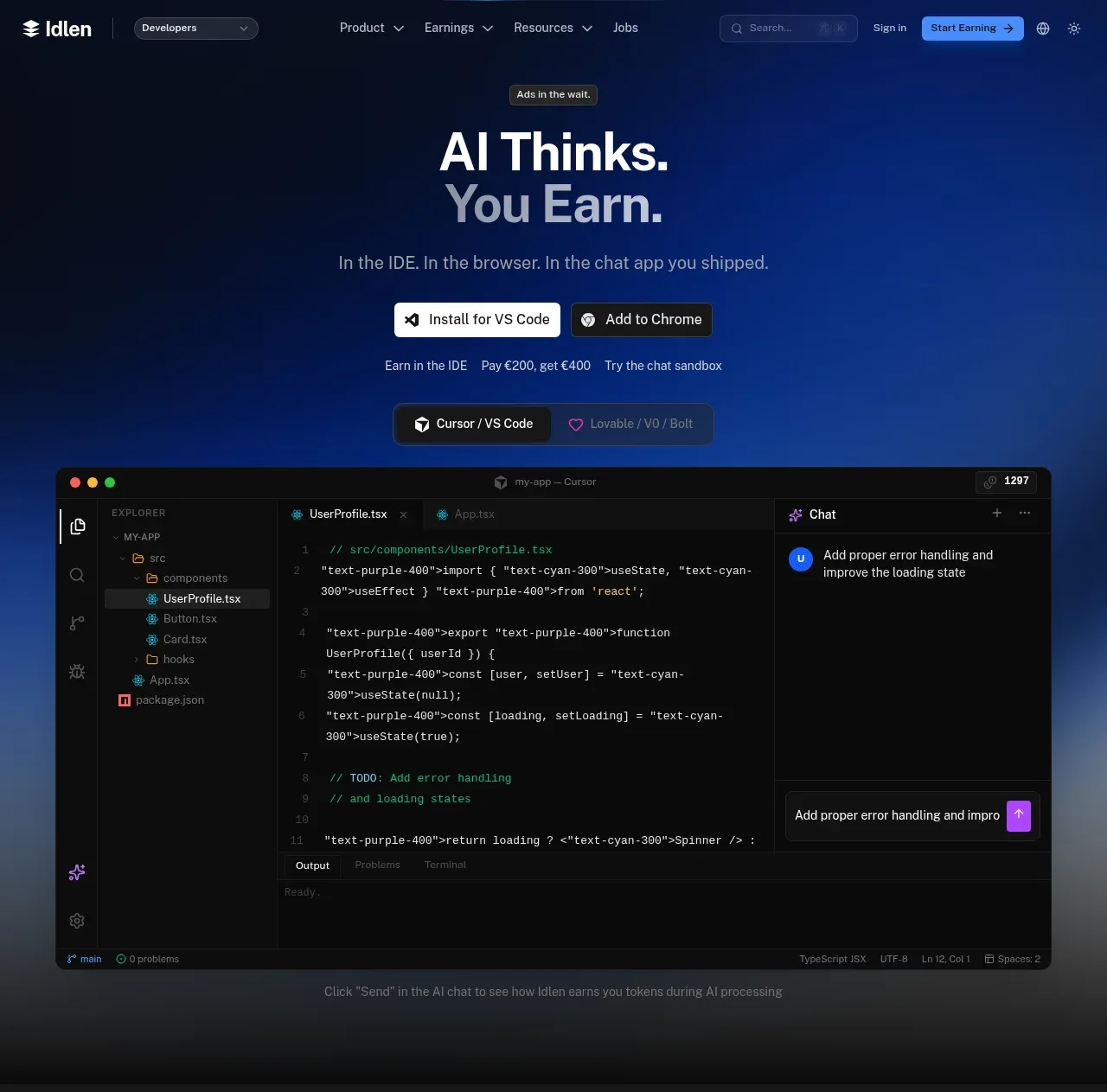
- Above the fold: https://kage-design-assets.t3.tigrisfiles.io/screenshots/idlen/09112380-17fc-499b-a8d2-71eed663a053-1789538476033.webp
- Design on Kage: https://kage.design/designs/idlen-landing-page

## Before you start
Ask the user what they are building, who it is for, and what brand assets they already have (name, colours, type, logo). Wait for the answers before writing any code. Everything below is applied to their product, not to the reference site.

## Page structure
Build a dark, single-page marketing site in this order:

1. **Sticky nav** — logo left, an audience-segment dropdown, centre nav links with dropdown chevrons, a search box, Sign In, a bright blue pill CTA and utility icons right.
2. **Hero** — a small eyebrow pill, a two-line oversized display headline (white first line, dimmer blue-grey second line), a one-line subhead, two primary buttons (white/one bright blue), then a row of small tertiary text links. Below it, a wide realistic app-window mockup (editor sidebar, syntax-highlighted code, chat panel) framed with soft blue glow, with a faint blue gradient horizon behind it.
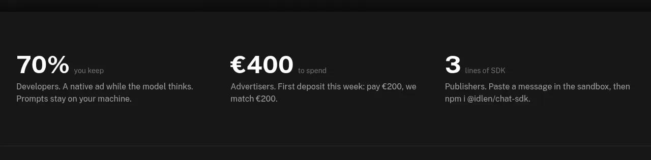
3. **Stat band** — three large numbers (70%, €400, 3) with small labels and one-line explanations, separated by hairlines on a slightly different dark tone.
4. **Logo marquee** — small uppercase label ("works with your favorite tools") and a horizontal row of monochrome partner chips.
5. **Audience sections** — heading + three equal cards (icon, title, 2-line copy, small blue text link with arrow).
6. **Download grid** — heading + two grouped panels (editor installs / browser installs) with white primary buttons and dark secondary buttons.
7. **How it works** — centred heading + subhead, three steps connected by a thin line, each with an icon tile, small blue uppercase "STEP 0N" label, bold title, short copy; a text link below.
8. **Feature grid** — heading + subhead, 3×2 grid of flat dark cards (small icon, title, one-line benefit).
9. **Privacy section** — eyebrow pill, big heading, three wide cards, then a bordered code-snippet panel showing the actual local-only logic with syntax colours, and a docs-style link.
10. **Interactive calculator** — heading + subhead, one large panel split: left side sliders (usage hours) and segmented subscription toggle; right side a circular progress gauge showing a percentage with a supporting line and a caveat footnote.
11. **Discovery row** — heading, subhead, four icon cards (Cloud, Databases, APIs, Dev Tools).
12. **FAQ** — heading + subhead, five narrow accordion rows with chevrons.
13. **Final CTA** — big centred headline ("Pick a door." style), one line of copy, one blue + one neutral button, a text link, and three small trust badges with icons.
14. **Footer** — brand column with product badges, five link columns, a bottom bar with copyright and a green "all systems operational" status dot.

## Design language
- Background: near-black `#0a0a12`–`#0d0d16`; sections alternate between `#0a0a12` and slightly lifted `#111118` panels. Use a soft blue radial gradient + glow only behind the hero mockup and the final CTA.
- Accent: a single blue `#3b82f6` for primary buttons, links, step labels, gauge and icons. Never more than one accent hue.
- Type: geometric sans (e.g. Inter/Geist). Display headings 56–72px bold white with tight tracking; section headings ~36px centred; body 14–16px in `#9ca3af`; eyebrow/step labels 11–12px uppercase with letter-spacing in blue.
- Hierarchy: headline → subhead → buttons → proof (stats/screenshot). Stat band uses very large numbers (~48px) with tiny muted labels beside them.
- Cards: flat `#13131c` panels, 1px `#1f1f2a` border, 12–16px radius, no shadows except a soft blue glow on the hero mockup. Card padding generous (~28–32px).
- Grid: alternate 3-col, 2-col, 4-col and 3×2 grids section to section; centred headings with a one-line muted subhead open most sections.
- Buttons: pill-shaped; primary = blue fill with white text; secondary = white fill with dark text; tertiary = dark fill with border; text links are blue with a trailing arrow.
- Code blocks: monospace on `#0f0f18` with real syntax colours (green comments, cyan/purple identifiers, blue keywords).
- Motion: subtle — glowing gradient horizon behind the hero mockup, gentle card hover borders, animated marquee, animated accordion and gauge. Keep everything else static and calm.
- Icons: thin-line monochrome icons inside small rounded dark tiles; small emoji only in the calculator result.

## Never
Never copy the reference's logo, wordmark, product name, marketing copy, illustrations, screenshots, icon set or its blue-on-black styling verbatim as "Idlen". Apply the design language to the user's own product and brand; never present the result as the reference product.
Components from this page
All components
 Dark product navigation
Idlen · Navigation
Dark product navigation
Idlen · Navigation
 AI earnings hero with editor preview
Idlen · Hero
AI earnings hero with editor preview
Idlen · Hero
 Three-value proof strip
Idlen · Stats
Three-value proof strip
Idlen · Stats
 Compatible tools strip
Idlen · Logo cloud
Compatible tools strip
Idlen · Logo cloud
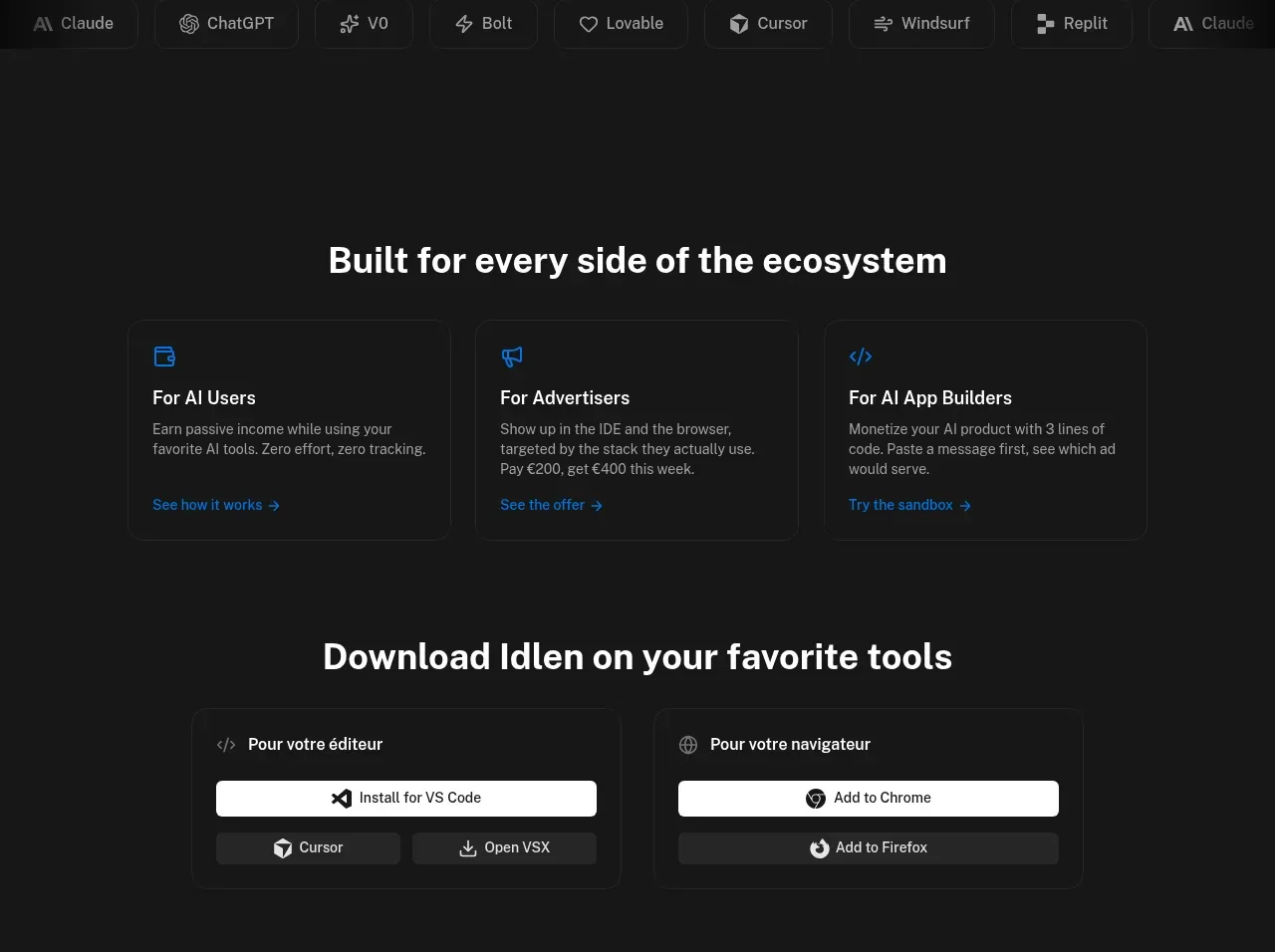 Audience pathways and downloads
Idlen · Feature grid
Audience pathways and downloads
Idlen · Feature grid
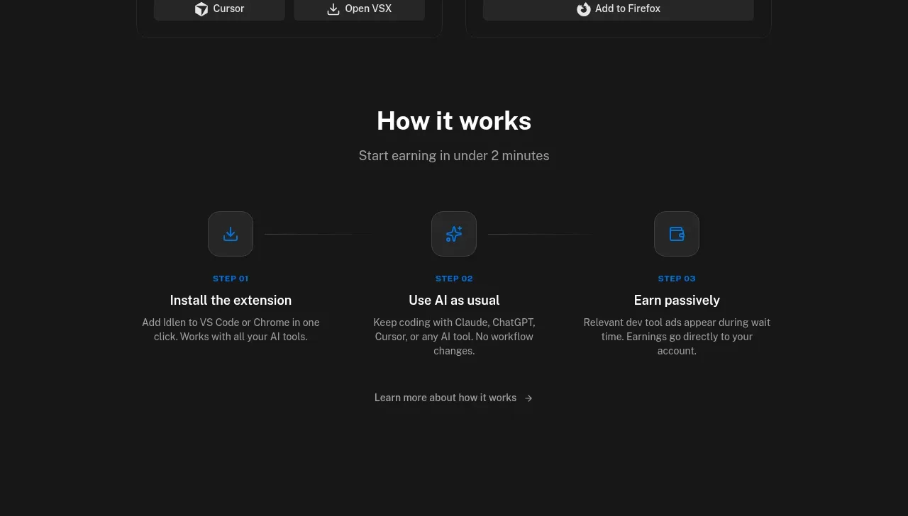 Three-step getting-started flow
Idlen · Feature grid
Three-step getting-started flow
Idlen · Feature grid
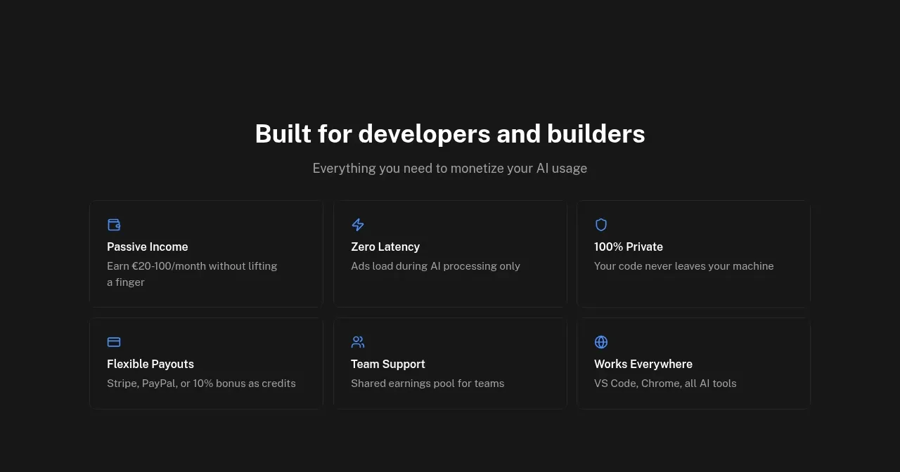 Developer and builder benefits
Idlen · Feature grid
Developer and builder benefits
Idlen · Feature grid
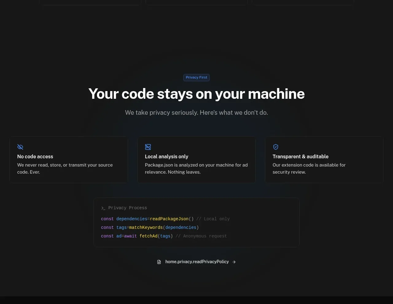 Privacy promise with code proof
Idlen · Feature grid
Privacy promise with code proof
Idlen · Feature grid
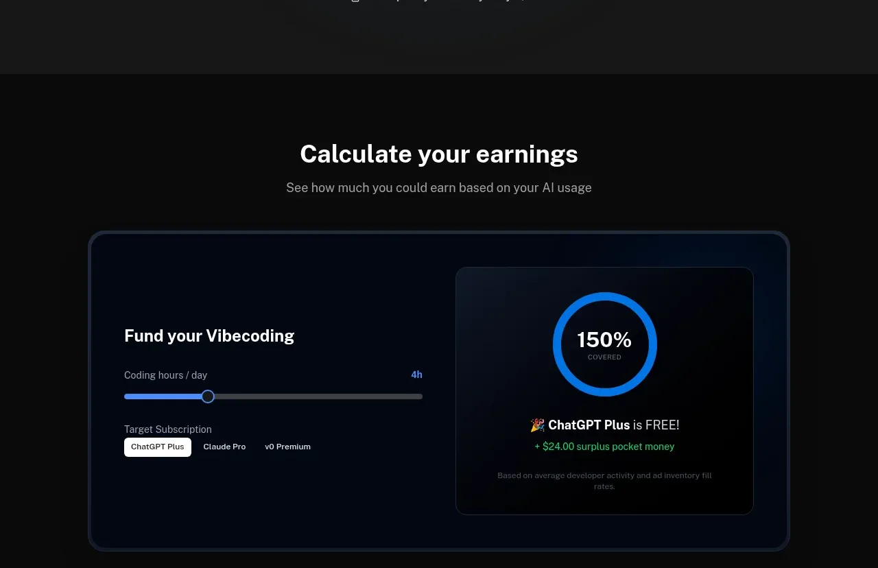 Earnings calculator
Idlen · Chart
Earnings calculator
Idlen · Chart
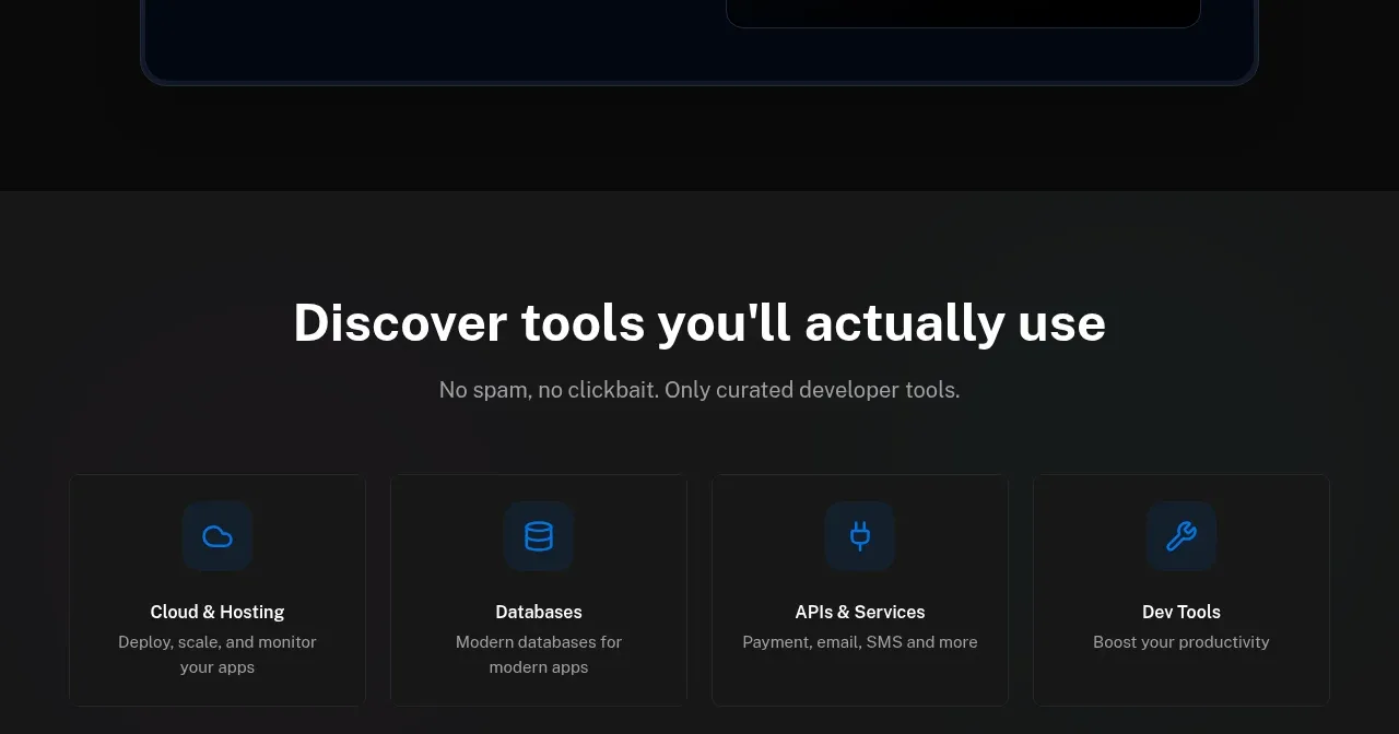 Curated tool categories
Idlen · Feature grid
Curated tool categories
Idlen · Feature grid
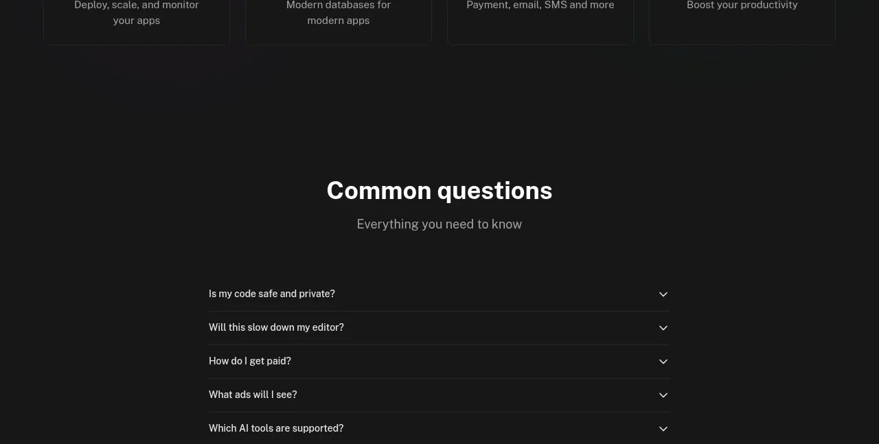 Common questions accordion
Idlen · FAQ
Common questions accordion
Idlen · FAQ
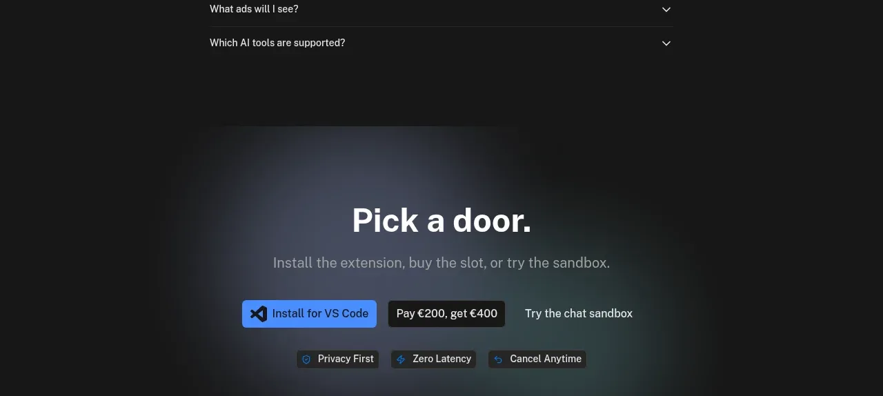 Final conversion panel
Idlen · Call to action
Final conversion panel
Idlen · Call to action