kage
kage
idlen.io

Design analysis
Three large metrics translate the product promise into distinct outcomes for developers, advertisers, and publishers. Short explanatory lines below each number make the figures understandable rather than ornamental.
Prompt preview
## Reference images

Study these alongside the description below: hierarchy, rhythm, spacing, colour. Build for the product you are asked about, using this design language.

- Component: https://kage-design-assets.t3.tigrisfiles.io/components/idlen/09112380-17fc-499b-a8d2-71eed663a053-1789538553-2.webp
- Full page it was cut from: https://kage-design-assets.t3.tigrisfiles.io/screenshots/idlen/09112380-17fc-499b-a8d2-71eed663a053-1789538482510-full.webp
- Component on Kage: https://kage.design/component/idlen-stats

## Before you start
Ask what the user's product, audience, and brand are, then apply the principles below to that product rather than copying this reference.

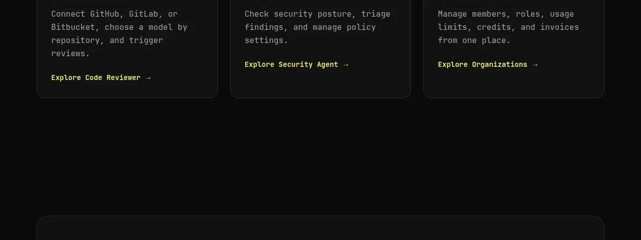
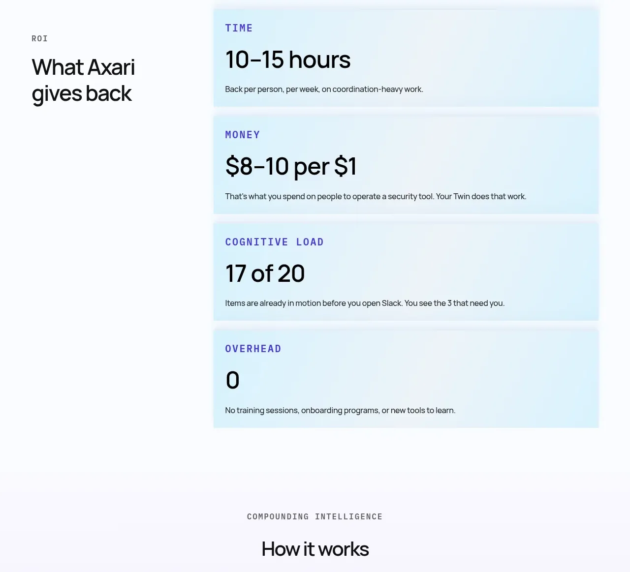
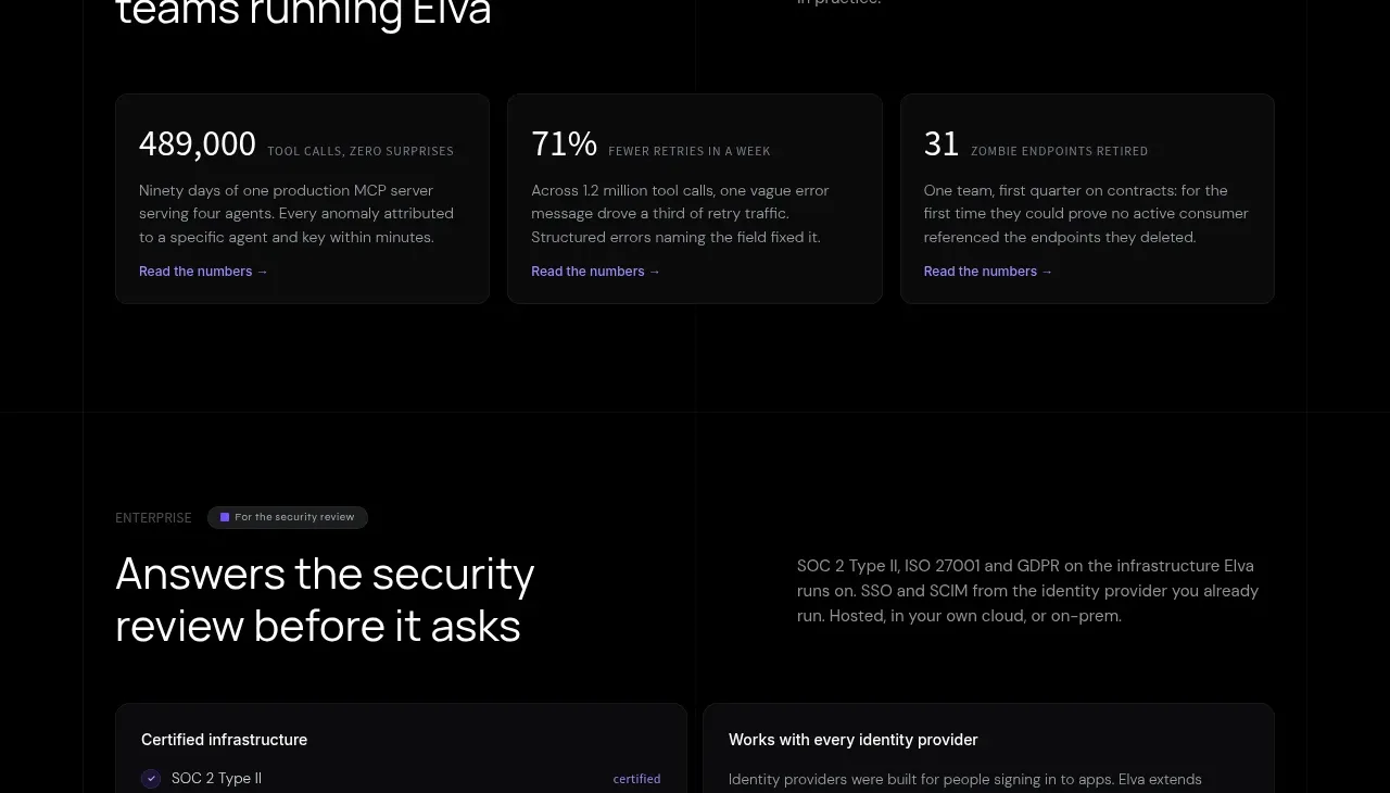
Build a horizontal three-column proof strip on a dark charcoal background. Each column should contain one oversized metric, a small qualifier beside or below it, and one or two lines explaining who benefits and why. Keep the layout quiet and spacious so the numbers act as scanning anchors.

Design rules:
- Use a centered max-width grid with three equal columns and generous vertical padding.
- Set metrics at 32–36px bold, qualifiers at 11–12px muted text, and descriptions at 12–13px.
- Approximate colours: background #171717, metric #f4f4f5, body text #929292, divider #292929, optional accent #cf3159.
- Avoid heavy cards; use whitespace and, at most, extremely subtle vertical separators.
- Make each metric independently understandable and replaceable with the user's real evidence.
- Stack to one column or two columns on narrow screens.

Never:
- Never use logos, product names, copy, illustrations, or imagery from the reference.
- Never invent statistics for the user's product.
- Never rely on numbers without a clarifying label.