kage
inflight.co
Design analysis
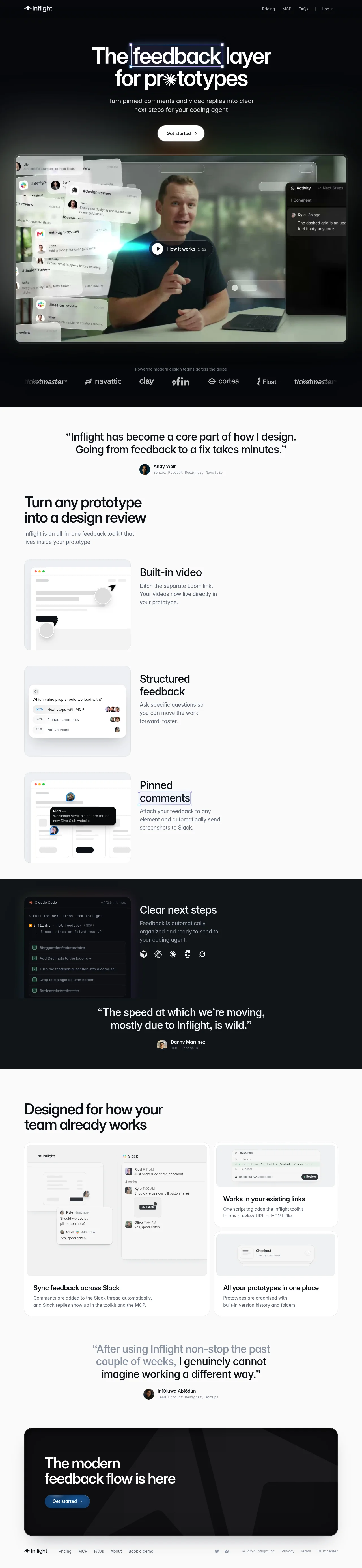
A dark-to-light narrative landing page: the hero and product story sit on near-black with glassy floating UI fragments and a video demo, then the page flips to a warm off-white for feature breakdowns, alternating back to dark for the AI/agent section. Type is a large, tight modern sans with playful touches (the asterisk in "pr*totypes", a highlighted word in the headline). Feature sections pair abstract, minimal product mockups with short copy in a consistent left-media/right-copy rhythm, and social proof quotes punctuate the flow between sections. The closing dark CTA card with a blue button gives the page a strong bottom anchor.
Prompt preview
## Reference images

Study these alongside the description below: hierarchy, rhythm, spacing, colour. Build for the product you are asked about, using this design language.

- Full page: https://kage-design-assets.t3.tigrisfiles.io/screenshots/inflight/ac6190d7-6ca0-4ac1-9ff1-df4f4b5185a3-1792562711335-full.webp
- Above the fold: https://kage-design-assets.t3.tigrisfiles.io/screenshots/inflight/ac6190d7-6ca0-4ac1-9ff1-df4f4b5185a3-1792562704920.webp
- Design on Kage: https://kage.design/designs/inflight-landing-page

# Build a landing page in this design language

## Before you start
Ask the user: what product are you building, who is it for, and what brand assets (name, colours, type) do they already have? Wait for the answers. Everything below is applied to their product, not to the reference.

## Page structure
1. **Top nav** (dark): small logo left; right-aligned text links (Pricing, Docs, FAQs) plus a Log in link; minimal, no buttons.
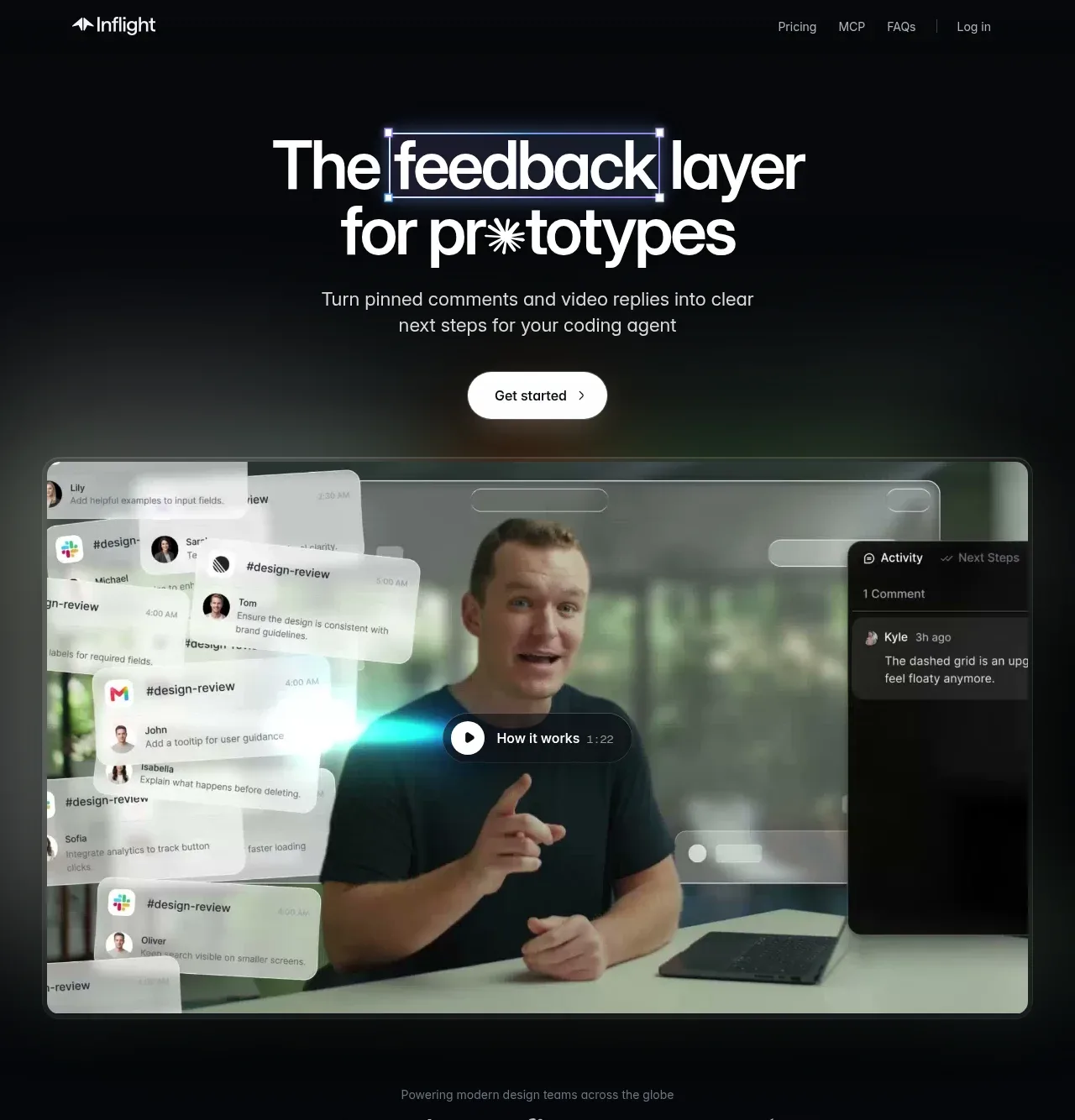
2. **Hero** (near-black #0a0a0a): two-line display headline where one key word sits inside a dashed "selection box" with corner handles (a design-tool metaphor) and another word has a character replaced by an asterisk-like glyph; short subhead in muted grey; a single pill "Get started" button; subtle dark gradient vignette behind.
3. **Video/demo panel**: a large rounded (16–20px radius) video frame with a play chip labelled "How it works", overlaid with floating glass comment cards and a dark activity sidebar mockup — the product's UI fragments floating around real footage.
4. **Logo strip**: small muted line "Powering modern design teams across the globe" above a single row of grey wordmarks.
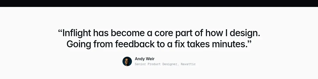
5. **Testimonial 1** (background flips to warm off-white #f5f4f0): large serif-weight quote centered, then avatar + name + role in mono/small caps below.
6. **Feature section 1 — light**: left-aligned section headline ("Turn any prototype into...") with a one-line subhead, then three alternating rows: abstract minimal UI illustration in a rounded beige card on the left, feature title + 2–3 line copy on the right. Titles get playful treatment (one word underlined/boxed).
7. **Feature section 2 — dark band**: rounded dark card containing a terminal/agent mockup on the left, headline "Clear next steps" + copy + a row of small tool logos on the right; followed by testimonial 2 in the same dark band.
8. **Feature section 3 — light bento**: large two-column headline, then a 2/3 + 1/3 card grid: one big card with a Slack-sync mockup, two stacked smaller cards (code snippet card, prototype list card), each with a bold title and short grey copy below the illustration.
9. **Testimonial 3** (light): centered quote with grey→black emphasis on key words, avatar + role below.
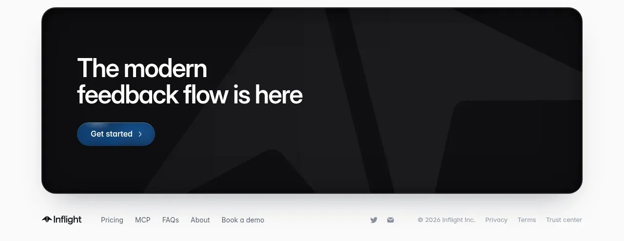
10. **Closing CTA**: large full-width dark rounded card with a giant watermark logo shape bleeding off the right edge, two-line display headline and a blue (#2563eb-ish) "Get started" pill.
11. **Footer** (dark): logo left, nav links, social icons, and legal links right in small muted type.

## Design language
- **Two-tone rhythm**: alternate near-black (#0a0a0a–#111) and warm off-white (#f5f4f0) full-bleed bands; sections change background to change pace rather than using dividers.
- **Hierarchy via scale**: display headlines ~64–96px, tight leading (-2%), medium weight, sentence case; body copy 15–16px in muted grey (#8a8a8a on dark, #555 on light). Very little mid-scale type — jump straight from display to body.
- **Colour discipline**: page is monochrome; one accent blue (#2563eb) reserved for the final CTA button. All imagery is desaturated grey/beige so screenshots never compete with type.
- **Playful precision**: design-tool motifs (dashed selection boxes with corner handles, cursor arrows, pinned-comment bubbles, mono type for roles/labels) echo the product's purpose without literal screenshots.
- **Cards and mockups**: 16–24px radius, 1px hairline borders, no drop shadows on light bands; glassy blurred panels only inside the dark hero. Mockups are abstract greyscale wireframes, not detailed UIs.
- **Testimonials as rhythm breaks**: short, large-type quotes centered between feature sections, with mono small-caps attribution — use them to reset density between heavy sections.
- **Motion**: keep it calm — subtle float on hero fragments, soft fade-ups on scroll, no parallax.
- **Grid**: generous max-width (~1100px), lots of vertical padding (120px+ between sections), left-aligned feature rows with ~40% media / 60% copy splits, bento cards with consistent 24px gutters.

## Never
No logos, wordmarks, product names, copy, illustrations, photography or icon sets from the reference. Never present the result as that product or reuse its headline metaphors verbatim.
Components from this page
All components
 Top navigation
Inflight · Navigation
 Feedback layer hero
Inflight · Hero
 Customer logo strip
Inflight · Logo cloud
 First customer quote
Inflight · Testimonials
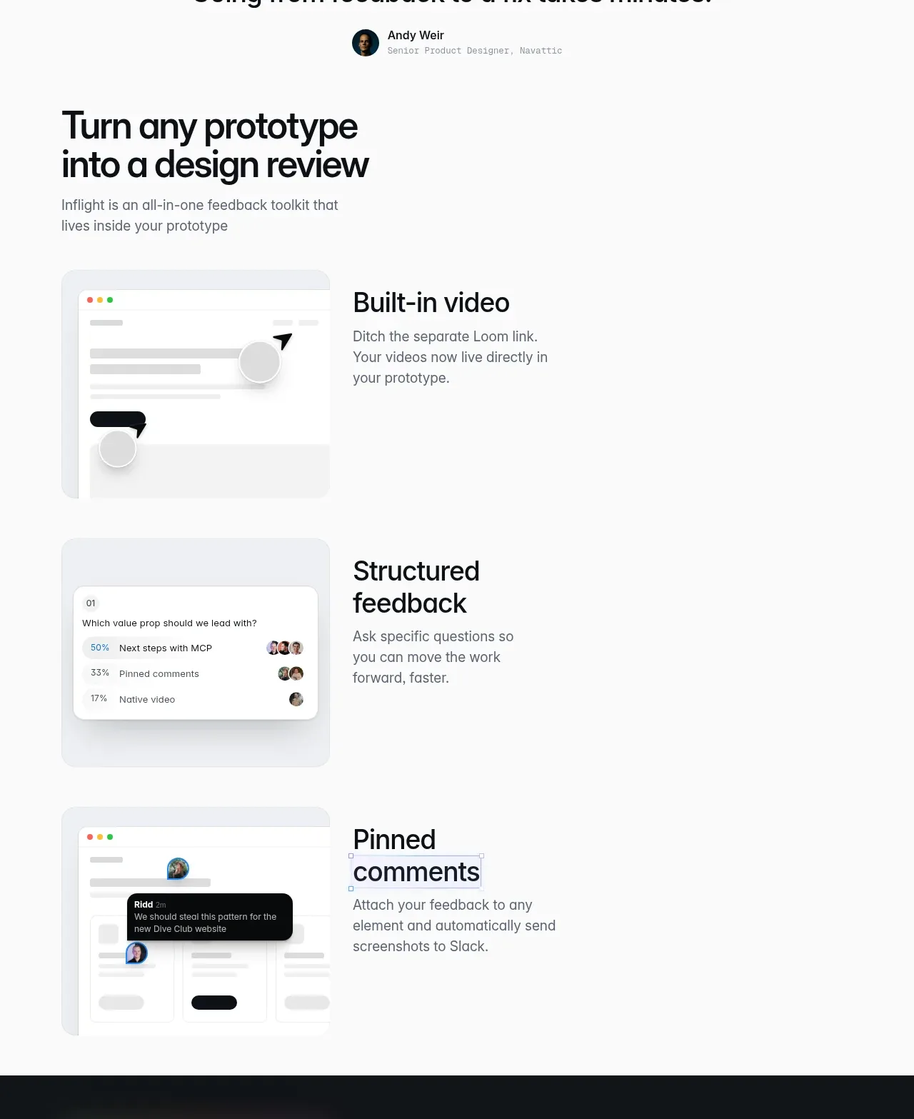 Core feedback workflow
Inflight · Feature grid
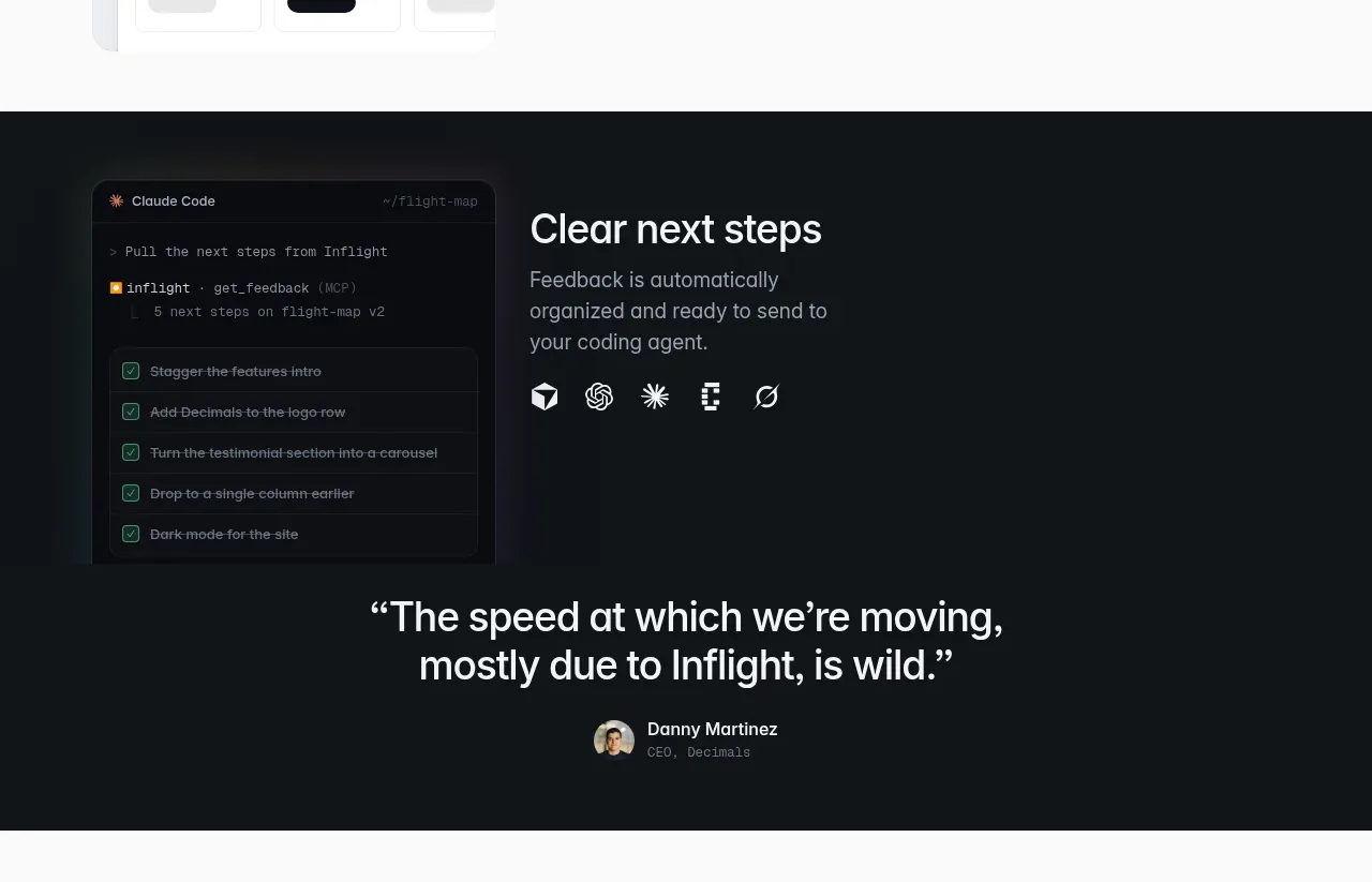 Agent handoff feature
Inflight · Feature grid
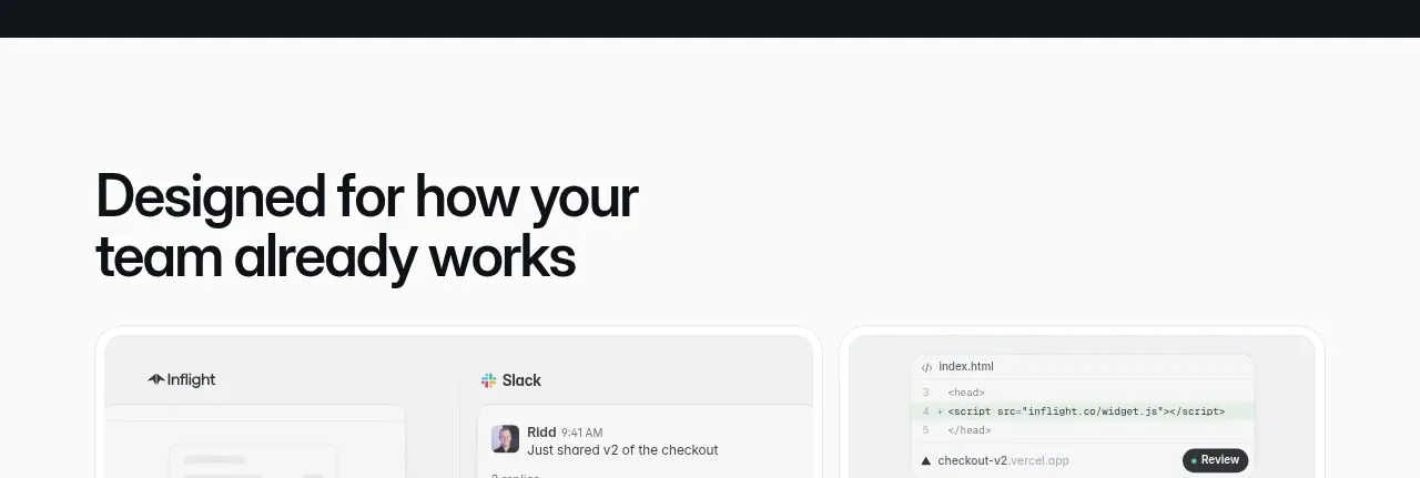 Second customer quote
Inflight · Testimonials
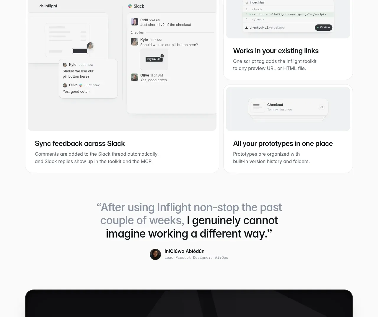 Team workflow integrations
Inflight · Feature grid
 Third customer quote
Inflight · Testimonials
 Final conversion panel
Inflight · Call to action