 kage
kage
intellagents.io

Design analysis
A clean white transition section reframes the offer as one unified system, balancing a large editorial headline on the left with concise explanation and repeated actions on the right.
Prompt preview
## Reference images

Study these alongside the description below: hierarchy, rhythm, spacing, colour. Build for the product you are asked about, using this design language.

- Component: https://kage-design-assets.t3.tigrisfiles.io/components/intellagents-io/be3df101-c546-4853-b3d0-99c345832561-1790316245-2.webp
- Full page it was cut from: https://kage-design-assets.t3.tigrisfiles.io/screenshots/intellagents-io/be3df101-c546-4853-b3d0-99c345832561-1790316161493-full.webp
- Component on Kage: https://kage.design/component/intellagents-cta

## Before you start
Ask for the user's product promise, audience, and preferred voice. Adapt this split positioning band to those answers rather than copying the reference wording.

Build a white, two-column positioning section with a large editorial headline on the left and supporting paragraph plus two CTAs on the right. Use a short italic or serif accent phrase above a bold sans-serif statement. Vertically center both columns, constrain the text width, and let whitespace do most of the work. Keep the background plain and separate it from adjacent sections with spacing rather than heavy decoration.

Use #FFFFFF background, #111111 primary text, #6B6B6B body text, and a blue-to-orange gradient for the main button with a white secondary button and light border. Use a 48–72px section padding, 40–48px headline size, 15–16px body copy, and 24px column gap. Stack columns on mobile.

### Never
- Never copy logos, product names, copy, illustrations, or imagery from the reference.
- Never fill the whitespace with unnecessary cards or icons.
- Never use more than one dominant headline.
More components
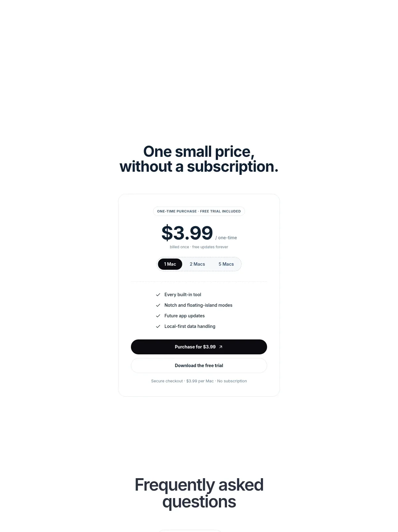
 Visual closing product statement
NotchPop · Call to action
Visual closing product statement
NotchPop · Call to action
 Final conversion banner
IntellAgents.io · Call to action
Final conversion banner
IntellAgents.io · Call to action
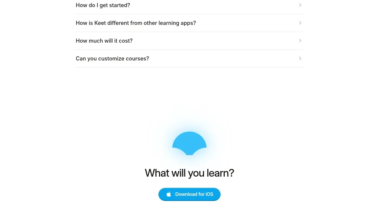
 Final app-download call to action
Keet · Call to action
Final app-download call to action
Keet · Call to action
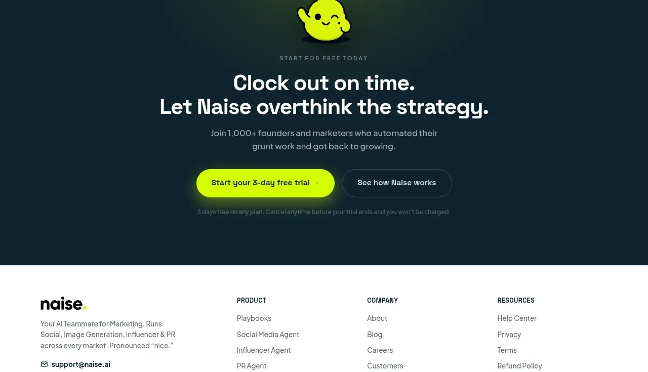
 Dark conversion call to action
Naise AI · Call to action
Dark conversion call to action
Naise AI · Call to action
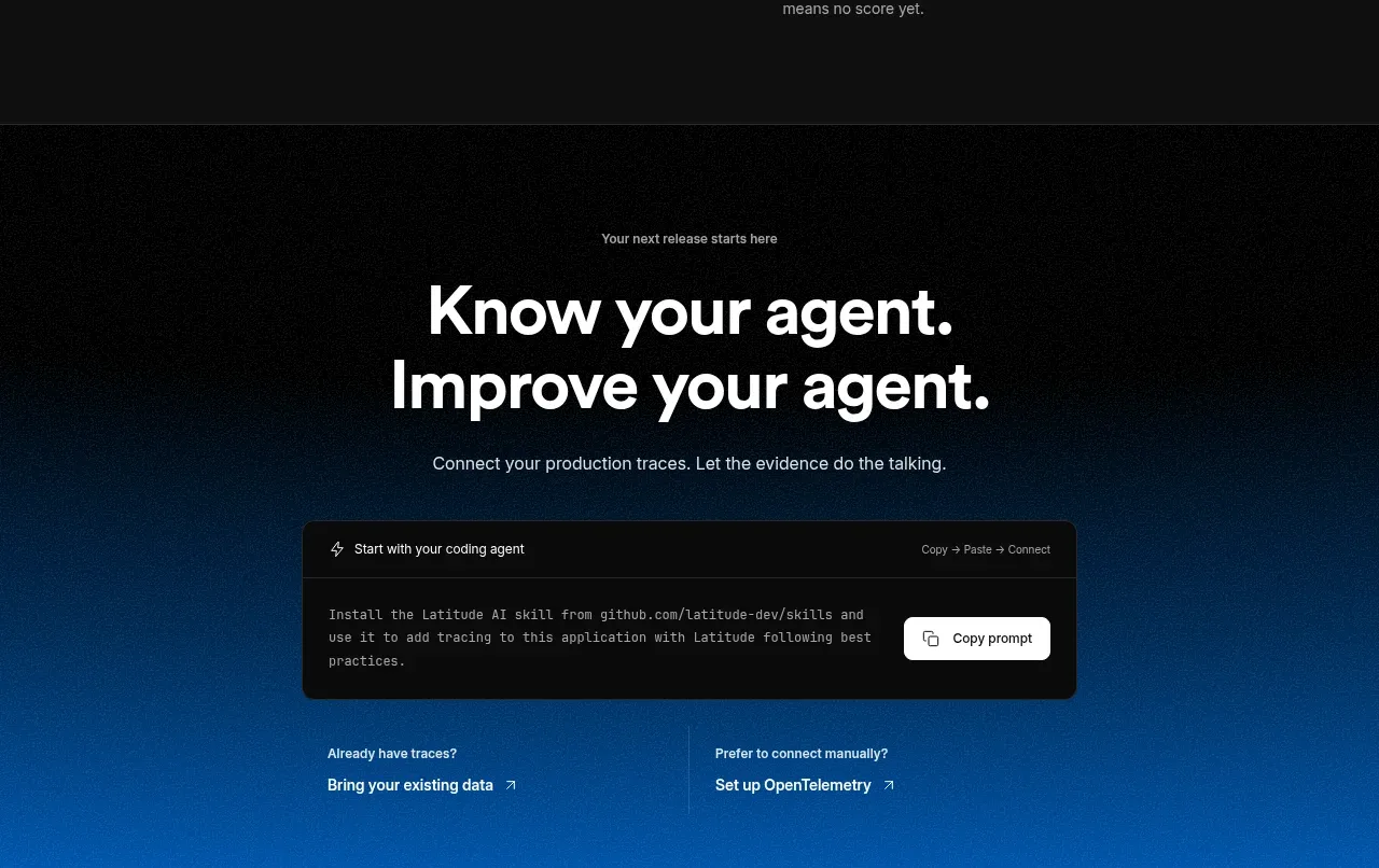
 Connect data and start improving
AgentScore · Call to action
Connect data and start improving
AgentScore · Call to action
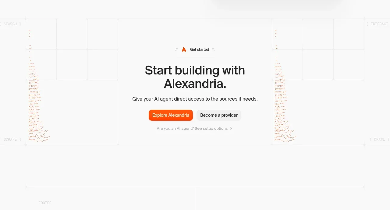
 Final build CTA
Alexandria by Firecrawl · Call to action
Final build CTA
Alexandria by Firecrawl · Call to action