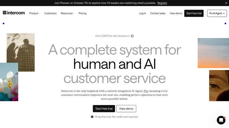
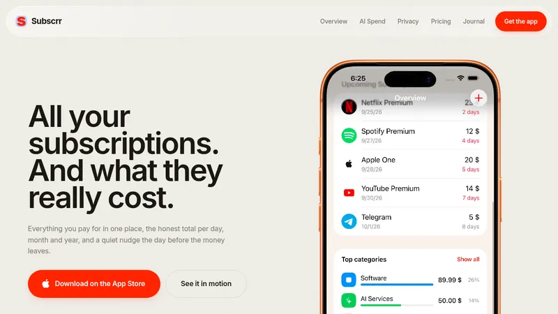
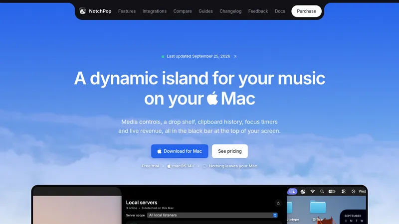
kage
kage
intellagents.io

Design analysis
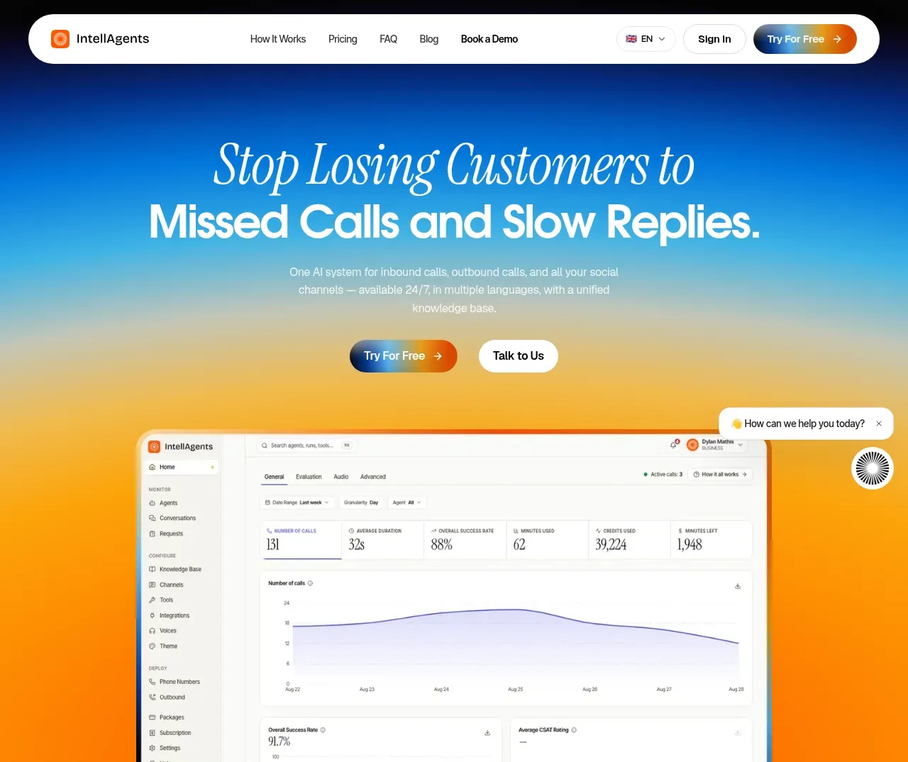
A long-form SaaS landing page uses a bright blue-to-orange gradient hero, oversized black-and-white typography, and repeated framed product screenshots to make the platform tangible. Below the hero, the rhythm alternates between compact editorial statements, full-width feature demos, channel diagrams, and split-image sections before tightening into pricing, a dark FAQ band, and a gradient CTA/footer; orange accents and soft colored screen borders provide continuity across otherwise white sections.
Prompt preview
## Reference images

Study these alongside the description below: hierarchy, rhythm, spacing, colour. Build for the product you are asked about, using this design language.

- Full page: https://kage-design-assets.t3.tigrisfiles.io/screenshots/intellagents-io/be3df101-c546-4853-b3d0-99c345832561-1790316161493-full.webp
- Above the fold: https://kage-design-assets.t3.tigrisfiles.io/screenshots/intellagents-io/be3df101-c546-4853-b3d0-99c345832561-1790316141709.webp
- Design on Kage: https://kage.design/designs/intellagents-landing-page

## Before you start
Ask the user what they are building, who it is for, and which brand assets they already have, including the product name, colours, typefaces, logo, and any existing visual rules. Wait for their answers before designing. Apply the system below to their product, not to the reference site.

## Page structure
1. **Sticky top navigation** — Use a compact rounded white navigation bar floating over the hero, with a small brand mark at left, restrained text links in the middle, language/account controls, and a high-contrast gradient CTA at right.
2. **Hero** — Open with a tall, centered statement using a large elegant italic/serif accent line above a heavy sans-serif headline. Add a short supporting paragraph and two CTAs, then place a large dashboard screenshot overlapping the lower edge of a blue-to-orange atmospheric gradient.
3. **System introduction** — On white, present a two-column editorial statement: oversized headline on the left with one italic orange phrase, and concise explanatory copy plus repeated CTAs on the right.
4. **Feature-section intro** — Add generous whitespace and a small uppercase eyebrow introducing the tools or capabilities that follow.
5. **Inbound call handling** — Show a large, centered product dashboard screenshot inside a pale panel with a thin warm/cool gradient frame, followed by a bold feature title and one-line explanation.
6. **Always-on availability** — Repeat the screenshot-plus-caption pattern with an agents view, keeping the image dominant and the text directly beneath it.
7. **Multilingual support** — Feature a language settings screenshot at large scale, followed by a title about language coverage and a concise italic-led description.
8. **Unified conversation database** — Show a database or document-list interface in the same framed treatment, then explain how calls and social conversations become one source of truth.
9. **Chat summaries** — Use a conversation-detail screenshot with audio/transcript/analysis UI, followed by a short caption explaining the operational benefit.
10. **Escalation workflows** — Replace the dashboard treatment with a workflow/node diagram screenshot, then explain routing, transfer, and human escalation.
11. **Channel integration statement** — Center a large headline with an italic first line, short explanatory text, and CTAs. Below it, arrange supported channels in two balanced columns around a glowing orange circular hub with curved connector lines.
12. **Offline/after-hours split section** — Use a two-column layout: editorial copy, pricing callout, and CTA on the left; a colorful illustrated or product-style message panel on the right. Keep the left side white and let the media carry the visual energy.
13. **Nothing-slips proof section** — Add a small uppercase eyebrow, a large oversized statement partially extending behind a centered request-management screenshot, then a paragraph, industry filter chips, and an action button.
14. **Pricing** — On a softly tinted background, introduce pricing with a serif italic phrase paired with a bold sans-serif promise. Add a billing toggle and four horizontal pricing cards, highlighting the recommended plan with an orange outline/badge and gradient CTA.
15. **FAQ** — Switch abruptly to a near-black section. Use a two-column layout with a large white heading and link on the left, and thin-divider accordion rows with plus/close controls on the right.
16. **Final CTA** — Use a compact, centered CTA over a horizontal orange-to-blue-to-black glow. Pair a bold white headline with an italic script/serif subheadline, supporting copy, and a white pill button.
17. **Footer** — Finish on black with a small brand block and description, social buttons, several compact link columns, legal/contact details, and a low-contrast copyright line.

## Design language
- Build hierarchy through contrast between a refined italic serif/script accent and a geometric, heavy sans-serif for functional headings; use oversized display text in the hero and major statements, then reduce sharply for captions and navigation.
- Let page rhythm change deliberately: spacious editorial introductions, dense screenshot-led feature modules, centered diagrams and proof moments, compact pricing cards, then high-contrast FAQ and footer bands.
- Keep most content on white or near-white surfaces, using saturated atmospheric gradients as punctuation. Approximate the signature gradient with deep blue `#003B88`, electric blue `#159FE8`, warm yellow `#F7C34A`, and orange `#F26A00`; use orange for italic emphasis, badges, and key accents.
- Treat product screenshots as primary evidence: use large crops, generous surrounding whitespace, and subtle warm-to-cool gradient borders rather than decorative illustrations. Preserve a clean, pale interface inside the screenshots.
- Pair near-black text `#090909` with soft gray body copy around `#777777`; reserve white type for dark sections. Keep text widths narrow enough for editorial line breaks and readable supporting copy.
- Use pill-shaped CTAs and controls with small radii-to-height ratios, white secondary buttons with fine gray borders, and gradient primary buttons that move from navy/blue into orange. Use restrained corner rounding on cards and screenshots, generally around 14–22px.
- Keep shadows soft and diffuse, mainly under floating navigation, pills, cards, and screenshot frames. Avoid heavy borders except for pricing emphasis and screenshot framing.
- Make the navigation feel lightly floating and persistent. Use accordion rows for FAQs, toggles for billing, chips for industries, and obvious hover/focus states on every CTA and interactive control; motion should be subtle, with screenshot and gradient elements easing into view rather than bouncing.
- Maintain a strong centered grid for hero, feature media, diagrams, and final CTA, while using two-column editorial grids for introduction, split proof sections, FAQ, and footer content.

## Never
- Do not copy the reference site's logos, wordmarks, product name, written copy, illustrations, photography, screenshots, channel icon set, or exact diagrams.
- Do not present the result as IntellAgents or imply an affiliation with it.
- Create original content, brand assets, interface examples, and visuals for the user's product while retaining only the reusable layout logic and design principles above.
Components from this page
All components
 Global navigation
IntellAgents.io · Navigation
Global navigation
IntellAgents.io · Navigation
 Gradient product hero
IntellAgents.io · Hero
Gradient product hero
IntellAgents.io · Hero
 System positioning statement
IntellAgents.io · Call to action
System positioning statement
IntellAgents.io · Call to action
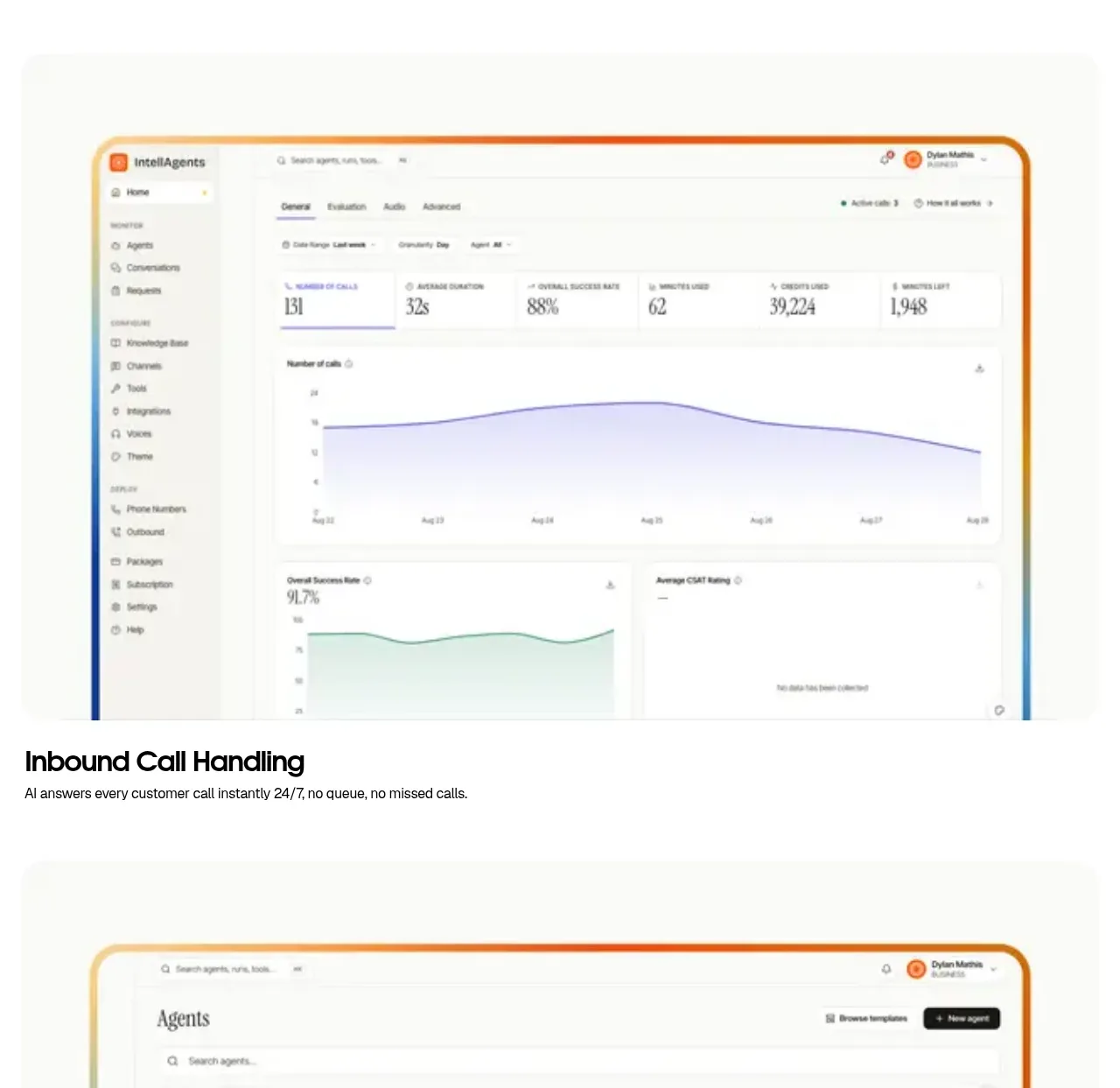 Inbound call handling
IntellAgents.io · Feature grid
Inbound call handling
IntellAgents.io · Feature grid
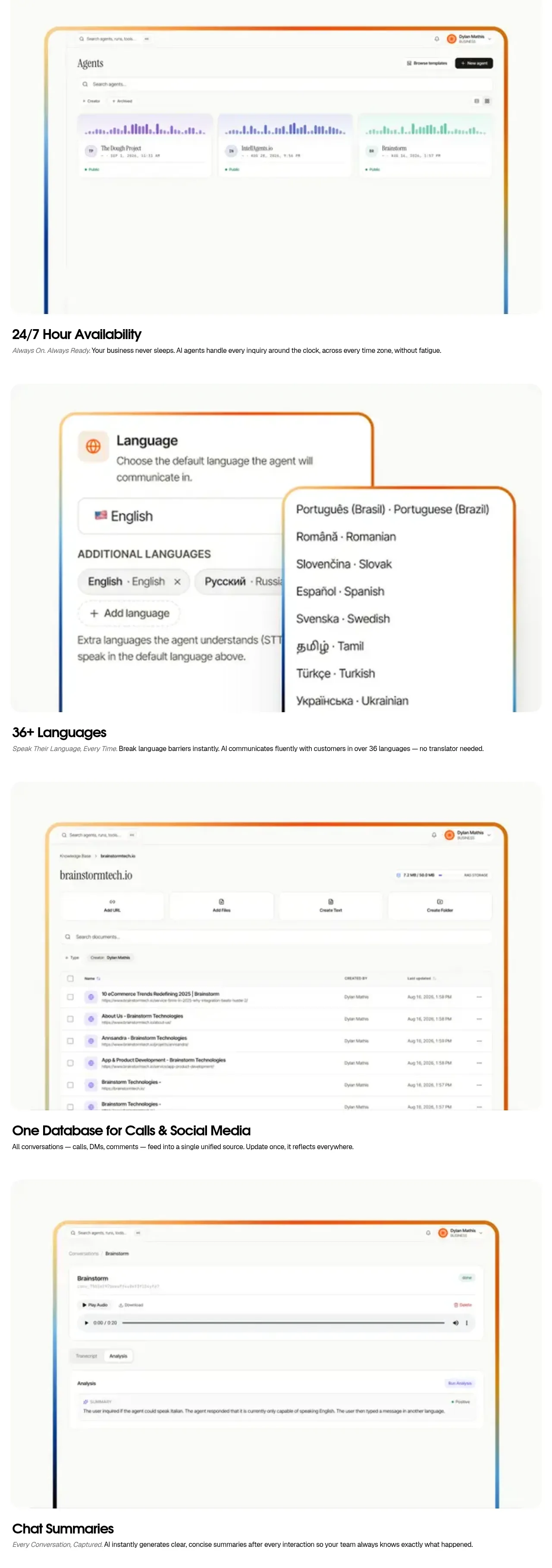 Always-on capability showcases
IntellAgents.io · Feature grid
Always-on capability showcases
IntellAgents.io · Feature grid
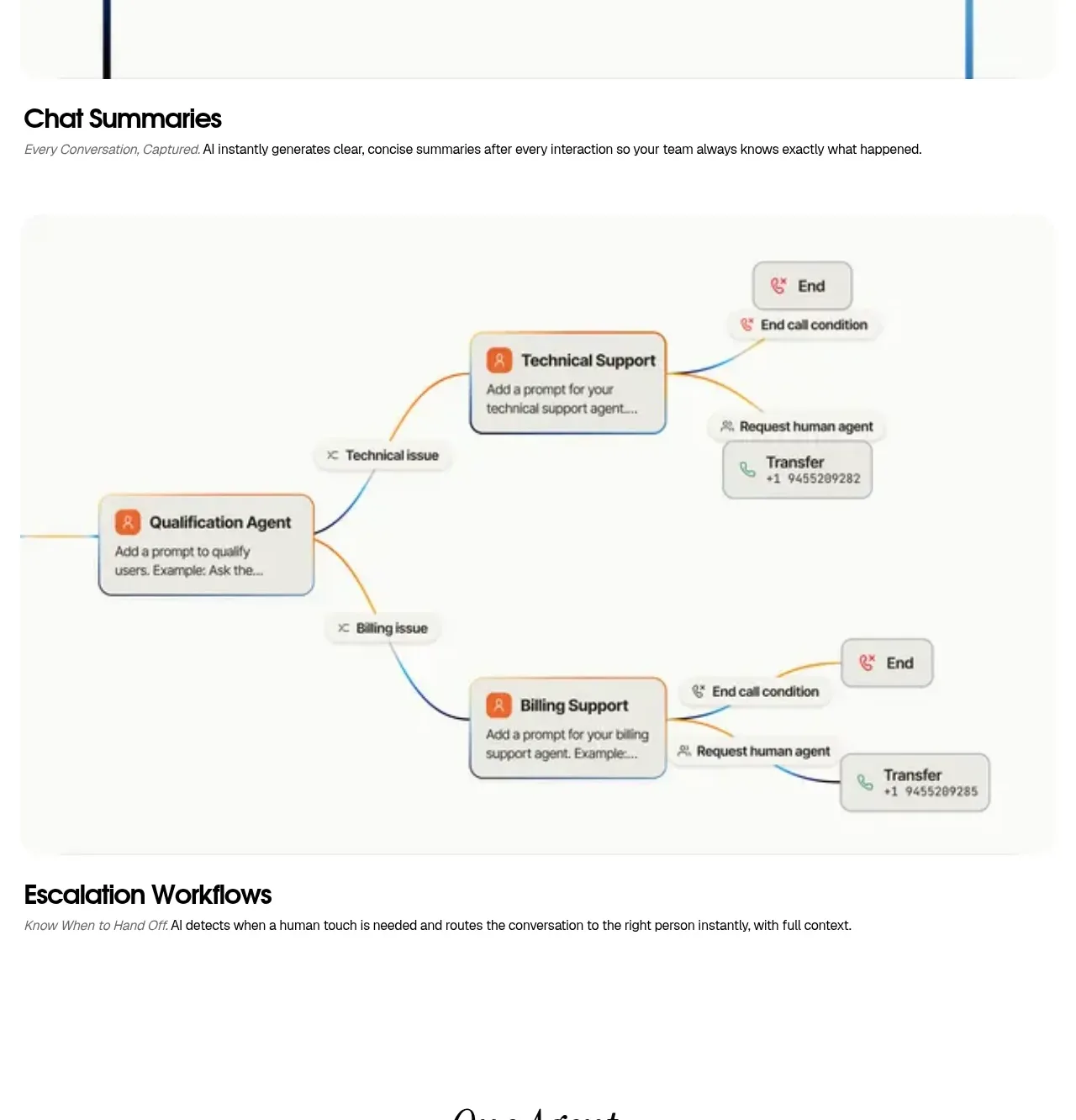 Escalation workflow diagram
IntellAgents.io · Feature grid
Escalation workflow diagram
IntellAgents.io · Feature grid
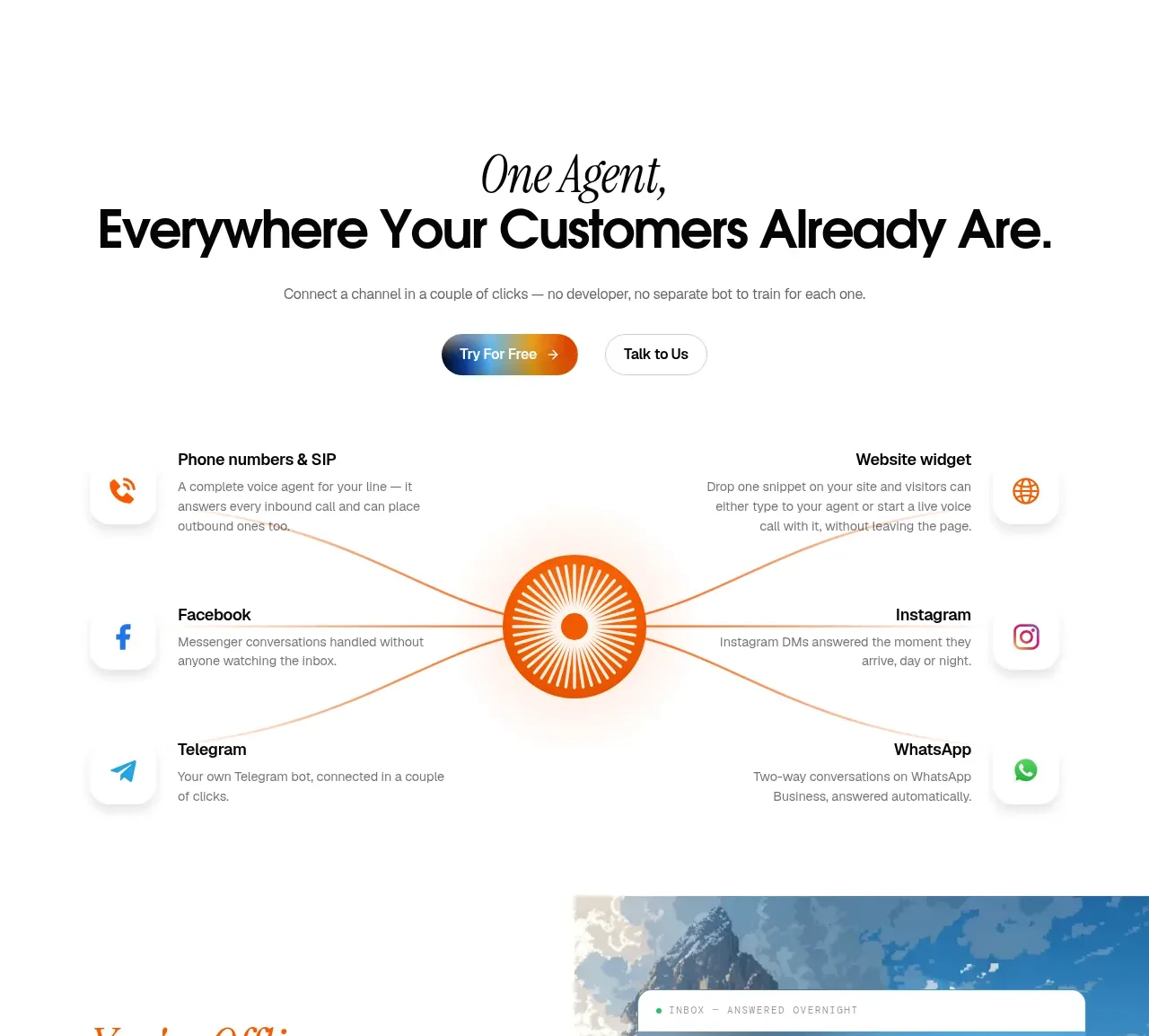 Omnichannel connection map
IntellAgents.io · Feature grid
Omnichannel connection map
IntellAgents.io · Feature grid
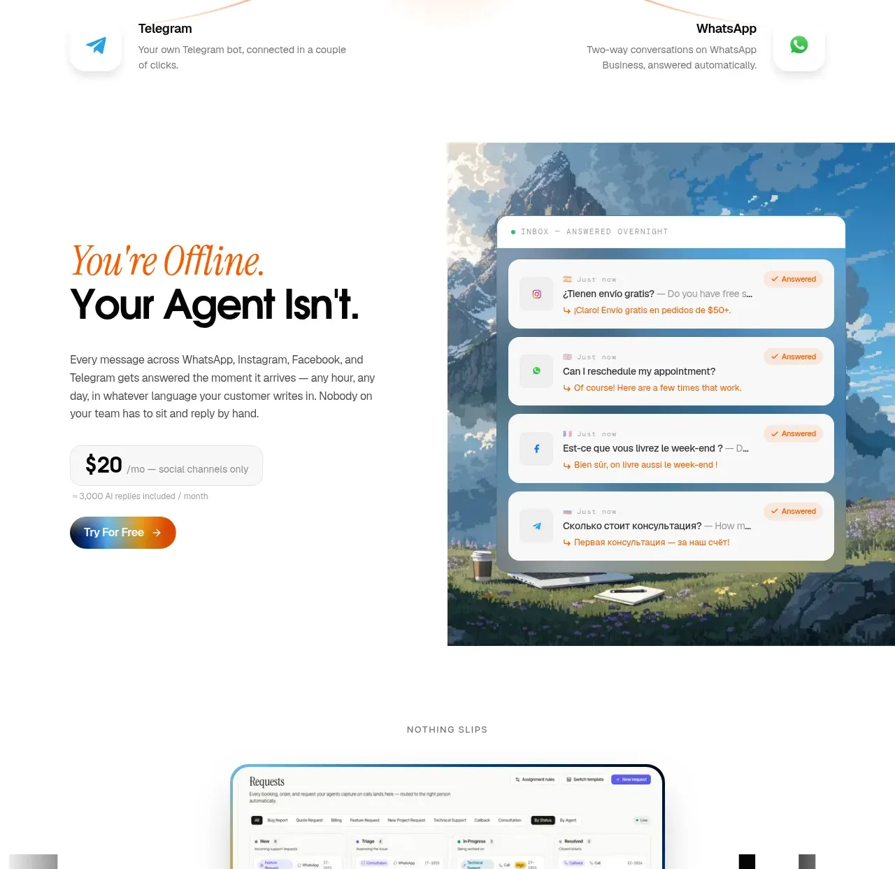 Offline continuity feature
IntellAgents.io · Card
Offline continuity feature
IntellAgents.io · Card
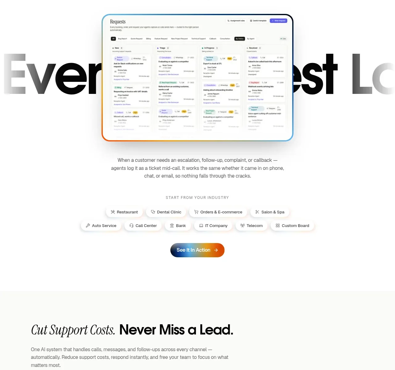 Unified request tracking
IntellAgents.io · Feature grid
Unified request tracking
IntellAgents.io · Feature grid
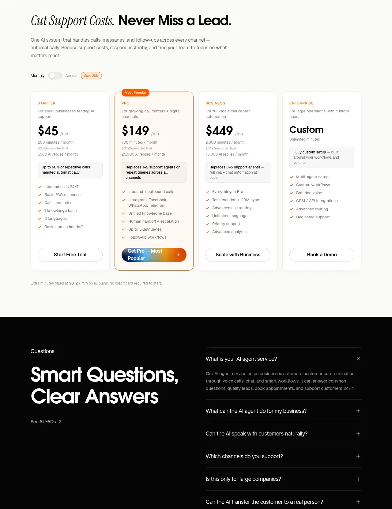 Support plan pricing
IntellAgents.io · Pricing table
Support plan pricing
IntellAgents.io · Pricing table
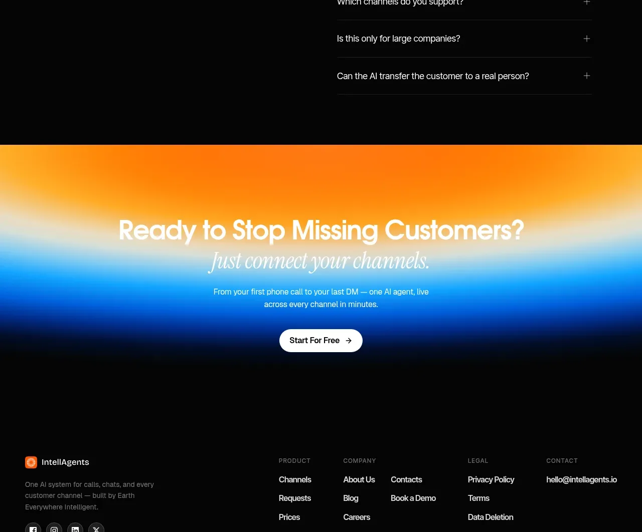 Questions and answers
IntellAgents.io · FAQ
Questions and answers
IntellAgents.io · FAQ
 Final conversion banner
IntellAgents.io · Call to action
Final conversion banner
IntellAgents.io · Call to action