 kage
kage
intellagents.io
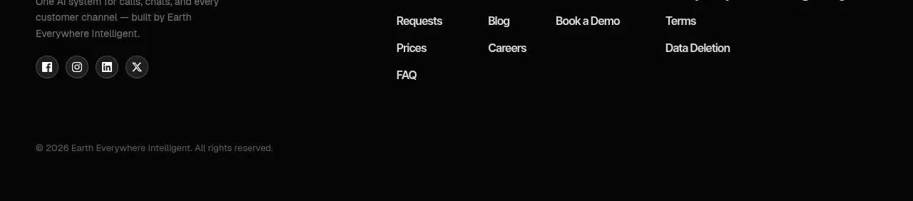
Design analysis
A compact high-energy gradient banner closes the marketing argument with a direct question, an italic supporting line, and a single centered action.
Prompt preview
## Reference images

Study these alongside the description below: hierarchy, rhythm, spacing, colour. Build for the product you are asked about, using this design language.

- Component: https://kage-design-assets.t3.tigrisfiles.io/components/intellagents-io/be3df101-c546-4853-b3d0-99c345832561-1790316249-11.webp
- Full page it was cut from: https://kage-design-assets.t3.tigrisfiles.io/screenshots/intellagents-io/be3df101-c546-4853-b3d0-99c345832561-1790316161493-full.webp
- Component on Kage: https://kage.design/component/intellagents-cta-2

## Before you start
Ask what final action the user should take and what emotional promise should motivate it. Adapt this closing banner to the user's brand and funnel stage.

Create a centered closing CTA with a vivid horizontal gradient background, a bold question-style headline, a refined italic or serif subline, one short supporting sentence, and one high-contrast pill button. Keep the hierarchy simple and the content centered. Use the gradient as the visual event, but preserve text contrast with a dark lower stop or a soft overlay if needed.

Use approximate #FF8A00, #F9C84A, #16A7E8, #0751C9, and #050505. Use 32–48px headline size, 16–22px accent line, 14px supporting text, 999px button radius, and 64–96px vertical padding. Add a visible focus state and respect reduced-motion preferences.

### Never
- Never copy logos, product names, copy, illustrations, or imagery from the reference.
- Never add multiple competing CTAs in the final banner.
- Never sacrifice readability for a dramatic gradient.
More components
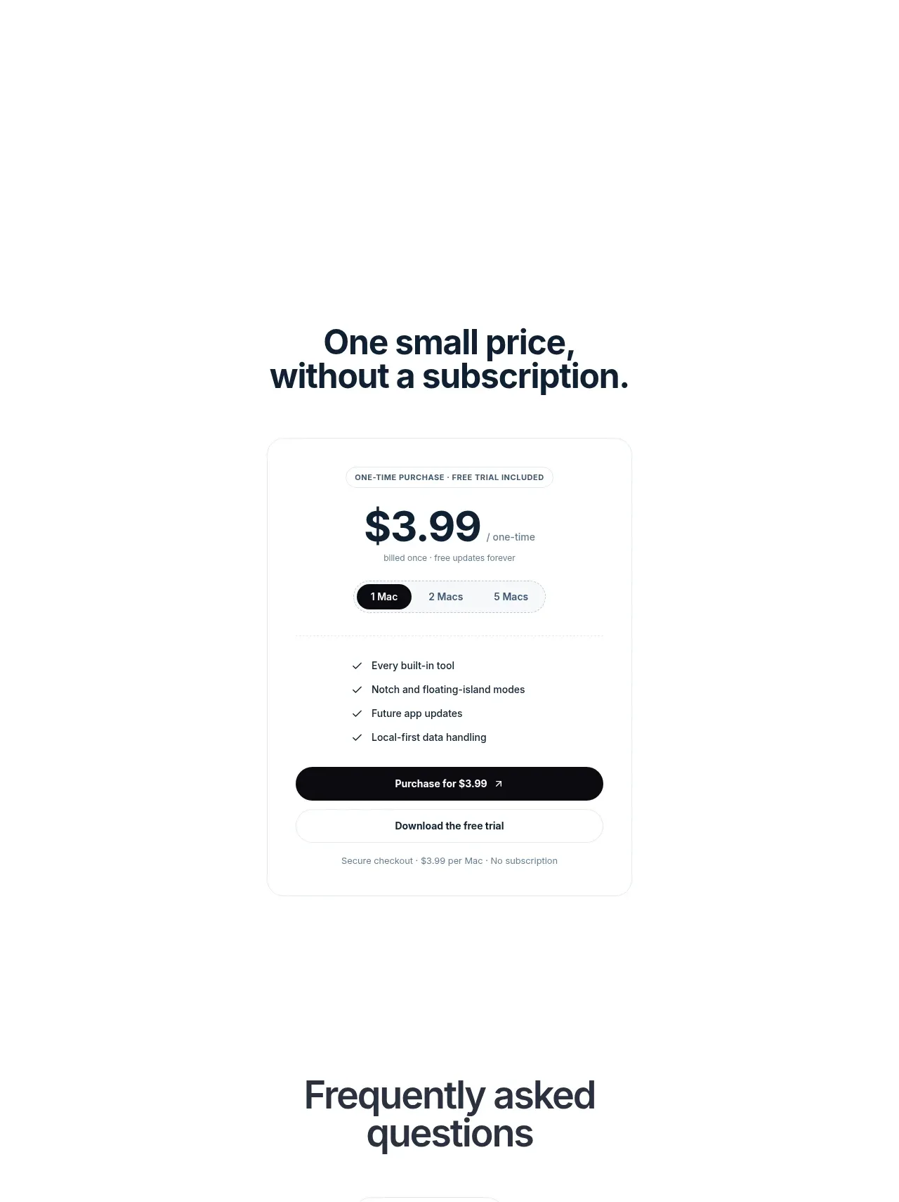
 Visual closing product statement
NotchPop · Call to action
Visual closing product statement
NotchPop · Call to action

 System positioning statement
IntellAgents.io · Call to action
System positioning statement
IntellAgents.io · Call to action
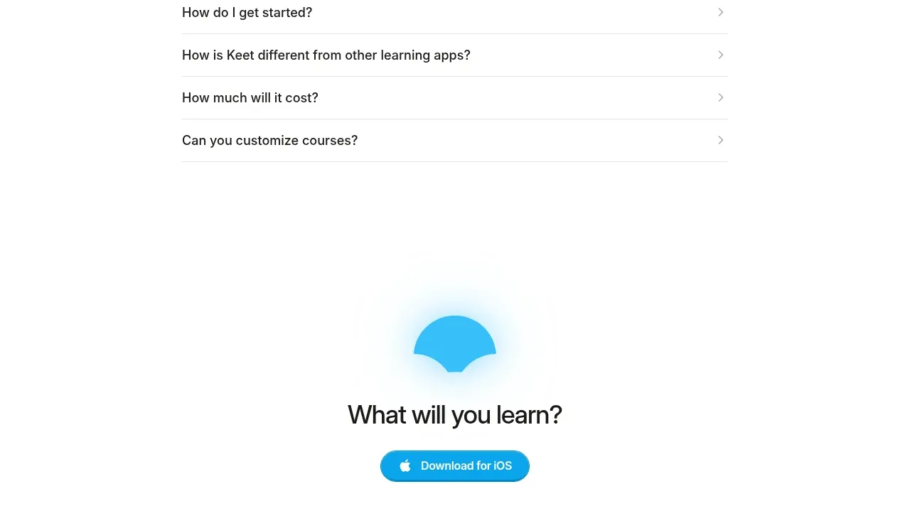
 Final app-download call to action
Keet · Call to action
Final app-download call to action
Keet · Call to action
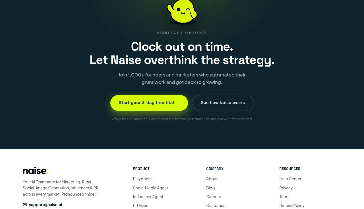
 Dark conversion call to action
Naise AI · Call to action
Dark conversion call to action
Naise AI · Call to action
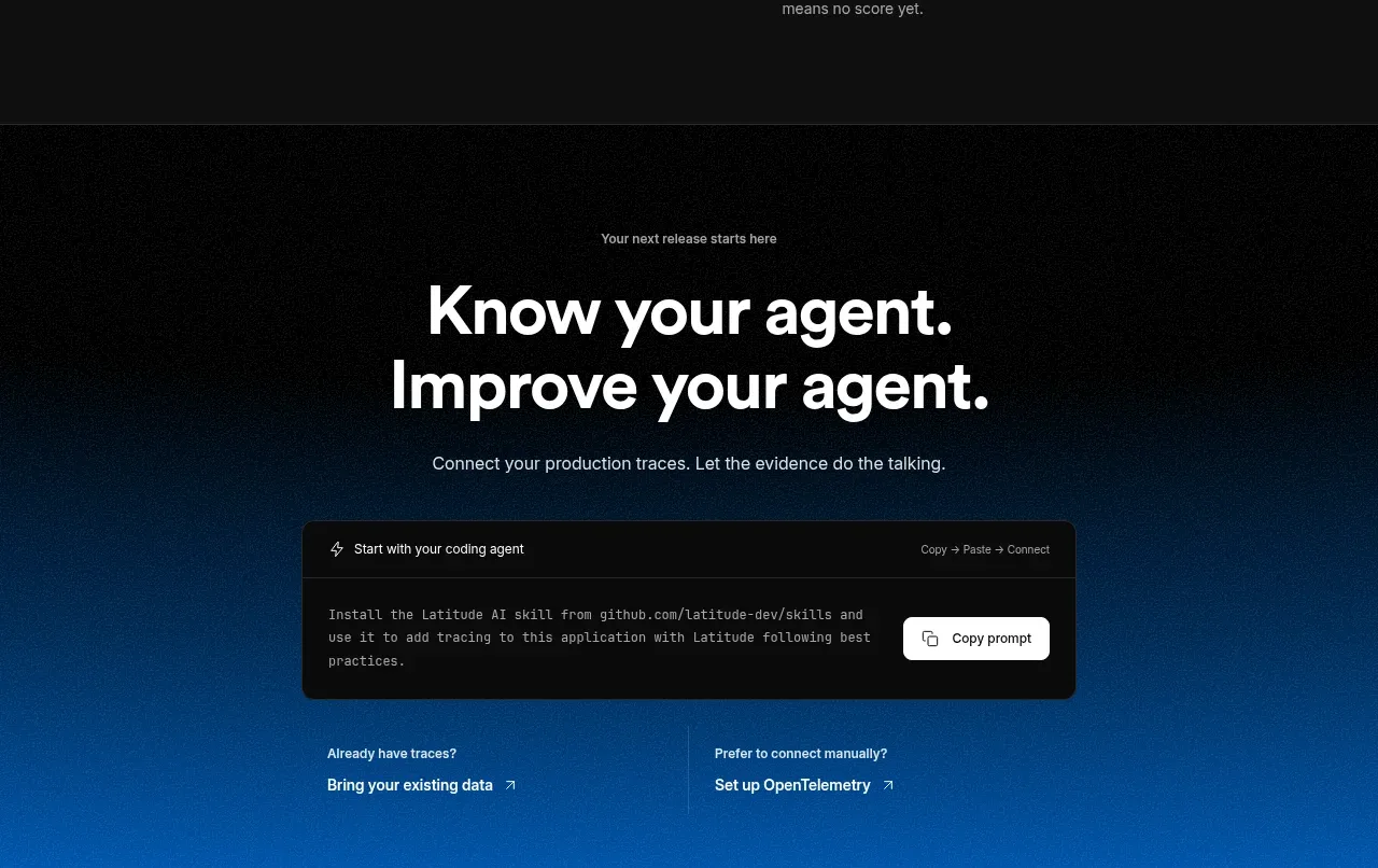
 Connect data and start improving
AgentScore · Call to action
Connect data and start improving
AgentScore · Call to action
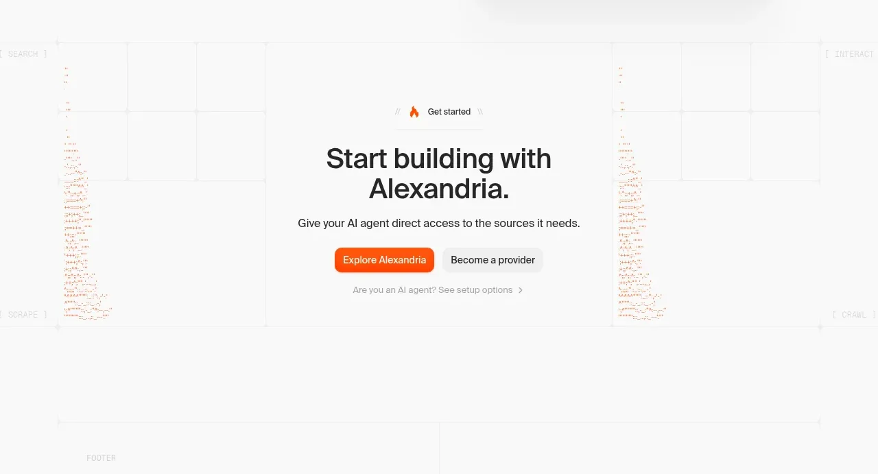
 Final build CTA
Alexandria by Firecrawl · Call to action
Final build CTA
Alexandria by Firecrawl · Call to action