 kage
kage
intercom.com
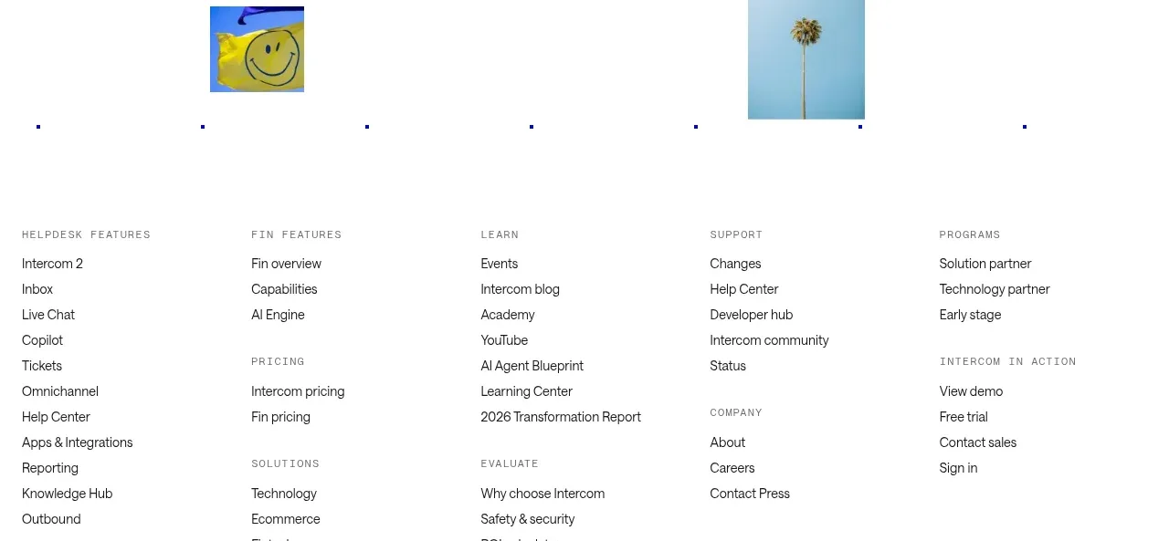
Design analysis
A minimal closing CTA uses a large centered statement, two buttons, and a sparse field of small image accents. It creates a memorable pause before the dense footer navigation.
Prompt preview
## Reference images

Study these alongside the description below: hierarchy, rhythm, spacing, colour. Build for the product you are asked about, using this design language.

- Component: https://kage-design-assets.t3.tigrisfiles.io/components/intercom-com/1643b347-46d4-4b8f-b100-4d586237bab2-1789906753-10.webp
- Full page it was cut from: https://kage-design-assets.t3.tigrisfiles.io/screenshots/intercom-com/1643b347-46d4-4b8f-b100-4d586237bab2-1789906717325-full.webp
- Component on Kage: https://kage.design/component/intercom-cta

## Before you start
Ask what the user's product, brand, and desired conversion action are, then apply these principles to that product.

Create a closing CTA with a large centered headline, a compact pair of primary and secondary buttons, and restrained decorative accents placed around the perimeter. The accents may be small cropped images, color blocks, or abstract shapes, but they should never interfere with the message. Keep the composition intentionally sparse and let the headline provide the emotional finish.

Use white #ffffff, black #111111, and one restrained accent such as #1717a8 or #e87518. Set the headline between 42–56px desktop with tight line-height, buttons at 14px, and 24–32px between heading and actions. Give the section 80–110px vertical padding and a max-width of 820px. Buttons use 8px radius; primary is filled black and secondary is outlined. Decorative elements should be aria-hidden and disappear or simplify on mobile.

Never: use logos, product names, copy, illustrations, or imagery from the reference.
More components
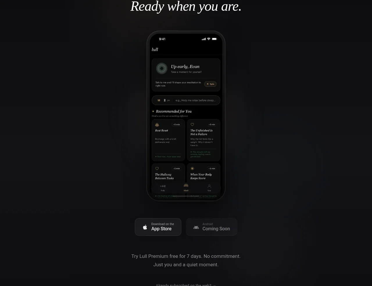
 App download conversion
Lull · Call to action
App download conversion
Lull · Call to action

 Centered final call to action
ApplySeed · Call to action
Centered final call to action
ApplySeed · Call to action
F
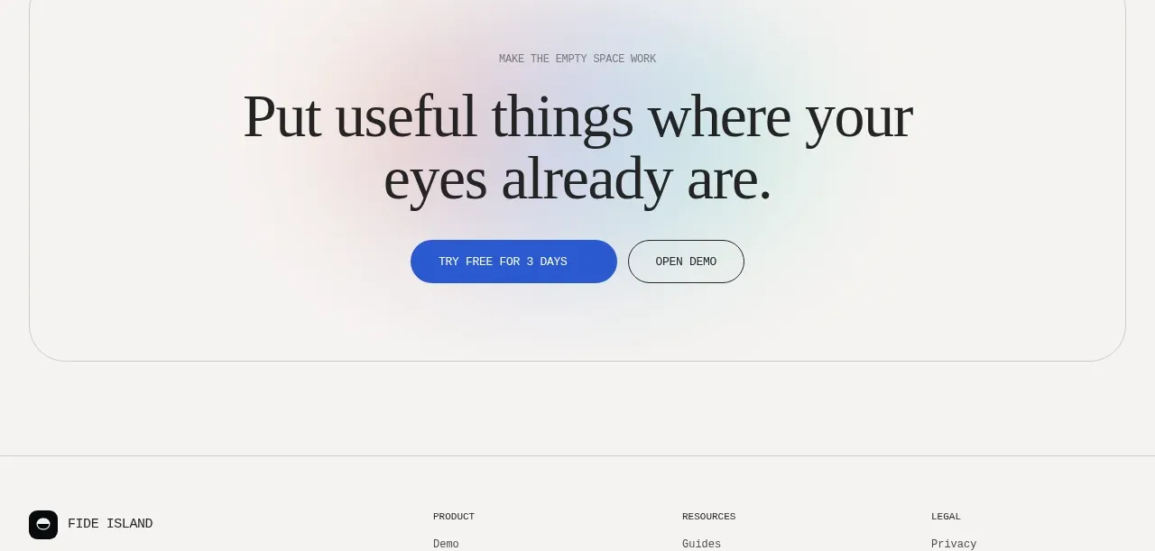
Final conversion call to action
Fide Island · Call to action

 Inline conversion banner
QAgent · Call to action
Inline conversion banner
QAgent · Call to action
A
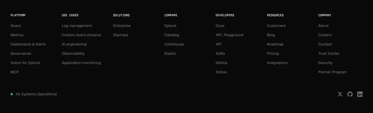
Final signup call to action
Axiom · Call to action
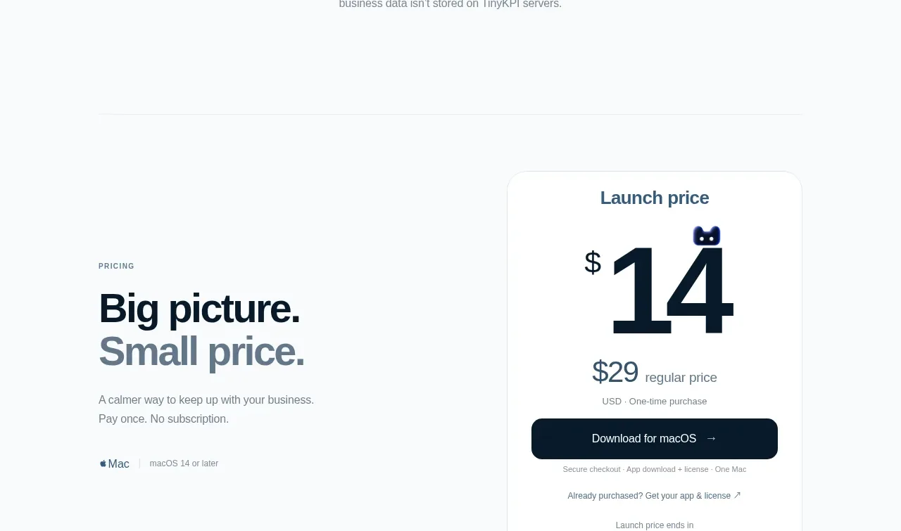
 Privacy promise
TinyKPI · Call to action
Privacy promise
TinyKPI · Call to action