kage
kage
intercom.com

Design analysis
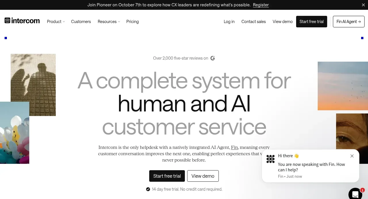
A long editorial landing page on warm off-white with a serif/sans mix, generous margins, and square black-blue/orange corner ticks framing each major section like crop marks. The hero pairs a huge centred headline with photography fragments and a floating Fin chat widget; below it the page alternates between alternating text-image feature sections, a dense logo cloud, three-up feature grids, a tabbed testimonial, an integration grid, and a single-centred pricing card, ending in a typography-led closing CTA. Rhythm comes from alternating section backgrounds (cream vs white) and from restrained illustrated ink motifs instead of product screenshots everywhere.
Prompt preview
## Reference images

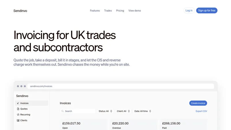
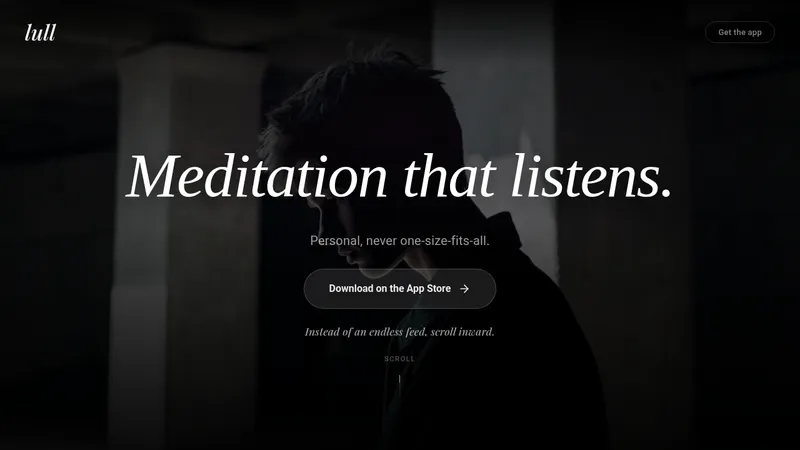
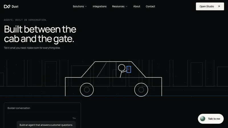
Study these alongside the description below: hierarchy, rhythm, spacing, colour. Build for the product you are asked about, using this design language.

- Full page: https://kage-design-assets.t3.tigrisfiles.io/screenshots/intercom-com/1643b347-46d4-4b8f-b100-4d586237bab2-1789906717325-full.webp
- Above the fold: https://kage-design-assets.t3.tigrisfiles.io/screenshots/intercom-com/1643b347-46d4-4b8f-b100-4d586237bab2-1789906711911.webp
- Design on Kage: https://kage.design/designs/intercom-landing-page

## Before you start
Ask the user what product they are building, who it is for, and what brand assets (name, colours, type, product screenshots) they already have. Wait for the answers. Everything below is applied to that product, not the reference.

## Page structure
1. **Announcement bar**: thin black bar at very top with one line of event/promo copy and a text link, plus a close control.
2. **Navbar**: left wordmark, centre-ish nav links with dropdown affordances (Product, Customers, Resources, Pricing), right side utility links (Log in, Contact sales, View demo) and a solid dark pill CTA plus an outlined secondary pill. Sticky, minimal height.
3. **Hero**: large centred headline (two lines, last line in a lighter/serif-toned treatment) over a short subhead paragraph and two buttons (solid dark pill + outlined pill) with a reassurance line underneath ("free trial, no credit card"). Around the headline sit cropped photographic fragments in the corners, and a floating chat-widget card at bottom-right demonstrates the product live.
4. **Two-product tabs**: a two-tab switcher ("Intercom helpdesk" / "Fin AI Agent") above a large product screenshot set in a photo-textured panel. Lets visitors pick which product story to see.
5. **Logo cloud**: eyebrow "Trusted by 30,000+ leading brands", then four rows of monochrome brand wordmarks in a loose grid, no card borders.
6. **Feature section A** (product 1): small uppercase eyebrow with a coloured square marker, large headline with one word italicised, short paragraph, dark CTA + outlined CTA, and an abstract black ink illustration on the right. Below, a large product screenshot collage, then a three-column feature grid (title + paragraph + "Learn more" link).
7. **Feature section B** (product 2): same pattern on a slightly different background tint, its own accent colour (orange markers), ink illustration on the right, then a big screenshot panel with a stacked list of three feature blocks on the right rail.
8. **"Better together" section**: both eyebrow markers side by side, headline + paragraph + CTAs, ink illustration, then a three-card row (screenshot + title + paragraph) showing combined workflows.
9. **Testimonial**: three tab buttons (customer names) above a bordered panel: brand wordmark, large pull-quote with the key stat highlighted in coloured underline/text, author name and title, and a portrait photo on the right.
10. **Integrations**: headline "Works with the tools you already use" left, paragraph and CTAs below; right side a staggered grid of integration cards each with a small logo tile and name.
11. **Pricing**: centred headline "Transparent pricing" over a single cream card: plan name, one-line description, big price formula ($29 + $0.99 with unit labels), two CTAs, and a dotted/halftone pattern bleeding outside the card; footnote line underneath.
12. **Closing CTA**: oversized display headline ("Perfect customer experiences") spread across the width, scattered small photo fragments and ink motifs, centre CTA pair.
13. **Footer**: multi-column link lists (features, learn, support, programs, solutions) with small uppercase column headers, then a legal row (Terms, Privacy, Security, privacy-choices toggle).

## Design language
- Base is warm off-white/cream (#faf8f5-ish); alternate section backgrounds between cream and white to create rhythm; use near-black text (#141414).
- Each major section is framed with tiny square "crop mark" ticks in the corners — blue-black for one product, orange for the other — a signature that gives the page a printed/editorial feel.
- Typography: a geometric sans for UI and most headlines, mixed with an italic or serif contrast word inside key headlines for emphasis. Hero headline ~90–110px at desktop, section headlines ~48–64px, body 16–18px with relaxed line height.
- Eyebrows: 12px uppercase letter-spaced labels preceded by a small coloured square marker; consistent across all sections.
- Buttons: solid dark pill (primary, white text) and thin-outlined pill (secondary, dark text); rounded-full, comfortable padding.
- Product screenshots are the hero imagery: large, slightly overlapping panels with subtle shadows and rounded corners, set inside warm photographic/textured backdrops.
- Illustration language: sparse black ink-brush motifs (butterflies, kites, figures) floating in whitespace next to headlines — never clip-art dense.
- Colour accents are used sparingly: tiny square markers, stat highlights in the testimonial, and tab markers; the page stays almost monochrome otherwise.
- Density rhythm: airy hero → dense logo cloud → alternating airy text blocks with heavy screenshot moments → compact three-up grids → single-card pricing → oversized closing display type.
- Interaction: hover states on links show underline or colour; tabs switch testimonial/product panels; floating chat widget card sits above the hero content.

## Never
- No Intercom logo, wordmark, "Fin" product name, or any copy, testimonial text, customer logos or ink illustrations from the reference.
- Do not recreate the exact headline, pricing numbers, or brand names; present the output as the user's own product.
Components from this page
All components
 Announcement bar and primary navigation
intercom.com · Navigation
Announcement bar and primary navigation
intercom.com · Navigation
 Human and AI customer service hero
intercom.com · Hero
Human and AI customer service hero
intercom.com · Hero
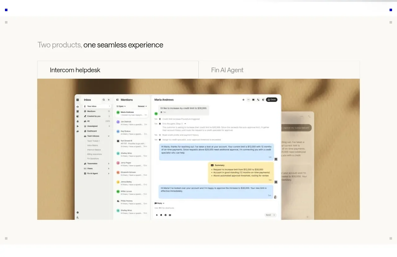 Product overview showcase
intercom.com · Tabs & steps
Product overview showcase
intercom.com · Tabs & steps
 Trusted brands logo cloud
intercom.com · Logo cloud
Trusted brands logo cloud
intercom.com · Logo cloud
 AI-powered helpdesk feature section
intercom.com · Feature grid
AI-powered helpdesk feature section
intercom.com · Feature grid
 AI agent capabilities section
intercom.com · Feature grid
AI agent capabilities section
intercom.com · Feature grid
 Unified support experience overview
intercom.com · Feature grid
Unified support experience overview
intercom.com · Feature grid
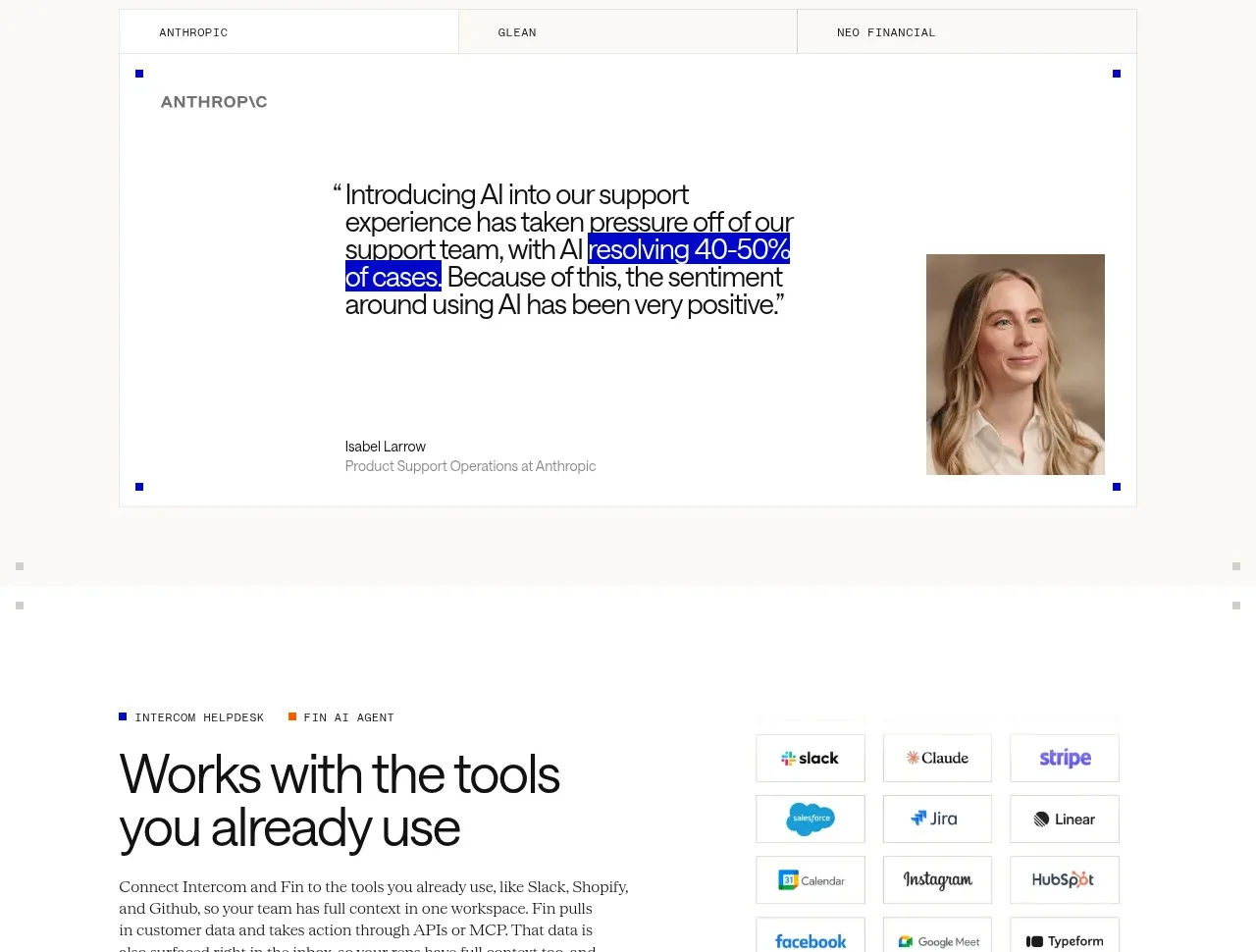 Customer testimonial panel
intercom.com · Testimonials
Customer testimonial panel
intercom.com · Testimonials
 Integrations and ecosystem section
intercom.com · Feature grid
Integrations and ecosystem section
intercom.com · Feature grid
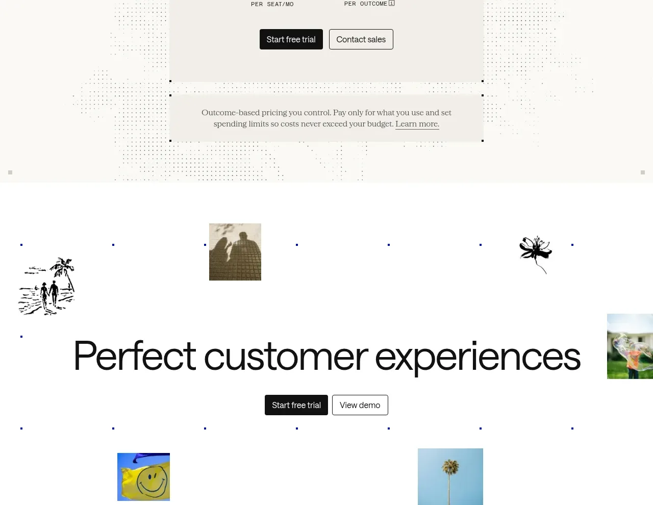 Transparent pricing card
intercom.com · Pricing table
Transparent pricing card
intercom.com · Pricing table
 Final customer experience call to action
intercom.com · Call to action
Final customer experience call to action
intercom.com · Call to action
 Multi-column site footer
intercom.com · Footer
Multi-column site footer
intercom.com · Footer