kage
kage
intercom.com

Design analysis
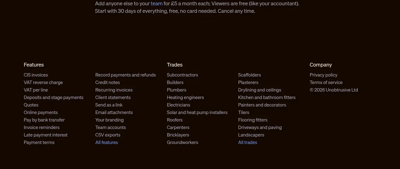
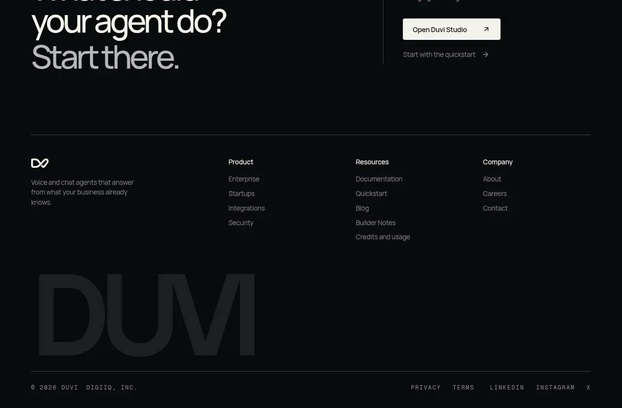
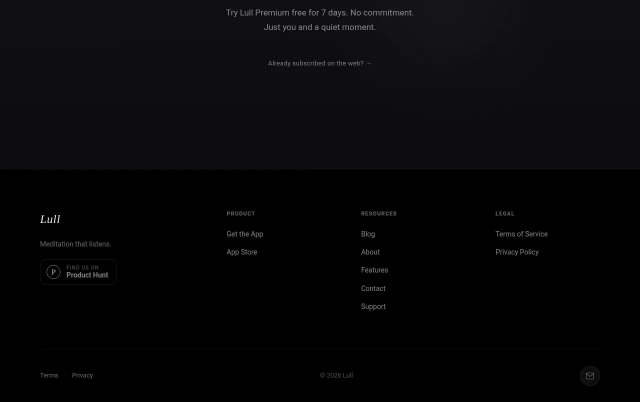
The footer is a dense but highly organized set of link columns with uppercase category labels, followed by a small legal utility row. Consistent column alignment makes a large information architecture scan quickly.
Prompt preview
## Reference images

Study these alongside the description below: hierarchy, rhythm, spacing, colour. Build for the product you are asked about, using this design language.

- Component: https://kage-design-assets.t3.tigrisfiles.io/components/intercom-com/1643b347-46d4-4b8f-b100-4d586237bab2-1789906753-11.webp
- Full page it was cut from: https://kage-design-assets.t3.tigrisfiles.io/screenshots/intercom-com/1643b347-46d4-4b8f-b100-4d586237bab2-1789906717325-full.webp
- Component on Kage: https://kage.design/component/intercom-footer

## Before you start
Ask what the user's product, brand, navigation structure, and legal requirements are, then apply these principles to that product.

Build a responsive multi-column footer with 5 navigation groups on desktop. Each group has a tiny uppercase heading with tracking, followed by vertically stacked links and optional subgroups. Add a bottom legal row for terms, privacy, security, and preference controls. Keep the footer informational and low-contrast rather than promotional.

Use #fafaf7 or #ffffff background, #151515 headings, #686b65 links, and #dcdcd6 dividers. Set 10–11px uppercase labels with 0.14em letter spacing, 12–13px link text, 8–12px vertical link gaps, and 32–48px column gaps. Use a max-width around 868px with 16px mobile padding. On smaller screens, collapse groups into accordions or stack them with clear headings; preserve focus states and sufficient touch targets.

Never: use logos, product names, copy, illustrations, or imagery from the reference.