 kage
kage
is.team
Design analysis
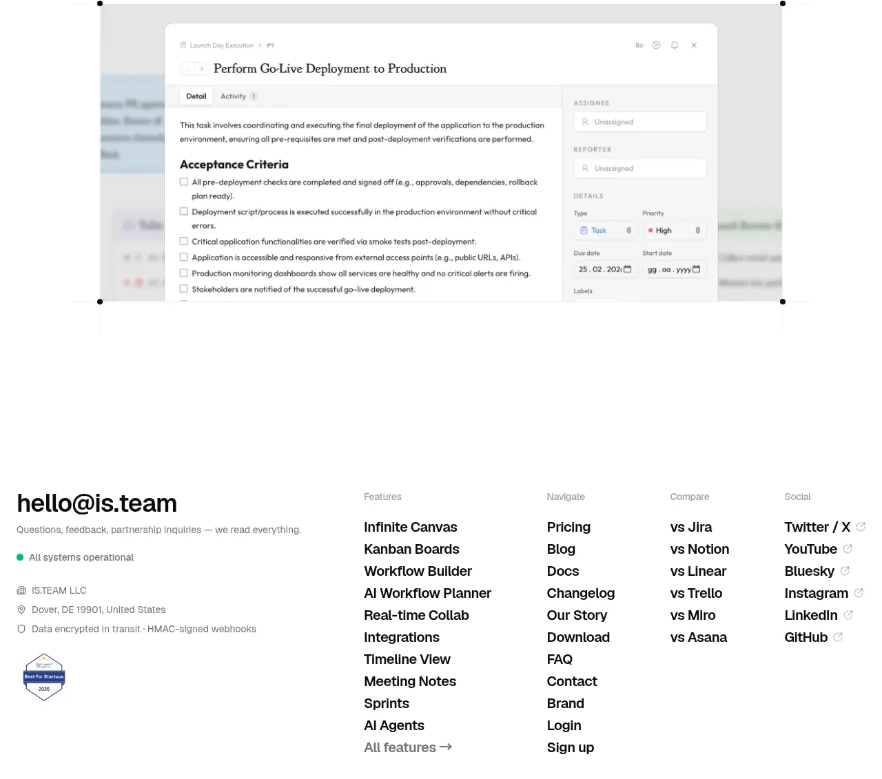
The closing CTA restates the product promise in a large editorial headline, pairs it with a single strong action, and places a wide product visual beneath. It is a decisive transition into the footer.
Prompt preview
## Reference images

Study these alongside the description below: hierarchy, rhythm, spacing, colour. Build for the product you are asked about, using this design language.

- Component: https://kage-design-assets.t3.tigrisfiles.io/components/is-team/5ec87905-607a-4eeb-afa3-a1b534169c52-1789538687-10.webp
- Full page it was cut from: https://kage-design-assets.t3.tigrisfiles.io/screenshots/is-team/5ec87905-607a-4eeb-afa3-a1b534169c52-1789538583775-full.webp
- Component on Kage: https://kage.design/component/is-team-cta

## Before you start
Ask me what final action I want visitors to take, what promise should be repeated, and what product visual is available. Build a closing CTA that fits my brand.

Create a final conversion band with a small reassurance line, a large left-aligned or split-layout editorial headline, a short supporting paragraph, and one dark primary button aligned near the headline. Follow it with a wide, lightly framed product screenshot or video preview that visually reinforces the promise. Use an airy white layout, a 40–52px display serif heading, 13–15px gray body copy, near-black #111 button, and a 10–14px radius on the visual frame. Keep the content within a 584px maximum width with generous outer padding, and make the CTA button highly visible without using a loud gradient. On mobile, stack headline and button, then scale the visual fluidly. Provide hover and focus states and avoid autoplay media.

Never use the reference's logo, product name, copy, illustrations, imagery, or exact screenshot.
More components

 Final conversion banner
tiun. · Call to action
Final conversion banner
tiun. · Call to action

 Mobile app conversion CTA
Payflip · Call to action
Mobile app conversion CTA
Payflip · Call to action

 Final download call to action
Grimo AI · Call to action
Final download call to action
Grimo AI · Call to action

 Download conversion panel
Kilo Code for iOS and Android · Call to action
Download conversion panel
Kilo Code for iOS and Android · Call to action

 Studio closing call to action
FATHER · Call to action
Studio closing call to action
FATHER · Call to action

 Final conversion panel
Idlen · Call to action
Final conversion panel
Idlen · Call to action