kage
kage

Design analysis
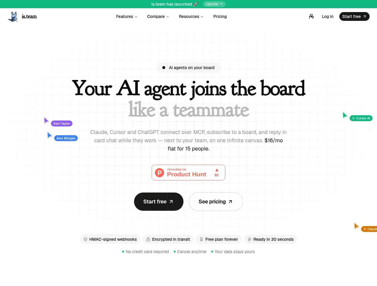
A long editorial landing page for an AI-agent project-management tool. The design leans on a large serif display face for headlines ("Your AI agent joins the board like a teammate", "Meet. Summarize. Ship tasks.") set against a warm off-white background with teal links and badges, giving the page a magazine feel rare in SaaS. Rhythm alternates between narrow centered text sections, full-width product screenshots (terminal-meets-kanban, workflow planner cards, laptop demo), a two-column integrations list, a dense feature grid, a four-column pricing table with grouped rows, and an FAQ. Persona accordion, pastel-tinted app mockups, and a beige final canvas showcase section keep the page varied while one type system and one accent colour hold it together.
Prompt preview
## Reference images

Study these alongside the description below: hierarchy, rhythm, spacing, colour. Build for the product you are asked about, using this design language.

- Full page: https://kage-design-assets.t3.tigrisfiles.io/screenshots/is-team/5ec87905-607a-4eeb-afa3-a1b534169c52-1789538583775-full.webp
- Above the fold: https://kage-design-assets.t3.tigrisfiles.io/screenshots/is-team/5ec87905-607a-4eeb-afa3-a1b534169c52-1789538573315.webp
- Design on Kage: https://kage.design/designs/is-team-landing-page

## Before you start
Ask the user what product they are building, who it is for, and what brand assets they already have (name, colours, fonts). Wait for the answers before writing any code. Everything below is applied to their product, not to the reference site.

## Page structure
Build a single long marketing landing page, top to bottom:

1. **Announcement bar** — thin full-width strip with a short promo message and an inline link pill, sits above the nav.
2. **Nav** — left wordmark, centred links (Features, Compare, Resources, Pricing), right login link and a dark pill CTA button.
3. **Hero** — centred. Small badge ("AI agents on your board"), huge serif two-line headline with the second line in a muted grey, one short paragraph naming concrete integrations and price ($16/mo, flat for 15 people). Decorative cursor-cursor labels scattered around (personas with small coloured tags). A dark "Start free" button plus a light "See pricing" button. Below, a trust strip of four small inline badges (security, encryption, free plan, setup time) and three dotted fine-print items.
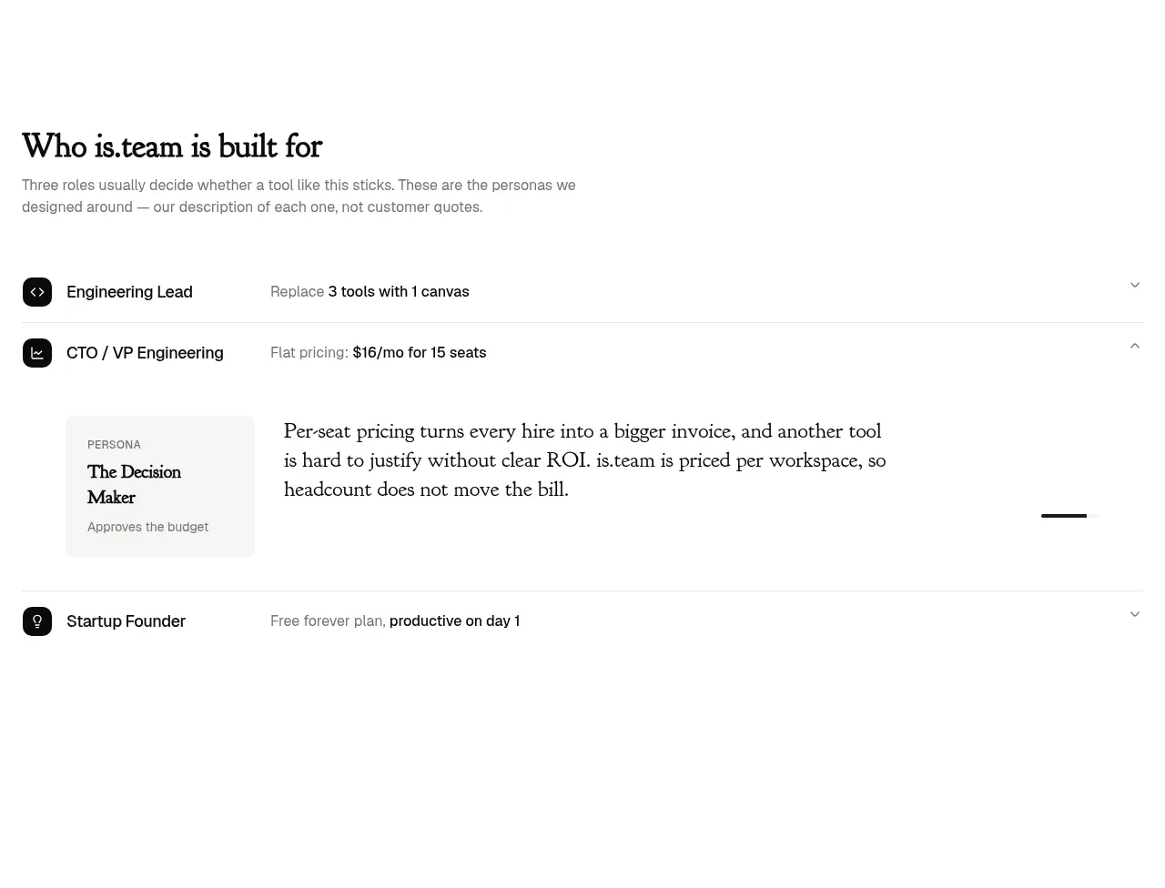
4. **Persona accordion** — "Who is it built for": three expandable rows (icon, role title, one-line promise); expanded row reveals a persona card ("The Decision Maker / Approves the budget") plus a paragraph on pricing objection handling.
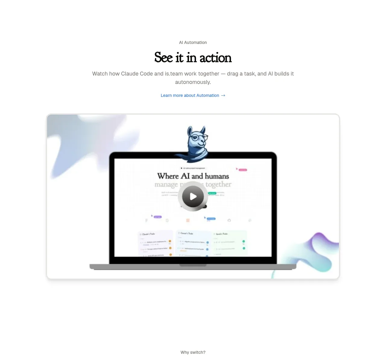
5. **Demo section** — "See it in action": eyebrow label, serif heading, subcopy, a text link, and a large laptop mockup video card with soft pastel blob shapes behind it.
6. **Business case** — three columns with big serif metric headlines ("3 tools → 1", "$X/week saved", "Day 1 productive"), each with supporting copy and a small pricing-comparison footnote. Dark pill button under it.
7. **Agent feature split** — heading pairing serif and grey text, then a large two-panel screenshot: dark terminal log on the left, light kanban board on the right, showing the same tasks.
8. **Meeting notes section** — serif headline "Meet. Summarize. Ship tasks.", subcopy, link, floating modal-style card mockup ("Extract Tasks" checklist with cancel/confirm buttons).
9. **Workflow planner** — heading, then a board mockup of three pastel-tinted task cards (violet, pink, green) each with task rows and checkmarks.
10. **Integrations** — two columns: left serif heading "Connect your tools" with paragraph and two links; right a stacked list of integration rows (icon, name, subtitle, right-aligned category tag) separated by hairlines.
11. **Feature grid** — heading "Everything else you'd eventually ask for", then a 3-column dense grid of ~18 small feature items, each with icon, name, short description; some carry a tiny "New" pill.
12. **Pricing** — "Simple, transparent pricing", Monthly/Yearly toggle, four plan cards (one highlighted/dark-bordered "Recommended"), then a full comparison table with grouped row sections (Workspace, Collaboration, AI Features, Advanced, Support) using checkmarks and dashes.
13. **FAQ** — serif heading left, list of expandable questions; the first item expanded with answer text; contact link on the left rail.
14. **Final showcase** — beige/off-white band: big two-line serif statement ("Your board is a list. This is a canvas."), paragraph, dark CTA, and a large app screenshot of a task detail panel.
15. **Footer** — light: large serif email link, contact blurb, company/legal bullets, multi-column link lists (product, pricing, comparisons, socials), huge display wordmark, copyright row.

## Design language
- Pair a high-contrast serif display face (e.g. a modern editorial serif) for all headlines with a clean neutral sans for body/UI. Headlines can be 56–96px; mix one line in near-black (#111) with a following line in muted grey (#8a8a86) for editorial rhythm.
- Background is warm off-white (#faf9f6 / #f4f2ec), never pure white on white. Text is near-black. One accent colour (teal ~#0d9488) used only for links, badges and small pills.
- Sections alternate rhythm: centred text → full-bleed screenshot → dense grid → table. Never two dense sections in a row; give screenshots generous vertical padding (~120px).
- Product mockups sit on soft rounded containers (radius ~16–24px) with pastel gradient blobs or tinted card backgrounds (violet, pink, green at low saturation) so the UI feels alive without photography.
- Buttons: dark near-black pill for primary CTA, light bordered pill for secondary. Small uppercase micro-labels for eyebrows and category tags.
- Hairline borders (#e5e2da) separate rows in lists, accordions and tables; avoid heavy shadows — one soft shadow at most on floating cards.
- The pricing table is grouped with section headers, check/dash markers, and one dark-bordered recommended card.
- Motion should be restrained: accordion expand for personas/FAQ, subtle hover on integration rows, no parallax.
- Everything must remain responsive: grids collapse to one column, table scrolls horizontally.

## Never
Do not use the reference's wordmark, product name, mascot, exact copy, or screenshots. Do not copy its specific integration names or testimonials. Recreate the design language applied to the user's own product and brand.
Components from this page
All components
 Primary navigation
is.team · Navigation
Primary navigation
is.team · Navigation
 AI teammate hero
is.team · Hero
AI teammate hero
is.team · Hero
 Audience selector
is.team · Feature grid
Audience selector
is.team · Feature grid
 Automation demo
is.team · Card
Automation demo
is.team · Card
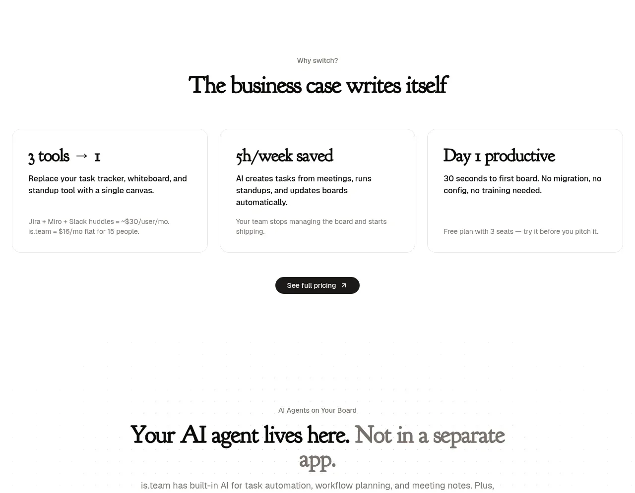 Business case benefits
is.team · Feature grid
Business case benefits
is.team · Feature grid
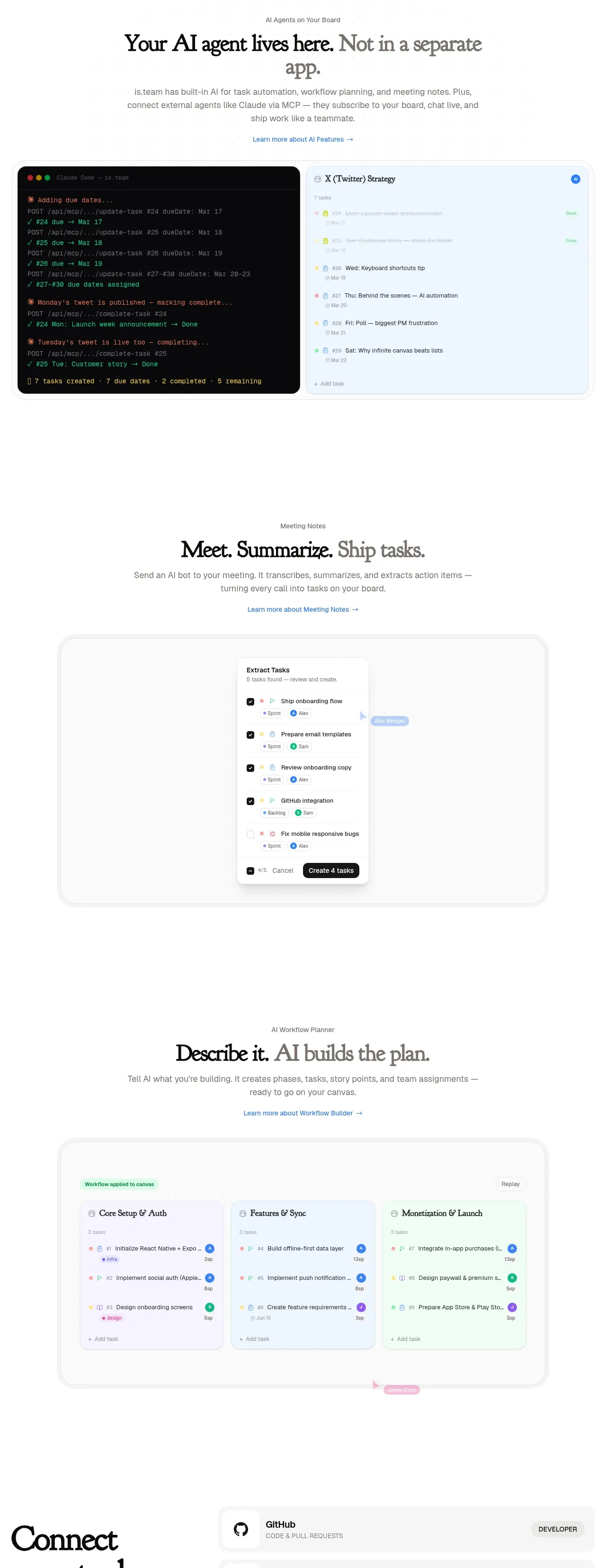 AI workspace capabilities
is.team · Feature grid
AI workspace capabilities
is.team · Feature grid
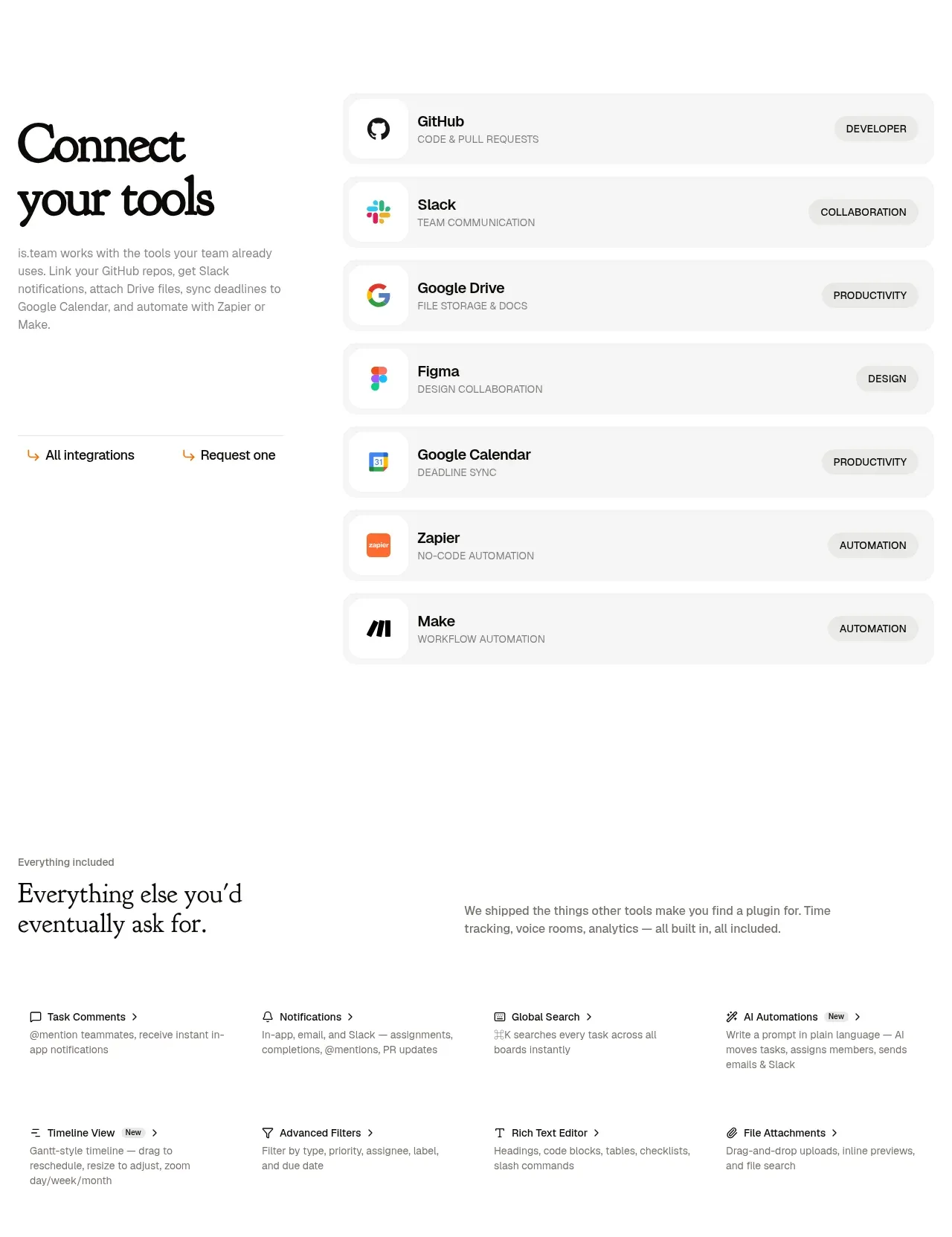 Tool integrations
is.team · Feature grid
Tool integrations
is.team · Feature grid
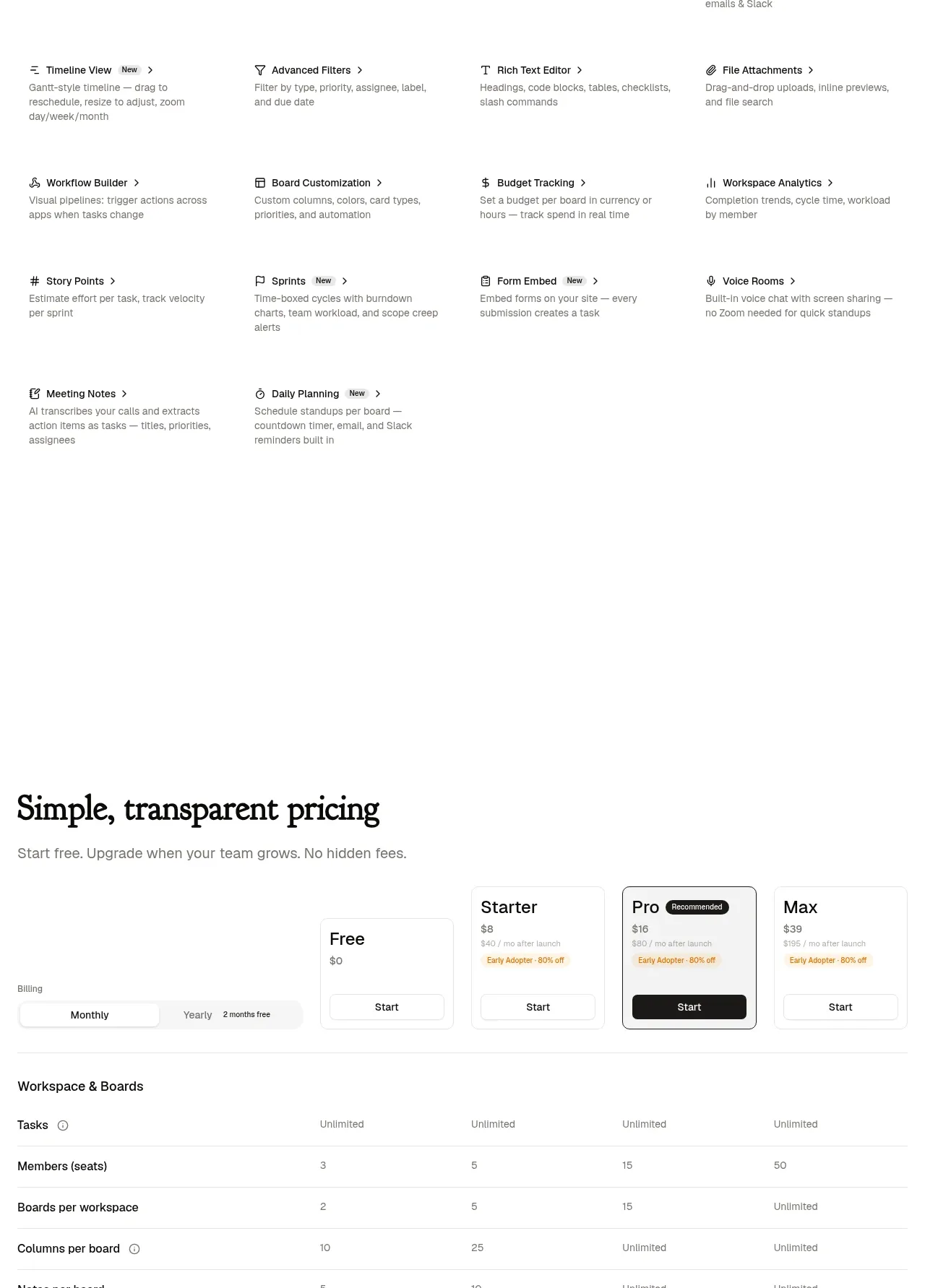 Included features grid
is.team · Feature grid
Included features grid
is.team · Feature grid
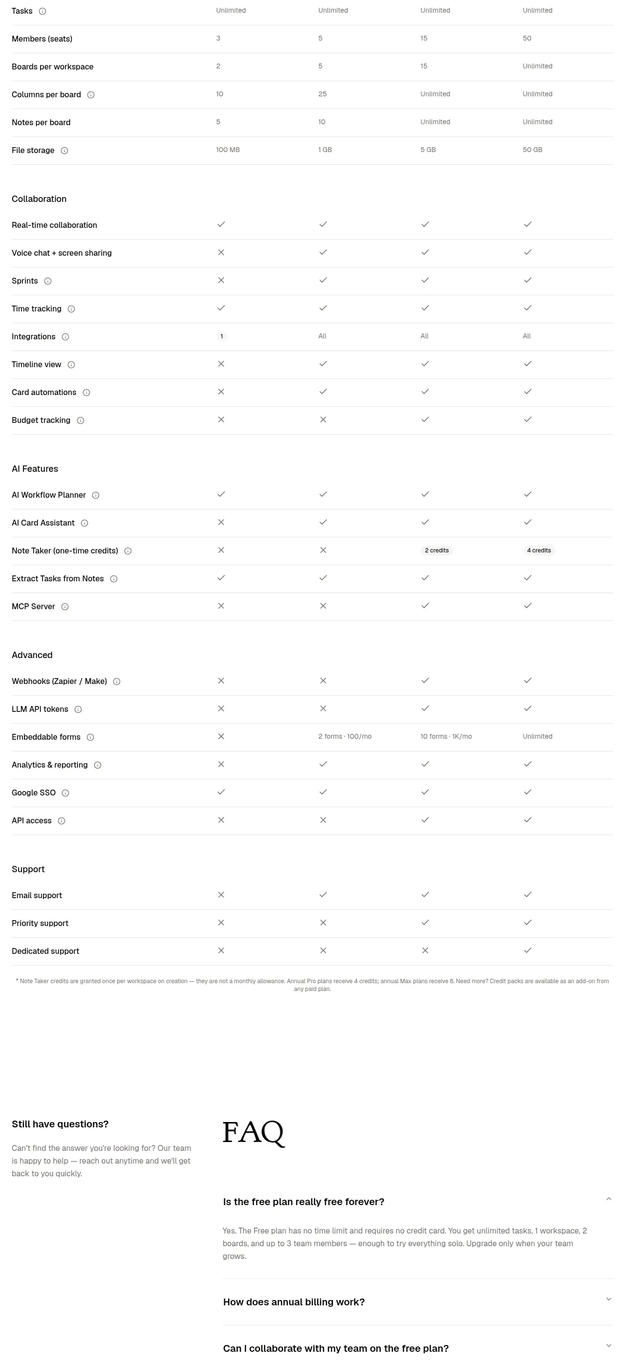 Transparent pricing comparison
is.team · Pricing table
Transparent pricing comparison
is.team · Pricing table
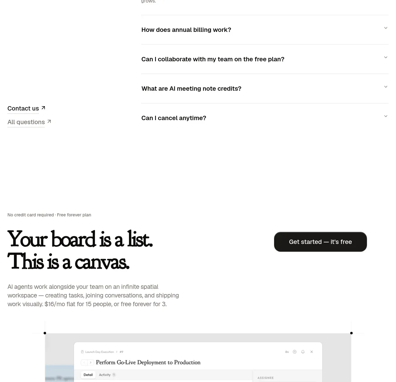 FAQ and contact
is.team · FAQ
FAQ and contact
is.team · FAQ
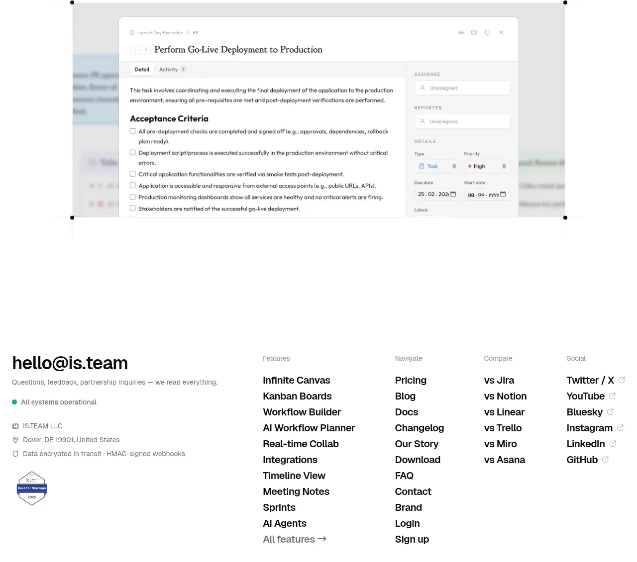 Final conversion CTA
is.team · Call to action
Final conversion CTA
is.team · Call to action
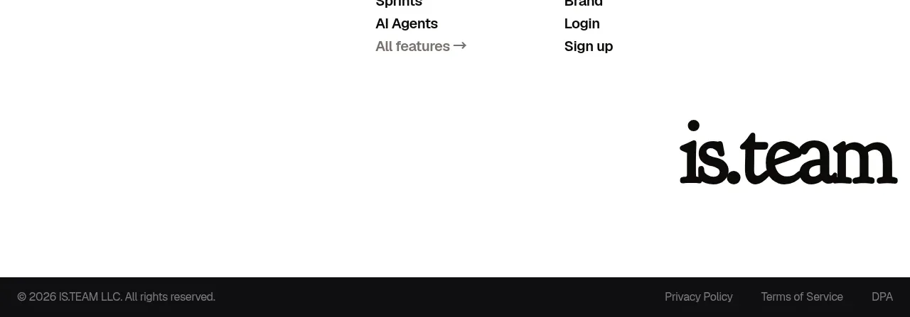 Site footer
is.team · Footer
Site footer
is.team · Footer