kage
kage
trykeet.com
Design analysis
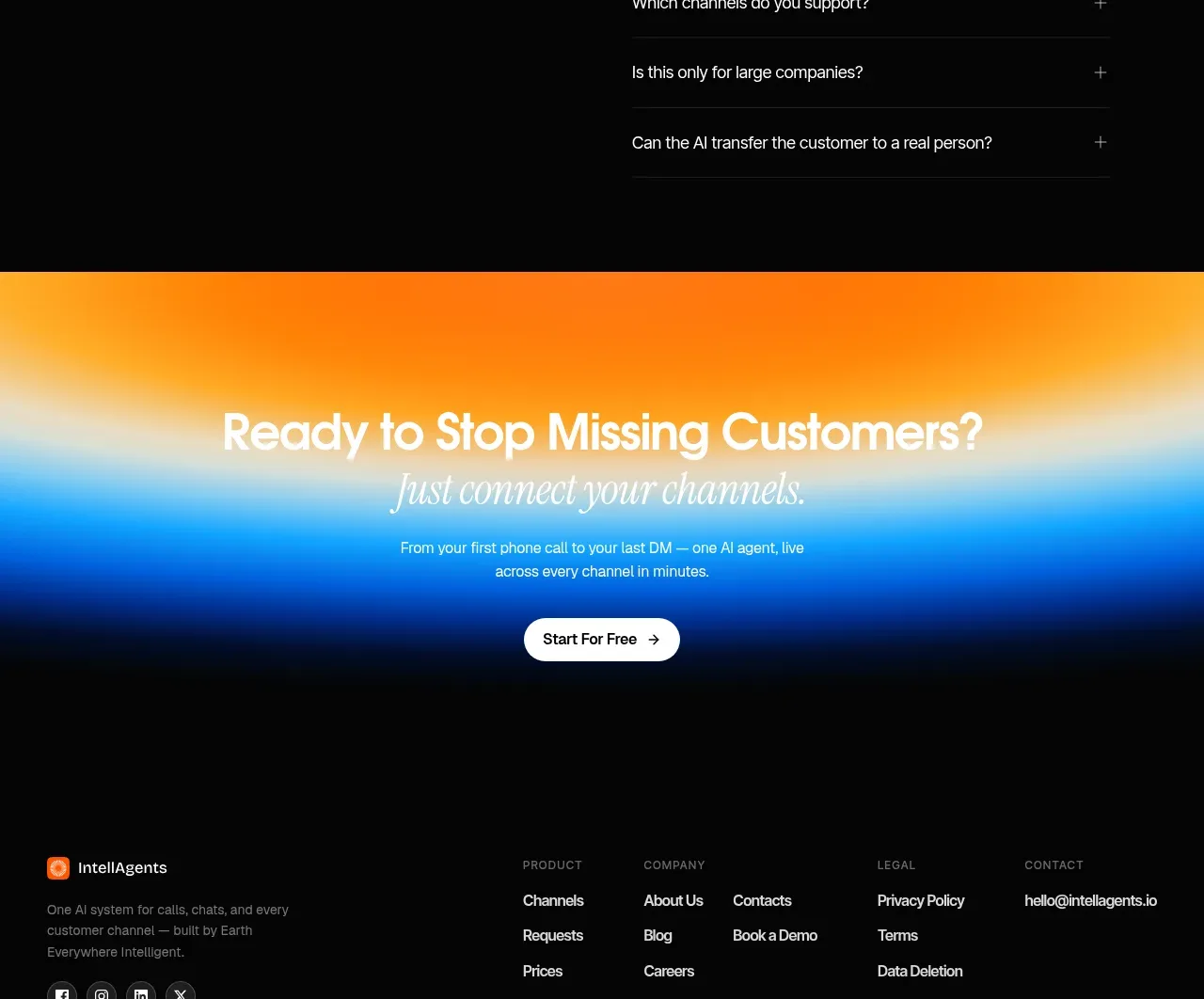
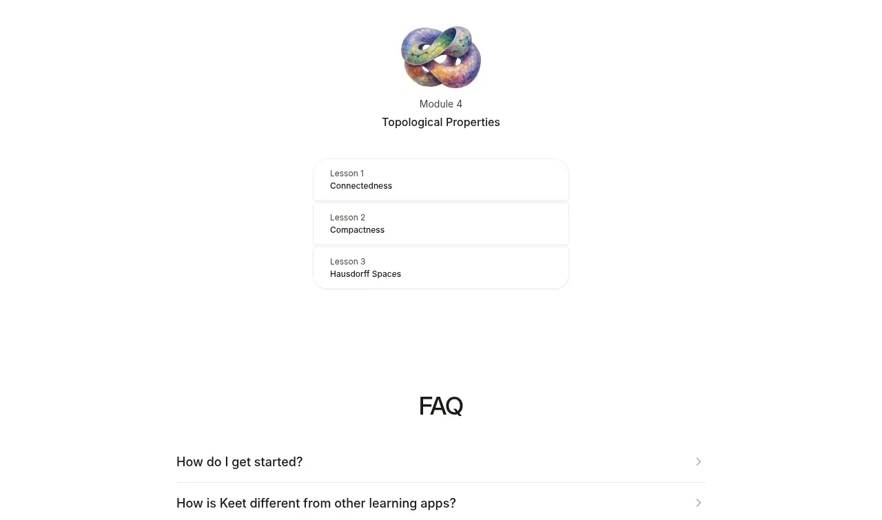
The FAQ is deliberately simple: a centered title above four full-width divider rows with right-facing disclosure affordances. The generous spacing and low-contrast rules make it easy to scan without feeling like a dense support page.
Prompt preview
## Reference images

Study these alongside the description below: hierarchy, rhythm, spacing, colour. Build for the product you are asked about, using this design language.

- Component: https://kage-design-assets.t3.tigrisfiles.io/components/keet/3f4c1a62-9831-48e4-b5b3-36349228cf18-1790229827-6.webp
- Full page it was cut from: https://kage-design-assets.t3.tigrisfiles.io/screenshots/keet/3f4c1a62-9831-48e4-b5b3-36349228cf18-1790229767831-full.webp
- Component on Kage: https://kage.design/component/keet-faq

## Before you start
Ask what questions prospective users have about the user's product and which answers are most important before conversion. Then apply this interaction pattern with the user's brand.

Create a centered FAQ section with a large but restrained heading and a vertically stacked accordion list beneath it. Use a max-width around 540–600px, 18–28px side padding, and 0.5–1px dividers in #e6e6e6. Each row should have 16–20px vertical padding, a 15–17px medium-weight question, and a small chevron on the right in muted gray. Keep the background white and avoid enclosing the entire list in a heavy card.

On click or Enter/Space, expand the answer with a short animation, rotate the chevron, and reveal readable body text at 14–15px in #666666. Use visible focus rings, proper button semantics, one-open-at-a-time only if it suits the product, and preserve layout stability. The heading can be 28–34px in near-black #191919.

### Never
- Never use logos, product names, copy, illustrations, or imagery from the reference.
- Never copy the exact FAQ questions or answers.
- Never hide critical pricing, privacy, or accessibility information behind inaccessible controls.