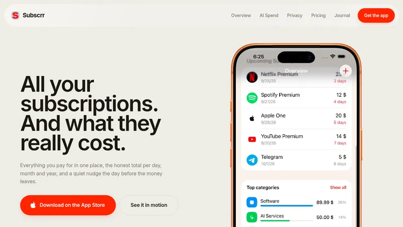
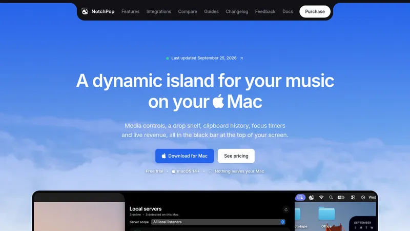
kage
kage
trykeet.com

Design analysis
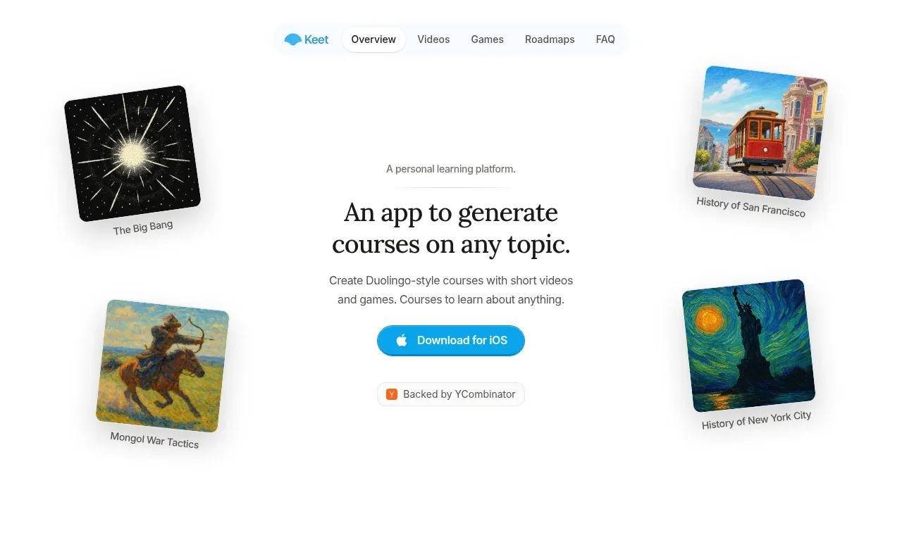
A very spacious, centered education landing page uses a restrained white canvas, small gray copy, black editorial headings, and bright blue pill labels and CTAs. The hero is framed by tilted course artwork, then the page progressively shifts from a large bookshelf illustration to product demonstrations: a dark video grid, a quiz interface, and a long, narrow roadmap made of module cards and lesson rows. The lower half becomes more information-dense through stacked curriculum panels and a simple FAQ, before returning to a sparse blue-accented download CTA and quiet footer.
Prompt preview
## Reference images

Study these alongside the description below: hierarchy, rhythm, spacing, colour. Build for the product you are asked about, using this design language.

- Full page: https://kage-design-assets.t3.tigrisfiles.io/screenshots/keet/3f4c1a62-9831-48e4-b5b3-36349228cf18-1790229767831-full.webp
- Above the fold: https://kage-design-assets.t3.tigrisfiles.io/screenshots/keet/3f4c1a62-9831-48e4-b5b3-36349228cf18-1790229764007.webp
- Design on Kage: https://kage.design/designs/keet-landing-page

## Before you start
Ask the user what they are building, who it is for, and which brand assets they already have (name, colours, type choices, logo, illustrations, screenshots, or other media). Wait for their answers before designing. Apply the system below to their product and content, not to the reference page.

## Page structure
1. **Slim top navigation:** Place a small centered navigation bar near the top of the page. Put the product mark at left, followed by compact text links; use a subtle active-pill treatment for the current section and keep the header visually quiet.
2. **Hero with floating subject cards:** Build a generous, mostly empty hero with a centered eyebrow, large two-line editorial headline, short explanatory paragraph, primary app/download CTA, and a small trust or social-proof badge. Frame the central copy with four tilted subject/course image cards positioned around it, each with a tiny caption and soft shadow.
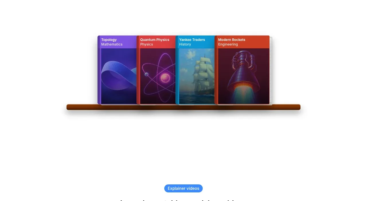
3. **Course bookshelf illustration:** After a large vertical pause, show a centered visual of several colourful course/book covers resting on a thin shelf. Keep this as an image-led transition rather than adding more copy; it should communicate breadth and variety.
4. **Explainer-video section:** Add a centered blue pill label, a concise section heading, and one short description. Below it, place a very large rounded media/demo panel with a dark nearly-black background and a visible grid dividing the panel into video tiles; allow the demo content to be animated or lazy-loaded.
5. **Games and knowledge-check section:** Use the same centered label-heading-description pattern, then show a compact row of game-mode tabs. Below, create a realistic quiz card: prompt label, question, four full-width outlined answer rows, a small progress indicator, and a muted action button aligned toward the bottom/right.
6. **Structured roadmaps introduction:** Add another blue pill, heading, and explanatory paragraph describing how content is divided into manageable chunks. Follow with a small horizontal roadmap selector containing four thumbnail cards inside a soft gray rounded container.
7. **Curriculum roadmap modules:** Present a narrow, vertically stacked curriculum column. Each module has a small illustrative thumbnail, module number, bold module title, and a rounded bordered list of lessons. Expand the first module to show multiple lesson rows with play icons and durations; keep later modules progressively collapsed to reduce visual density while preserving the full learning path.
8. **FAQ:** Transition to a wider, simpler content block with a centered “FAQ”-style heading. Use four full-width horizontal accordion rows with thin separators, readable question text, and a small right-facing chevron; keep answers collapsed in the initial state.
9. **Final conversion CTA:** Return to a sparse centered section with a large blue abstract product symbol or brand visual, a strong question-led heading, and a repeated blue app/download button. Use generous whitespace so this feels like a conclusion rather than another feature block.
10. **Footer:** Finish with a small, low-contrast centered footer containing copyright and a short row of legal/contact links. Keep it understated and aligned to the same central page axis.

## Design language
- Use a very airy, single-column composition on a white or warm-white canvas, with large vertical gaps between feature sections; let the page become denser only inside product demos and the roadmap.
- Build hierarchy with a compact sans-serif for navigation, labels, metadata, and body copy, paired with a high-contrast editorial serif or similarly distinctive display face for the main hero headline. Use approximately 48–64px for the desktop hero, 28–36px for section headings, 14–16px for body text, and 11–13px for labels and metadata; scale down cleanly on mobile.
- Keep text primarily near-black (#111111) and secondary copy cool gray (#6B7280). Use a vivid sky/cyan blue (#20A9E0 to #3B82F6) for pills, primary buttons, selected states, progress, and small brand accents; let course imagery supply secondary reds, purples, greens, and oranges rather than adding those colours to the UI chrome.
- Treat blue labels as small rounded capsules with white text. Make primary CTAs compact, bright, pill-shaped controls with a subtle hover lift; pair them with simple platform icons only when supplied by the user's brand assets.
- Use thin light-gray borders (#E5E7EB), small to medium corner radii around 8–16px for cards, and very restrained shadows. Give image cards, the bookshelf, roadmap selector, and quiz controls enough soft shadow to feel tactile, but avoid glossy gradients or heavy elevation.
- Keep most layout edges centered and symmetrical, then introduce character through tilted floating artwork in the hero and carefully composed product illustrations. Use a constrained reading width for copy and a narrower column for curriculum details.
- Establish rhythm by alternating copy-led centered sections with visual-led sections: hero copy, bookshelf, dark video demo, quiz interaction, roadmap explanation, dense curriculum, FAQ, and final CTA. Do not fill the large blank spaces with extra decoration.
- Product demos should look like real interfaces rather than generic placeholders: use a dark tiled media frame, crisp quiz rows with selected/active blue states, small utility icons, progress feedback, and lesson cards with play affordances and duration metadata.
- Motion should be quiet and purposeful: gently float or rotate hero cards, reveal section visuals on scroll, animate video/demo tiles or roadmap progress, and use short 150–250ms transitions for pills, accordion rows, buttons, and card hover states. Respect reduced-motion preferences.
- Make the long page responsive: collapse the desktop navigation, reposition the four hero cards around or below the copy, turn horizontal roadmap selectors into a scrollable row, make demos full-width, and preserve generous spacing without creating excessive empty mobile screens.

## Never
- Do not copy any logos, wordmarks, product names, exact copy, course titles, subject matter, illustrations, photography, screenshots, icon sets, or branded artwork from the reference.
- Do not present the result as the reference product or imply an affiliation with it.
- Replace every example with the user's own product name, audience, content, brand assets, and calls to action; create original placeholder visuals when assets are unavailable.
Components from this page
All components
 Floating top navigation
Keet · Navigation
Floating top navigation
Keet · Navigation
 Centered learning-platform hero
Keet · Hero
Centered learning-platform hero
Keet · Hero
 Course-cover showcase
Keet · Gallery
Course-cover showcase
Keet · Gallery
 Video learning feature
Keet · Feature grid
Video learning feature
Keet · Feature grid
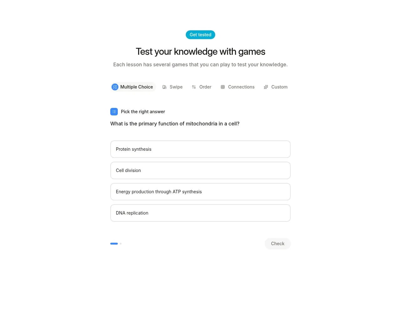 Game-based knowledge check
Keet · Feature grid
Game-based knowledge check
Keet · Feature grid
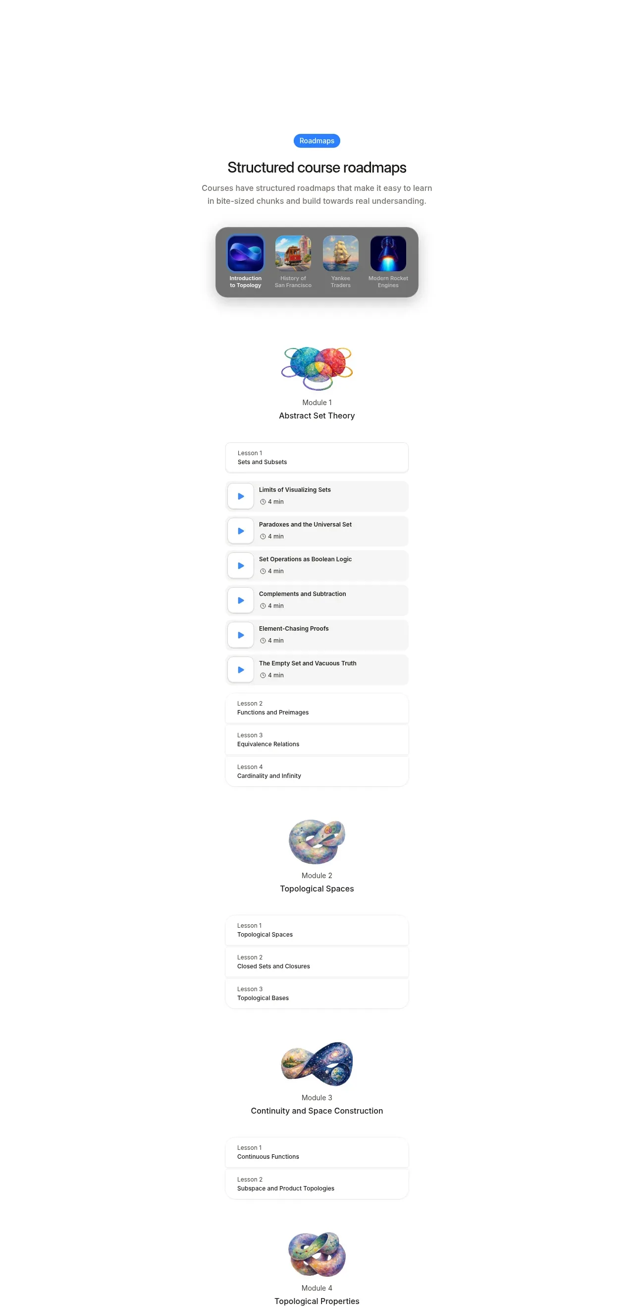 Structured roadmap feature
Keet · Feature grid
Structured roadmap feature
Keet · Feature grid
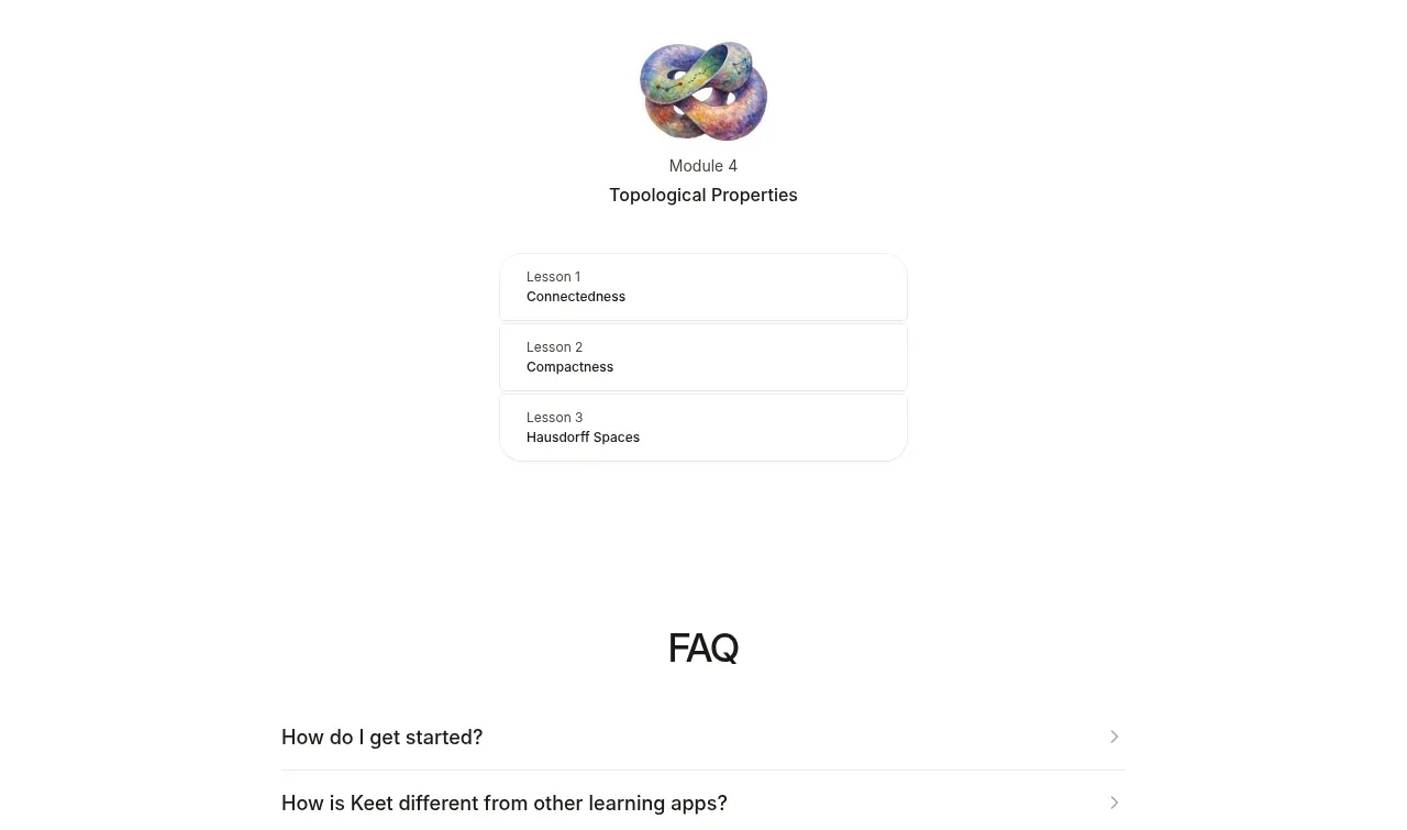 Frequently asked questions
Keet · FAQ
Frequently asked questions
Keet · FAQ
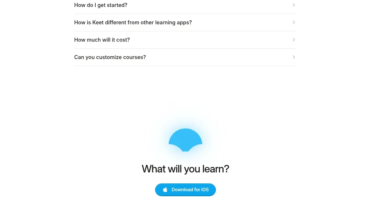 Final app-download call to action
Keet · Call to action
Final app-download call to action
Keet · Call to action
 Minimal legal footer
Keet · Footer
Minimal legal footer
Keet · Footer