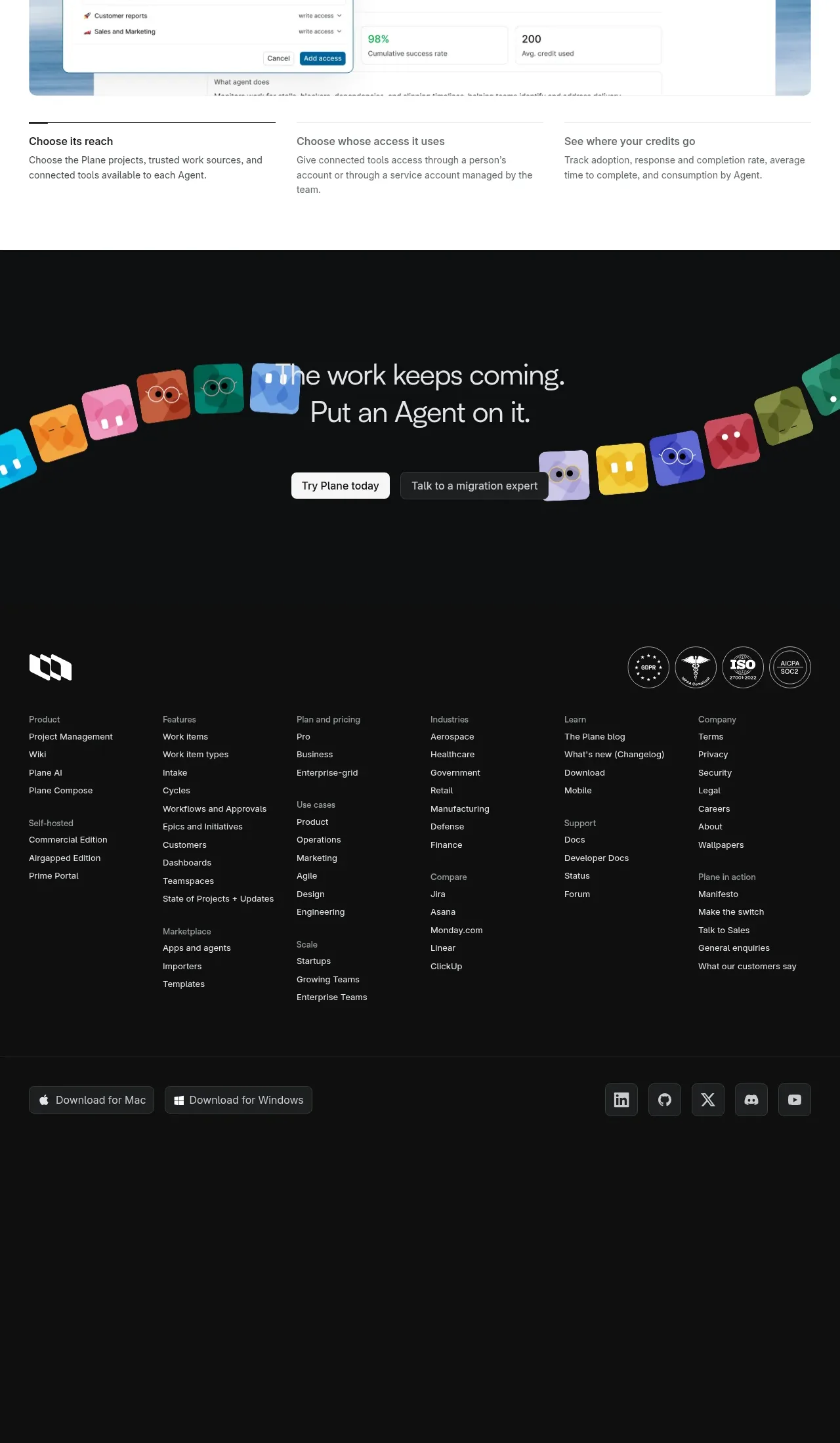
kage
kage
trykeet.com

Design analysis
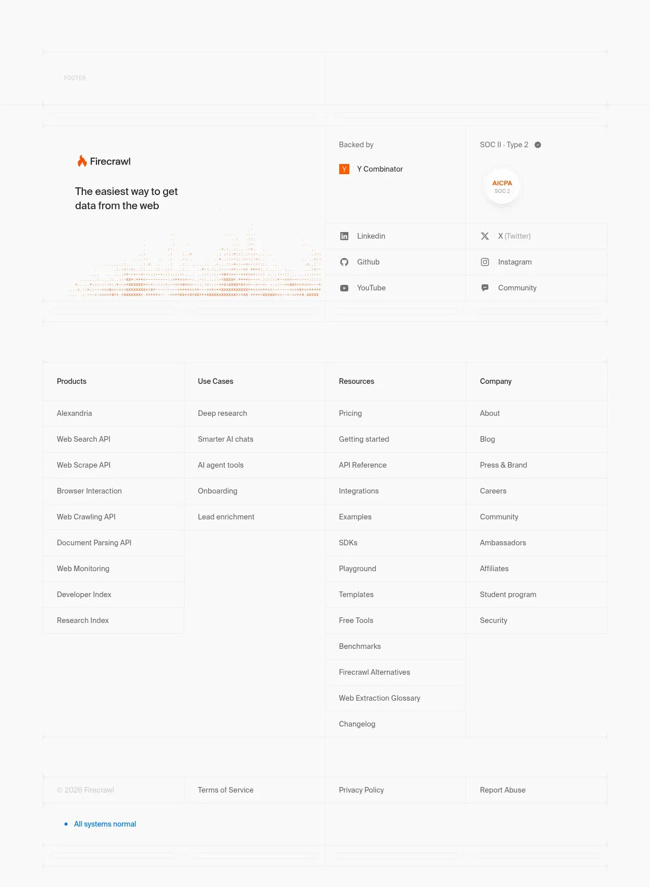
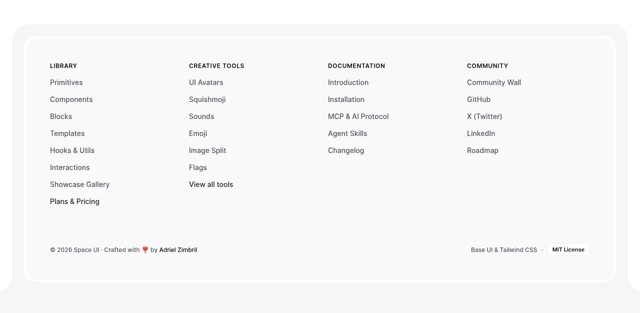
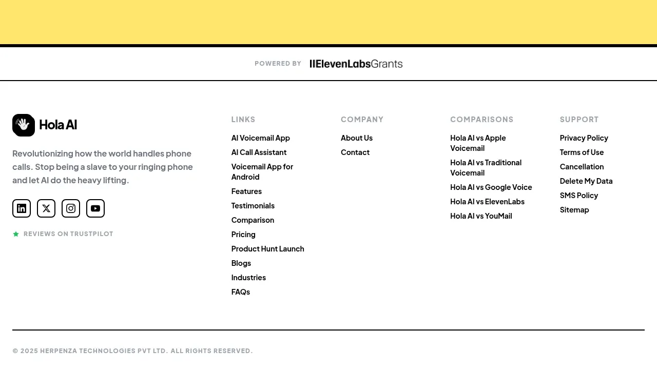
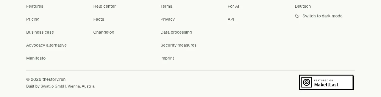
The page ends with a sparse footer containing a small copyright line and a few low-emphasis utility links. Its quiet treatment preserves the airy product-led feel through the bottom edge.
Prompt preview
## Reference images

Study these alongside the description below: hierarchy, rhythm, spacing, colour. Build for the product you are asked about, using this design language.

- Component: https://kage-design-assets.t3.tigrisfiles.io/components/keet/3f4c1a62-9831-48e4-b5b3-36349228cf18-1790229828-8.webp
- Full page it was cut from: https://kage-design-assets.t3.tigrisfiles.io/screenshots/keet/3f4c1a62-9831-48e4-b5b3-36349228cf18-1790229767831-full.webp
- Component on Kage: https://kage.design/component/keet-footer

## Before you start
Ask what legal, support, and social links the user's product requires and what footer tone fits its brand. Then build a minimal footer with only necessary information.

Create a simple white footer with a centered or max-width-aligned row of small utility links and a copyright notice. Use 12–13px text, muted gray around #777777, generous top padding of 70–100px, and 12–20px gaps between links. Keep link hover and focus states visible with a darker text color and underline or subtle accent. On mobile, wrap the links cleanly into two rows and maintain 24px side padding.

Use no large logo lockup, newsletter form, or dark panel unless the user's product genuinely needs one. Ensure legal links have sufficient contrast and the footer has a semantic landmark.

### Never
- Never use logos, product names, copy, illustrations, or imagery from the reference.
- Never copy the exact copyright year or link labels.
- Never add empty decorative columns or clutter the page with unnecessary destinations.