kage
kage
trykeet.com
Design analysis
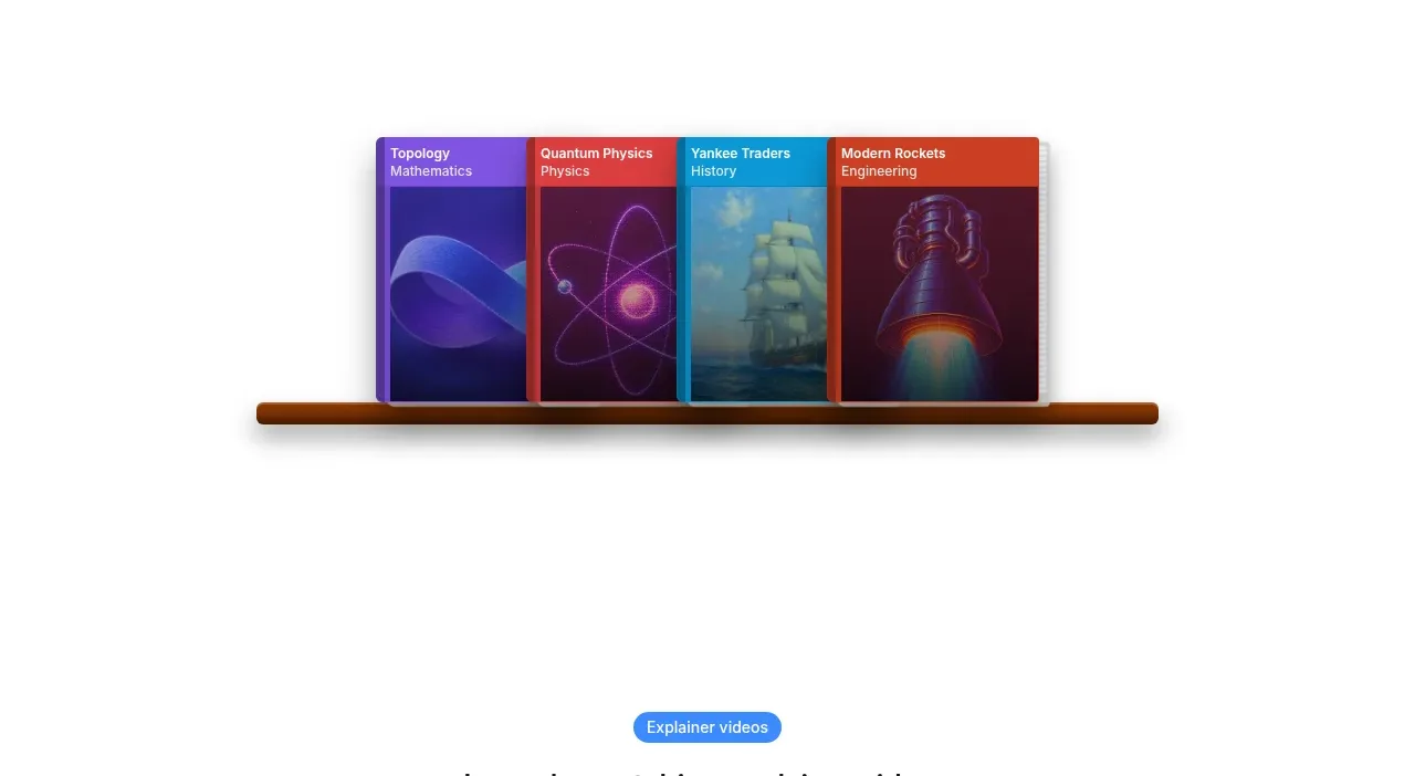
A quiet transition area showcases a row of colorful course covers resting on a narrow shelf-like base. It works as visual evidence of variety while preserving the page's unusually large white margins.
Prompt preview
## Reference images

Study these alongside the description below: hierarchy, rhythm, spacing, colour. Build for the product you are asked about, using this design language.

- Component: https://kage-design-assets.t3.tigrisfiles.io/components/keet/3f4c1a62-9831-48e4-b5b3-36349228cf18-1790229826-2.webp
- Full page it was cut from: https://kage-design-assets.t3.tigrisfiles.io/screenshots/keet/3f4c1a62-9831-48e4-b5b3-36349228cf18-1790229767831-full.webp
- Component on Kage: https://kage.design/component/keet-gallery

## Before you start
Ask what the user's product offers and what visual proof would best communicate variety or quality. Ask for the brand's palette, then apply this composition to the user's product.

Build a standalone visual showcase section with generous white space above and below. Center a horizontal arrangement of 3–5 portrait cards or product previews on desktop, with slight overlap and varied but controlled color blocks. Use cards around 110–145px wide, 170–220px tall, 8–12px corner radius, subtle elevation shadows, and a low horizontal grounding element such as a shelf, rail, or soft gradient. Use a restrained composition: the visual should feel like a proof point between major content sections, not a dense gallery.

Use vivid but brand-appropriate accent colors, approximately #6540a8, #d83e4c, #168eae, and #c43b1e only as examples; choose a coherent palette for the user's product. Keep surrounding background near #ffffff and use a soft shadow around #00000014. Add gentle hover lift or horizontal scrolling on touch devices. Ensure the cards have accessible labels and remain legible at small sizes.

### Never
- Never use logos, product names, copy, illustrations, or imagery from the reference.
- Never recreate the exact course covers, shelf, or artwork.
- Never make the gallery the sole explanation of the product.