 kage
kage
kerno.io
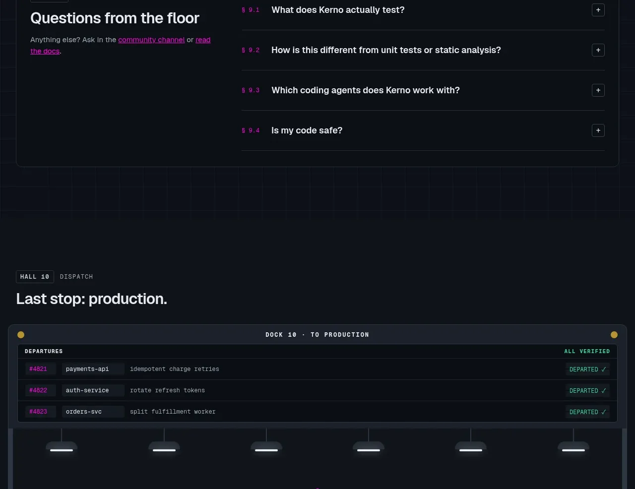
Design analysis
A dispatch-themed conversion area combines a compact status table with a centered final CTA. The visual framing turns the final ask into the next operational step rather than a generic marketing banner.
Prompt preview
## Reference images

Study these alongside the description below: hierarchy, rhythm, spacing, colour. Build for the product you are asked about, using this design language.

- Component: https://kage-design-assets.t3.tigrisfiles.io/components/kerno-1-0/454d79dc-d228-4b14-889b-ec4f181556d7-1792130642-11.webp
- Full page it was cut from: https://kage-design-assets.t3.tigrisfiles.io/screenshots/kerno-1-0/454d79dc-d228-4b14-889b-ec4f181556d7-1792130514699-full.webp
- Component on Kage: https://kage.design/component/kerno-1-0-cta

## Before you start
Ask what action the user's product wants visitors to take next, what objections remain, and what secondary contact option should sit beside the primary CTA. Apply the visual principles to that conversion goal.

Create a final conversion section with an upper production/status panel and a centered CTA beneath it. The status panel can be a short table or activity log showing a few believable, clearly labeled items; keep it supportive rather than distracting. Below, center a small status eyebrow, a strong 28–38px headline, one sentence of reassurance, and two buttons. Use a dark navy background (#0b1119), a framed panel (#151d26), subtle grid or station-like dividers (#293440), off-white primary action (#f0f3f3), and a bright brand accent for the status mark. Keep the CTA group compact, with 4–6px button radii and clear hover/focus states. Add a little more vertical breathing room than the earlier sections so the final ask feels decisive. On mobile, stack the table and buttons.

Never use the reference dispatch text, product name, logo, imagery, table data, or exact CTA copy.
More components

 Final conversion banner
CrewTower Mod for Claude Code · Call to action
Final conversion banner
CrewTower Mod for Claude Code · Call to action
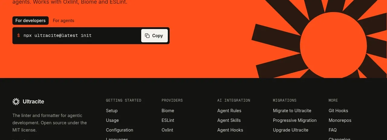
 Bright installation call to action
Ultracite v8 · Call to action
Bright installation call to action
Ultracite v8 · Call to action
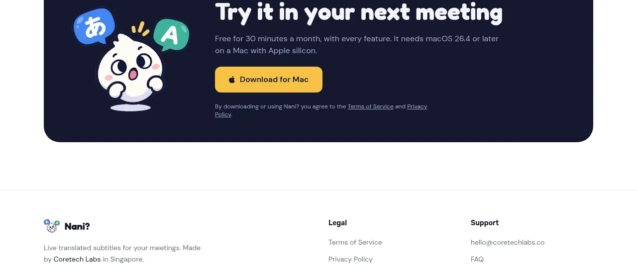
 Download call to action
NANI??? · Call to action
Download call to action
NANI??? · Call to action

 Marble-backed final CTA
Maybloc · Call to action
Marble-backed final CTA
Maybloc · Call to action
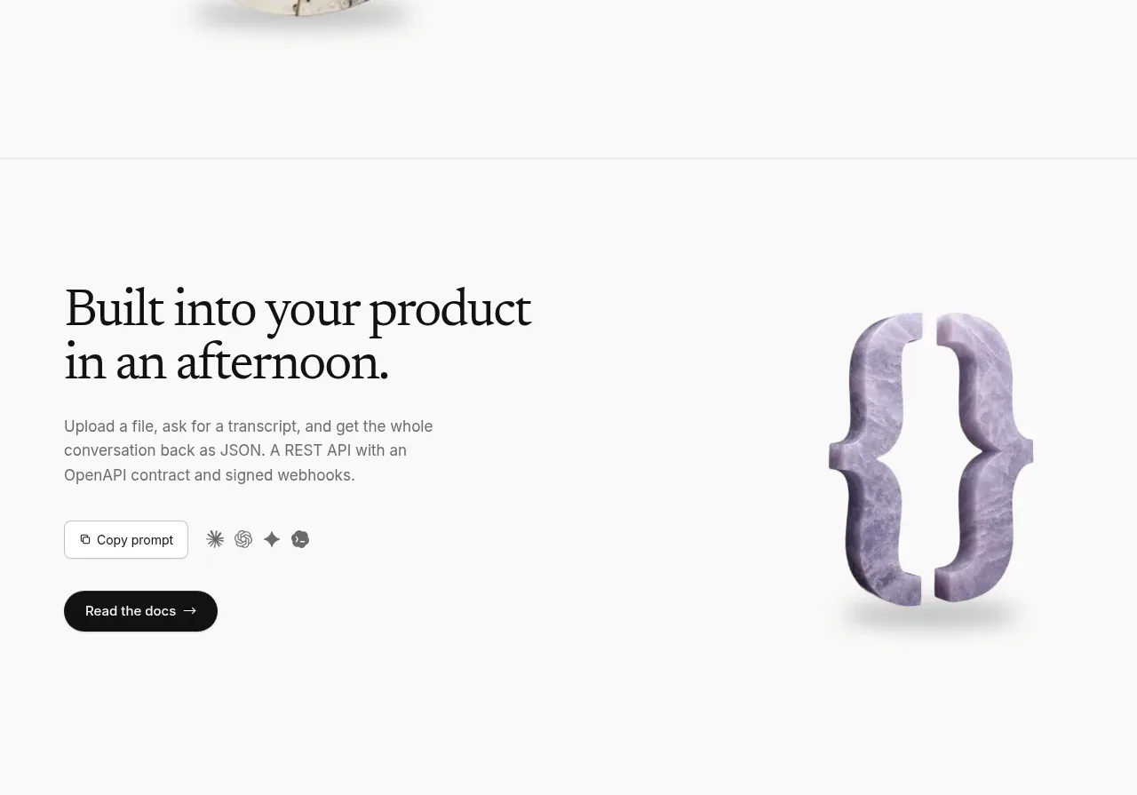 Developer integration CTA
Maybloc · Call to action
Developer integration CTA
Maybloc · Call to action
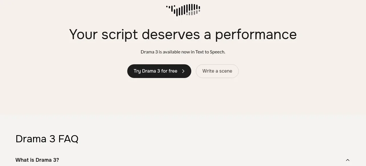
 Centered conversion call to action
Fish Audio Drama 3 · Call to action
Centered conversion call to action
Fish Audio Drama 3 · Call to action