kage
kage
kerno.io

Design analysis
A long-form dark product narrative treats the page like a technical factory walkthrough: a compact navigation and announcement bar lead into a framed hero, then repeated hall dividers create clear chapters as the content moves from problem framing to capabilities, integrations, dashboard proof, rollout, FAQ, and conversion. Near-black surfaces, thin blue-gray borders, mono micro-labels, isometric technical illustrations, and yellow hazard stripes establish an industrial control-room language, while magenta, green, amber, and blue status accents selectively mark system states and calls to action.
Prompt preview
## Reference images

Study these alongside the description below: hierarchy, rhythm, spacing, colour. Build for the product you are asked about, using this design language.

- Full page: https://kage-design-assets.t3.tigrisfiles.io/screenshots/kerno-1-0/454d79dc-d228-4b14-889b-ec4f181556d7-1792130514699-full.webp
- Above the fold: https://kage-design-assets.t3.tigrisfiles.io/screenshots/kerno-1-0/454d79dc-d228-4b14-889b-ec4f181556d7-1792130511802.webp
- Design on Kage: https://kage.design/designs/kerno-1-0-landing-page

## Before you start
Ask the user what they are building, who it is for, and what brand assets they already have (name, colours, type, logo, and illustration assets). Wait for their answers before designing. Apply the system below to their product, not to the reference product, and replace all reference-specific copy and visuals with their own.

## Page structure
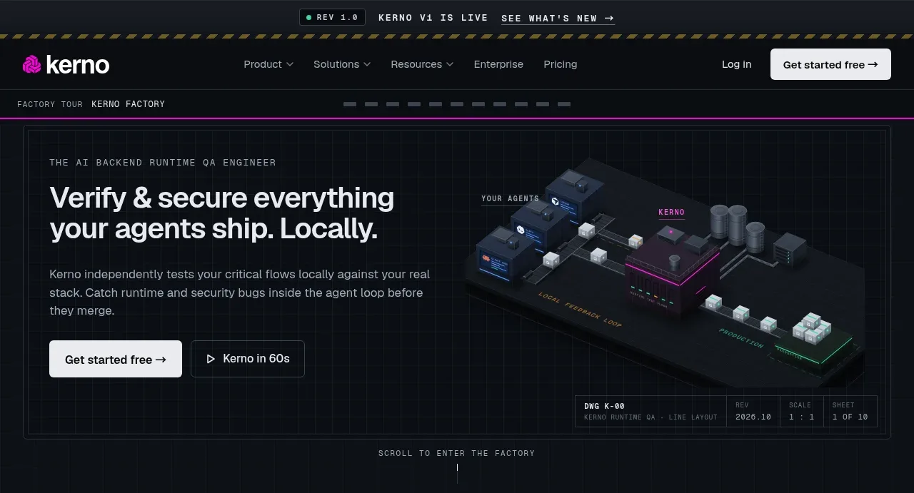
1. **Announcement strip and global navigation** — Start with a narrow live-status announcement at the very top, followed by a dark navigation bar with a left brand mark, compact product/resource links, login, and a high-contrast primary CTA.
2. **Factory breadcrumb / progress rail** — Add a thin technical rail beneath the nav with tiny monospace labels and short segmented progress indicators to establish the feeling of entering a guided system.
3. **Hero command panel** — Use a large bordered, split-layout hero: eyebrow and large two-line headline on the left, supporting paragraph and two CTAs below, and a framed isometric product/system illustration on the right. Include restrained metadata and technical labels around the artwork.
4. **Hero transition marker** — Separate the hero from the proof section with a small centered instruction such as a scroll cue and a vertical indicator.
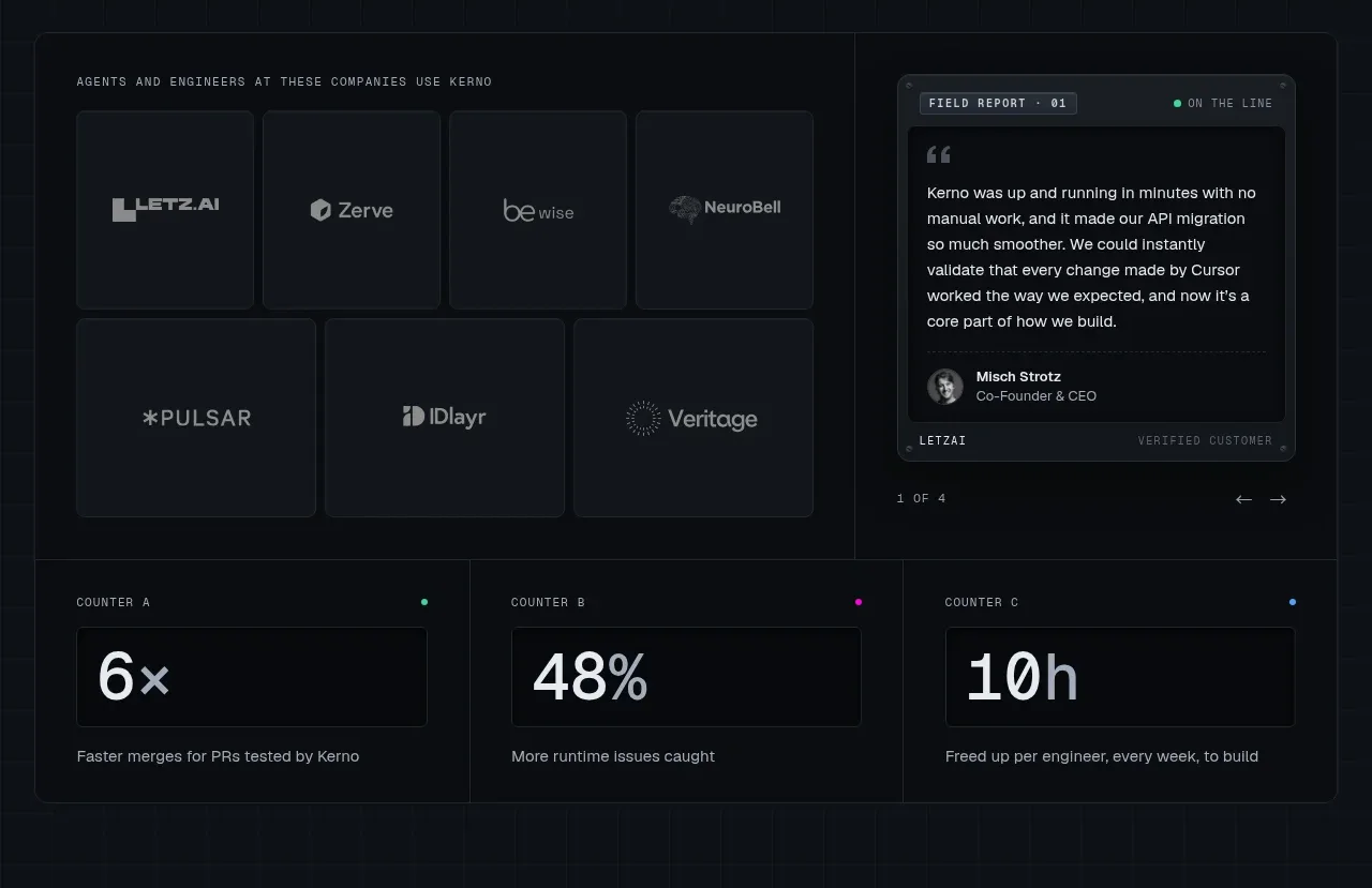
5. **Customer proof and impact metrics** — Present a dark bordered section with a grid of customer tiles on the left, a testimonial/report card on the right, then a three-column metrics row beneath. Use restrained logos or customer names supplied by the user only.
6. **Hall 01 divider** — Insert a full-width chapter separator with dark blue-gray metal treatment, small circular fasteners, centered hall number/title, subtitle, and a yellow-black hazard stripe edge.
7. **Problem / slow feedback section** — Open with a left text column explaining the central pain, paired with a large isometric process illustration on the right. Follow it with a compact simulated metrics panel and a full-width alert board listing realistic failure rows.
8. **Hall 02 divider** — Repeat the chapter separator, changing the chapter label and subtitle while preserving the same industrial navigation grammar.
9. **Runtime quality and security section** — Use a two-column layout: stacked feature/module cards with small thumbnails, labels, descriptions, and installed/status states on the left; a large framed system diagram on the right with callout badges.
10. **Hall 03 divider** — Add the next chapter separator to mark the transition from quality/security to end-to-end flow coverage.
11. **End-to-end flow section** — Pair a framed workflow/isometric diagram on the left with a numbered four-step explanation list on the right. Highlight the current or most important step with the accent colour.
12. **Hall 04 divider** — Use another separator to introduce runtime inspection and edge-case coverage.
13. **Runtime inspection section** — Place the explanatory copy and large technical illustration in the left portion, with a dense two-column grid of capability cards on the right. Show green completed states and one amber upcoming state to communicate coverage and roadmap.
14. **Hall 05 divider** — Mark the transition into dependency and stack support.
15. **Stack / supply-depots section** — Begin with a heading and short description, then use a wide split panel: a cargo-manifest style list of supported languages, databases, data systems, and cloud providers on the left; an illustrated dependency topology and evidence/report strip on the right.
16. **Hall 06 divider** — Introduce the rules and learning section with the same metal rail, fasteners, centered label, and hazard stripe.
17. **Custom rules and feedback section** — Present two equal feature cards. The first shows a code/rules work order with scope and an enforced status; the second shows a lesson log with checked feedback entries. Keep both cards visually dense but easy to scan.
18. **Hall 07 divider** — Introduce the control-room product proof.
19. **Dashboard showcase section** — Use a strong heading and a large framed application screenshot/mockup occupying most of the width. Show a dark analytics/control dashboard with side navigation, charts, tables, filters, status pills, and a secondary monitoring rail. Keep the mock interface denser than the marketing sections around it.
20. **Hall 08 divider** — Mark the setup and rollout chapter.
21. **Three-stage rollout section** — Add a heading, short setup description, and a horizontal magenta timeline with three milestones. Under it, place three equal cards for install/map, cover/test, and roll out/team adoption, each with a small technical illustration and explanatory text.
22. **Hall 09 divider** — Introduce the help/manual section.
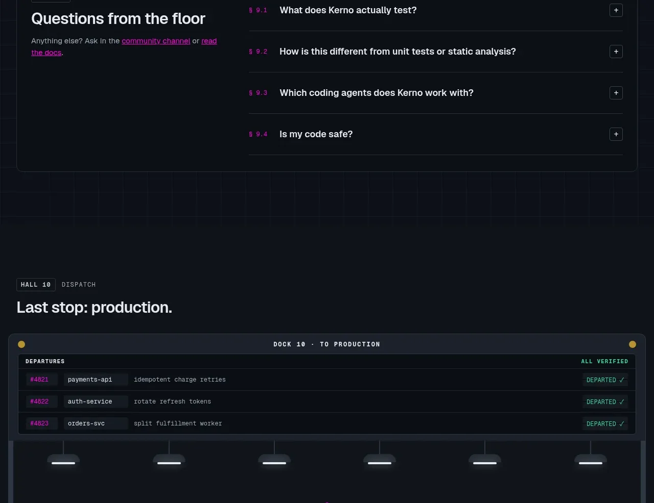
23. **FAQ help desk** — Build a wide bordered manual-style panel with a left title, support sentence and links, and a right vertical accordion list. Use numbered magenta question labels and compact plus controls.
24. **Dispatch / final production CTA** — Add a small dispatch eyebrow and heading, then a large production-dock panel with a departure/status table at the top, hanging light motifs, a centered brand-neutral icon, headline, supporting line, and paired CTAs. Include a small verified shipment/object detail near the lower edge.
25. **Footer** — Finish with a dark multi-column footer containing a compact brand description, social/link buttons, grouped product/solutions/resources/company links, a very large low-contrast background word or texture, and a thin legal/copyright row.

## Design language
- Build hierarchy through scale and framing rather than decoration: use bold condensed or grotesk display text for headings, small uppercase monospace labels for system metadata, and readable neutral sans-serif body copy.
- Use a near-black base around `#080b10` or `#0b0d12`, panel surfaces around `#10151d` and `#151b24`, and cool gray-blue borders around `#27313d`. Keep most sections quiet so diagrams and status accents carry attention.
- Reserve vivid magenta around `#d900b8` / `#f000c8` for the primary brand accent, selected steps, active indicators, and key links. Use signal green around `#39d99a` for verified/installed states, amber around `#f4b83f` for warnings, and occasional electric blue for secondary telemetry.
- Treat yellow-black hazard stripes as a recurring chapter boundary, not as a general background. Use them at the top or bottom of hall dividers and around major framed modules to create rhythm across the long page.
- Keep cards rectangular and technical: use 1px borders, small radii around 2–5px, minimal shadows, inset lines, corner metadata, and occasional rivet/fastener dots. Avoid soft floating SaaS cards, large rounded pills, and excessive gradients.
- Make the page dense in its proof and product sections, but alternate density with breathing-room chapter dividers and short centered transition labels. The repeated hall separators should make the long scroll feel like a sequence of navigable rooms.
- Use framed diagrams as primary visual evidence: isometric low-poly systems, queues, services, containers, pipelines, and control-room screens. Keep them on almost-black canvases with thin wireframe lines and small annotation tags; create original visuals appropriate to the user's domain.
- Use tables, manifests, alert boards, logs, timelines, status badges, and accordion rows to communicate operational credibility. Align labels and values to a consistent grid and use monospace for identifiers, metrics, timestamps, and technical captions.
- Make CTAs rectangular and high contrast: white or pale gray primary buttons with dark text, paired with transparent bordered secondary buttons. Add short arrow or directional affordances, but keep interaction styling restrained.
- For motion, use subtle scan-line or telemetry flicker, status-dot pulses, gentle diagram parallax, and reveal-on-scroll transitions between halls. Preserve usability: avoid constant aggressive animation and ensure reduced-motion support.
- Make the responsive version stack each split section vertically, keep the chapter separators and hazard stripes, turn horizontal timelines into vertical steps, and let the dashboard mockup scroll horizontally rather than becoming unreadably small.

## Never
- Do not copy any reference logos, wordmarks, product names, tagline, customer names, screenshots, exact copy, illustrations, diagrams, or icon set.
- Do not present the result as the reference product or imply an affiliation with it.
- Do not reproduce the reference's exact page text or branded visual assets; create new content, labels, diagrams, and data for the user's product.
- Do not use generic decorative gradients or unrelated photography when an original technical diagram, panel, table, or product UI would better express the design language.
Components from this page
All components
 Factory-style global navigation
Kerno 1.0 · Navigation
Factory-style global navigation
Kerno 1.0 · Navigation
 Technical verification hero
Kerno 1.0 · Hero
Technical verification hero
Kerno 1.0 · Hero
 Customer proof and operating metrics
Kerno 1.0 · Logo cloud
Customer proof and operating metrics
Kerno 1.0 · Logo cloud
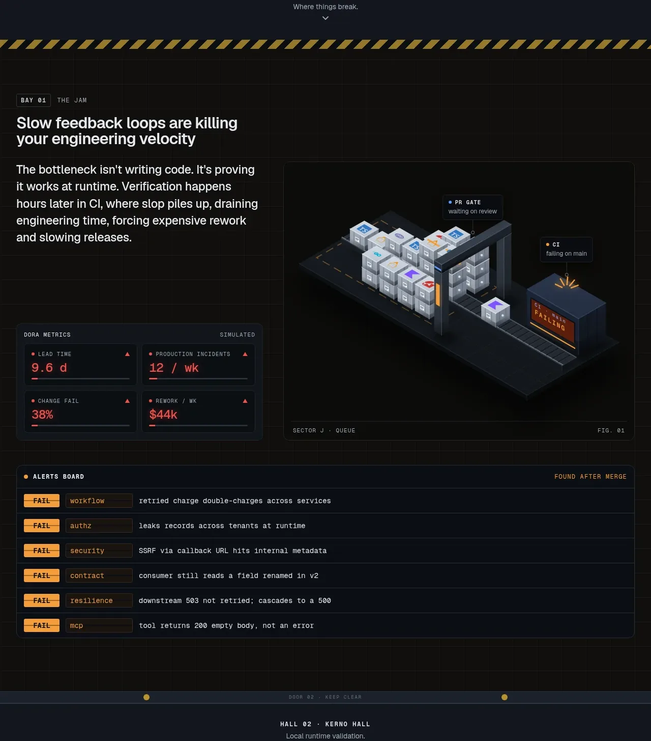 Operational failure modes
Kerno 1.0 · Feature grid
Operational failure modes
Kerno 1.0 · Feature grid
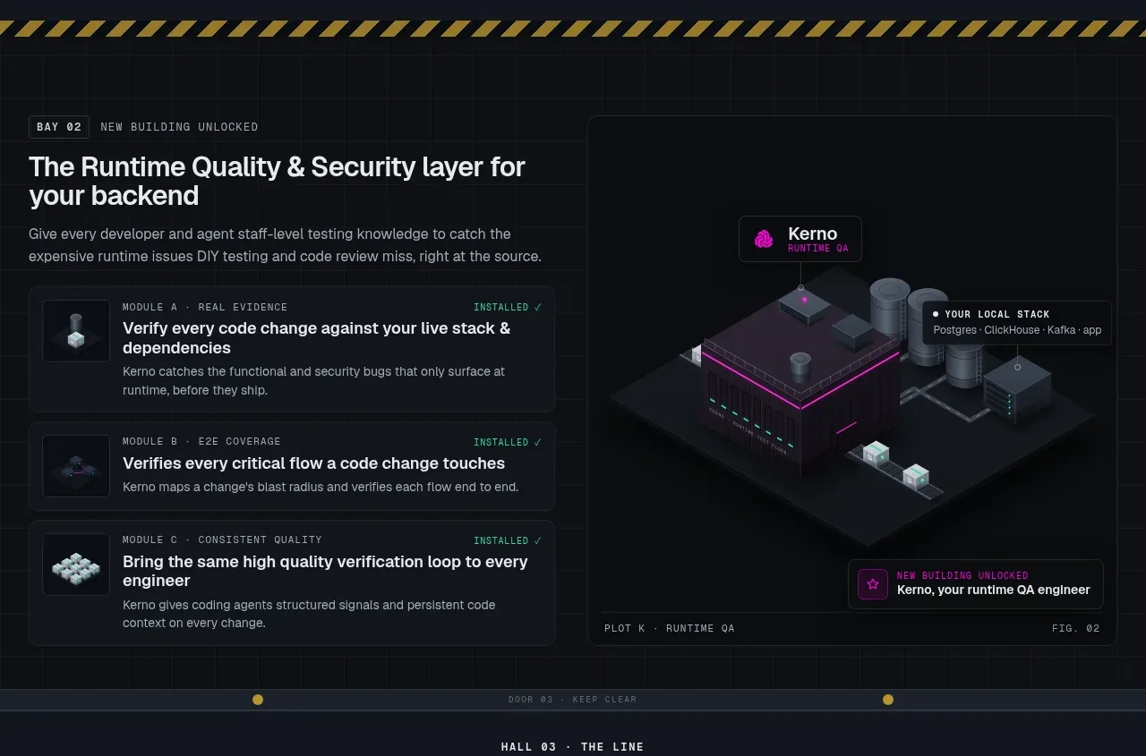 Runtime quality and security layers
Kerno 1.0 · Feature grid
Runtime quality and security layers
Kerno 1.0 · Feature grid
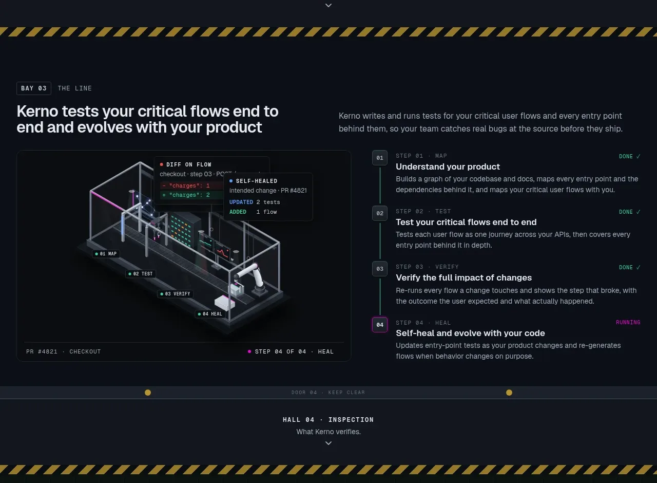 End-to-end critical flow
Kerno 1.0 · Feature grid
End-to-end critical flow
Kerno 1.0 · Feature grid
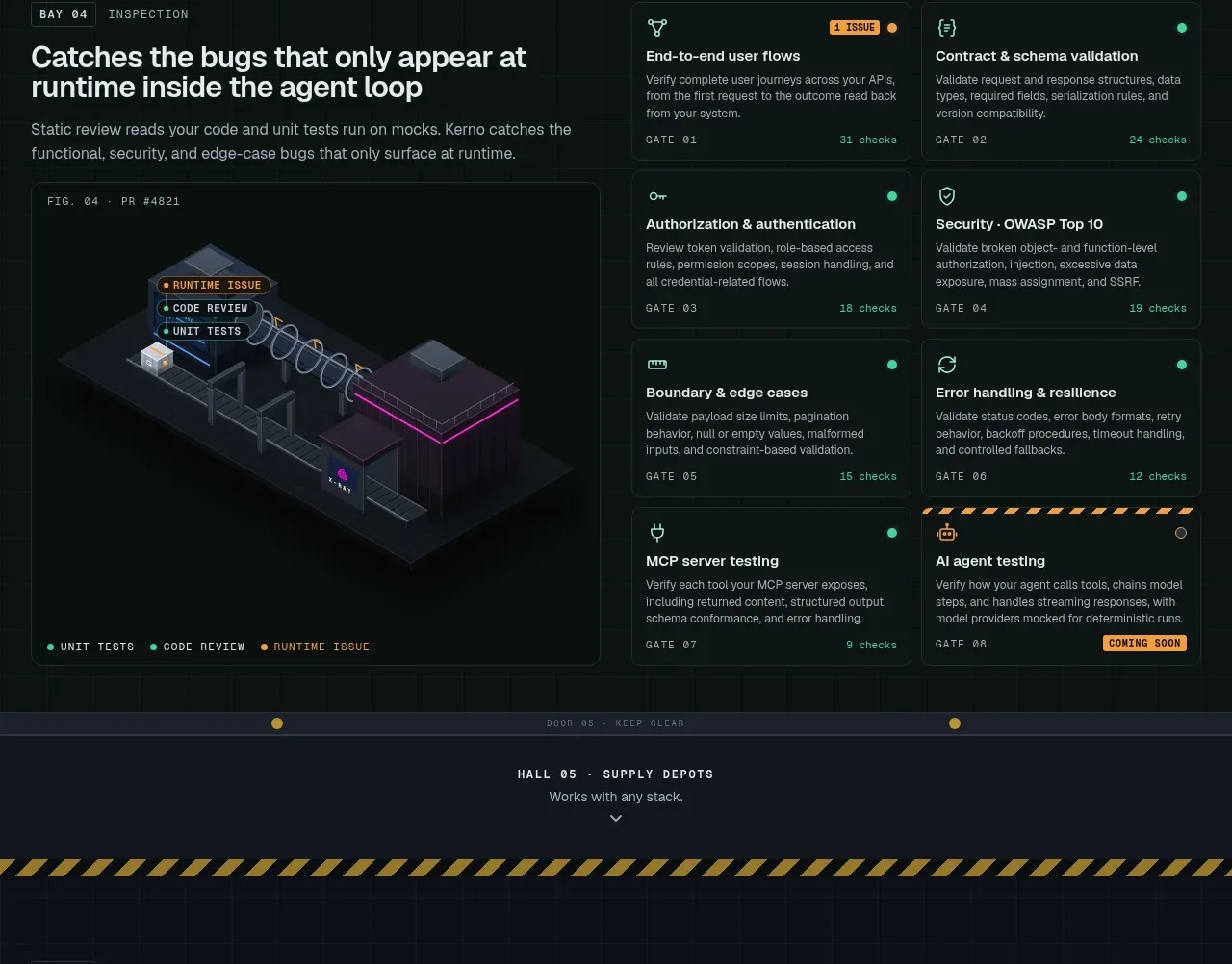 Verification gates matrix
Kerno 1.0 · Feature grid
Verification gates matrix
Kerno 1.0 · Feature grid
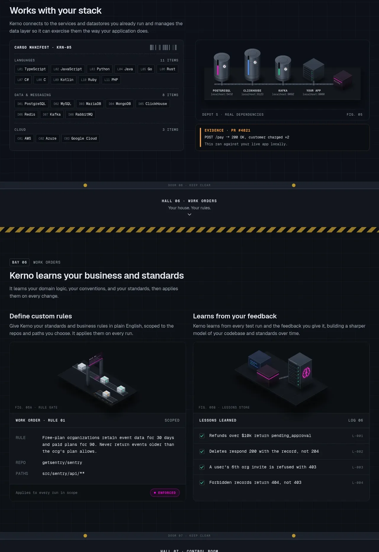 Stack and work-order configuration
Kerno 1.0 · Feature grid
Stack and work-order configuration
Kerno 1.0 · Feature grid
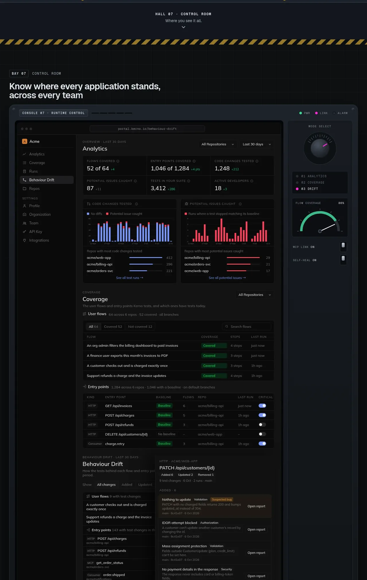 Control room analytics
Kerno 1.0 · Feature grid
Control room analytics
Kerno 1.0 · Feature grid
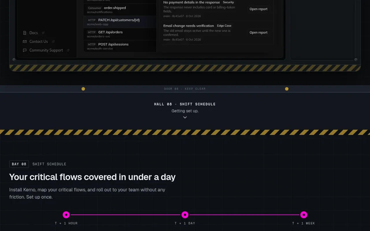 Three-stage rollout timeline
Kerno 1.0 · Feature grid
Three-stage rollout timeline
Kerno 1.0 · Feature grid
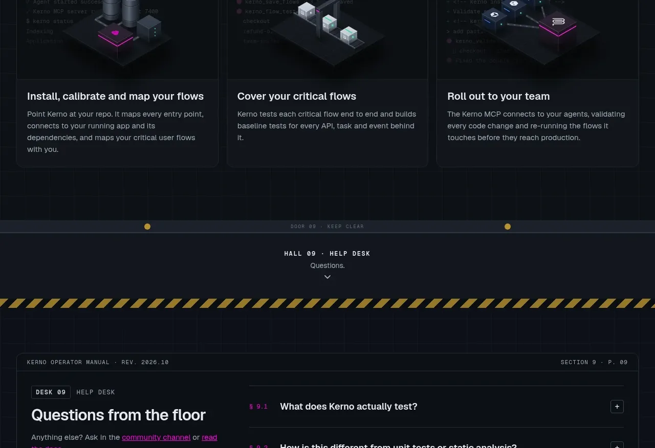 Help desk FAQ
Kerno 1.0 · FAQ
Help desk FAQ
Kerno 1.0 · FAQ
 Production dispatch CTA
Kerno 1.0 · Call to action
Production dispatch CTA
Kerno 1.0 · Call to action