 kage
kage
kerno.io
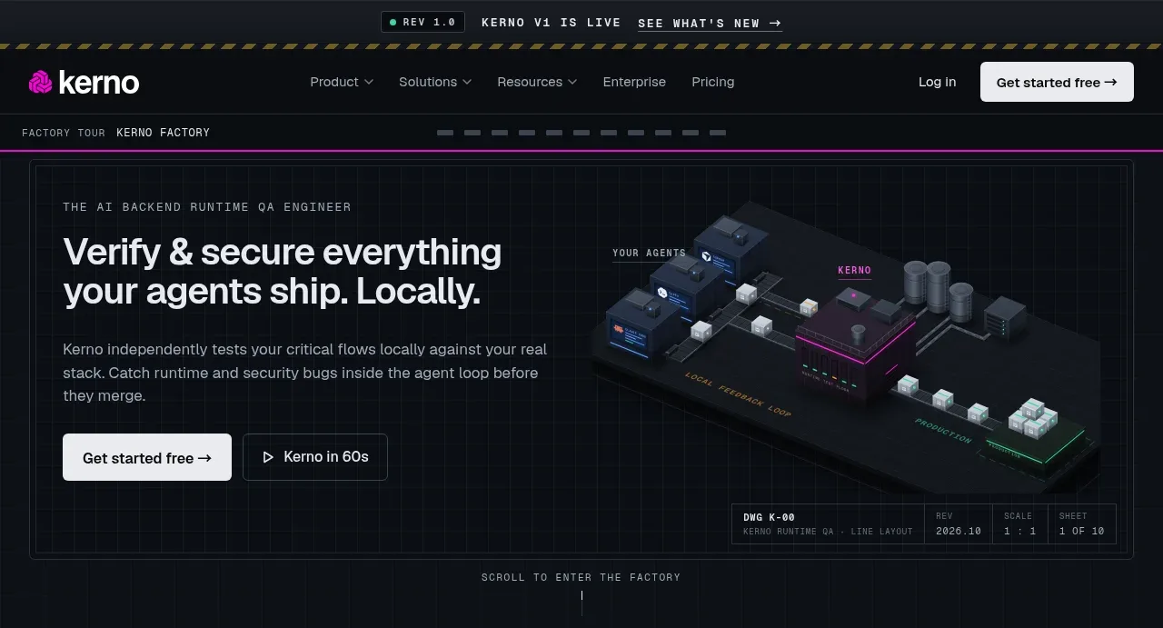
Design analysis
The hero pairs a direct product promise and two CTAs with a large technical system visualization framed like an instrument panel. Small labels, grid lines, and diagnostic metadata make the visual feel like a working product rather than decoration.
Prompt preview
## Reference images

Study these alongside the description below: hierarchy, rhythm, spacing, colour. Build for the product you are asked about, using this design language.

- Component: https://kage-design-assets.t3.tigrisfiles.io/components/kerno-1-0/454d79dc-d228-4b14-889b-ec4f181556d7-1792130637-1.webp
- Full page it was cut from: https://kage-design-assets.t3.tigrisfiles.io/screenshots/kerno-1-0/454d79dc-d228-4b14-889b-ec4f181556d7-1792130514699-full.webp
- Component on Kage: https://kage.design/component/kerno-1-0-hero

## Before you start
Ask what the user's product does, what outcome it creates, and what brand and visual assets are available. Apply these principles to that product and create original content and visuals.

Design a wide, dark hero directly below navigation. Use a split composition: left-aligned eyebrow, strong two-line headline, concise supporting paragraph, and primary plus secondary actions; place an abstract product/system visualization on the right, allowing it to overlap or sit inside a technical frame. Use a near-black blue background (#090d12), panel fill (#10161e), faint grid lines (#202832), cool gray text (#aab4bd), and a bright off-white primary button (#edf1f2), with one saturated brand accent such as magenta (#d900a9). Set the headline around 30–38px with tight line height and the supporting copy around 12–14px. Keep a generous 32–48px inner padding and align every element to a consistent vertical grid. Add tiny mono labels, corner metadata, hairline borders, and restrained glow only where they clarify the system metaphor. The primary CTA should be unmistakable; the secondary CTA can use a play or terminal-style affordance. On mobile, stack copy above the visual and preserve the visual's focal point.

Never use the reference product name, exact headline, logo, illustration, screenshot, or copy.
More components
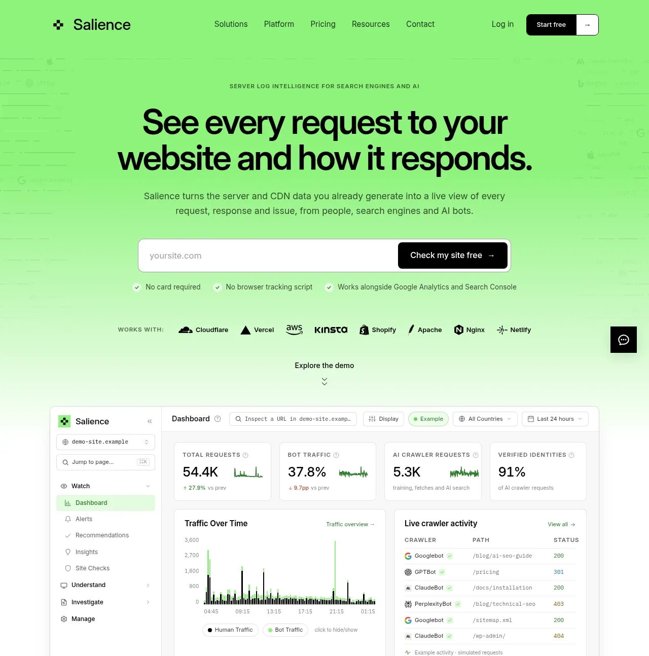
 Product promise and site checker hero
Salience · Hero
Product promise and site checker hero
Salience · Hero
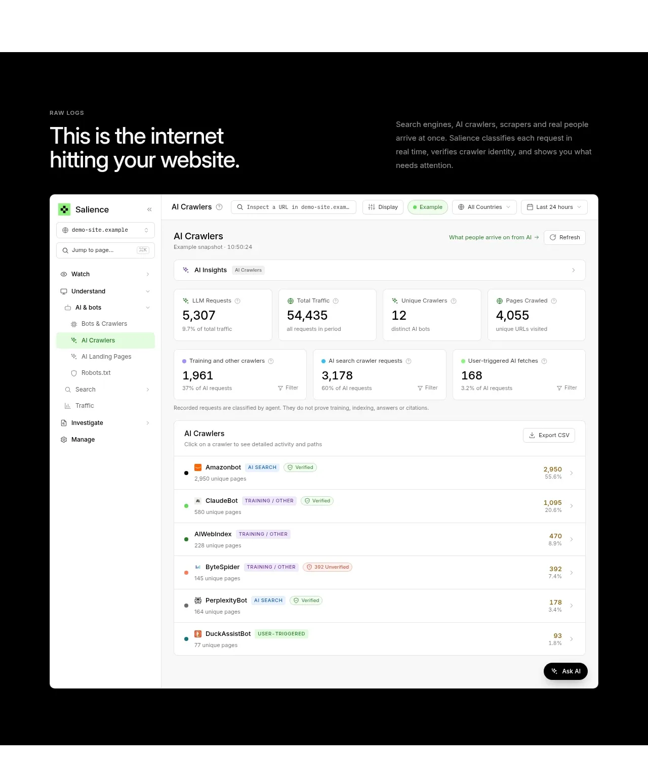 Raw activity dashboard showcase
Salience · Hero
Raw activity dashboard showcase
Salience · Hero
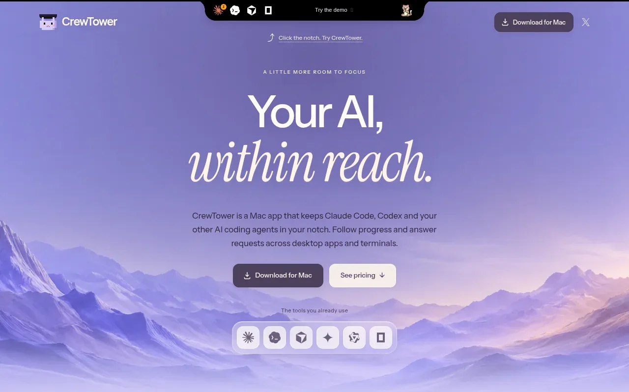
 Focus-oriented hero
CrewTower Mod for Claude Code · Hero
Focus-oriented hero
CrewTower Mod for Claude Code · Hero
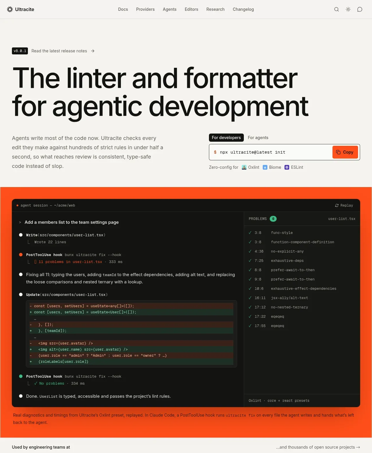
 Agentic development hero with live terminal preview
Ultracite v8 · Hero
Agentic development hero with live terminal preview
Ultracite v8 · Hero
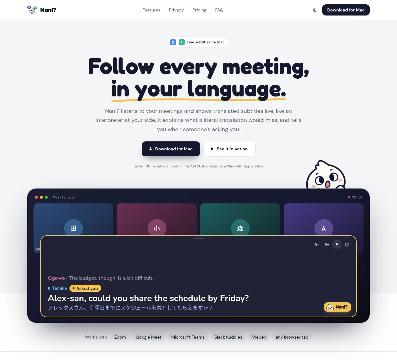
 Translation meeting hero
NANI??? · Hero
Translation meeting hero
NANI??? · Hero
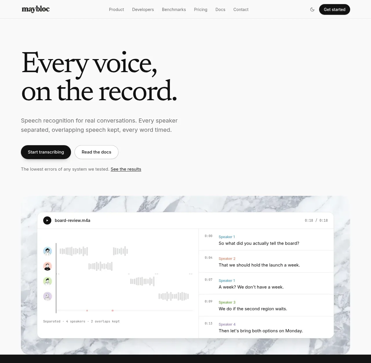
 Editorial speech transcription hero
Maybloc · Hero
Editorial speech transcription hero
Maybloc · Hero