kage
kage
kilo.ai
Design analysis
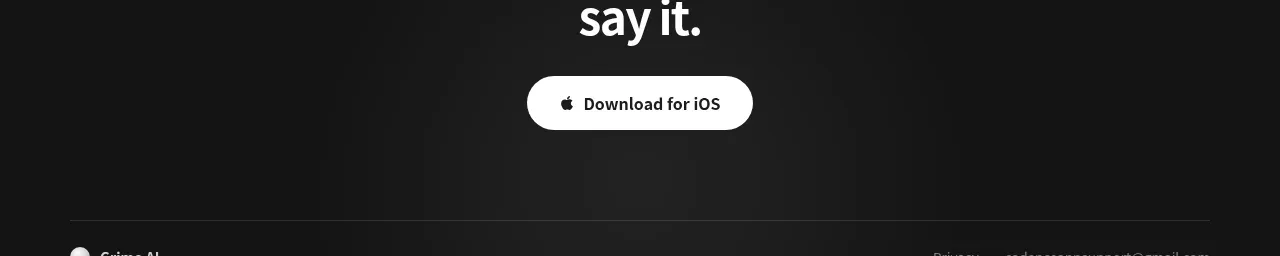
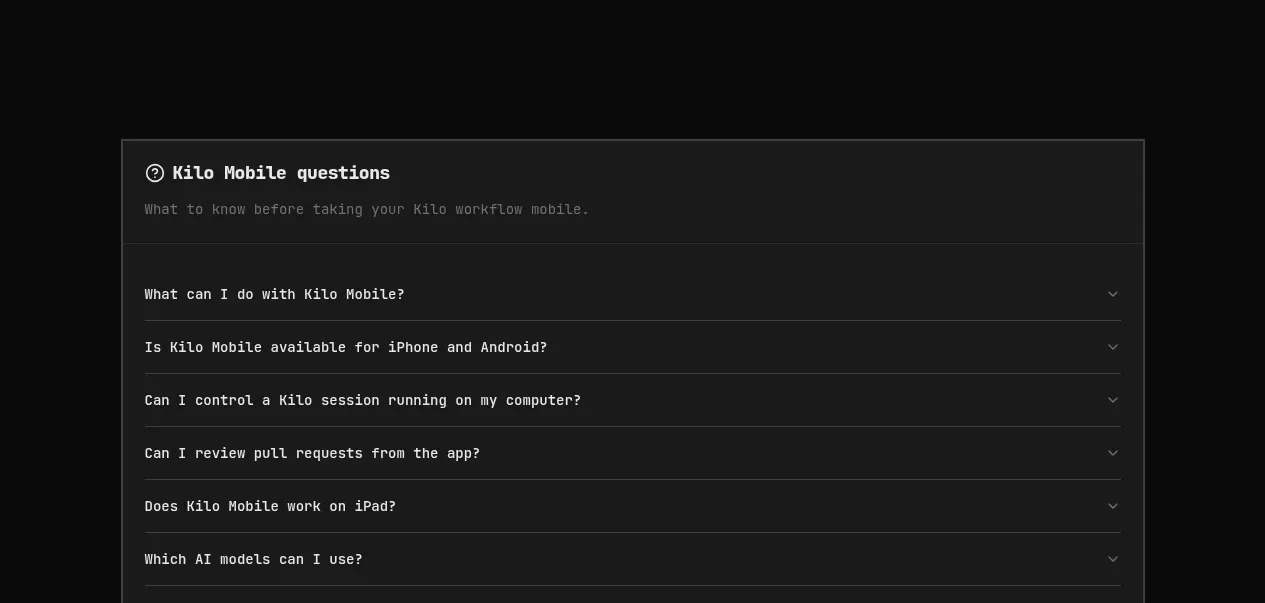
A large tinted rounded panel centers a final download headline, app-store actions, and a QR-code download control.
Prompt preview
## Reference images

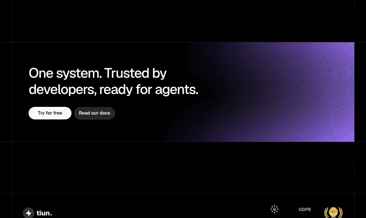
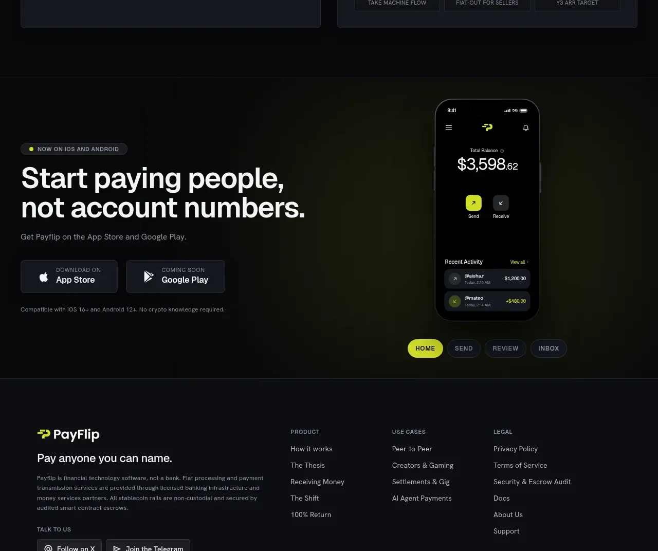
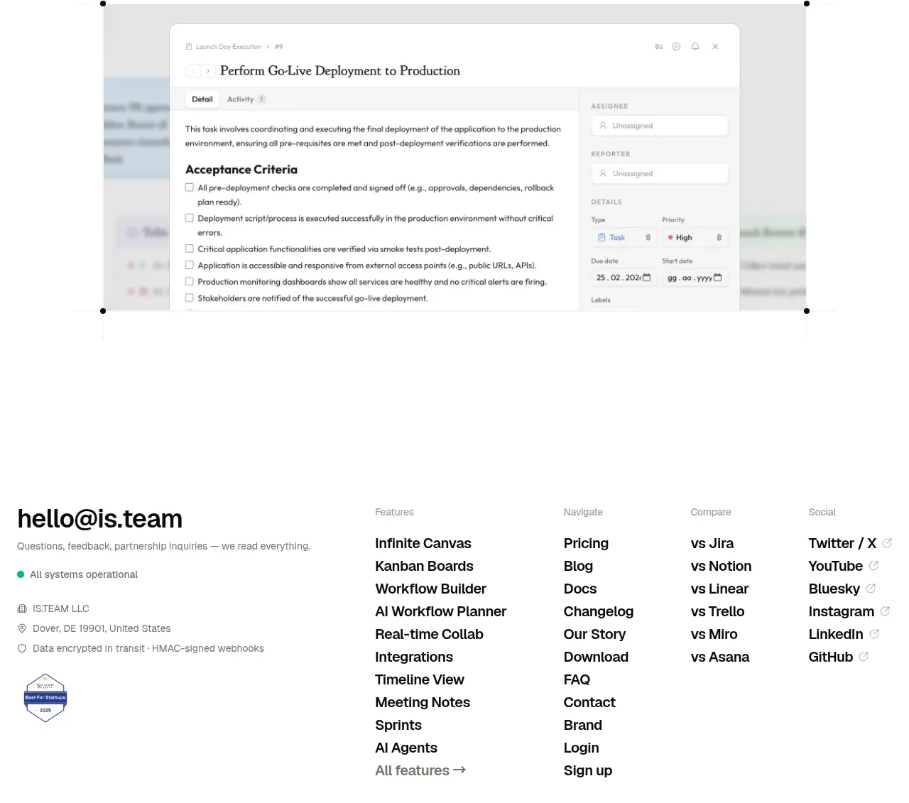
Study these alongside the description below: hierarchy, rhythm, spacing, colour. Build for the product you are asked about, using this design language.

- Component: https://kage-design-assets.t3.tigrisfiles.io/components/kilo-code-for-ios-and-android/a36b68a0-c268-4b03-b068-c86b233a401a-1789538730-10.webp
- Full page it was cut from: https://kage-design-assets.t3.tigrisfiles.io/screenshots/kilo-code-for-ios-and-android/a36b68a0-c268-4b03-b068-c86b233a401a-1789538626553-full.webp
- Component on Kage: https://kage.design/component/kilo-code-for-ios-and-android-cta

## Before you start
Ask the user what final conversion action matters, which platforms are supported, and what brand treatment should make the CTA feel distinctive, then apply the principles below to that product rather than copying this reference.

Build a centered final CTA panel with a subtle dark olive gradient, a thin olive border, 18–22px radius, and 48–64px padding. Center a large 42–50px heading, a two-line muted subtitle, platform download buttons, and a compact QR-code row beneath. Keep the CTA visually separated from the FAQ with ample outer whitespace. Use off-white text, #9da097 body text, and a warm lime accent around #e7ed63. Make every button at least 44px tall, use real accessible labels, and provide a mobile layout that wraps the store buttons without overflow.

Never: use logos, product names, copy, illustrations, or imagery from the reference.