kage
kage
kilo.ai

Design analysis
A dark, terminal-flavoured product page for a mobile coding-agent app. Nearly everything is set in a monospace face on near-black, with a single lime-yellow accent used sparingly for the hero keyword, checkmarks and links. The page alternates between wide phone mockups (screenshot-of-the-real-app style) and copy blocks, then shifts rhythm through a four-step numbered workflow, a two-card notification/dictation row, a three-card ecosystem grid, a stat bento, a bordered FAQ accordion and a QR-code closing CTA. Realistic device UIs in light-on-dark contrast against the dark page do most of the persuasion work; the copy stays terse and developer-literate throughout.
Prompt preview
## Reference images

Study these alongside the description below: hierarchy, rhythm, spacing, colour. Build for the product you are asked about, using this design language.

- Full page: https://kage-design-assets.t3.tigrisfiles.io/screenshots/kilo-code-for-ios-and-android/a36b68a0-c268-4b03-b068-c86b233a401a-1789538626553-full.webp
- Above the fold: https://kage-design-assets.t3.tigrisfiles.io/screenshots/kilo-code-for-ios-and-android/a36b68a0-c268-4b03-b068-c86b233a401a-1789538618159.webp
- Design on Kage: https://kage.design/designs/kilo-code-for-ios-and-android-landing-page

## Before you start
Ask the user: what product are you building, who is it for, and what brand assets (name, colours, type, logo) do they already have? Wait for the answers. Everything below is applied to their product, not to the reference.

## Page structure
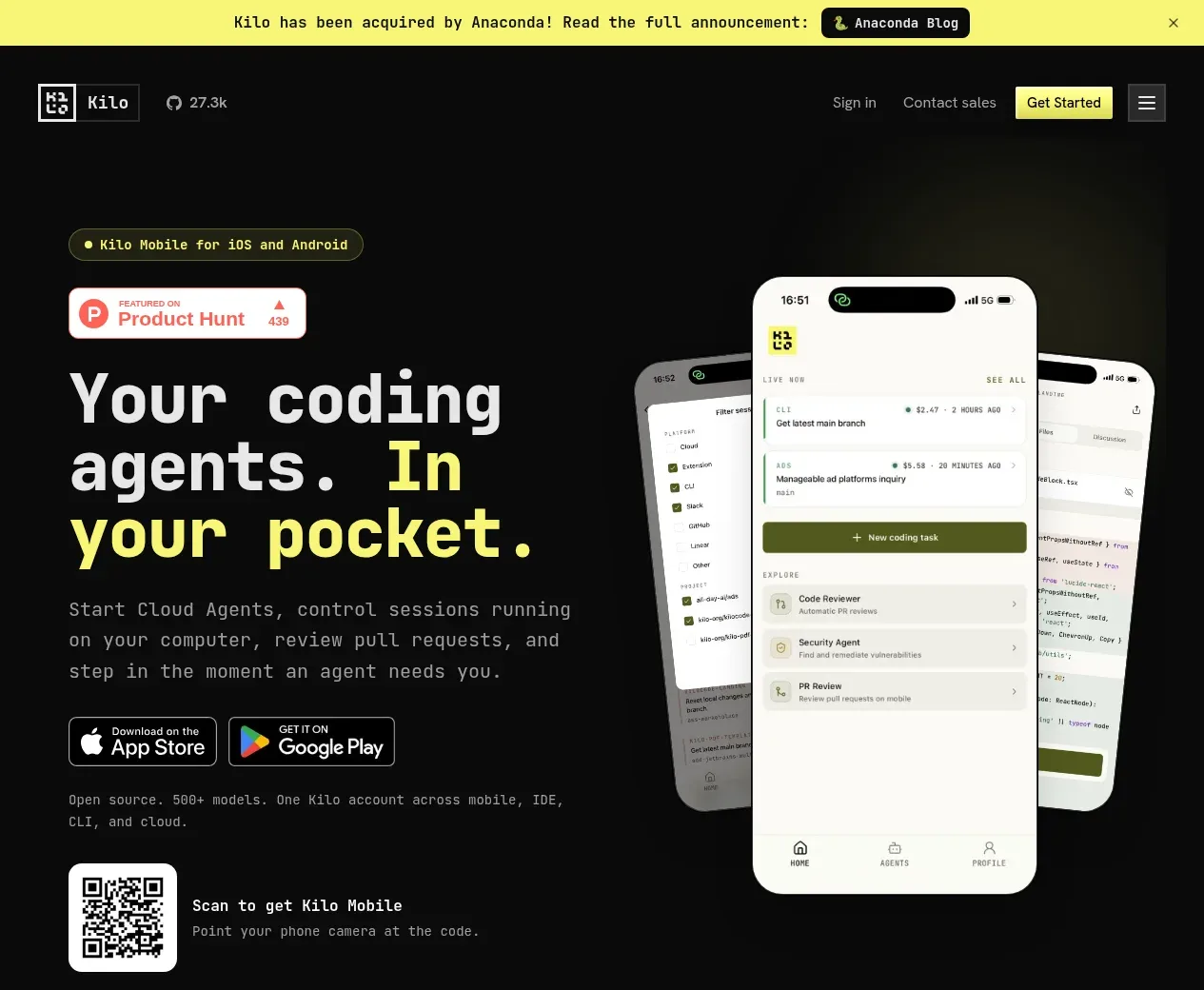
1. **Announcement bar**: full-width bright yellow strip at the very top with a single line of dark text, an inline pill button, and a dismiss ×.
2. **Nav**: dark bar with logo lockup left, a GitHub-star count chip, and right-aligned Sign in / Contact sales / a small yellow "Get Started" button plus a hamburger icon.
3. **Hero**: left column — a small outlined pill tag ("for iOS and Android"), a Product Hunt badge, a very large monospace headline where the final phrase is the accent colour, a two-line subheading, App Store + Google Play buttons, a one-line open-source footnote, and a QR code with "Scan to get [product]" caption. Right column — a fan of two/three overlapping phone mockups showing the real app UI.
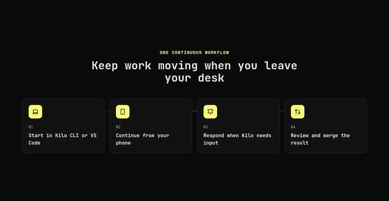
4. **Workflow strip**: small uppercase eyebrow ("one continuous workflow"), centred heading, then a 4-column row of bordered cards, each with an icon, an index number (01–04) and one short line — the desktop-to-phone journey.
5. **Feature section A (text right, phone left)**: a dark-outlined phone mockup on the left; on the right a small icon, large monospace heading, paragraph, and a checklist with accent-coloured check marks.
6. **Feature section B (mirrored)**: same pattern flipped — text left, phone mockup right.
7. **Feature section C in a full-width bordered panel**: heading + paragraph + an inline sub-card labelled for tablet ("Built for iPad") on the left, two overlapping phone/tablet mockups on the right.
8. **Two-card row**: centred heading ("Step in at the right moment") then two equal cards — notifications and voice/attachments — each icon, heading, short paragraph.
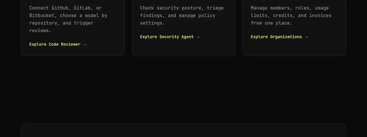
9. **Ecosystem grid**: heading ("More of X, in one app") and three cards (Code Reviewer / Security Agent / Organizations) with an accent-coloured "Explore →" link at the bottom of each.
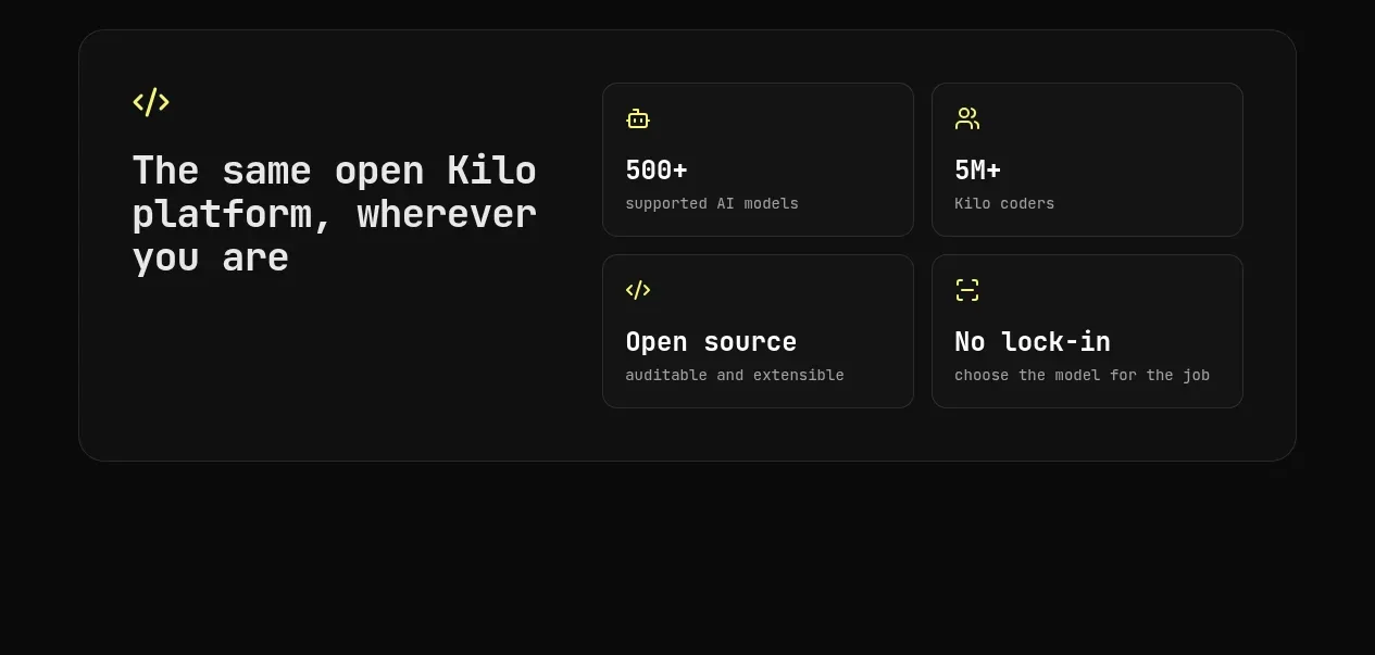
10. **Stats bento**: a large bordered panel — left side a heading with an icon; right side a 2×2 grid of cells: a big stat ("500+ supported AI models"), another stat ("5M+ coders"), "Open source" and "No lock-in" cells.
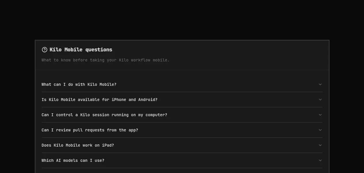
11. **FAQ accordion**: heading + subtitle, then a bordered list of 6–7 collapsed questions with chevrons.
12. **Closing CTA panel**: bordered dark panel with centred heading, subline, App Store/Google Play buttons, and a QR code with caption.
13. **Footer**: multi-column link footer — community/social column, product, models, enterprise, resources, company, comparison and legal columns — ending with copyright and a location credit line.

## Design language
- **Type**: one monospace family for nearly everything — headings, body, nav, buttons — giving a terminal feel. Scale contrast does the hierarchy: hero at ~64–80px bold, section headings ~40–48px, card headings ~20px, body 14–15px. Small uppercase eyebrows at ~12px with letter-spacing introduce sections.
- **Colour**: near-black background (#0d0d0b–#111), slightly lighter panel greys (#1a1a17) for cards, white/off-white text, and a single lime/chartreuse accent (~#d6f542 / #b8e62e) reserved for hero emphasis, checkmarks, links and small CTAs. One bright full-bleed yellow bar (#f5ff66) at the top for the announcement only. Never use more than these three colour roles.
- **Density and rhythm**: the page alternates large airy sections (phone mockups with lots of dark space) with tighter card clusters (4-up, 2-up, 3-up, 2×2). Change the column count between sections to keep the eye moving; never repeat the same grid twice in a row.
- **Cards and borders**: 1px hairline borders in a dark warm grey (#2a2a26), radius ~8–12px, flat fills — no shadows, no gradients on cards. Bordered panels wrap the hero mockups, PR-review section, stats bento, FAQ and final CTA to create "framed" moments.
- **Mockups**: render the actual product UI inside phone frames with rounded bezels and a status bar; overlap two phones slightly for depth. Keep mockup screens light/neutral where the page is dark so they pop.
- **Lists**: feature points as single-line items with accent-coloured check icons rather than bullets.
- **Links**: inline accent-coloured text links with an arrow (→) instead of button-style links inside cards.
- **Motion**: keep it quiet — hover states lighten card backgrounds and accent links underline; accordions expand with a short ease. No parallax or heavy animation.
- **Footer**: dense multi-column small-type link grid, monospace, muted grey text, generous top padding.

## Never
Never copy Kilo's logo, wordmark, product names, headline copy, screenshots, QR code, Product Hunt badge or icon set. Do not reproduce their exact announcements, stats or FAQ wording. Never present the result as Kilo or imply affiliation.
Components from this page
All components
 Announcement bar and site navigation
Kilo Code for iOS and Android · Navigation
Announcement bar and site navigation
Kilo Code for iOS and Android · Navigation
 Mobile coding agents hero
Kilo Code for iOS and Android · Hero
Mobile coding agents hero
Kilo Code for iOS and Android · Hero
 Continuous workflow steps
Kilo Code for iOS and Android · Feature grid
Continuous workflow steps
Kilo Code for iOS and Android · Feature grid
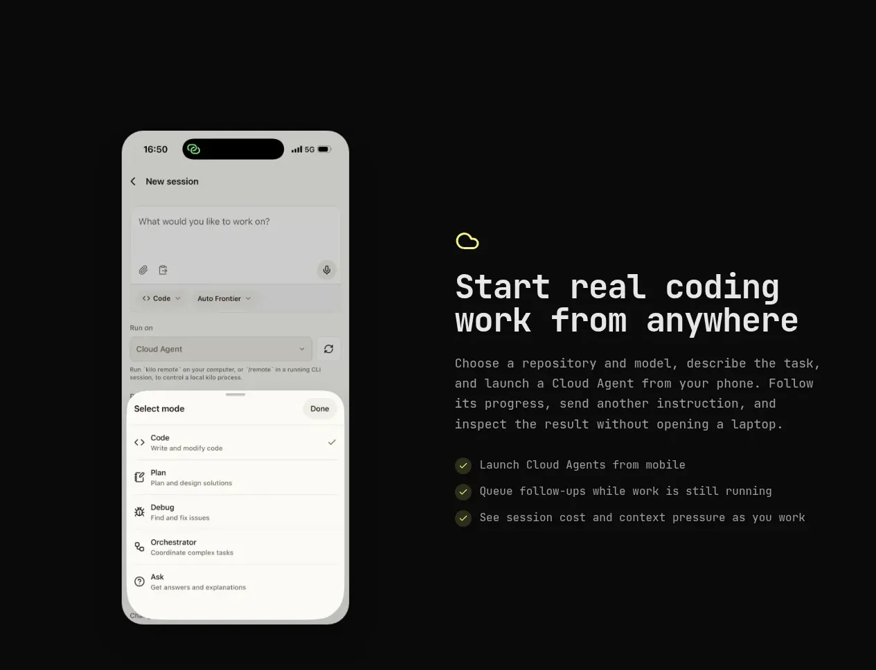 Cloud agent from anywhere
Kilo Code for iOS and Android · Feature grid
Cloud agent from anywhere
Kilo Code for iOS and Android · Feature grid
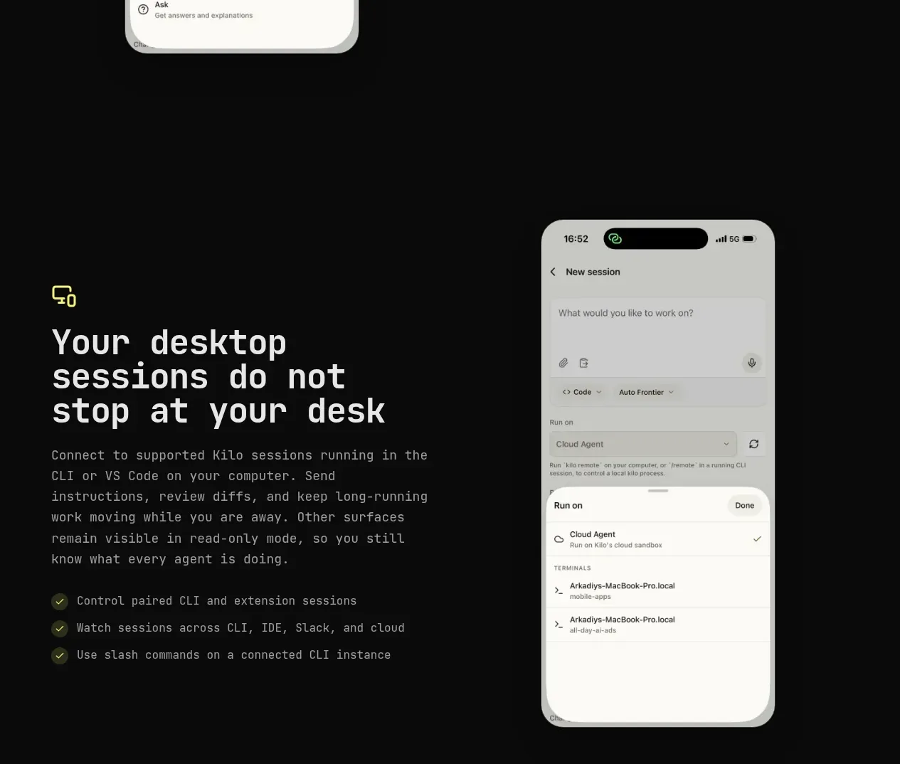 Desktop session continuity
Kilo Code for iOS and Android · Feature grid
Desktop session continuity
Kilo Code for iOS and Android · Feature grid
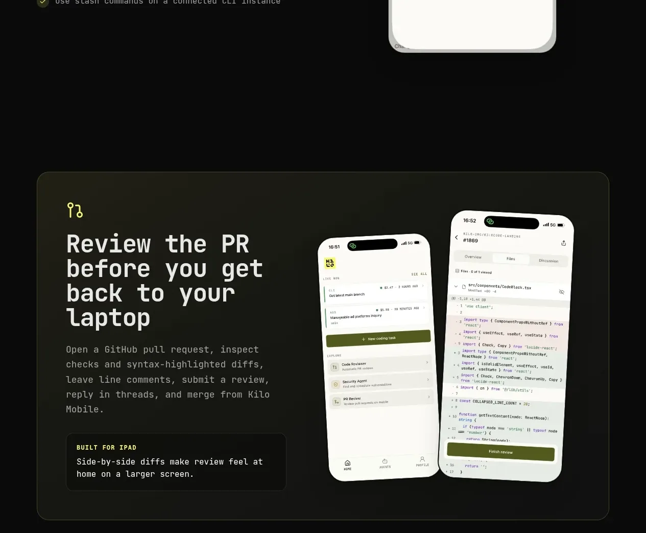 Pull-request review showcase
Kilo Code for iOS and Android · Card
Pull-request review showcase
Kilo Code for iOS and Android · Card
 Moment-of-need actions
Kilo Code for iOS and Android · Feature grid
Moment-of-need actions
Kilo Code for iOS and Android · Feature grid
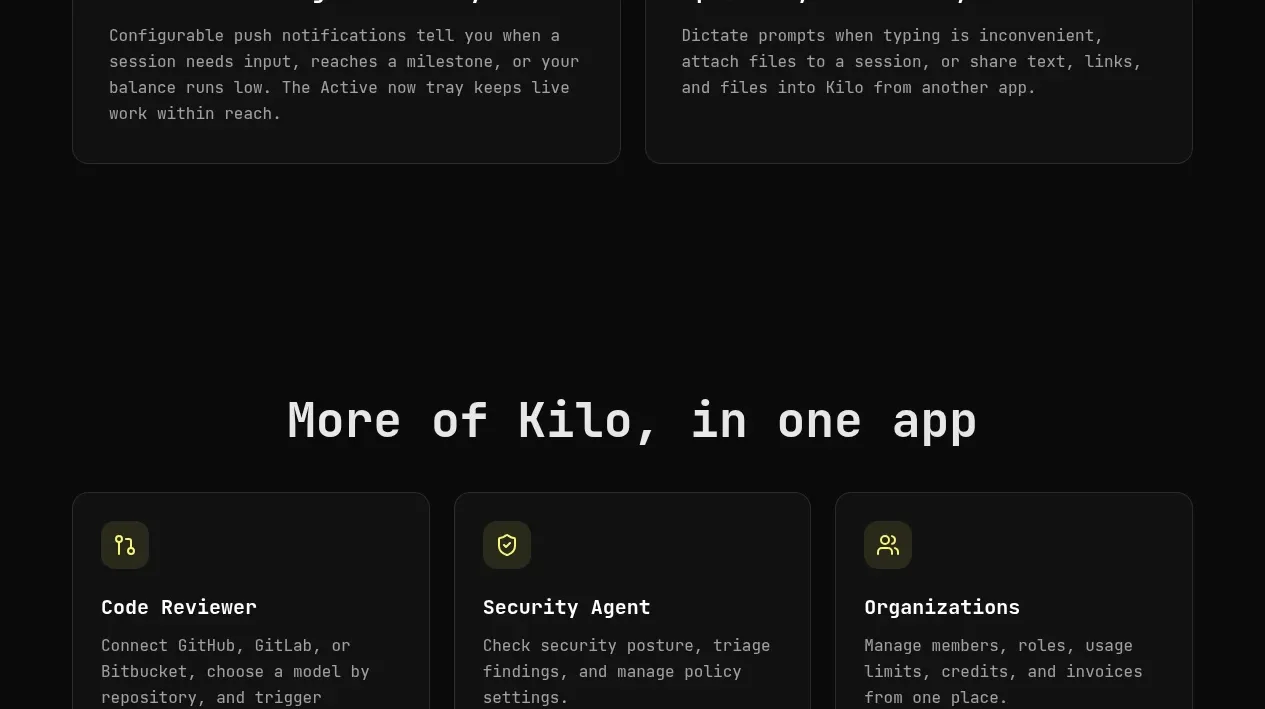 Related capabilities
Kilo Code for iOS and Android · Feature grid
Related capabilities
Kilo Code for iOS and Android · Feature grid
 Open platform stats
Kilo Code for iOS and Android · Stats
Open platform stats
Kilo Code for iOS and Android · Stats
 Mobile product FAQ
Kilo Code for iOS and Android · FAQ
Mobile product FAQ
Kilo Code for iOS and Android · FAQ
 Download conversion panel
Kilo Code for iOS and Android · Call to action
Download conversion panel
Kilo Code for iOS and Android · Call to action
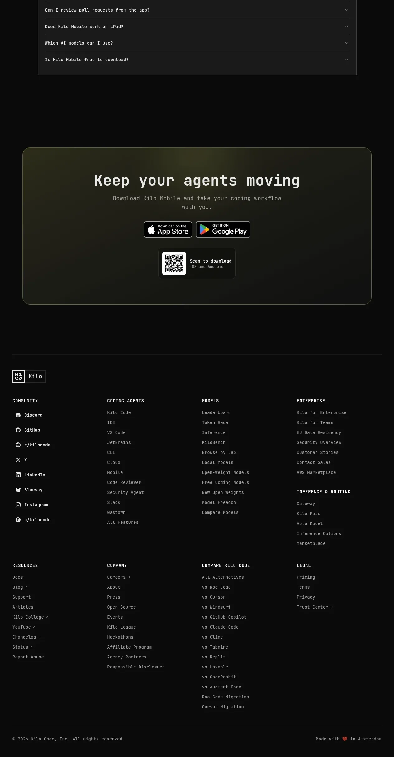 Multi-column site footer
Kilo Code for iOS and Android · Footer
Multi-column site footer
Kilo Code for iOS and Android · Footer