kage
kage
kilo.ai
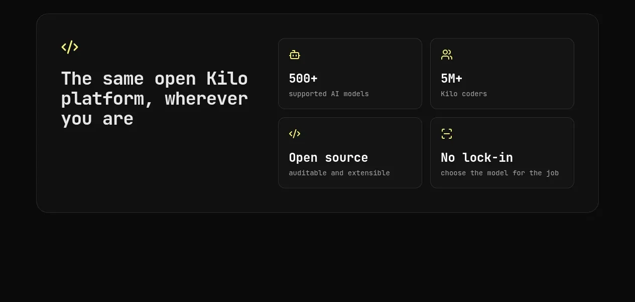
Design analysis
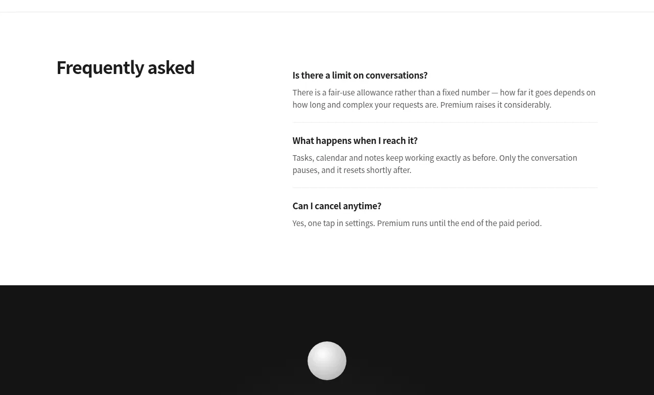
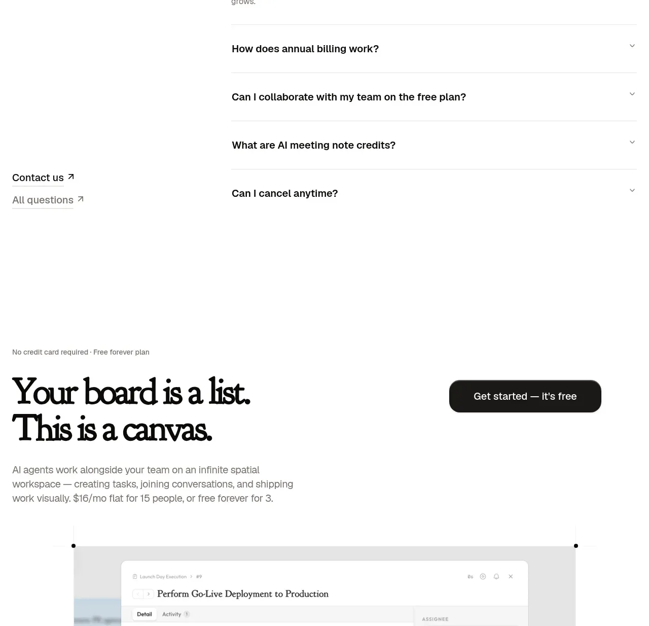
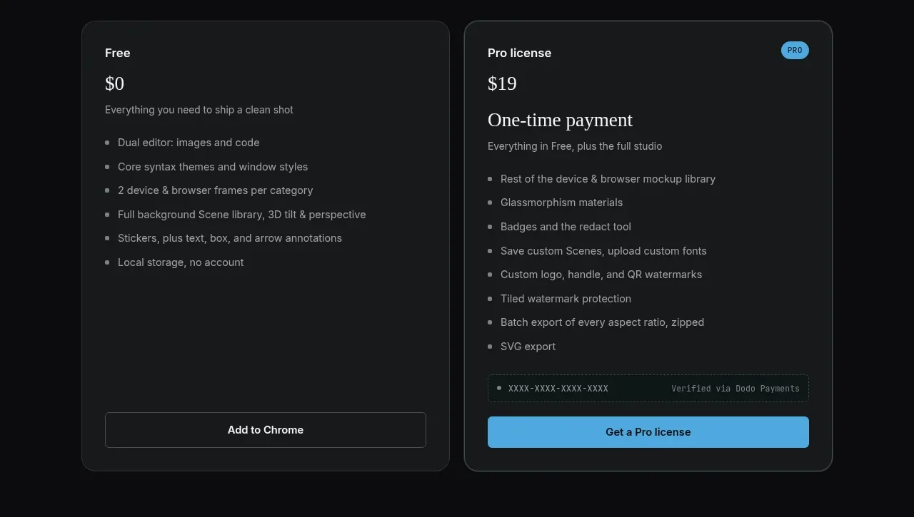
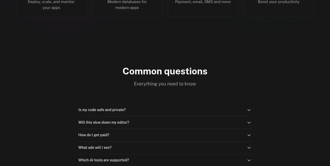
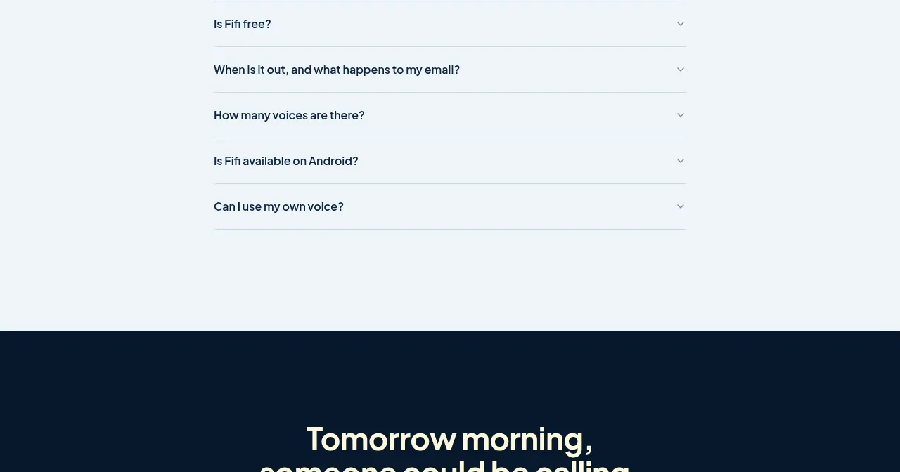
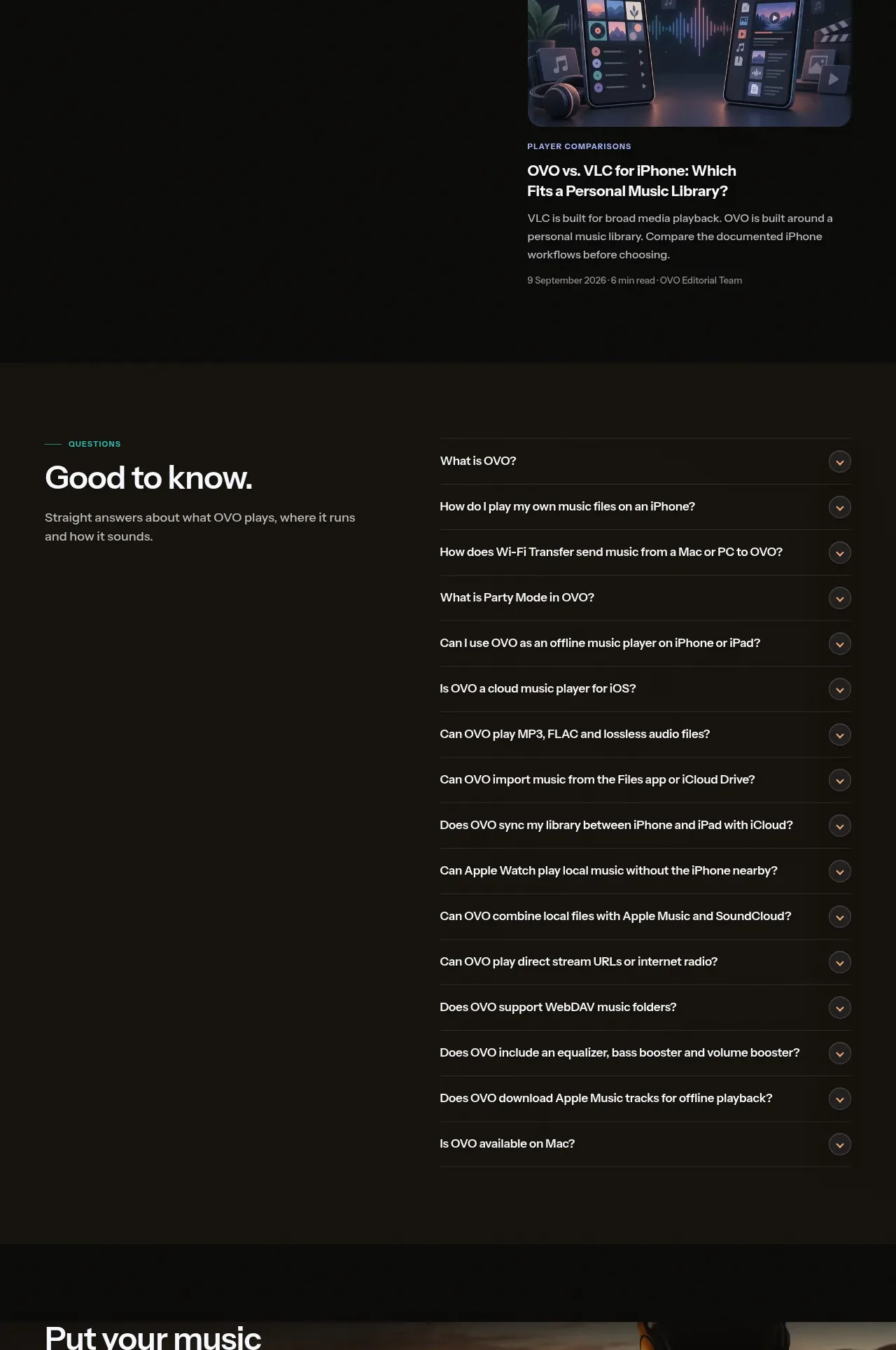
A constrained accordion panel uses a title row and evenly divided question rows with chevrons.
Prompt preview
## Reference images

Study these alongside the description below: hierarchy, rhythm, spacing, colour. Build for the product you are asked about, using this design language.

- Component: https://kage-design-assets.t3.tigrisfiles.io/components/kilo-code-for-ios-and-android/a36b68a0-c268-4b03-b068-c86b233a401a-1789538729-9.webp
- Full page it was cut from: https://kage-design-assets.t3.tigrisfiles.io/screenshots/kilo-code-for-ios-and-android/a36b68a0-c268-4b03-b068-c86b233a401a-1789538626553-full.webp
- Component on Kage: https://kage.design/component/kilo-code-for-ios-and-android-faq

## Before you start
Ask the user what questions customers ask about their product and what answers are approved, then apply the principles below to that product rather than copying this reference.

Create a centered FAQ accordion with a constrained width around 80–82% of the viewport. Use a dark panel (#1b1c1b), a 1px medium-gray border (#41433f), and a simple header containing a question icon, title, and muted description. Divide rows with 1px separators; each row has a clear 14–16px question, a right-aligned chevron, generous 18–22px vertical padding, and an accessible button target. Allow one or more rows to expand, animate height subtly, and preserve strong keyboard and screen-reader semantics. On mobile use full width with reduced padding.

Never: use logos, product names, copy, illustrations, or imagery from the reference.