kage
kage
kilo.ai
Design analysis
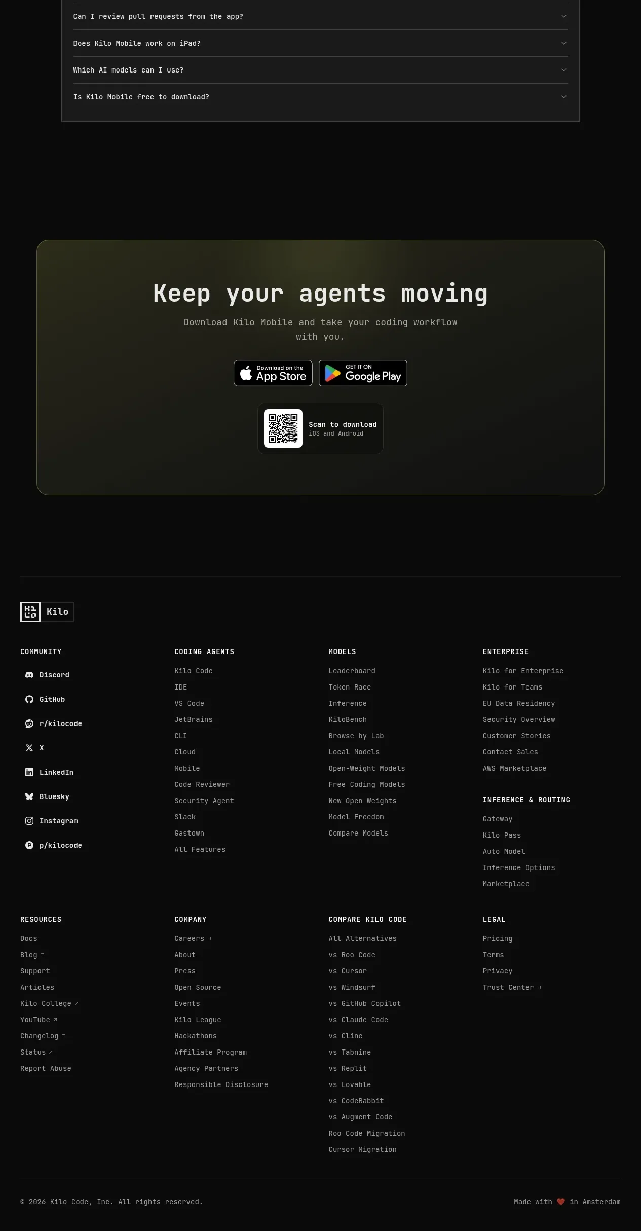
The footer begins with a brand lockup and expands into multiple link columns for community, product, models, enterprise, resources, company, comparisons, and legal, ending with a copyright row.
Prompt preview
## Reference images

Study these alongside the description below: hierarchy, rhythm, spacing, colour. Build for the product you are asked about, using this design language.

- Component: https://kage-design-assets.t3.tigrisfiles.io/components/kilo-code-for-ios-and-android/a36b68a0-c268-4b03-b068-c86b233a401a-1789538730-11.webp
- Full page it was cut from: https://kage-design-assets.t3.tigrisfiles.io/screenshots/kilo-code-for-ios-and-android/a36b68a0-c268-4b03-b068-c86b233a401a-1789538626553-full.webp
- Component on Kage: https://kage.design/component/kilo-code-for-ios-and-android-footer

## Before you start
Ask the user what footer destinations, social channels, legal links, and brand lockup are appropriate for their product, then apply the principles below to that product rather than copying this reference.

Create a large dark footer separated from the CTA by a subtle horizontal rule. Start with a compact brand mark, then use a spacious multi-column link grid with uppercase/small section labels and vertically stacked links. Organize links into logical groups; on smaller screens collapse to two columns or accordions rather than shrinking text excessively. Use #090a09 background, #d9dcd4 headings, #858982 links, 12–14px technical typography, 28–32px column gaps, and generous row spacing. Include a final divider and bottom row with copyright on the left and a short maker/location note on the right. Ensure focus states, sufficient contrast, and semantic navigation landmarks.

Never: use logos, product names, copy, illustrations, or imagery from the reference.