kage
kage
kilo.ai
Design analysis
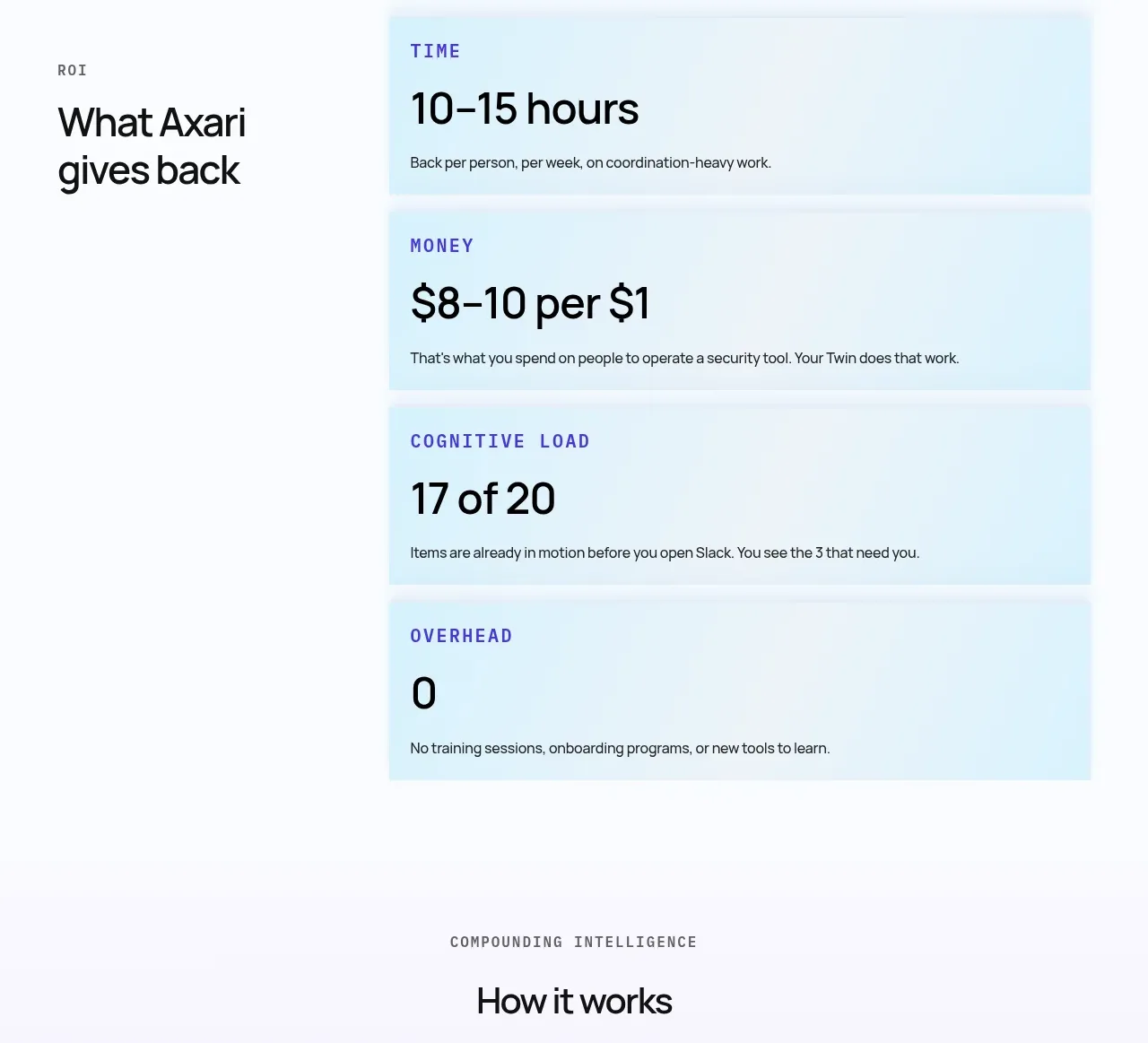
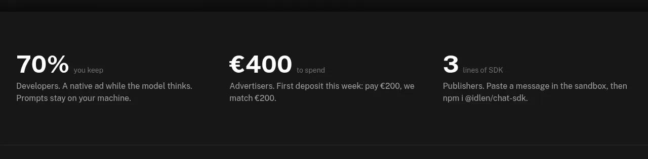
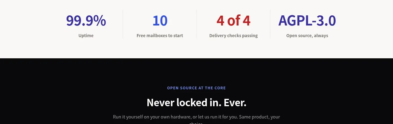
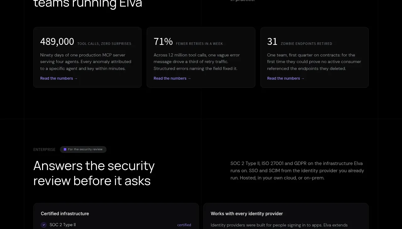
A wide bordered panel pairs a statement about the platform with four compact metric cards.
Prompt preview
## Reference images

Study these alongside the description below: hierarchy, rhythm, spacing, colour. Build for the product you are asked about, using this design language.

- Component: https://kage-design-assets.t3.tigrisfiles.io/components/kilo-code-for-ios-and-android/a36b68a0-c268-4b03-b068-c86b233a401a-1789538729-8.webp
- Full page it was cut from: https://kage-design-assets.t3.tigrisfiles.io/screenshots/kilo-code-for-ios-and-android/a36b68a0-c268-4b03-b068-c86b233a401a-1789538626553-full.webp
- Component on Kage: https://kage.design/component/kilo-code-for-ios-and-android-stats

## Before you start
Ask the user which credible metrics or principles should be highlighted and what evidence is available, then apply the principles below to that product rather than copying this reference.

Build a wide rounded stats panel with a left statement block and a 2×2 metric grid on the right. Use a near-black surface (#101110), subtle #292b28 border, 18px radius, and 36px padding. The statement should have a small accent icon and a large 34–42px heading; each metric tile should contain a prominent value, a short label, and optional supporting microcopy. Keep metric values off-white and icons/accent rules in #e8ef63. On mobile, stack the statement above the metrics. Avoid animation that makes numerical content hard to read.

Never: use logos, product names, copy, illustrations, or imagery from the reference.